Site Gallery
- All tags
- #Design Studies
- #Render
- #Interior Views
- #Section
- #Elevation
- #Exterior Views
- #Drawings
- #Floor Plan
- #Views
- #Education
- #Urban Design
- #Axonometric
- #Technical Drawing
- #Diagram
- #Laurieston
- #Perspective
- #Model
- #Site Plan
- #Art Gallery
- #3D
- #collage
- #Exploded Axonometric
- #sketch
- #Masterplan
- #Concept
- #Diagrams
- #Site
- #Front Elevation
- #Housing
- #Renderings
- #Community Centre
- #Technical Design
- #Plans
- #conservation design project
- #Context
- #hand drawing
- #isometric
- #Public spaces
- #Technical Studies
- #landscaping
- #Structure
- #Cultural Studies
- #History
- #Dementia
- #Neighbourhood
- #Professional Studies
- #Art Gallery in the City
- #Environment
- #photomontage
- #Sustainable production
- #Construction
- #detailing
- #M8
- #Market
- #Physical Model
- #Programme
- #street elevation
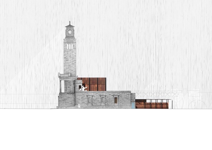
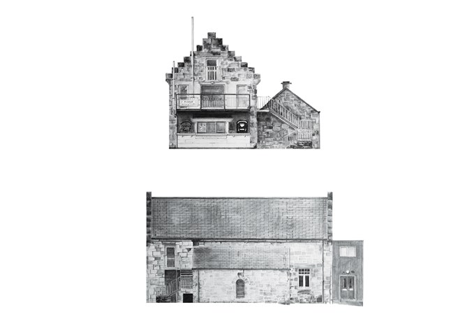
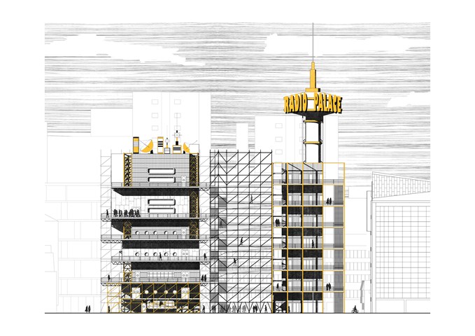
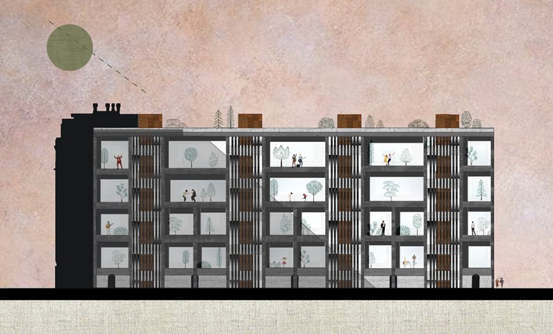
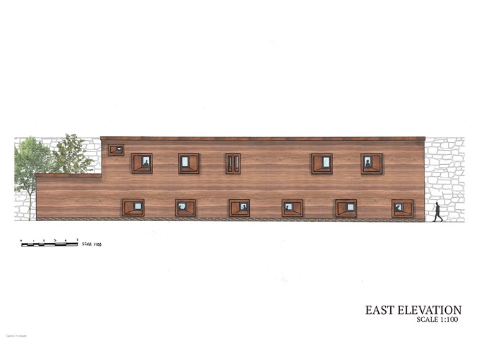
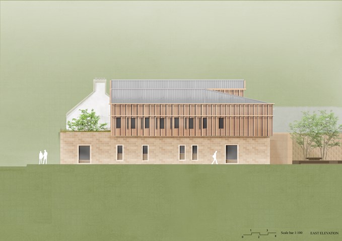
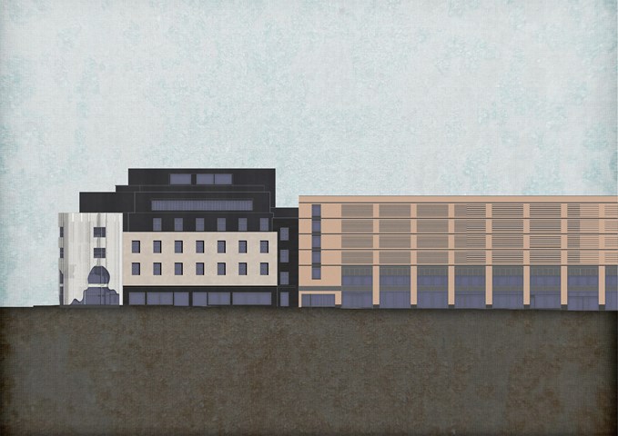
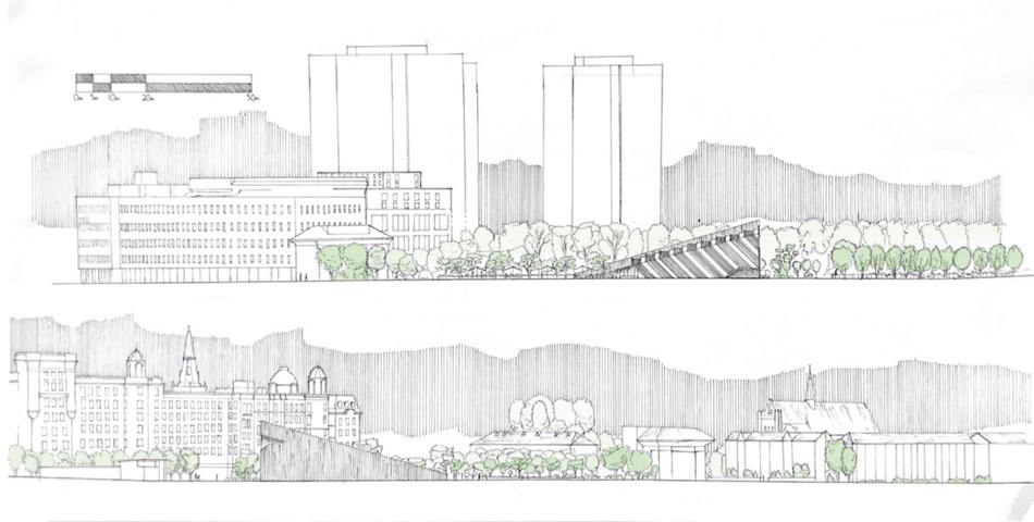
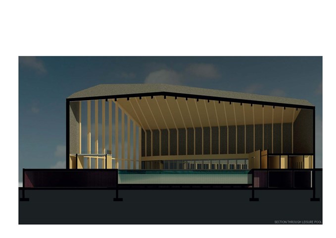
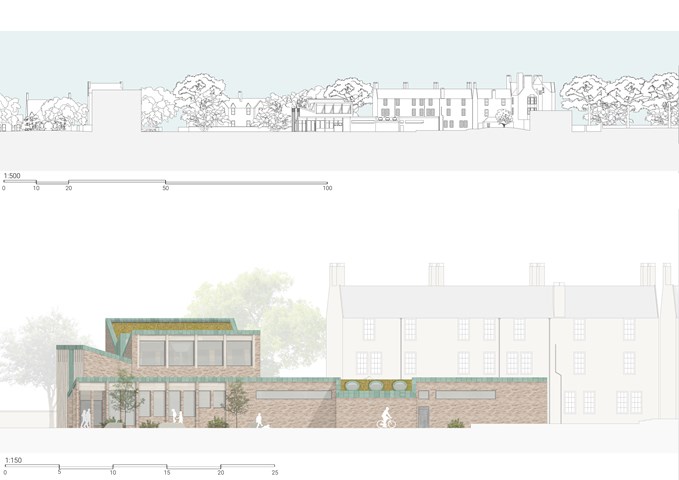
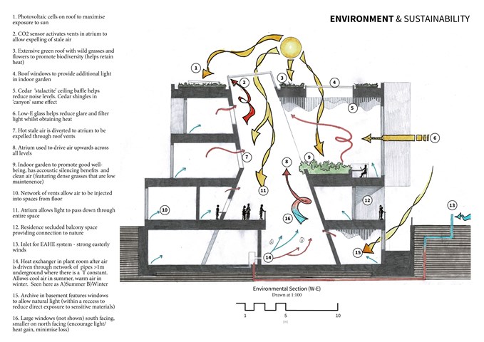
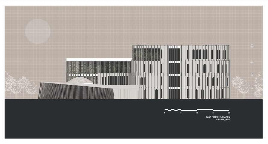
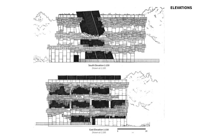
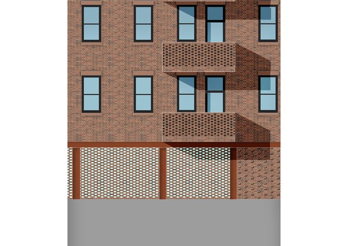
East Elevation - Alfie Hollington
Design Studies 3b
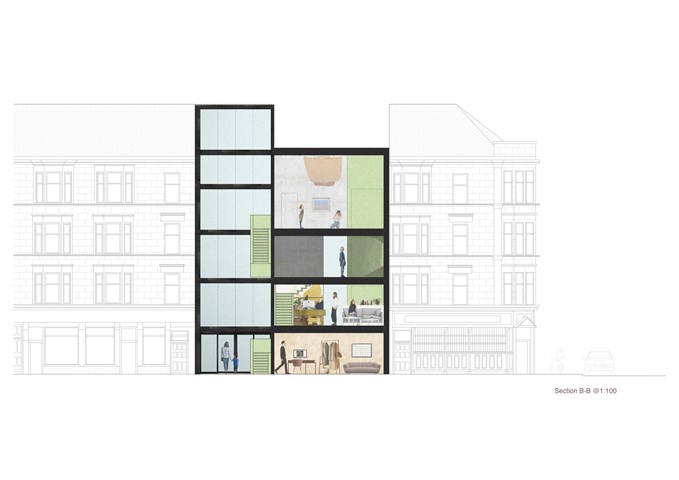
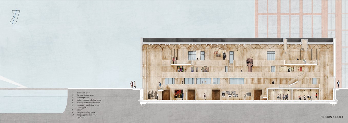
"To Engage" - Section B-B 1:100 - Zuzanna Woznicka
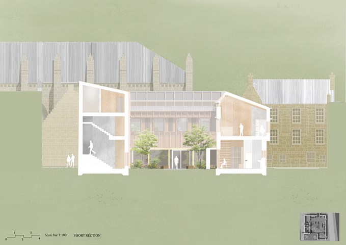
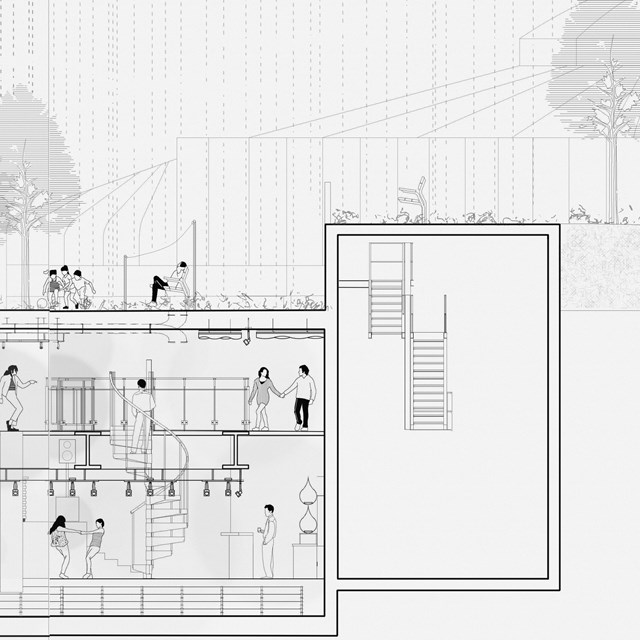
In this section, the main focus was to show this "hanging staircase" in a dramatically tall hall space. The gallery space is located on the last two floors which allow the space to be used after opening hours as a community centre or meeting point.
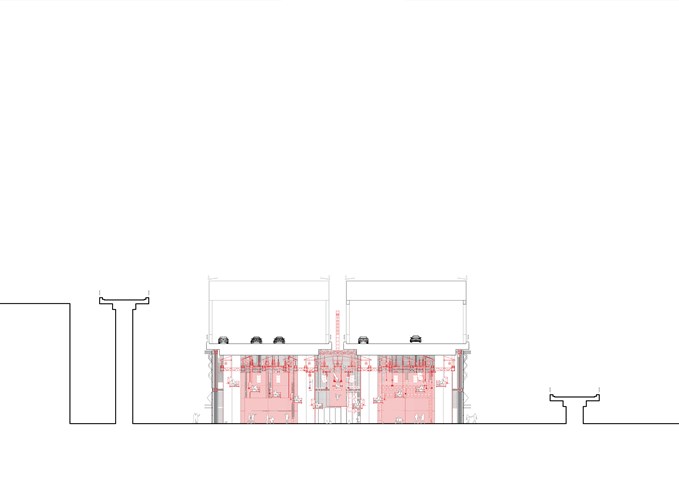
Section CC 1:100 - Conor Ryan McCormack
Down The Rabbit Hole_3B To Play
Down the Rabbit Hole_3B To Play.
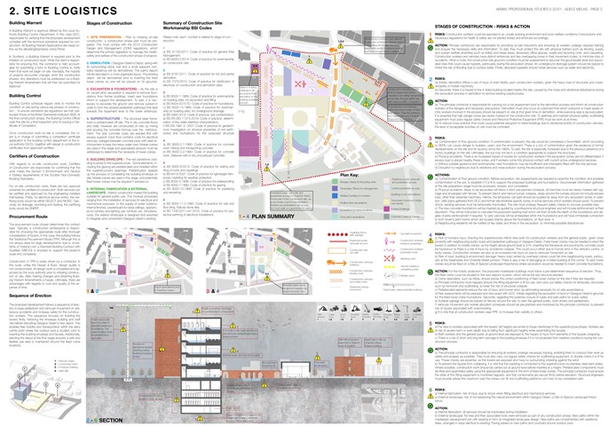
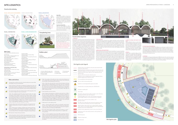
Site Logistics - Adele Melas
Professional Studies
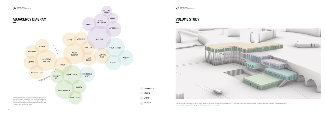
Adjacencies and Volume Study - Shivani Sarjan
Laurieston Education Hub
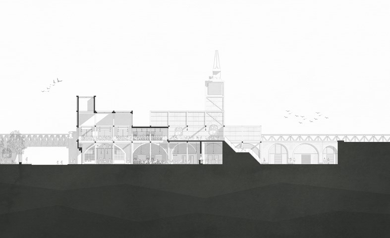
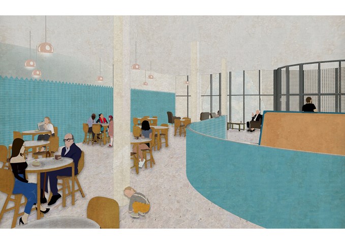
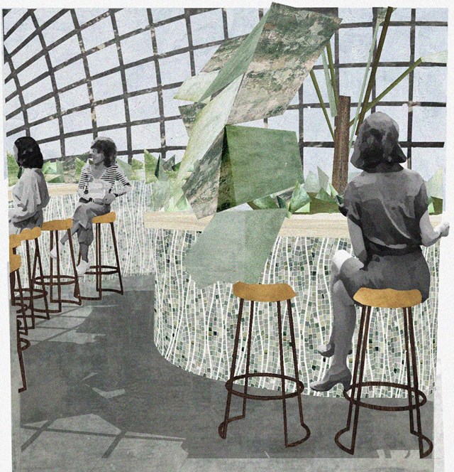
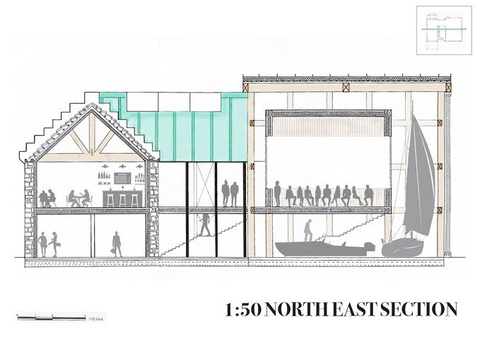
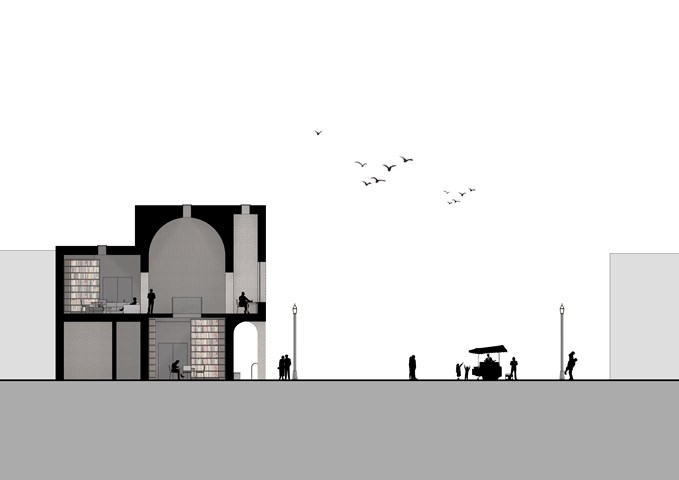
Section through cafe/bistro (ground floor) & rooftop bar (above) - Jakob Young
Undergraduate Thesis: Merchant Theatre
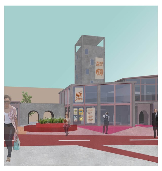
View of the tower from the courtyard - Asya Gumus
The tower is located at the heart of Haghill and the curtain wall facade offers the opportunity to empower, encourage and promote activities through signage on the windows. The central space can also be used to sit, meet, socialize and spend time in the day.
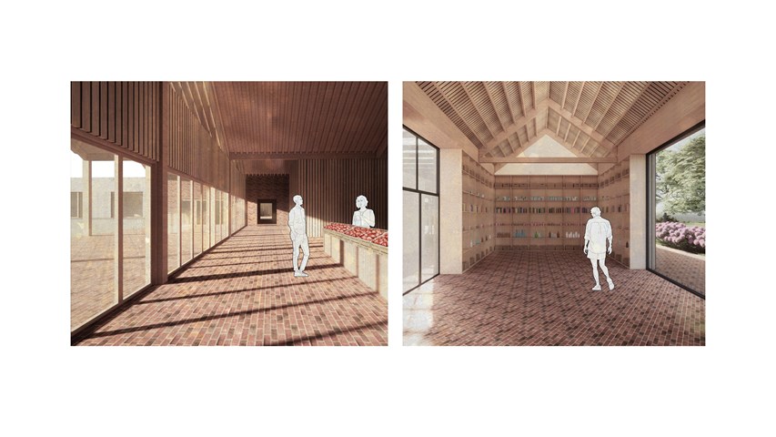
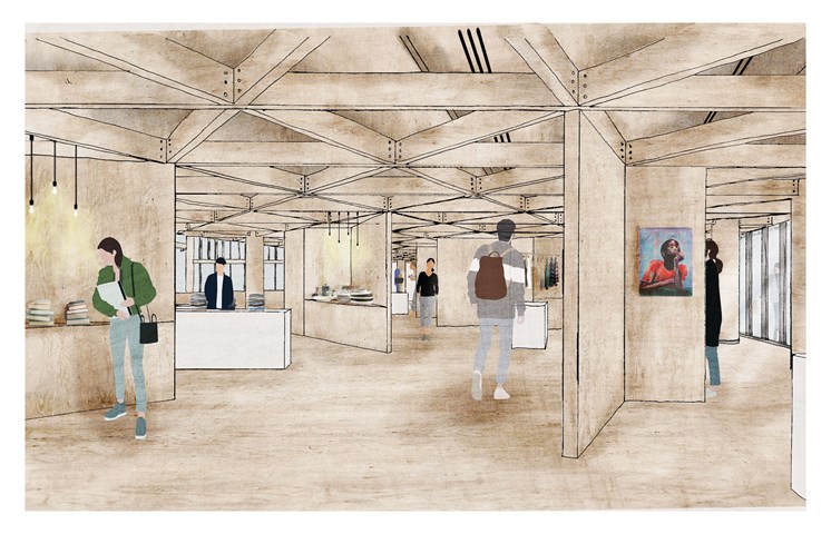
Left: View inside the market. Right: View inside the materials library - Carla Feraru
The market opens towards the square on the weekend and as such, the design here blurred the boundary between inside and outside. Brick is used here as a paving material. Across the site, the versatility of the material is celebrated and used to tie in together the different areas of the masterplan. Inside the materials library, objects rescued from the waste stream are displayed to be repurposed for upcycling in the crafts workshops on site.
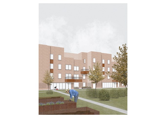
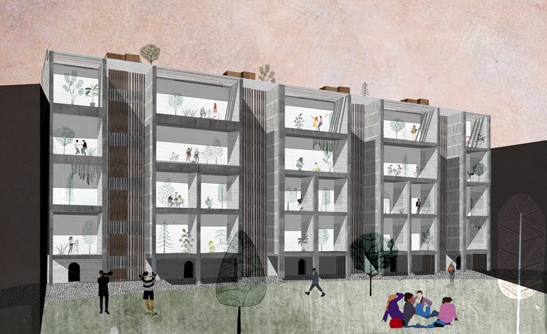
Shared Courtyard - Sadie Sanchez-Ruiz Malan
To Live/Work
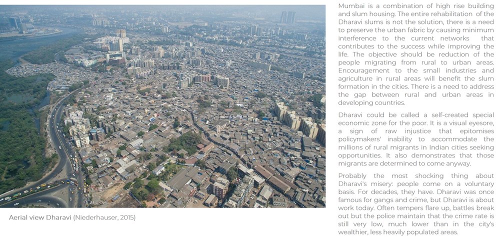
Sustainability - DHARAVI- POOR SLUM OR SUSTAINABLE INDUSTRY? Slum as growth engine in development of Mumbai - Mrunmayi Pandit
Cultural studies and electives
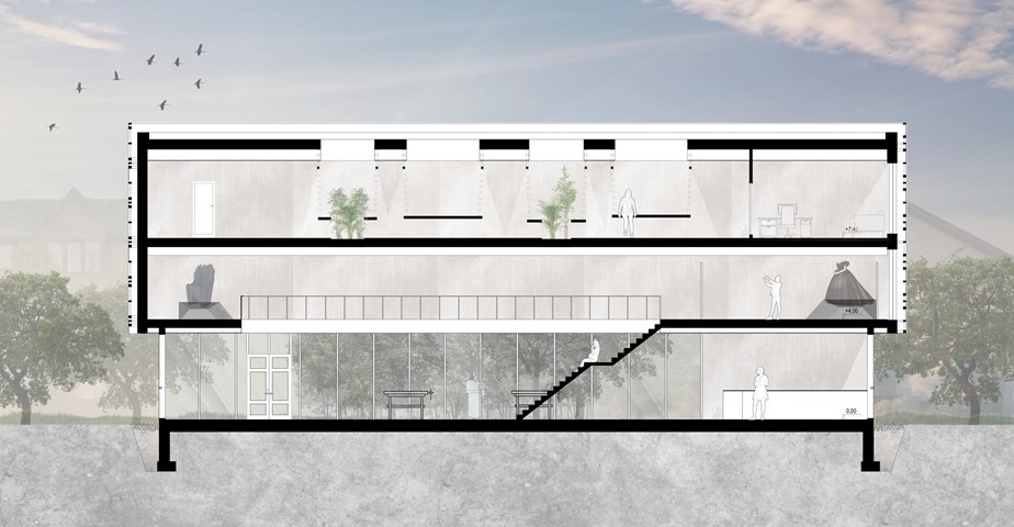
Section A-A - Angelika Hajdasz
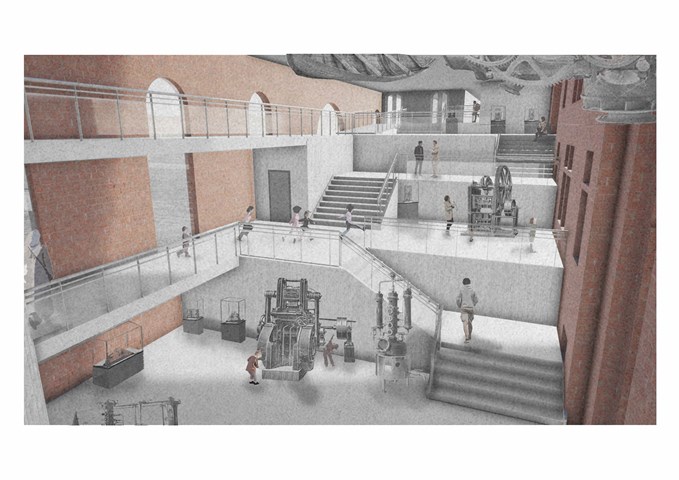
The stairs are one of the main gathering points in the centre. This is a place from which the majority of the centre is visible so it is a perfect place for socialisation while on the move from one workshop to another or to just sit back and enjoy the views.
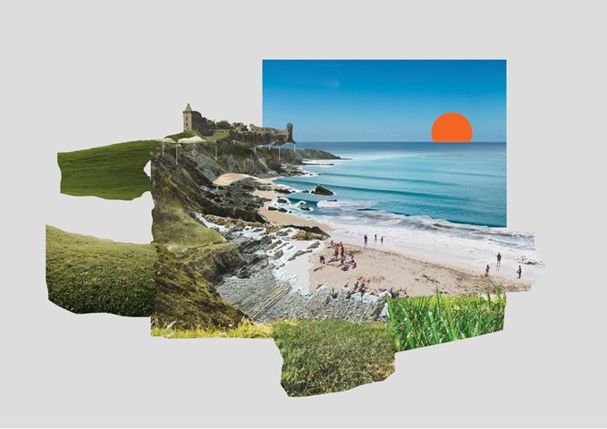
St. Andrews' Character Collage - Victoria Rozewska
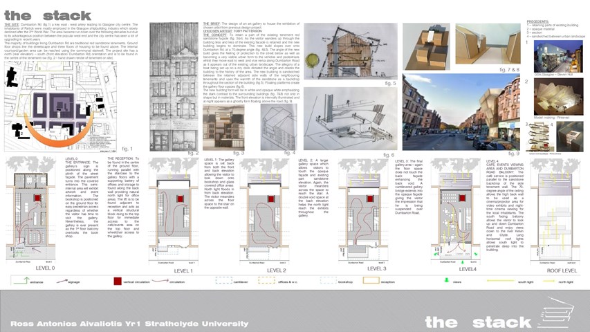
THE STACK - Ross A Aivaliotis
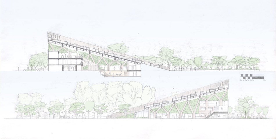
THE CONCEPT: To retain a part of the existing tenement red sandstone façade. As the visitor wanders up through the building less and less of the existing facade is retained and the new building begins to dominate. This new build slopes over onto Dumbarton Rd. at a 70-degree angle. The angle of the new build gives the feeling of protection to the street below as well as becoming a very visible urban form to the vehicles and pedestrians whilst they move east to west and vice versa along Dumbarton Road as it appears out of the existing urban landscape. The allegory of a boat being set up on a dry dock dictated the angle and relates the building to the history of the area. The new building is sandwiched between the retained adjacent side walls of the neighbouring tenements and uses the warmth of the sandstone as a backdrop throughout the section of the building. Floating platforms create the gallery floor spaces.
The new building form will be in white and opaque white emphasizing the stark contrast to the surrounding buildings not only in shape but in materials. The front elevation is internally illuminated and at night appears as a ghostly form floating above the road.
Artwork by Toby Patterson
Ross A Aivaliotis
Artwork by Toby Patterson
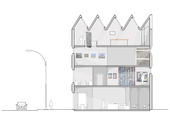
Section - Laura Kennedy
1:50 Section taken through gallery proposal showing art work.
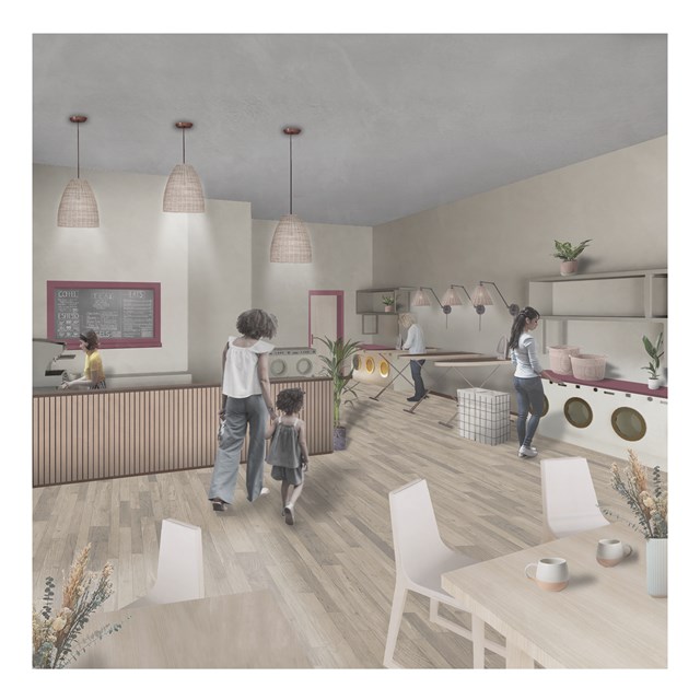
Laundrette Cafe - Rebecca Irving
A laundrette cafe in the centre for unpaid care & domestic work.
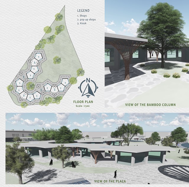
Plaza - Mrunmayi Pandit
A Plaza has been provided as a market space and community area. A Plaza mainly consists of shops and also small covered spaces are proposed for the pop-up shops and kiosks on the weekends. Plaza is designed in such a way that it has a visual and direct connection with the surrounding. It is accessible from all sides and creates ease of movement. The Plaza is one storey structure with metal sheet cladding and glass with bamboo columns for aesthetic purposes.
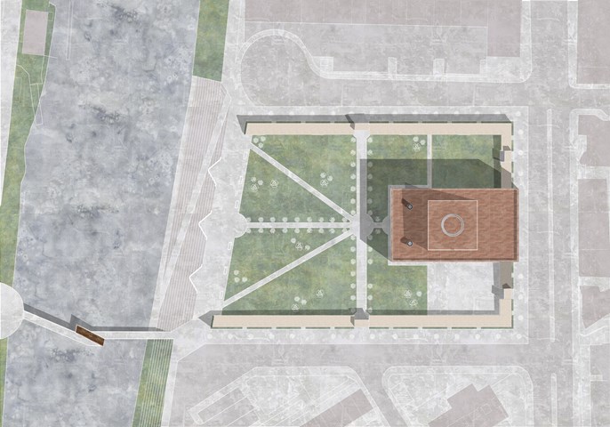
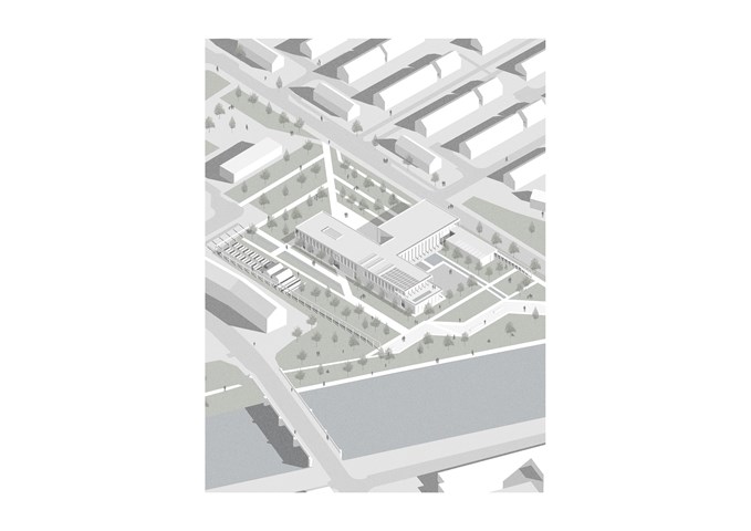
Site Plan of Part E of the Masterplan - Kate Melhuish
The Building aims to provide an immersive experience celebrating the Story of the Glasgow Washer Woman. This story if split into three parts.
Part 1 is the Glasgow washer woman: The collective act of washing and getting clean has been prevalent throughout Glasgow's history. Before the creation of the bathhouse, or Steamie, the women from a certain area would gather together and head down to the river to perform the ritual of cleaning. The washing of cloths became a social and community activity, a time for women to communicate and support one another.
Part 2 is the Goddess Clota: Depicted as a lone washer woman seated on the edge of the river or a ford the Goddess Clota was the Celtic deity of the Clyde. They worshiped the water and regarded the river as sources of fertility. The Clyde was known as the purifying as it carried large amounts of mud to sea when it flooded. an earlier name for it was Clwyd meaning heard from a distance. These qualities of the river were reflected in the Goddess she was known to be pure and hold the divine ear.
Part 3 Is the Bean Nighe who is depicted as a lone washer woman. She is a female spirit or banshee, a messenger from the other-world. She can be seen washing blood from cloths at the ford of a river, it is believed that these are the cloths of those about to die. If approached with caution, a person may be able to get between her and the river they are entitled to the granting of three wishes or the telling of three truths. This varies within different versions of the legend.
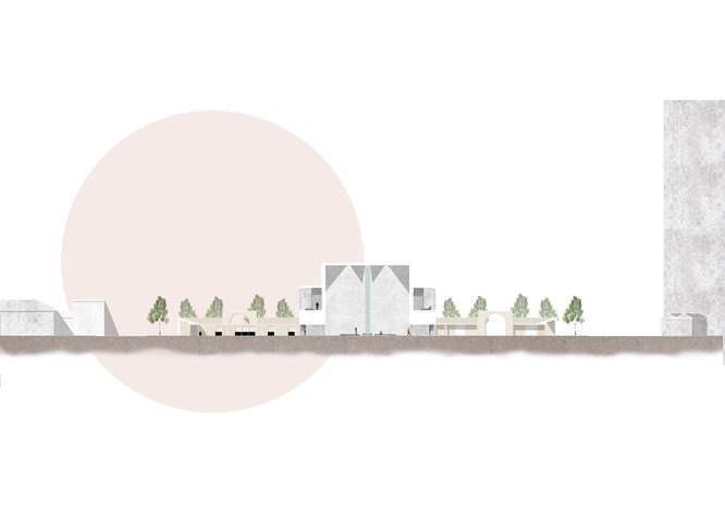
Section through the Main Building Showing Some Immersive Rooms - Kate Melhuish
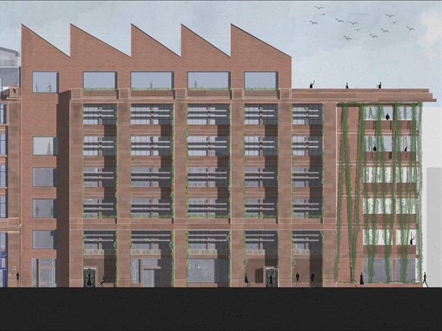
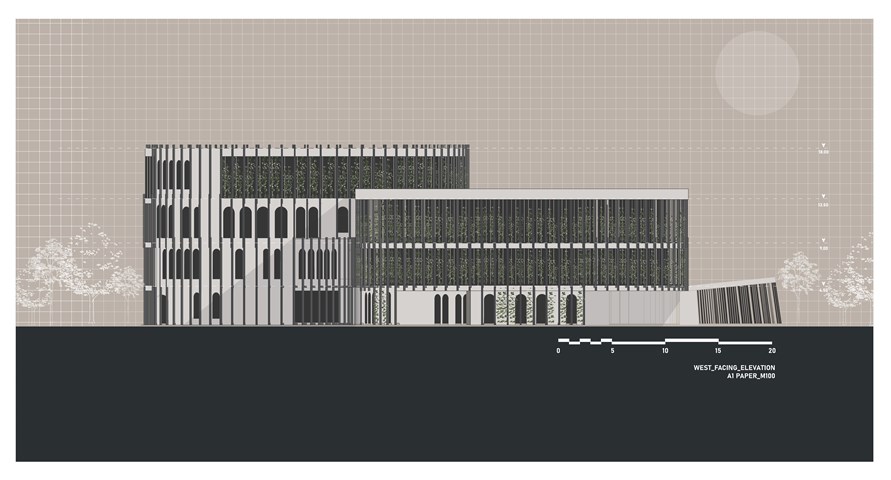
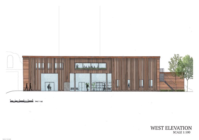
West Elevation - Jakob Young
Housing Project: The Living Machine
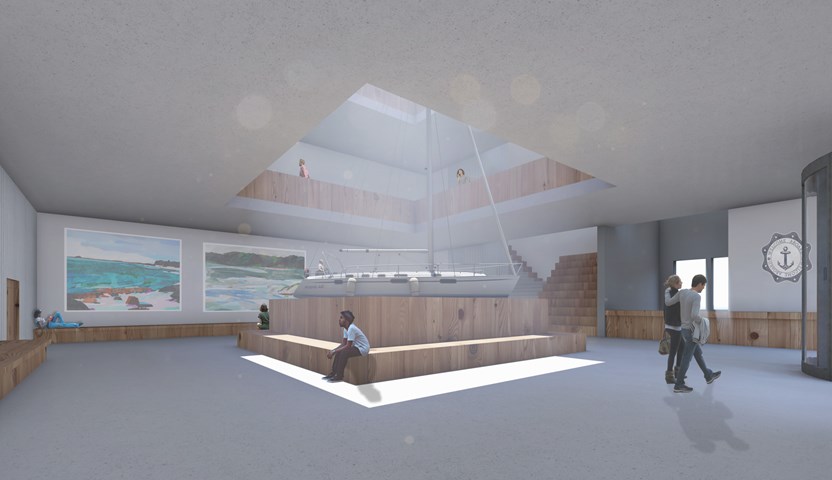
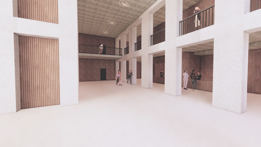
Interior of the Education Hub's Atrium and Reception - Ellie Carroll
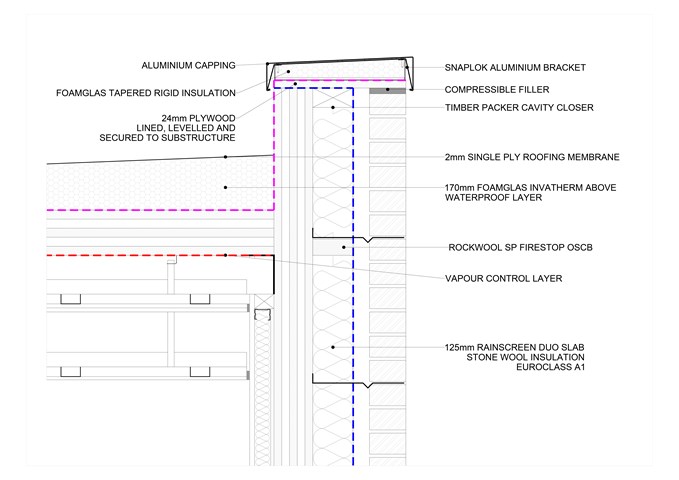
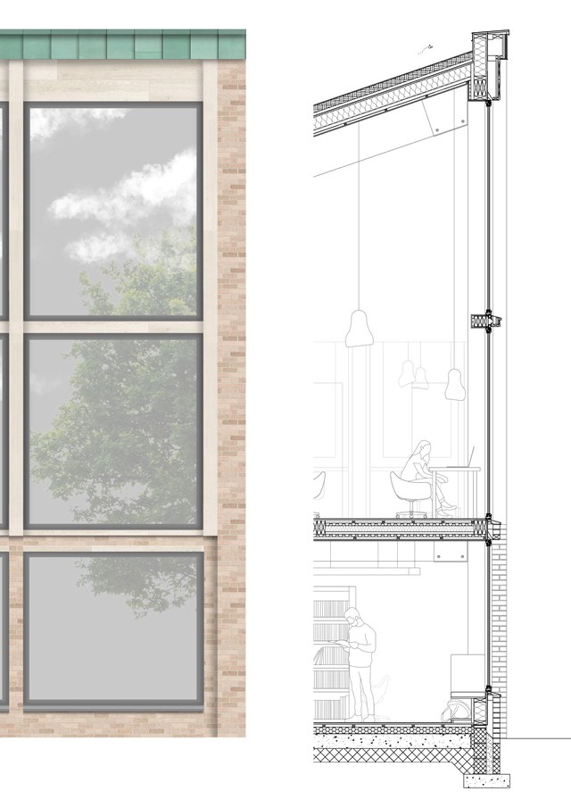
Vertical section, Roof at 1:5 - Giulia Panedigrano
Technology Studies
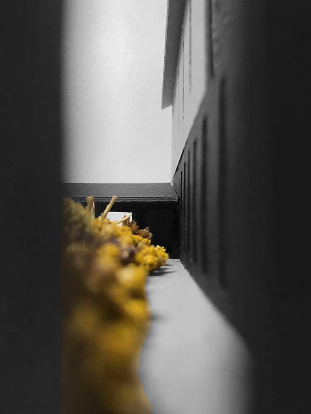
Long View Through Wild Flower Garden to Entrance - Eilidh McGuigan
By only providing views towards the green space in the middle of the building, the user develops a strong connection physically and mentally to the outdoor world. Not only does the direct connection to the green space physically transport the user away from the busy city surroundings, but mentally it is proven to enhance students learning, reduce stress and improve general wellbeing too.
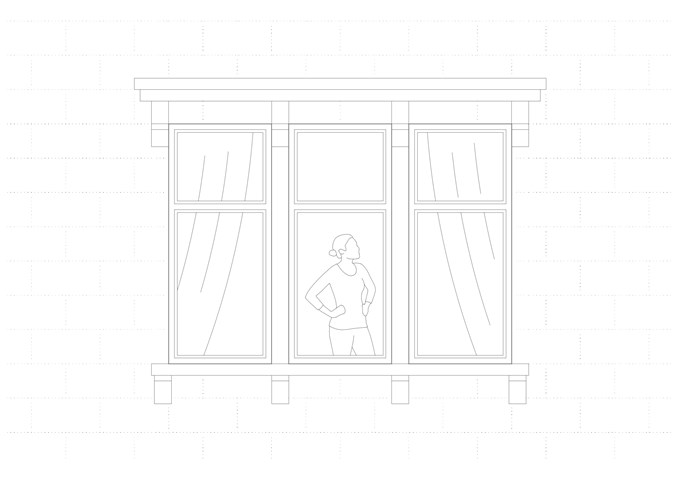
Glasgow Tenement Window - Laura Kennedy
1:10 Detailed drawing of a tenement window using CAD. Emphasising the importance of line weights and hierarchy of line through a digital output rather than a physical hand drawing.
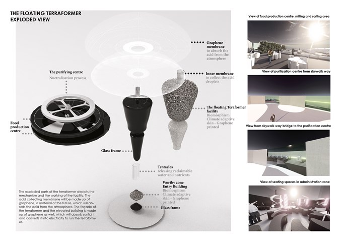
The Exploded Diagram of the Floating Terraformer - Sania Halim
The exploded parts of the terraformer depict the mechanism and the working of the facility. The acid collecting membrane will be made up of graphene, a material of the future, which will absorb the acid from the atmosphere. The façade of the terraformer and the elevated building is made up of graphene as well, which will absorb sunlight and converts it into electricity to run the terraformer.
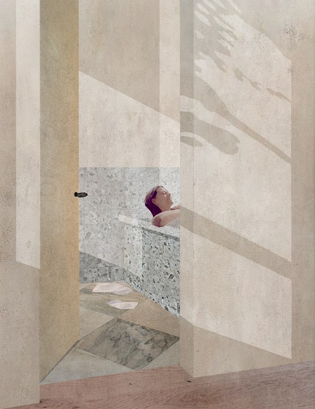
The Bathroom as a space for both Body and Mind - Zachariasz Czerwinski
Design Studio 3A
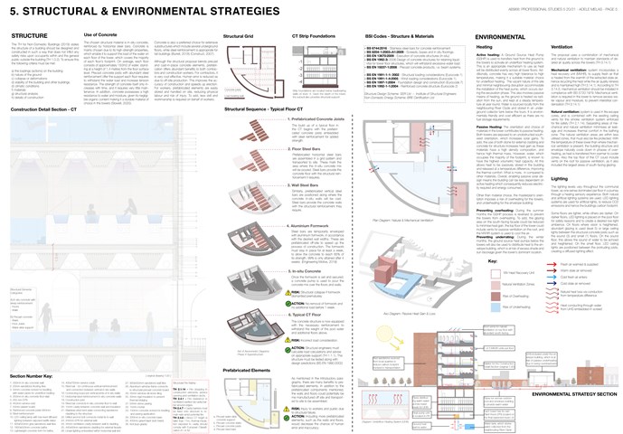
Structural & Environmental Strategies - Adele Melas
Professional Studies
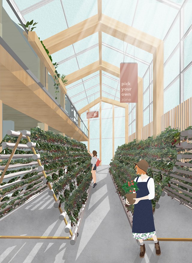
The U-Pick Greenhouse - Fiona Wylie
Off of the public market space, there is a dedicated greenhouse where people can pick their own berries, right off of the plants. This promotes a level of transparency within indoor growing, and allows the community to get hands-on knowledge about where their food comes from.
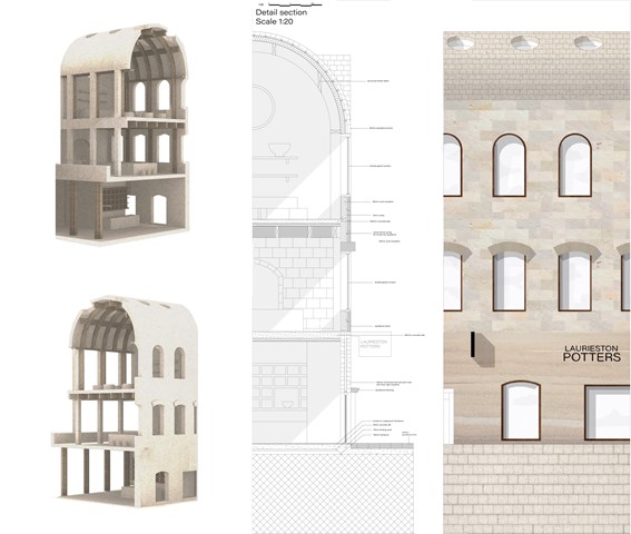
Technical detail - Fatema Hassan
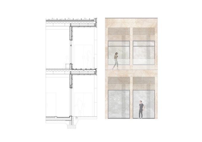
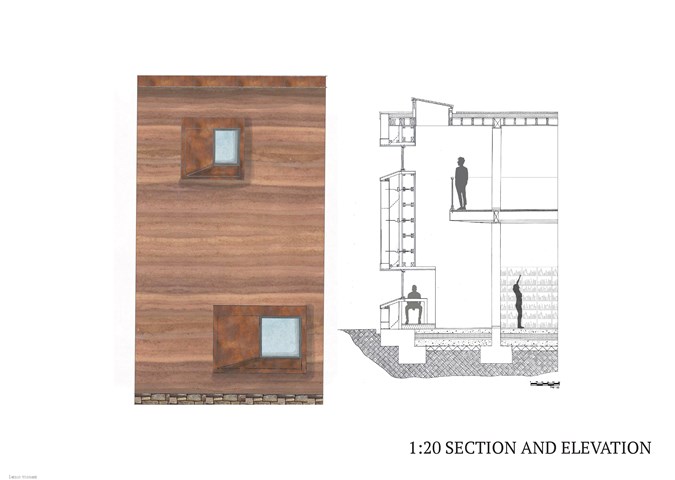
In comparison, a rendered model interprets the differences between the interior and exterior elevations of the selected region to cut through. The technical section highlights the material relations of the facade with the interior activities.
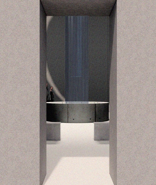
Internal Visual Showing Atmosphere - Kate Melhuish
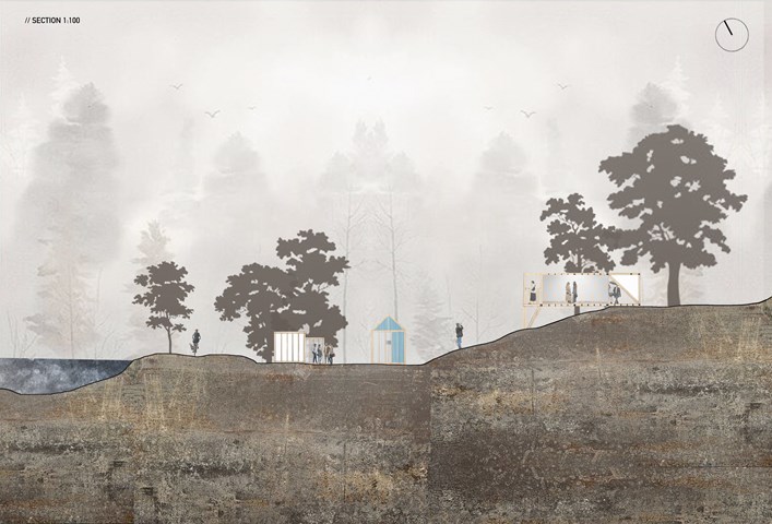
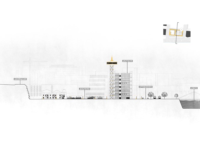
"To See" - Site Section 1:100 - Zuzanna Woznicka
Site Section 1:100, representing the layout of the pavilions within the site. The site I have chosen has uneven terrain, which was quite challenging from a technical point of view. The site had a river view and multiple points of access which were the main reasons for me to choose this location. What I really like about this picture is the misty atmosphere, in the future, I would like to achieve this effect more often.

Masterplan - Angelika Hajdasz
To reach more people, the project provides a network of She Sheds in various parts of the city. Smaller sheds are focused either on woodworking or sewing depending on the community’s choice. The locations were chosen by analysing the need for mental health support in the communities and the proximity of the location to Men's Sheds, libraries and Mental Health Centres.
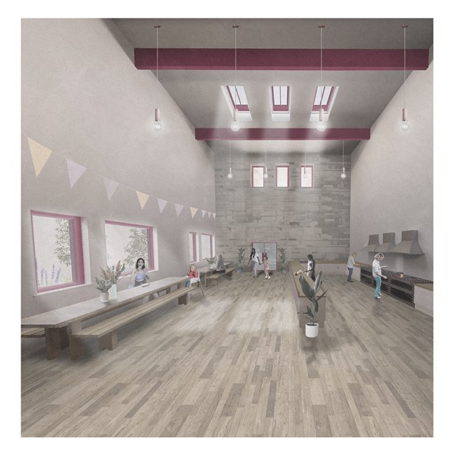
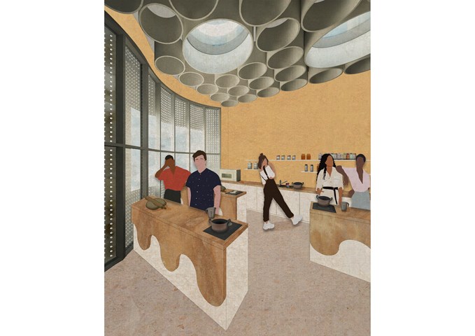
South Satellite Shared Kitchen - Rebecca Irving
The communal kitchen provides a shared productive domestic space. It should allow users to take control of the space and form social connections.

The Emotion Spaces - Kate Melhuish
This image depicts visuals of the emotion space. Each space looks to link with a part of a story.
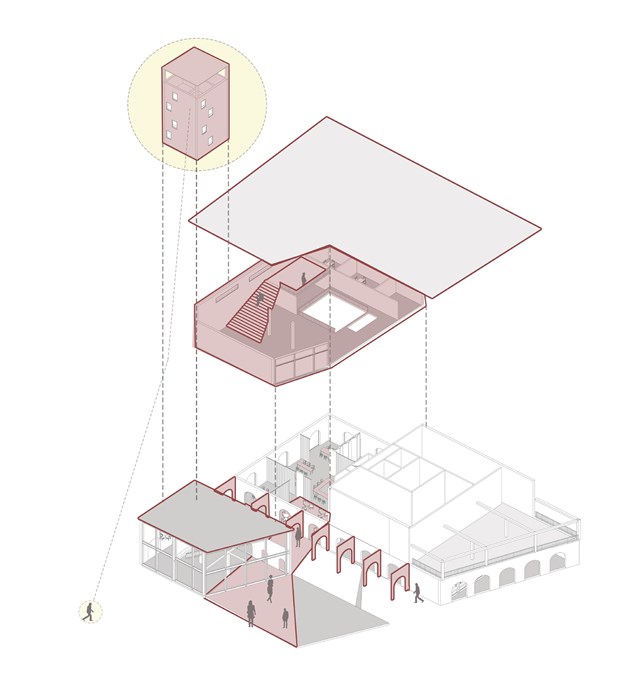
Model of the carers hub - Asya Gumus
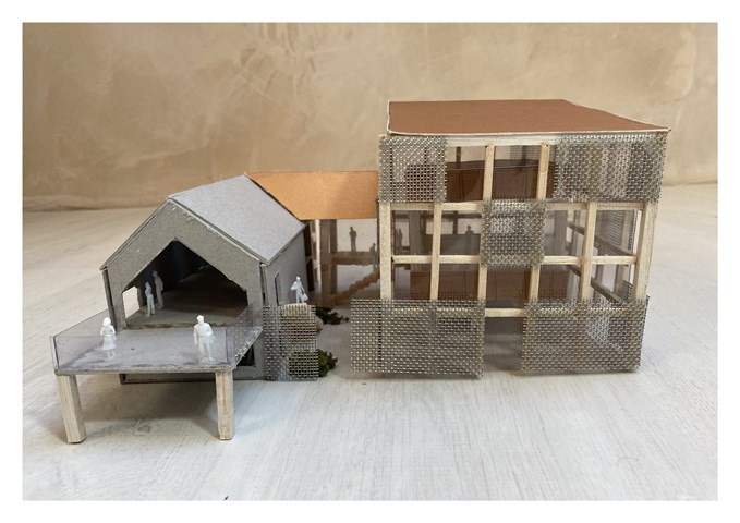
This building is split in to the three. The ground floor invites the locals to join in coworker activities/ workshops and start up businesses, the middle floor proposes an activity space for both elderly residents with dementia and carers and the tower proposes private studio spaces that view the neighbourhood.
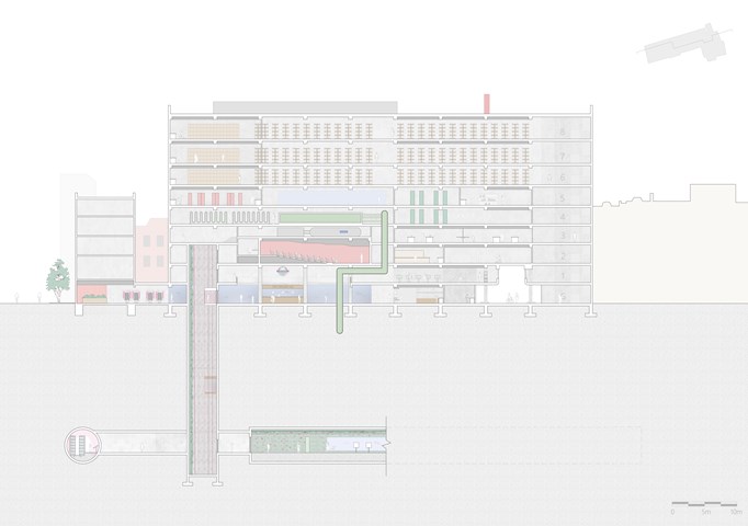
Longitudinal Section through The Lifeline HQ - Shravan George
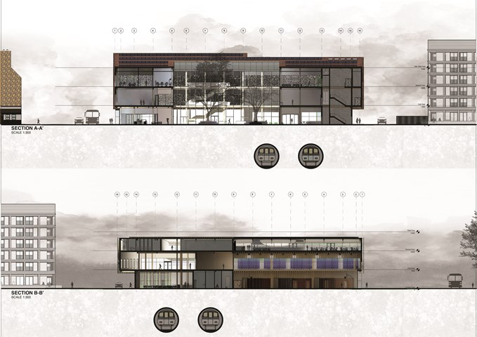
This section illustrates the connections between The Lifeline HQ and the abandoned tube tunnels below. The tunnels accommodate a public exhibition space (tunnel) and a fine-dining restaurant. The tunnels are accessed via capsule lifts that take users through a vertical exhibition (lift shaft).
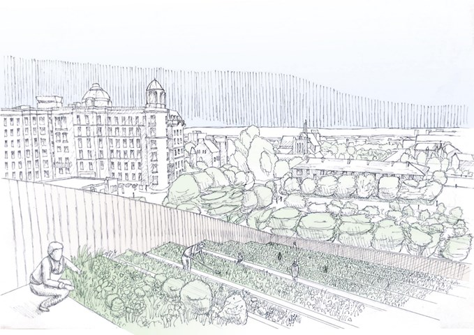
Rooftop Farming View - Finlay Ulrichsen
The terraced farm plots stepping back northwards allows ample south light to reach each plot on top of a natural drainage and water distribution,
with water moving from one plot down to the next following the pitched roof form. However it does more than that, it allows users to see
the food produce from growth to consumption, getting that sought after direct connection with their food production. Its gives them an elevated
view of the landscape and the community the design brings together similar to one you would gain from standing on top of the Necropolis.
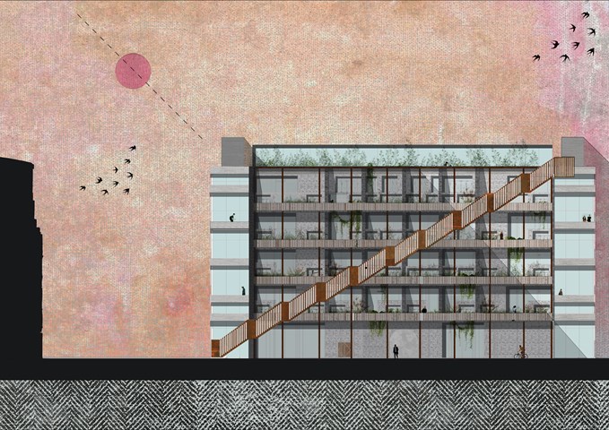
West Elevation 1:100 - Conor Ryan McCormack
Allotment Living _3A To Play
Allotment Living_3A To Live.
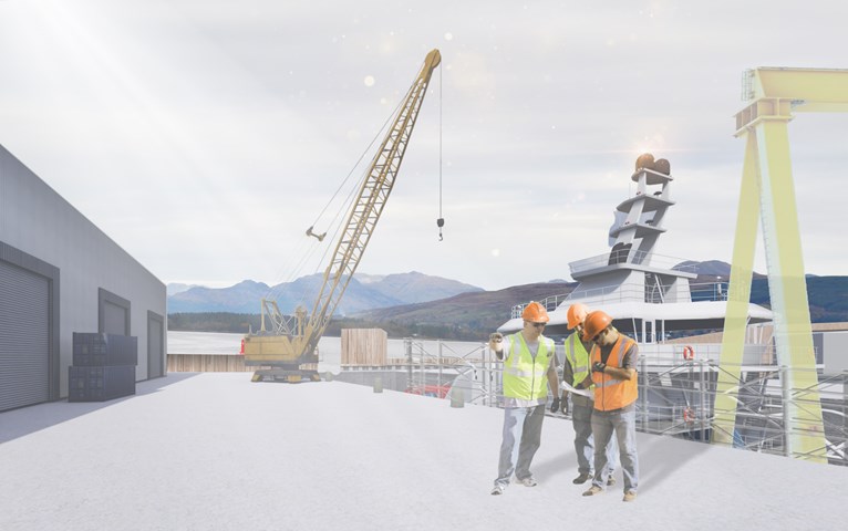
View of the Small Dock, towards the River Clyde - Ellie Carroll
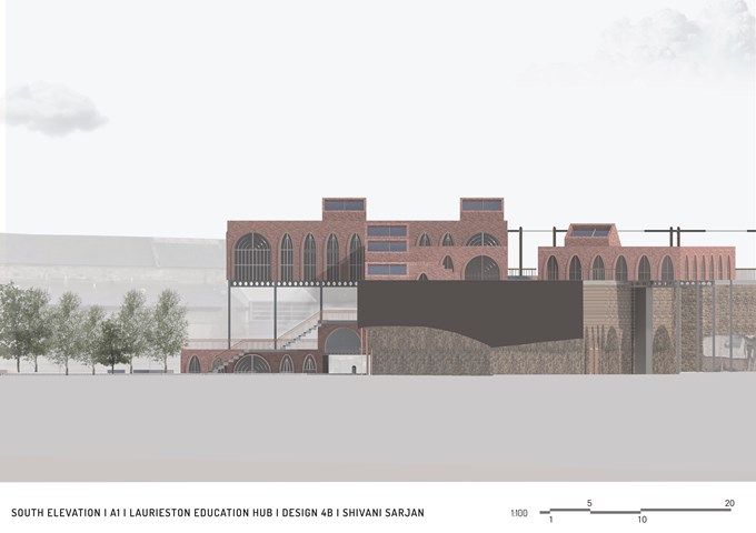
South Elevation - Shivani Sarjan
Laurieston Education Hub
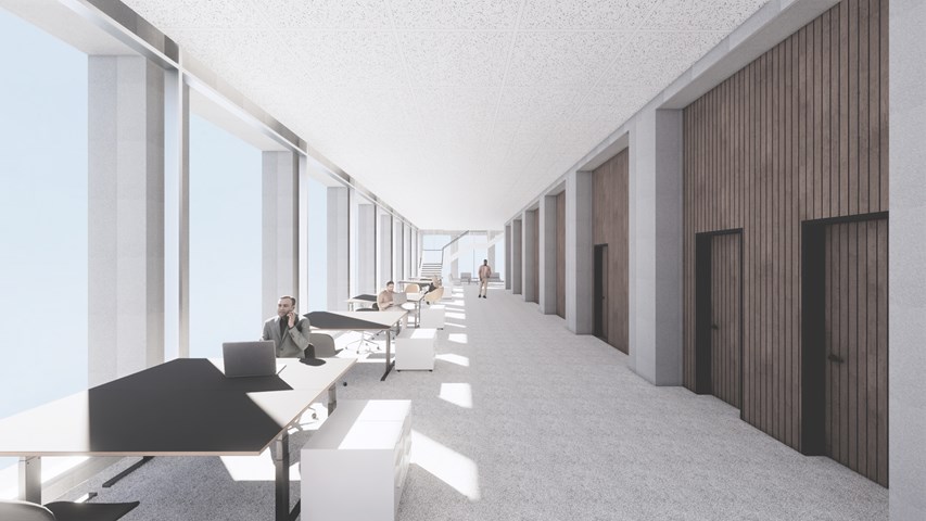
View along the inside of the tower - Andrew Devine
This image highlights the expressed structural stone elements on both the inside and outside.
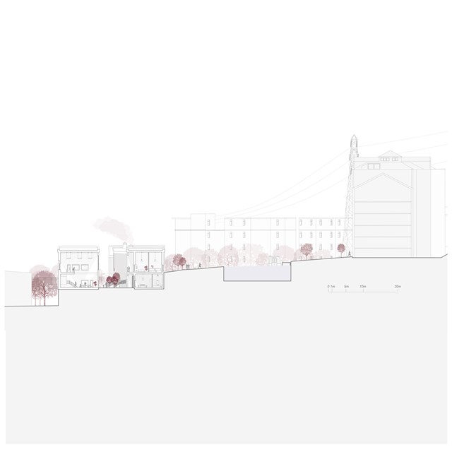
Social Services and Housing Section - Rebecca Irving
The housing blocks and community services are located in the heart of the site. The requirements for the community services are based on discussions with a diverse group of women, who suggested we need ‘in-between’ spaces for people to access help and support, without direct intervention.
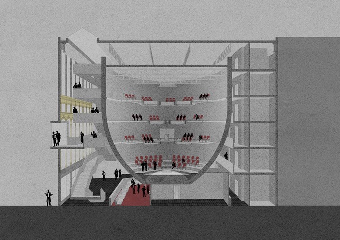
Cinema Perspective Section - Anthony Mazeli
Section cutting through ovoid shaped cinema drum to expose balcony seating arrangement for groups of six and three. The floating design intends to draw customers while protecting from virus spread and serving entertainment, with accommodation for scratch coated Perspex screens attached to balconies. Building programme is split into; circulation visible through transparent windows at the front of house; Cinema; and services at the back of house.
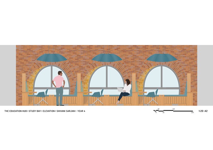
Interior Elevation of 3 Study Bays - Shivani Sarjan
Laurieston Education Hub
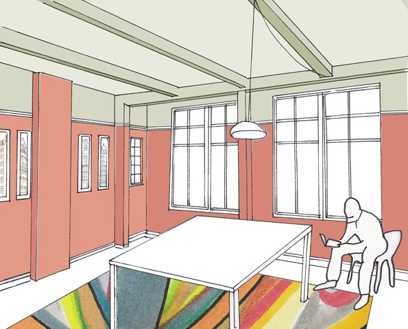
This interior elevation shows 3 Study Bays ranging along a mezzanine. It shows the relationship between these spaces as well as the larger building. The large windows frame the space while the desk forms and interlocking partition to divide but not entirely seperate the spaces. The bay accomodates several ways to work, including a formal desk, a bookshelf and a bench.
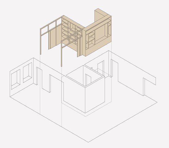
Transforming spaces through timber inserts - Zachariasz Czerwinski
Design Studio 3A
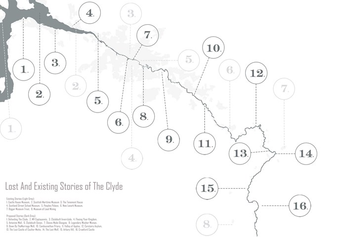
Map of the Clyde Highlighting Existing Celebrations of History and Opportunities for New Ones - Kate Melhuish
The Clyde is the main river that flows in the west of Scotland. It is a major feature in the natural landscape. Not only is it a prominent feature in the natural landscape but it is also key element in the development of places, memories and stories. This map highlights some of the told and untold stories that run along the riverside. Within this project I explored various stories and created an architectural time capsule of one, which can be used as an example of how to produce this corridor of memories, celebrating lost stories.
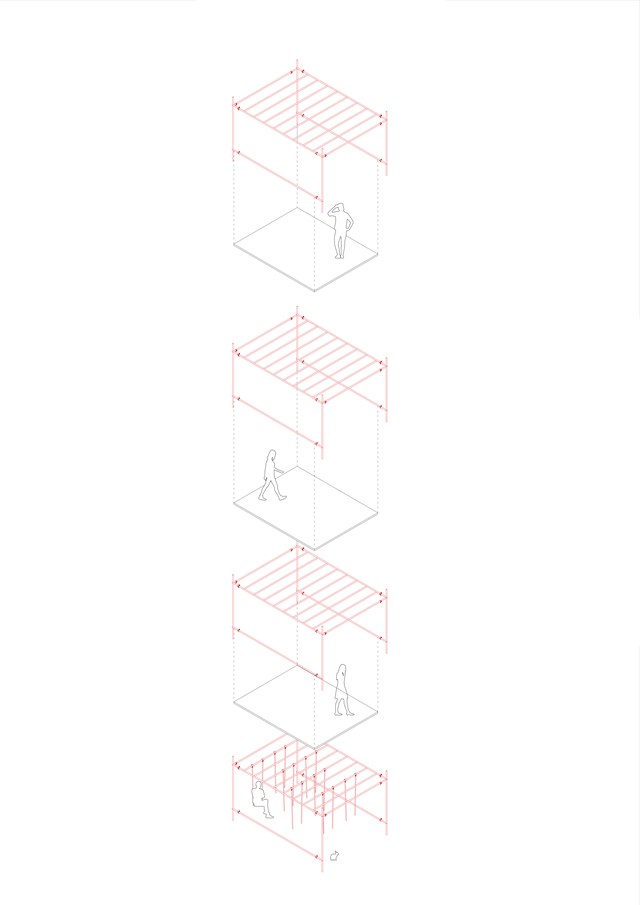
Exploded Axonometric Detail 1:50 - Conor Ryan McCormack
Down The Rabbit Hole_3B To Play
Down the Rabbit Hole_3B To Play.
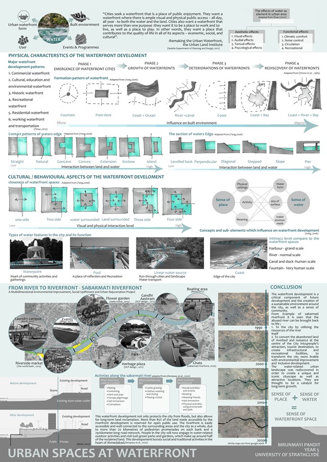
Urban spaces at waterfront - Mrunmayi Pandit
Cultural studies and electives
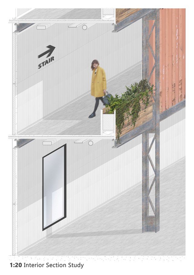
1:20 Interior Section Study - Andrew Devine
Study showing the construction of the gantries around the atrium
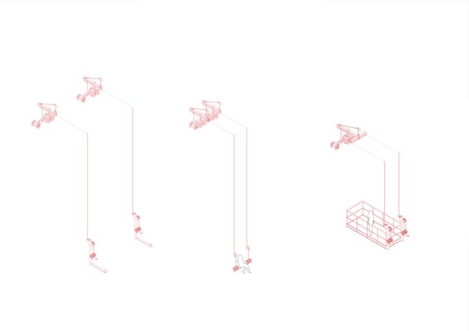
Exploded Axonometric Detail 1:50 - Conor Ryan McCormack
Down The Rabbit Hole_3B To Play
Down the Rabbit Hole_3B To Play.
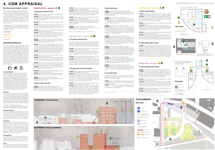
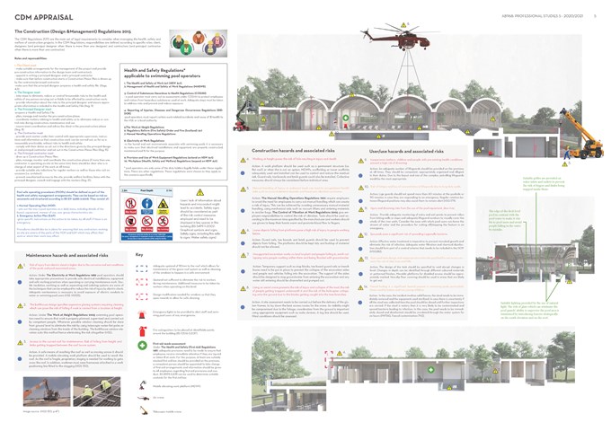
CDM Appraisal - Adele Melas
Professional Studies
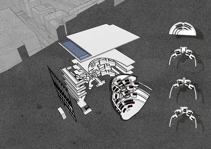
Axonometric - Anthony Mazeli
Exploded view and seating arrangement separating building into its smaller features. The building is made up of (from Left to Right): balcony façade intervention, existing faced plus extension, circulation stairs, floating bridges + service area, skylight, and cinema.
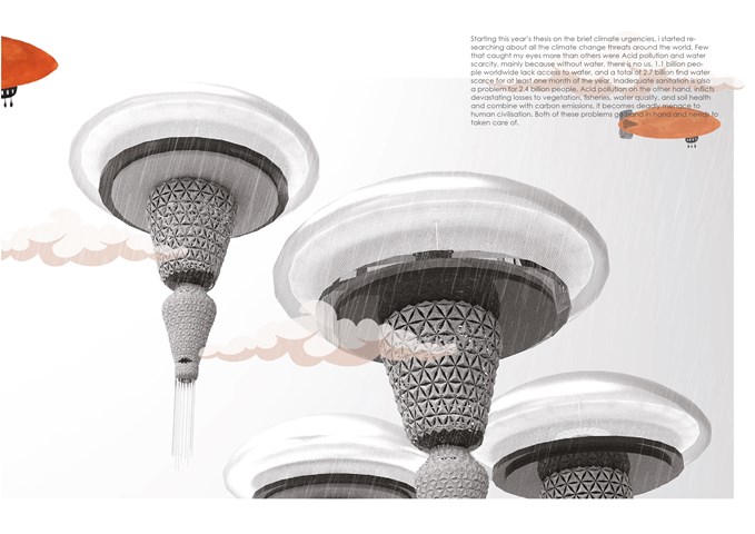
How the journey started - Sania Halim
Starting this year’s thesis on the brief climate urgencies, I started researching about all the climate change threats around the world, Few that caught my eyes more than others were Acid pollution and water scarcity, mainly because without water, there is no us, 1.1 billion people worldwide lack access to water, and a total of 2.7 billion find water scarce for at least one month of the year. Inadequate sanitation is also a problem for 2.4 billion people. Acid pollution, on the other hand, inflicts devastating losses to vegetation, fisheries, water quality, and soil health, and combine with carbon emissions, it becomes a deadly menace to human civilization. Both of these problems go hand in hand and need to be taken care of.
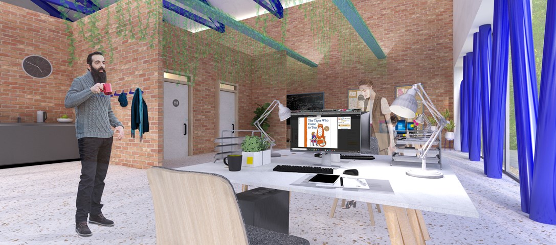
Andrew McCluskie
Distribution Admin Space
The Existing Building has been adapted to host the the Book Distribution related programme elements, thereby using the existing structure on site to portray the existing functions of the two organisations. The existing building has fell victim to a few unsympathetic extensions, which will be removed and brick partitions in the distribution building are formed from reclaimed brick kept aside during demolition. The glazed façade and additional dark blue steelwork provide a visual link both to the new façade elements and the rest of the scheme. Biophilic Design has been linked psychologically to stress relief, so the admin office includes plants within and a view to the living retaining wall and the new Reading Green it neighbours. This contributes to a relaxed atmosphere within the spacious office.
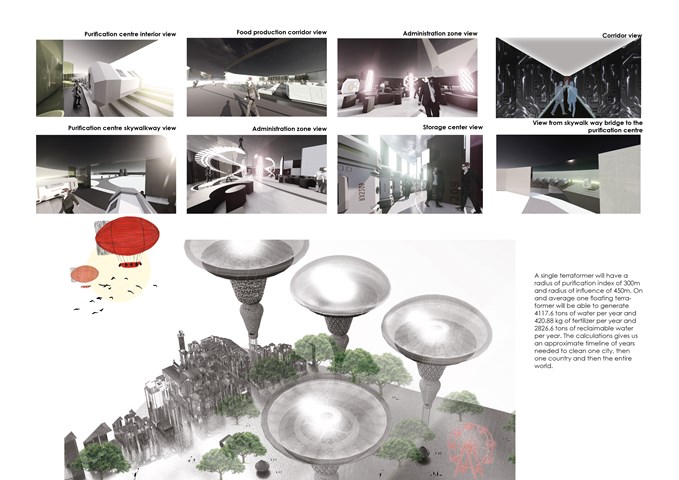
The Interior View of the Facility - Sania Halim
A single terraformer will have a radius of purification index of 300m and a radius of influence of 450m. On an average one floating terraformer will be able to generate 4117.6 tons of water per year and 420.88 kg of fertilizer per year and 2826.6 tons of reclaimable water per year. The calculations give us an approximate timeline of years needed to clean one city, then one country and then the entire world.
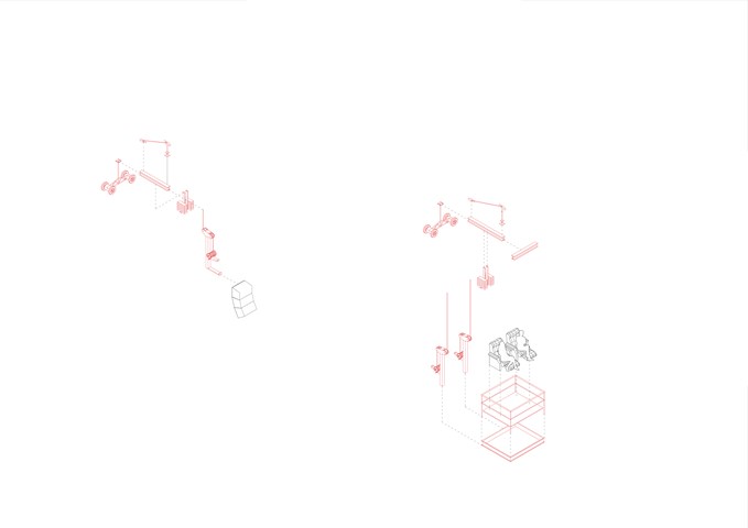
Exploded Axonometric Detail 1:50 - Conor Ryan McCormack
Down The Rabbit Hole_3B To Play
Down the Rabbit Hole_3B To Play.
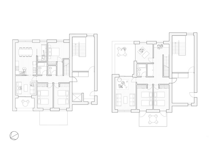
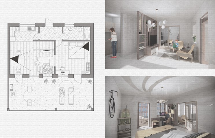
5-Bedroom Maisonette Flat Plans - Sadie Sanchez-Ruiz Malan
To Live/Work
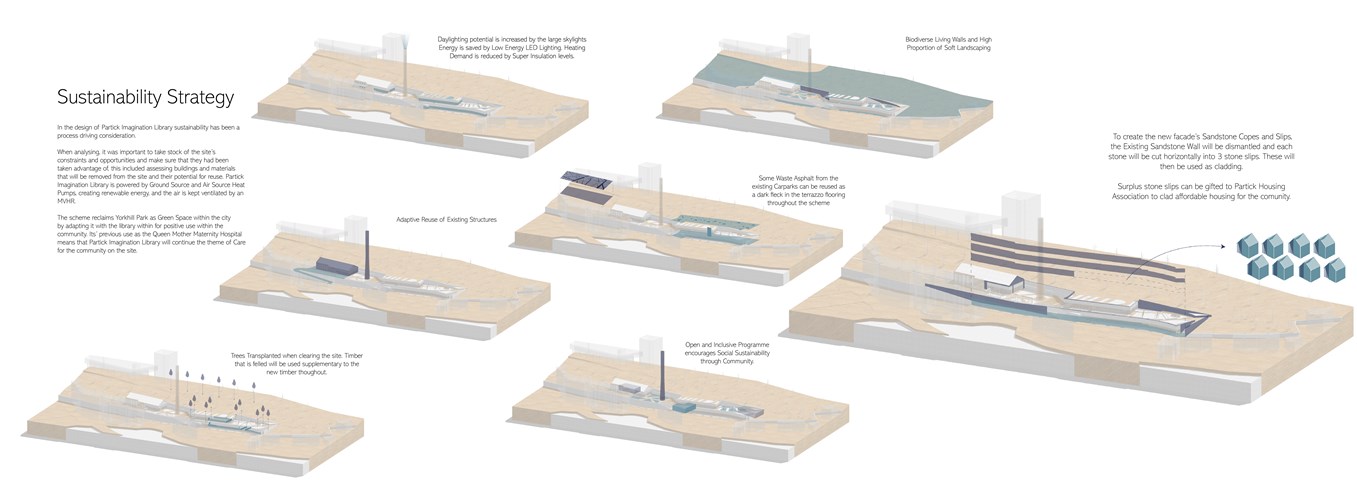
Andrew McCluskie
Sutainability Diagrams
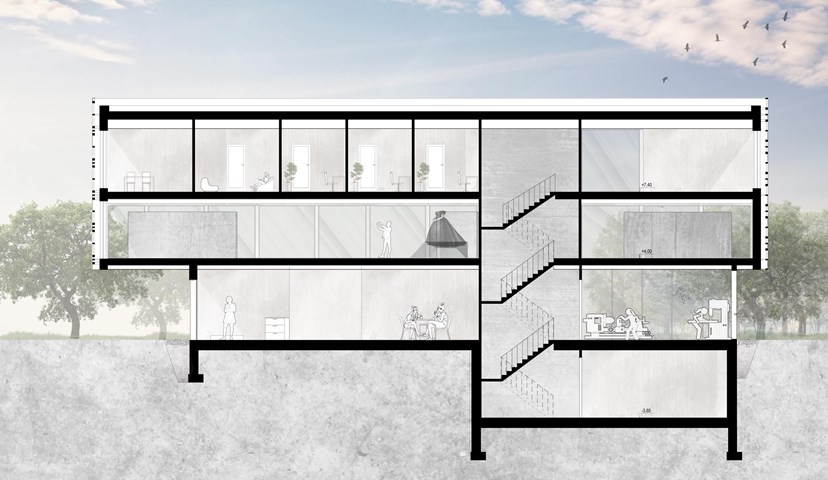
Section B-B - Angelika Hajdasz
The centre provides multiple opportunities to expand someone’s interest and share talents. The activities offered to women are woodworking, which helps to boost productivity and sense of achievement, which boosts self-esteem as a side effect. Another important space in the building is the sewing workshop, a place where women can express their creativity through fashion and clothes.
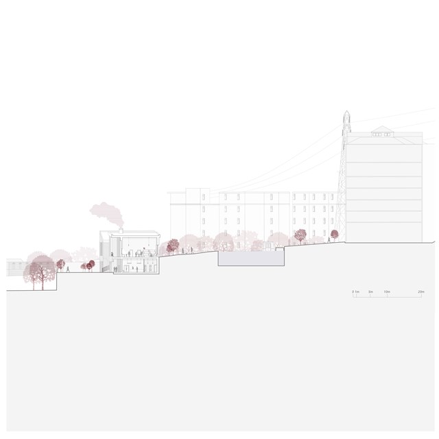
Centre for Unpaid Care Work Section - Rebecca Irving
The centre for unpaid care and domestic work challenges existing approaches to unpaid care and domestic work by providing a shared space for the work to become visible and portrayed as a productive activity within the community.

Proposed care model - Asya Gumus
This diagram shows the proposed care model establishing the location and different scales of the interventions.
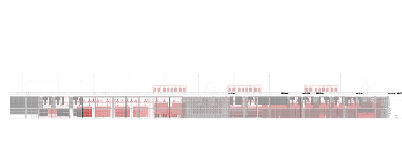
West Elevation 1:100 - Conor Ryan McCormack
Down The Rabbit Hole_3B To Play
Down the Rabbit Hole_3B To Play.
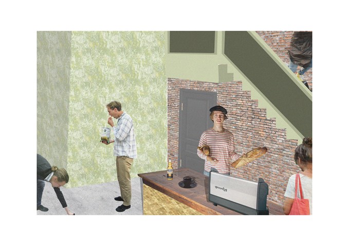
"To Engage" - Collage - Zuzanna Woznicka
Collage showing part of the cafe. At this stage of the project I started to face significant problem with my computer, and doing even simply collage was quite challenging. I really want to try to work with 3d software and see how my work can progress.
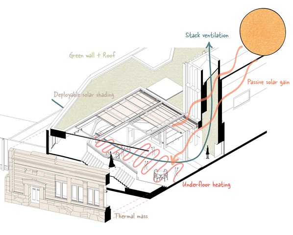
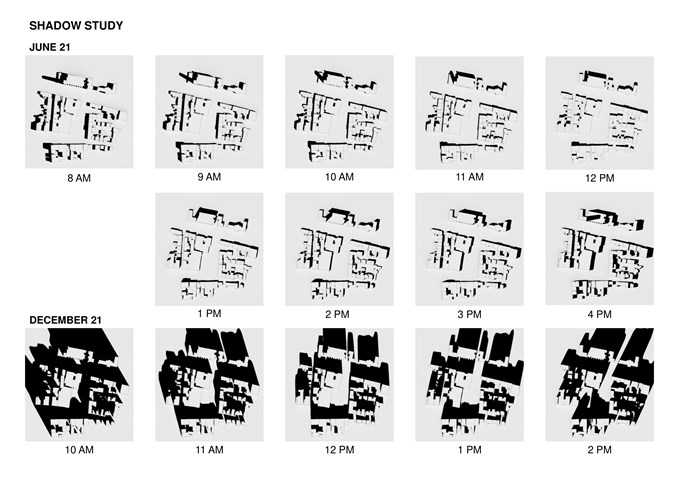
Environmental diagram - Alfie Hollington
Design Studies 3b
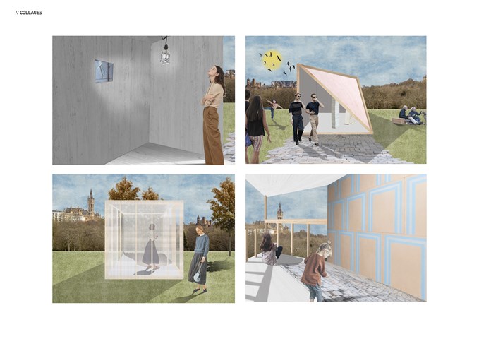
"To See" - Series of collages - Zuzanna Woznicka
Semester one project "To See".
Series of collages capturing the internal or external character of the temporary pavilions. Collages were made in Photoshop over the hand-drawn sketches.
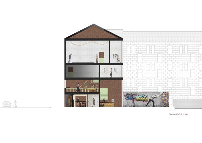
"To Engage" - Section C-C 1:100 - Zuzanna Woznicka
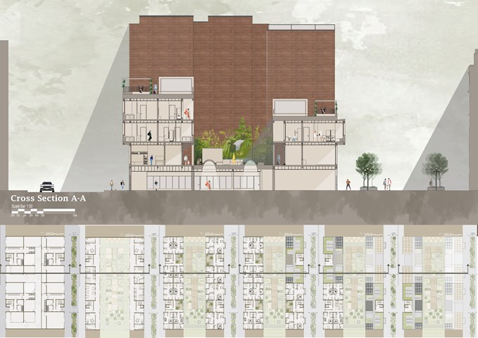
In this section, we can see the difference between the height of the floors and how the light accesses those spaces. In the backyard is located a public graffiti wall, that can be used by anyone who would like to express himself. To introduce the gallery to another social group I proposed a mini ramp at the back. The brick in the back is the recycled wall of the preexisting building, and that was my starting point for this project. I wanted to leave one wall that would be a reminder of the past.
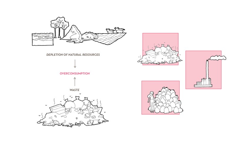
Research background - Carla Feraru
With accelerated consumption rates and unsustainable disposal practices, natural resource reservoirs are predicted to be depleted by the end of the century whilst our residual waste production is set to double. This thesis presents the opportunity for a new industry for the 21st century: ‘waste mining’, where waste streams both past (trapped in landfills) and future are mined and reintroduced back as resources in a circular economy model.
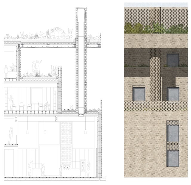
Technical Section and Elevation - Rachel McLure
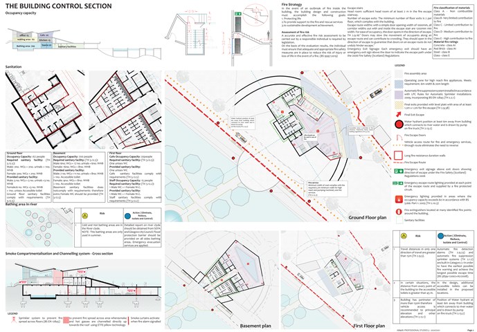
The building control section - Mrunmayi Pandit
Professional studies
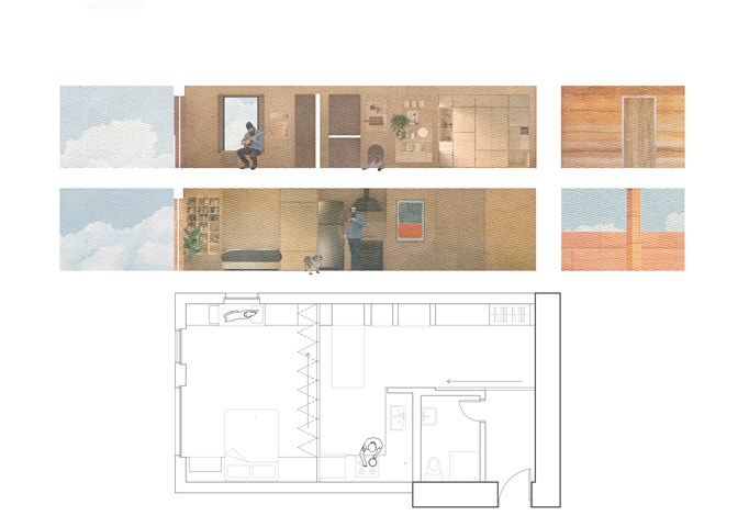
Flat plan and section - Alfie Hollington
Design Studies 3a
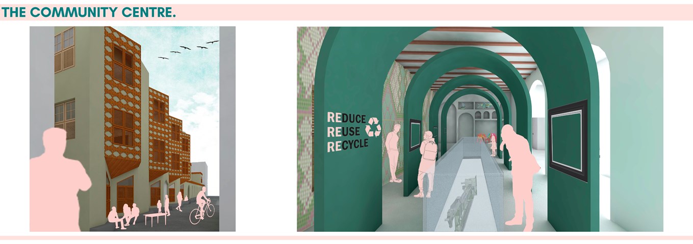
Alamin Mandhry
The exterior of the community centre features a modern interpretation of the protruding screened timber balconies and baraza (stone bench). The traditional straight baraza is transformed into a triangular one to create a space that allows for better interactions. To enhance the transparency of the recycling process, the display area has a void cased by a glass structure that allows visitors to see directly into the recycling plant below. Goods produced within the scheme are displayed in modern Swahili zidaka (wall niches) while artwork and information on recycling are displayed on large green structures made from recycled plastic meant to create this feeling of one being in a life-sized zidaka. The walls of the display area are adorned with plastic-bottle tops that create a mosaic; an example of how recycled materials can be used in construction.
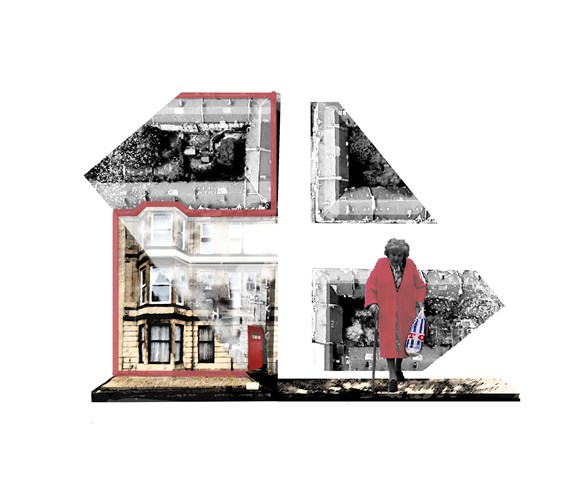
The Cross Concept - Adele Melas
Crosses are conceptually chosen as the ideal settings to accommodate the Dementia Friendly Neighbourhood. Being vibrant in character and centralised in location, they offers individuals with dementia the opportunity to continue life as normal, participate actively and integrate with society. Often stemming into high streets, they increase accessibility and safety between homes and primary services, which heightens independence and confidence. Vitaly, they facilitate the creation of a ‘walkable zone of experience’ for individuals with dementia (Blackman, 2006).
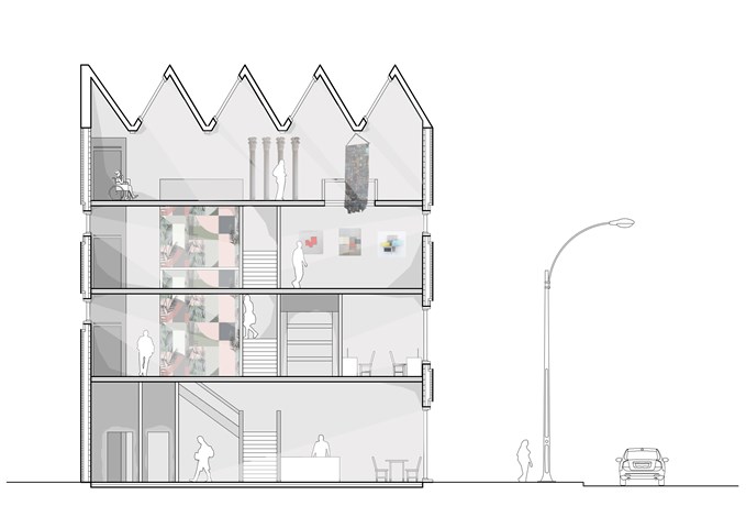
Section - Laura Kennedy
1:50 Section taken through gallery proposal showing vertical circulation and art work .

Timeline of Designing for the Enemy - Ami Coulter
The notion of Designing for the Enemy was explored in the first semester of 5th year Design Studies. Thorough exploration into the evolution of the city exposed the reactionary nature of city design; design as an action against the enemy opposed for the citizens.
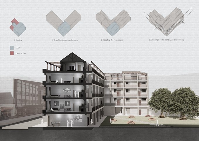
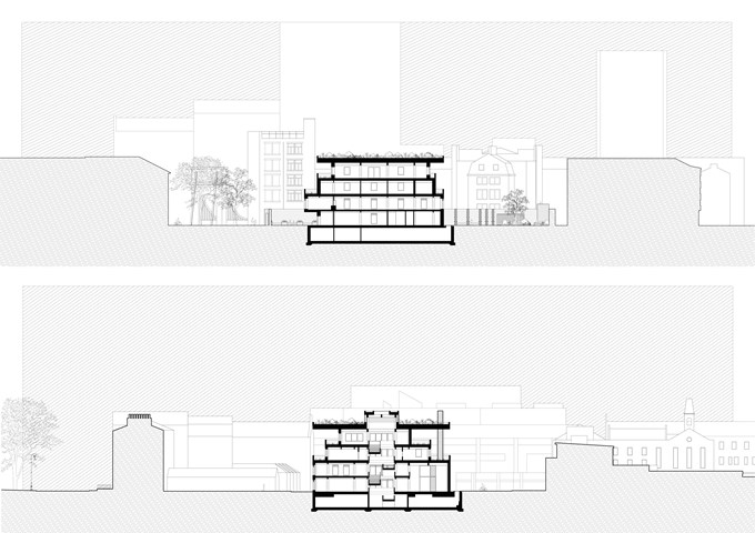
Site Section - Viktoria Georgieva
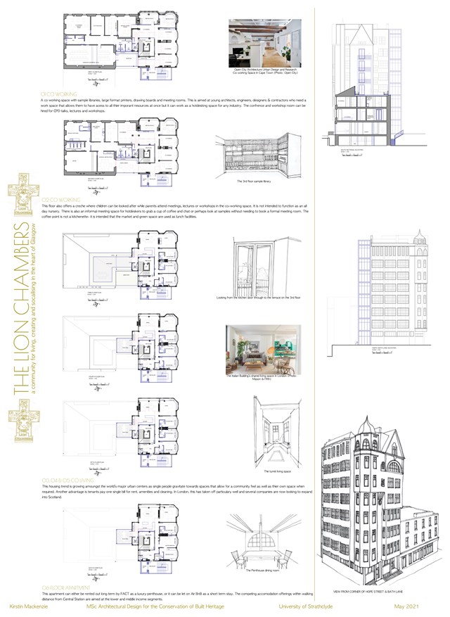
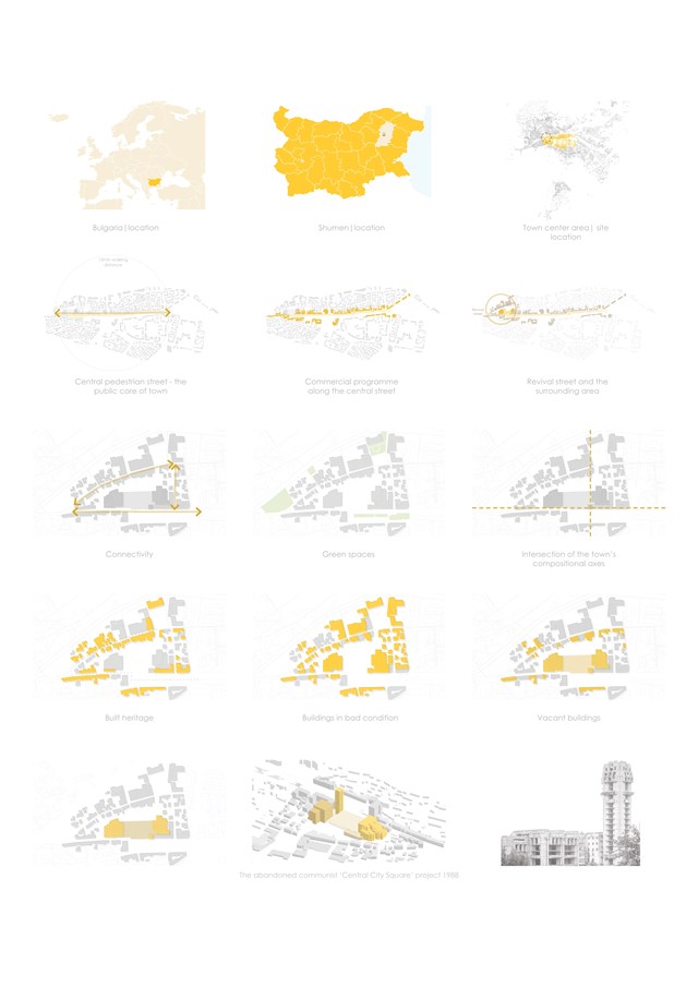
Conservation Design Proposal - Kirstin Mackenzie

The Inclusion Insurrection - Anna Rogowska
The Inclusion Insurrection is an architecture movement created by a group of young architects, who oppose widely spread xenophobia and intolerance in Poland. Fed up with passiveness of general population and visible acceptance of prejudice and bigotry of the ruling right-wing government, they have decided to create a new, culture fluid style, putting a spin on the old motto of the first activist architecture group-modernists: ‘form follows foreign’. In order to bring acceptance of multiculturalism to the monogamous society they plan to influence Poles with the following framework: introduce -> familiarize -> normalize. Starting out in one of the biggest cities, with a now seemingly forgotten history of diverse nationalities coexisting peacefully, they plan a set of architectural interventions utilizing the new style, created through breaking down of the language of architecture. As a starting point they have decided to work with an anti-racism organisation "Never Again" Association, creating their new branch combined with a cross-cultural hub located on the main historical artery and current representative promenade of the city-Piotrkowska Street.
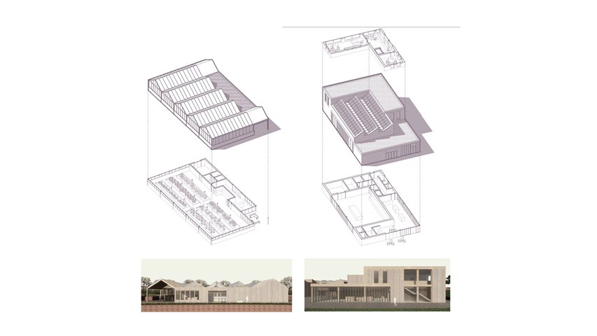
Greenhouse and workshop typologies - Carla Feraru
The greenhouses symbiotically coexist with the recovery facilities in such a way that one’s waste becomes another resource. Food waste from the crops is reprocessed on-site while CO2 produced in the waste-to-energy process is captured and used to enhance the growing process. The small scale manufacturing workshops are located on the lower platform of the production area. The workshop space is located on the ground floor together with a shopfront where products are displayed and sold. The design studio and meeting room are located on the upper floor.
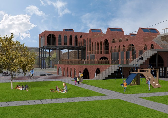
Exterior View of the Laurieston Education Hub along Gorbals Street - Shivani Sarjan
Laurieston Education Hub
This exterior render shows the Hub from the landscaping. It depicts the change in scale as the blocks rise off the ground, as well as its exterior staircase which allows visitors to 'climb' the building.
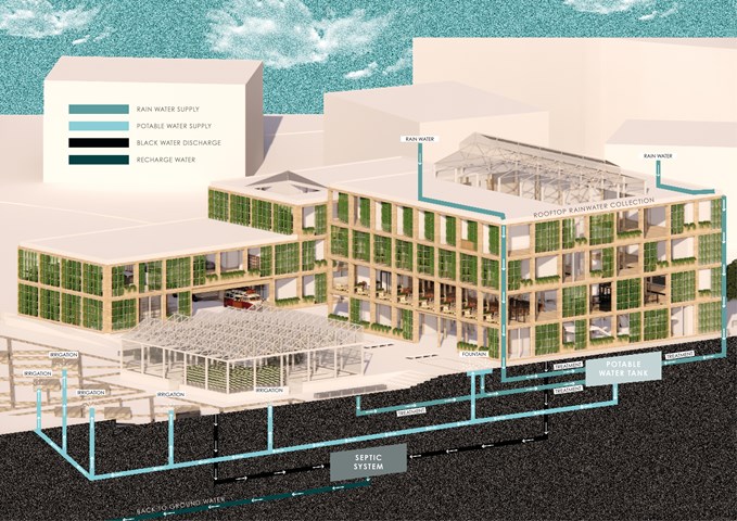
ENERGY STRATEGIES: Rainwater Harvesting System - Gertie Leong Hei Li
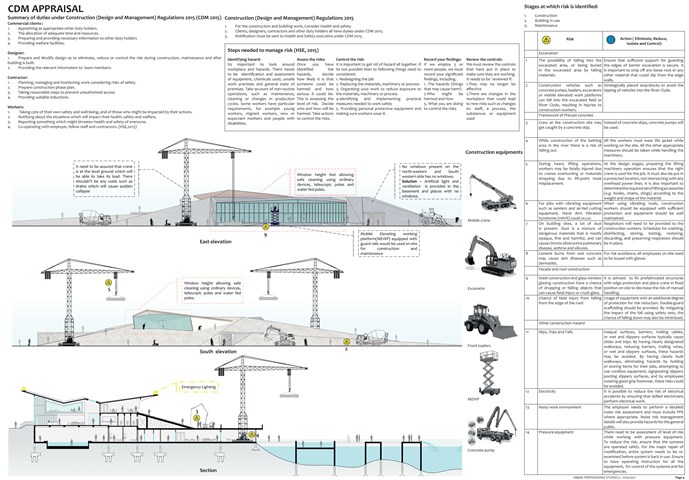
CDM Appraisal - Mrunmayi Pandit
Professional studies

"To Engage" 1;50 Final Model - Samuel Sharkey
The final sectional model of the Blink Art Gallery, Kelvinbridge. This wooden model was used to photograph interior views of the proposed gallery.
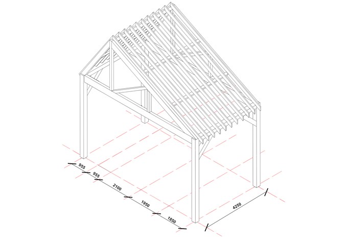
Structural Bay - Victoria Rozewska
Technology Studies
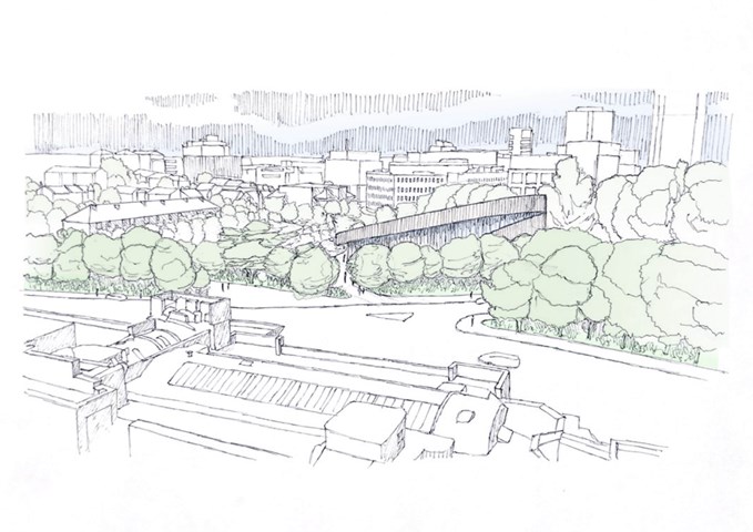
Royal Infirmary View - Finlay Ulrichsen
The design provides a scenic view from the hospital wards of rooftop farming and biophilia,
with the design’s large disc roof “peeking” above the various layers of greenery and planting. The site
creates an inviting and relaxing natural space for in-patients, who may not be able to travel far from the hospital, to go
for a bite to eat with family, watch a performance or simply stretch their legs for a change of scene.
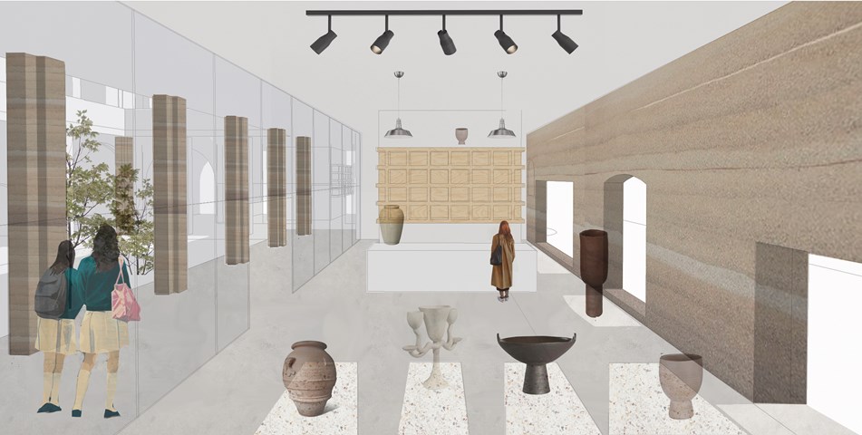
Pottery showroom and shop - Fatema Hassan
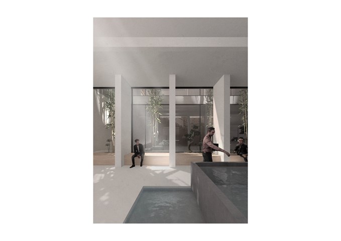
The pottery showroom is situated on the ground floor and lit with sunlight penetrating through the carved openings in the load-bearing rammed earth wall. Further light and views appear left through the central courtyard garden and rammed earth columns.
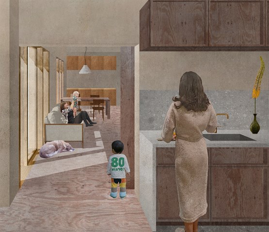
Thresholds between shared and private spaces - Zachariasz Czerwinski
Design Studio 3A
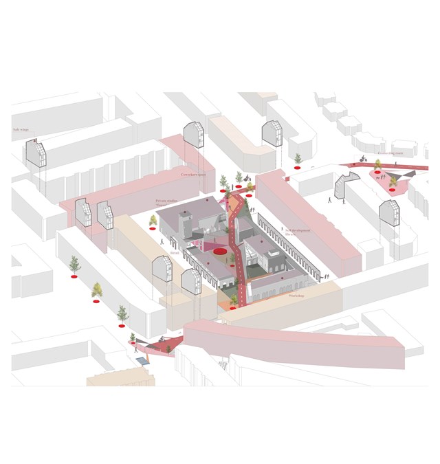
Proposed Community Village - Asya Gumus
Master plan strategy aims to connect, protect and reset ambitions of the elderly community. Inclusivity, accessibility and safety is created by integrating different scale interventions and reusing vacant/ neglected land within the area. Dementia design principles are integrated into this process including familiarity, transparency and wayfinding.
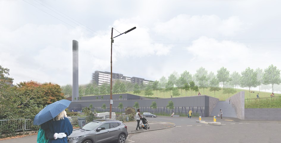
Andrew McCluskie
View from Benalder Street Bridge
Initial analysis of Yorkhill Park, which the site is bound by, revealed a need for improved access and public realm. Therefore the access stairs were rotated to receive pedestrians from Partick and accentuate their desired path. The scheme will also provide disabled access to Yorkhill Park for the first time. A green buffer and internal balustrades will ensure privacy in the main library space and increase biodiversity on site.
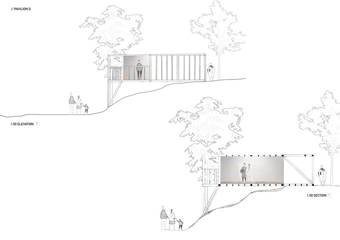
Section and elevation 1:50 - Zuzanna Woznicka
My first attempt at section and elevation, a combination of hand drawing and photomontage.
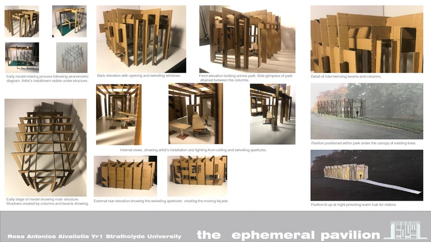
THE EPHEMERAL PAVILION - Ross A Aivaliotis
Working and final model. Exterior views by day and night.
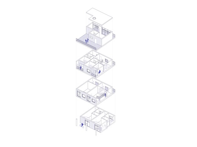
Flat Type A+C, Exploded Axonometric - Giulia Panedigrano
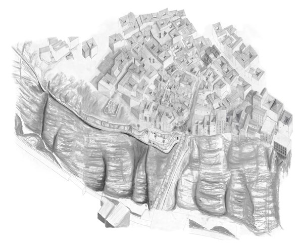
Masterplan of proposal - Axonometric of Souika, Constantine, Algeria (1.7m x 2m) Pencil, Chalk - Nassim Belgroune
This drawing helps to contextualise the proposal within Souika with all 5 phases incorporated, it views the gorge as the centre rather than the perimeter edge of the scheme creating a better understanding of the vast changes in levels at each point of the site.
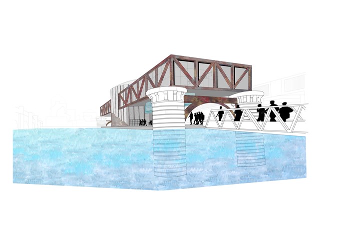
From the Riverbank - Zoe Bennett
Design Studies 3B
Entry onto the structure- where the performers and the audience walk below the exposed glass training pool and gain glimpses of the performance pool and the lift mechanisms through the semi-transparent drum.
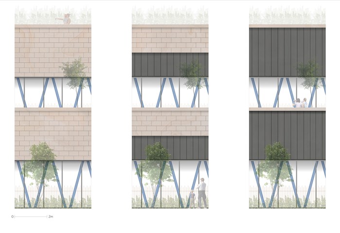
Andrew McCluskie
1:20 Façade Accent Testing
These images were created to decide the extents of Standing Seam Zinc within the Repurposed Sandstone Slips as well as to investigate how they would interact with the structural columns. The third test with the most zinc was chosen as it created the most layering and depth.
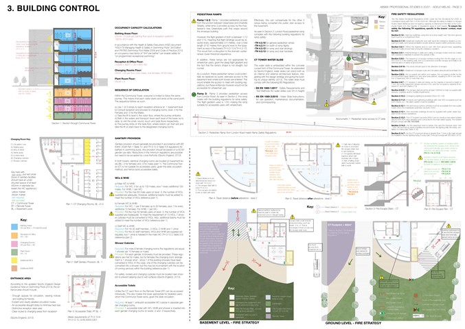
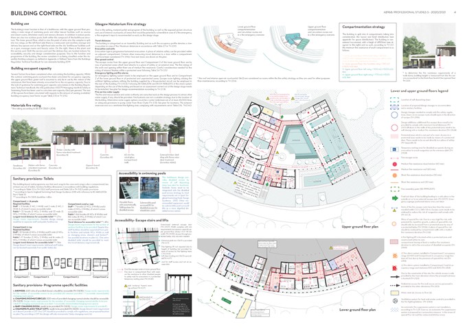
Building Control - Adele Melas
Professional Studies
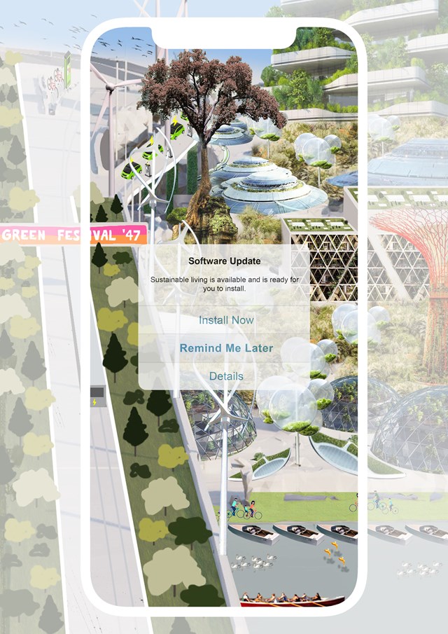
SELF-INITIATED_v2 - Gertie Leong Hei Li
Design Studies: Workshop
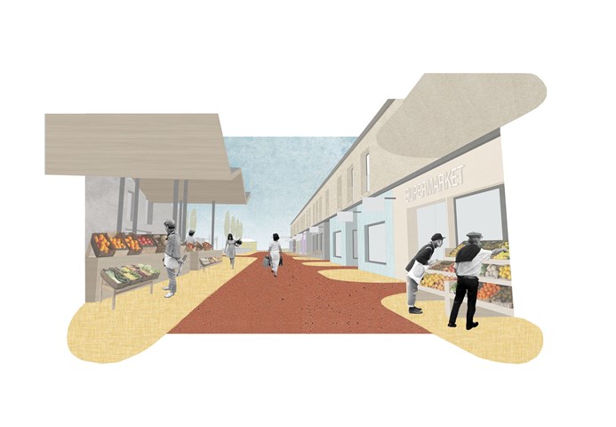
D. High Street - Adele Melas
The High Street is a prominent feature of the dementia-friendly neighbourhood and is key to enhancing factors including normality, accessibility and inclusiveness. In an attempt to capture a sense of normality for residents, many care homes have often implemented false interpretations of streets in their design - many times as internal elements, which are not functional but simply stand as inactive façades. The ethos of the High Street is to ensure the façades and use of specific shops are legible and distinct, which is achieved through distinguished colour use, clear signs, and bringing shop activity beyond the facade where possible. With time and recurring exposure, familiarity of the shops will increase. In accordance with the fundamental needs of users in terms of services and shops, the DFN proposal provides a range of primary and secondary facilities; 500m-800m from level 2 and 3 dementia housing.
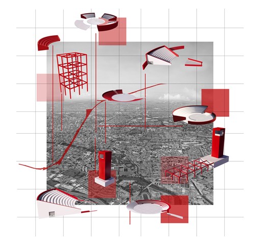
Elements of the Open City - Ami Coulter
Moving Toward an Open City through design interventions; Arx, Pnyx and Iter. Creating flexible spaces centred on citizen exchange, accepting and celebrating the city as ever evolving and unfinishable. Theory based design interventions tested in Glasgow with scope for deployment in other cities around the world.
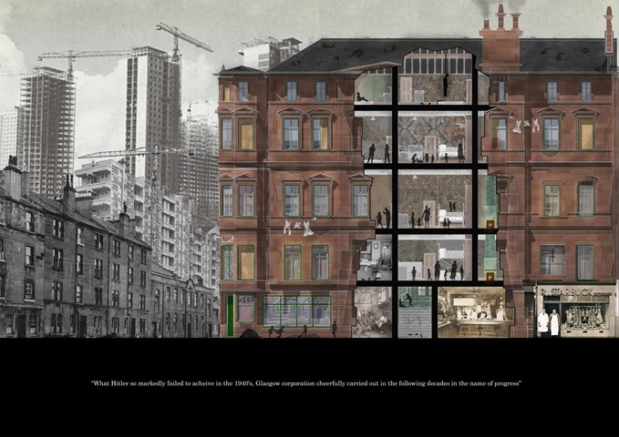
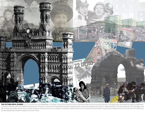
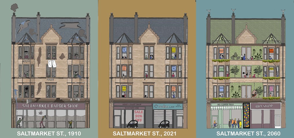
Stage 1: The Tenement Slum - Jakob Young
Cultural Studies Triptych: Inequality Street

Centre for Sisterhood Approach - Rebecca Irving
The tower is the control centre for safety around the city and represents Jane Jacobs’ conceptual theories for ‘eyes on the street’. Visually, it is a metaphor for representing safety in architecture by adopting elements of watchtowers and lighthouses.
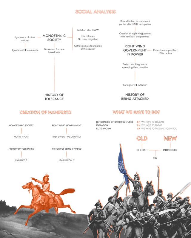
Research and Manifesto - Anna Rogowska
Despite its turbulent past Poland has had a long history of tolerance for other cultures and religions. It has unfortunately seen a decline in recent years with acts of racism, hate speech, and xenophobia becoming an almost every day occurrence with no visible repercussions. The two main questions that this project aims to answer are: ‘why is it happening?’ and ‘what can be done to stop it?’.
Insurrections and Uprisings have been an inseparable part of our history following multiple invasions and attacks. So much so that there is a separate page on Wikipedia collecting all Polish uprisings featuring 16 pages and 23 subcategories. Just as in the past Poles had to rise up against invaders and occupants, it is time to rise up against intolerance and injustice.
After analyzing the timeline and recent events certain conclusions could be drawn and overall society profile with four main factors could be recognized. All of these factors served later as a guideline for creation of the Manifesto. While creating the manifesto, lessons derived from previous analyses have been applied. Thus the following workflow model has been developed:
recognized issue -> possible solution
Based on proposed solutions the specific manifesto points were created, after which the architectural solutions were modeled.
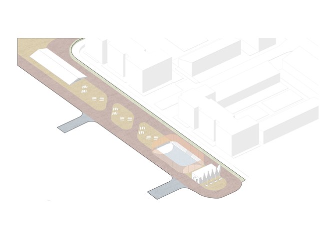
B. Street - Adele Melas
All Entrance Buffers, besides the west wing, stem into streets which meet at the heart of the dementia-friendly neighbourhood - the Cross. The Streets are fully pedestrianised and are vibrant with life, both as transitional zones and dwelling points. As explained in the criteria, these are divided in accordance with the colour of the paving - red implying the former and yellow the latter. Similarly to landmarks, familiarity of their use is gained with time, particularly through the eyes of dementia-users. This allows the use of outdoor environments to be sustained as dementia-friendly, for instance as pedestrian paths are maintained unobstructed, wide, and directional.
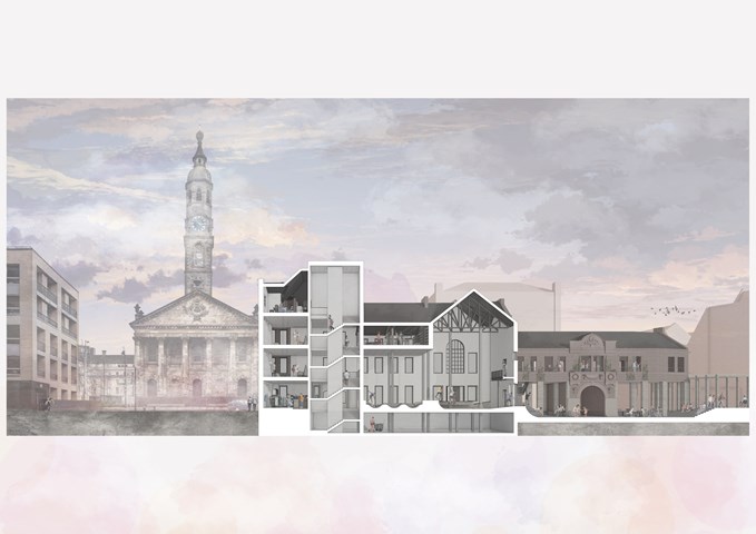
West Section – View on St. Andrews in the Square - Giovanni Miscena
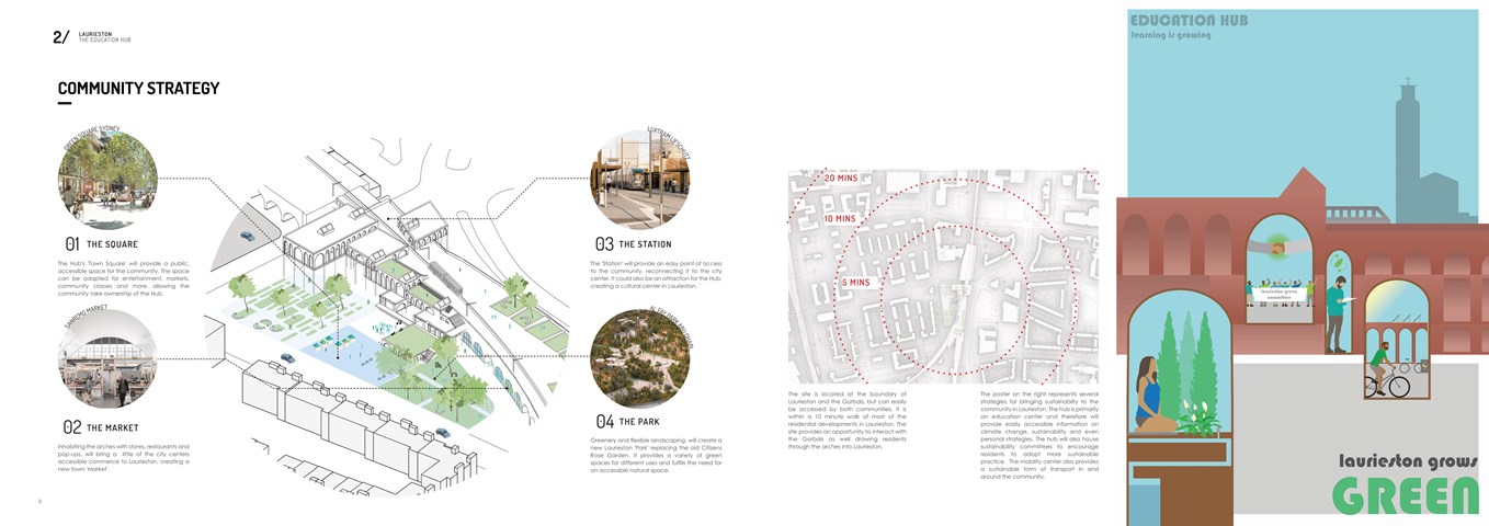
Community Strategy - Shivani Sarjan
Laurieston Education Hub
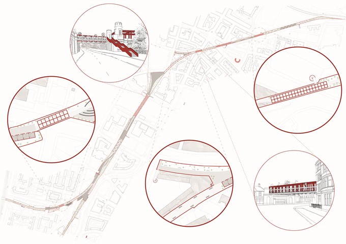
Iter | Plan and Sketches - Ami Coulter
Iter looks to surpass boundaries, slow citizens down, allow time and space to THINK and experience others. In Glasgow, it assumes a largely disused railway track which flows through the centre of the city. The focus is on holistic connection, the experience of layering another street or Iter, within the city, and the connection points introduced. It offers a new completely pedestrianised route, removing the intrusion and speed of the car, returning freedom of movement over the speed of movement. It draws people closer together and transcends boundaries whilst utilising acts of compression and connecting different parts of the city similar to Luchtsingel in Rotterdam.
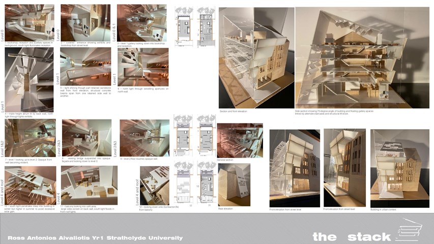
THE STACK - Ross A Aivaliotis
Final model showing internal and external spaces.
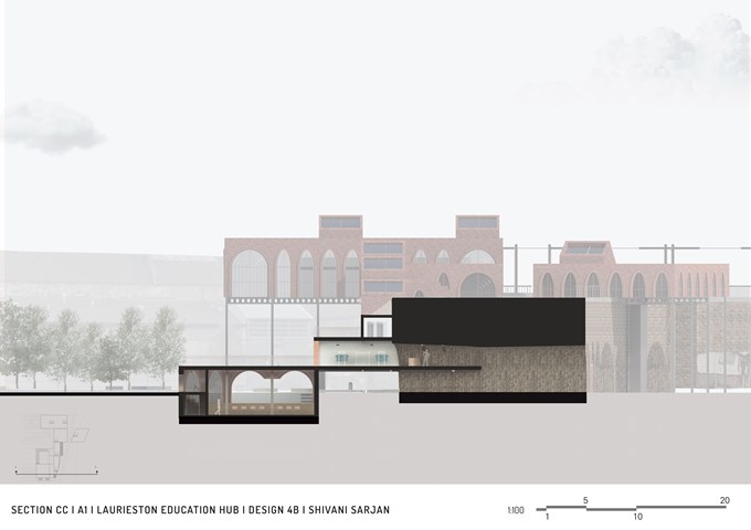
Section CC - Shivani Sarjan
Laurieston Education Hub
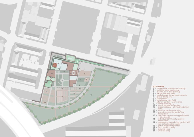
Site Usage Plan - Fiona Wylie
Due to the site's unique placement and size, it is ideal for not only indoor vertical farming, but also allows for exterior agriculture, community gardens, and public spaces to bring more open green space to Tradeston.
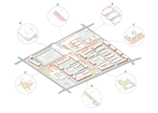
DFN Masterplan Zones - Adele Melas
The DFN Masterplan incorporates the following Zones: Entrance Buffers (A), Streets (B), Cross (C), High Street (D), Severe Dementia Housing (E), Moderate Dementia Housing (F), Community Centre (G)
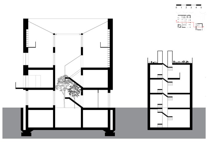
The Section - Freyja Lehnen
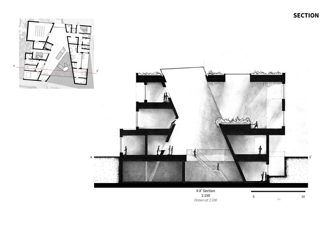
The section is defined by the void in the middle of the building that doubles as a staircase. The idea is the use the natural features of St Andrews, for example the rain, to power the building. The design form was based on the conditions of the site.
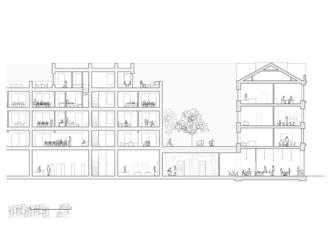
Section - Sadie Sanchez-Ruiz Malan
To Live/Work
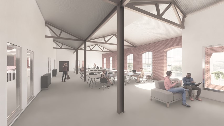
Working Space - Andrew Devine
Image showing a typical quiet working space off of the atrium.
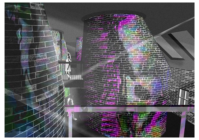
Immersive Space - Sadie Sanchez-Ruiz Malan
To Play
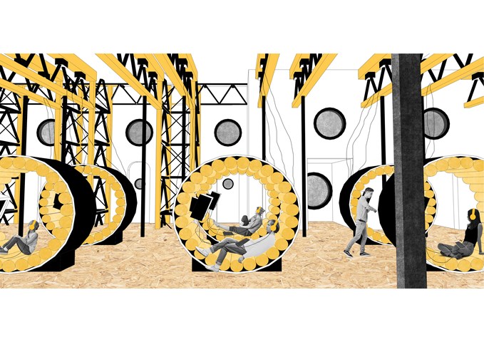
This space aims to be more immersive. Being able to project visuals and lighting onto the studio 'kilns' adds another dimension to the sensory experience. When not in use for production, artists can perform within them.
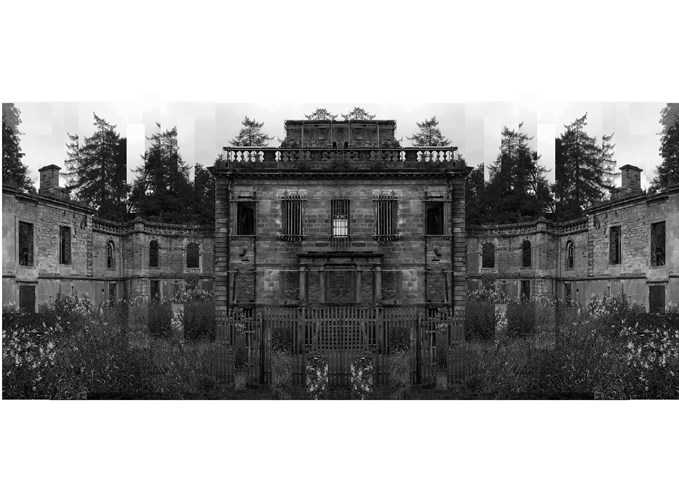
Mavisbank House / Symmetry and Order - Eilidh McGuigan
The following artworks convey the regression of Mavisbank House. The Palladian villa was the first of its kind to be built in Scotland during the period of enlightenment, where it experienced an entourage of regimes. Originally built in 1727 by architect William Adam in collaboration with his client with intentions of being a stately family home, the building was erected with strict form and order which showed its stance in the local hierarchy. With being a sign of wealth and importance within the area, the building received high levels of care with a flock of maids and groundskeepers to maintain the property. Through time, and many pairs of hands, the building was eventually left in a state of hibernation after the property owner passed away. Eventually gutted by fire, the building was robbed of its elegance and hope of rejuvenation. The building then left in turmoil gradually disintegrated, finding purpose as a car park and scrap heap in the early 70s.
Within this project, I wanted to reveal how although the building may not stand with its intended character, I think the building is far more interesting now nature and time have allowed it age and develop its own charm.
I have compared the buildings in their two main phases of life through photo collage. In the first I show the building as if it had aged through time, maintaining the characteristics of the Palladian style with strong symmetry and organised features.
In the second I have shown how the building has truly deteriorated, veering away from its original style and descending into a state of chaos.
Personally I much prefer the style of the more chaotic artwork as I feel as though it represents the bitty and unpredictable life that the building has endured.
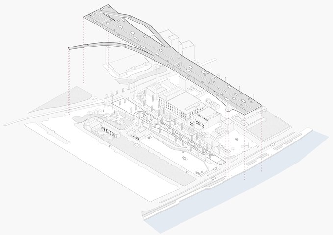
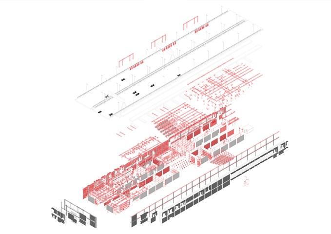
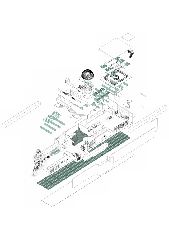
The M8, currently - Exploded Axonometric - Giulia Panedigrano
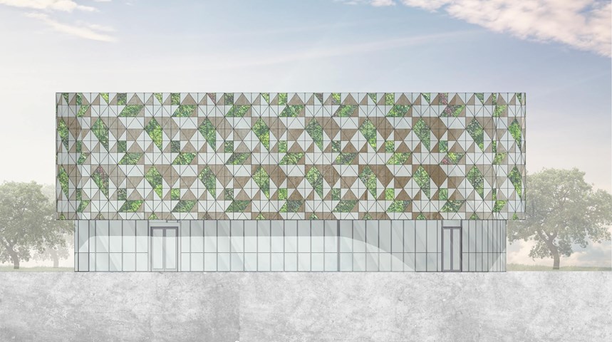
South Elevation - Angelika Hajdasz
The elevation of the centre is designed from natural materials and includes elements of vertical gardens. The second-skin facade creates a repeatable pattern using wooden, glass and greenery panels.
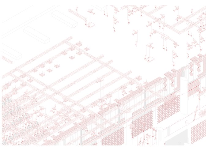
Exploded Axonometric Detail 1:50 - Conor Ryan McCormack
Down The Rabbit Hole_3B To Play
Down the Rabbit Hole_3B To Play.
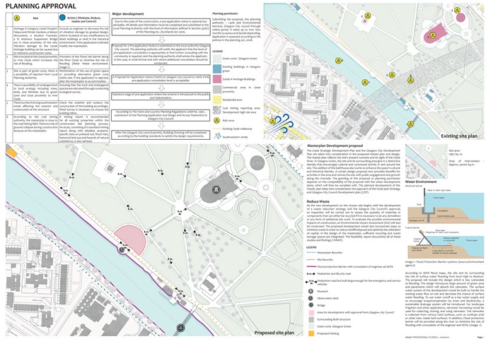
Planning Approval - Mrunmayi Pandit
Professional studies
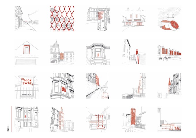
Glasgow Dérive - Ami Coulter
From dérive’s, various patterns which draw in the wanderer were noted: Beacon elements that break the skyline, Changes in pattern, material, colour, or texture, Key provocative elements, posters, artworks, activist boards etc., Repetition and rhythm, Layering and depth, Specific elements of intrigue which don’t seem to fit formally or are unexpected.
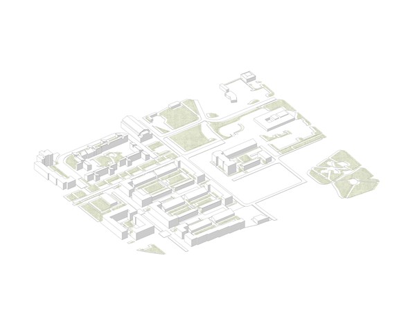
Laurieston Existing Site - Adele Melas
Today the site exists as a Transformational Regenerational Area (TRA), marked as ‘Laurieston Living’. Currently, the housing development is towards the end of Phase 2. Adjoining with the initial concept, the wider site of Laurieston Living is enveloped by various crosses, including Gorbals Cross and St. Andrews Cross, which help increase opportunity for dementia-friendly outdoor environments. The Dementia-Friendly Neighbourhood (DFN) proposal aspires to integrate with future plans in Phase 3. Ultimately, this fusion would reinforce a Neighbourhood For Life (NFL) concept; a key component to creating inclusive environments (Mitchell et al., 2010).
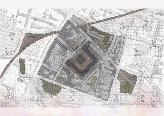
Apparatus Drawing – Site Plan: St. Andrews Square - Giovanni Miscena
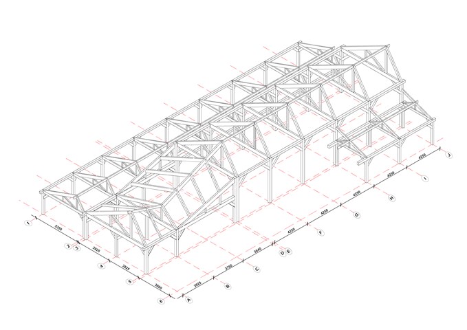
Structural Diagram - Glulam Frame - Victoria Rozewska
Technology Studies
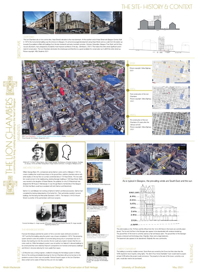
The Site History & Context - Kirstin Mackenzie
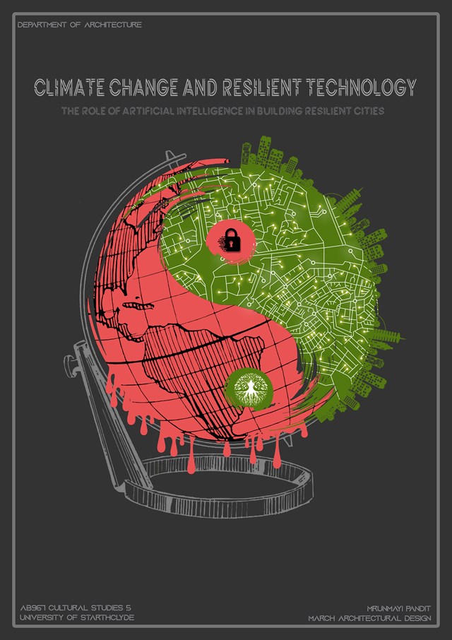
Climate change and resilient technology - Mrunmayi Pandit
Cultural studies and electives
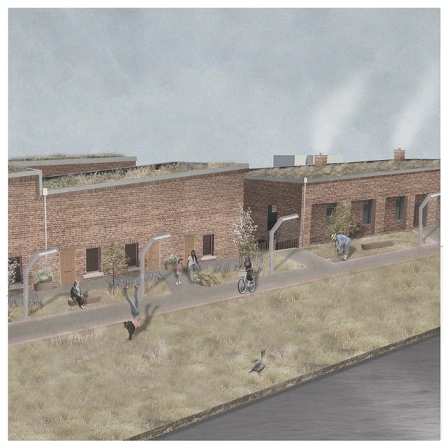
Canal Street Urban Green Route - Rebecca Irving
The urban green route of Canal Street connects to neighbouring communities and the city centre.
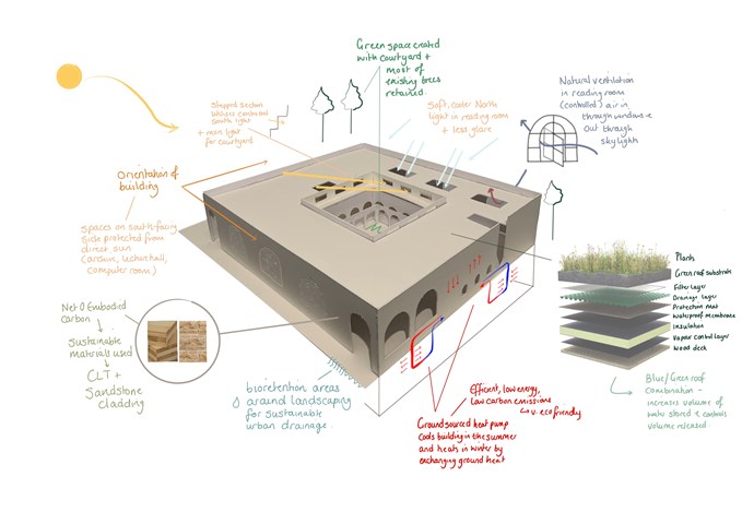
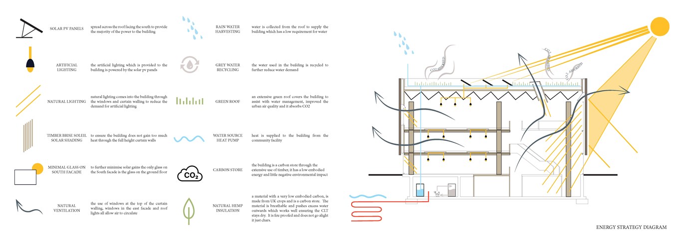
Environmental Strategies - Leena Hussain
Based on RIBA sustainable outcomes.
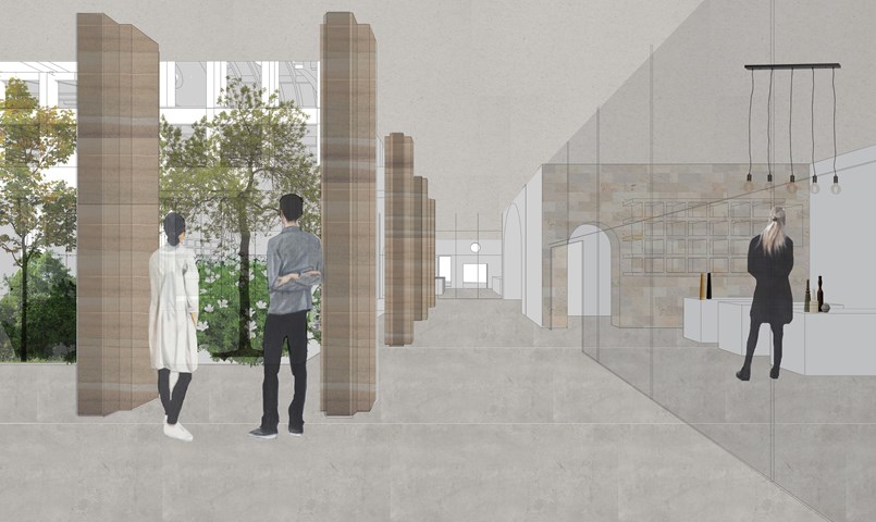
Arcade between shops and courtyard - Fatema Hassan
This region within the ground floor connects all entrances from all edges of the site to the central courtyard and shops. It is open to the outside and sheltered with a cantilever that forms the first floor. All shops have curtain walls facing the interior courtyard to absorb light penetrating through.
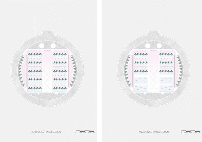
Typical section through production tunnels - Shravan George
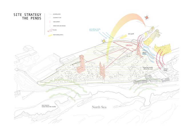
Site Strategy for The Cathedral Site (The Pends) in St Andrews - Milosz Cwiklinski
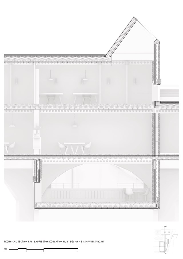
Technical Section - Shivani Sarjan
Laurieston Education Hub
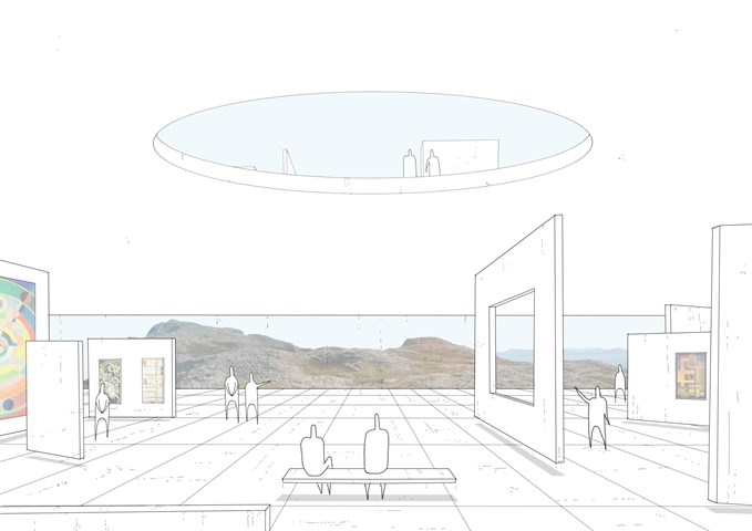
Kinetic and Adaptive Spaces - Daniel Kelly
We need to accommodate the constant change in society through technology, user needs and the way we live.
Therefore, the external form remains as a permanent but the internal spaces will be in constant flux through the use of kinetic partitions and smart furniture.
Through the arrival process, the AI can develop algorithms of each citizen and distinguish how they will like to enjoy their time and what activities they want to partake in, and in turn transport and create those spaces using these forms of kinetic and evolving architecture. This image shows the lower level on the circuit which is being used as a continuous art gallery.
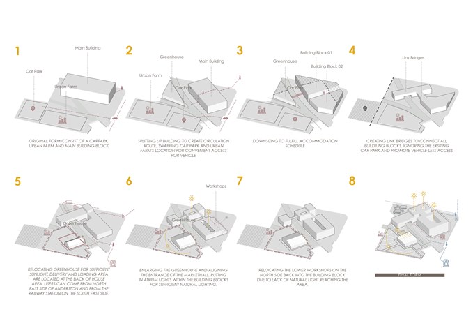
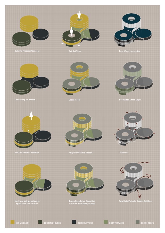
Building Formation Massing Diagrams - Gertie Leong Hei Li
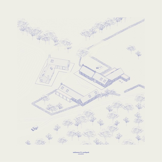
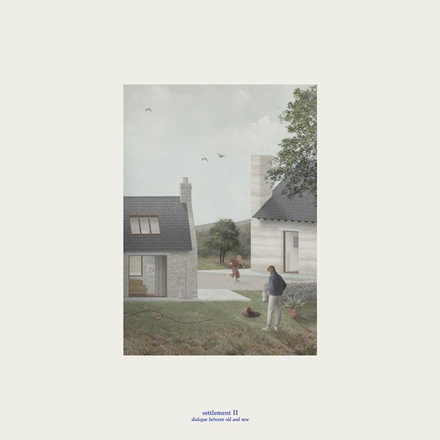
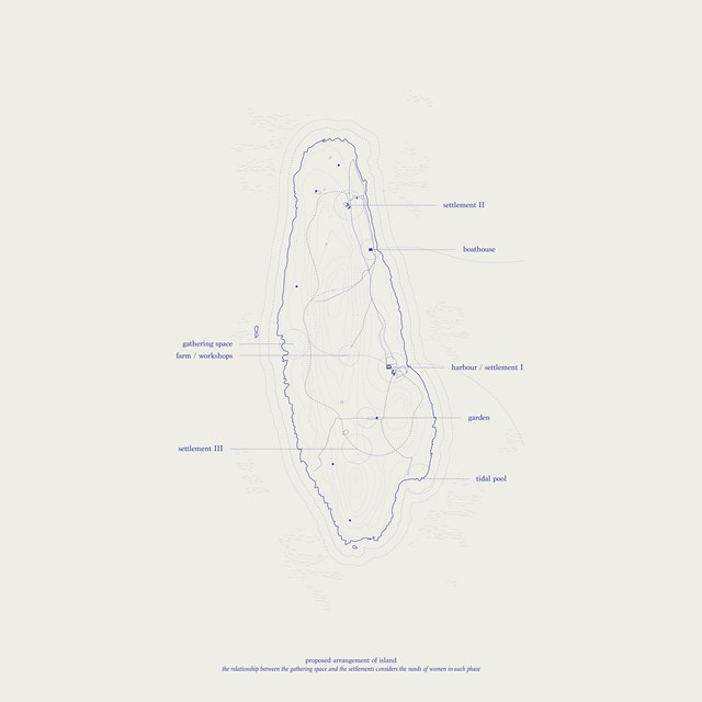
Settlement II - Mairi Watson
Women's accommodation occupies the existing farm ruins alongside contemporary additions.
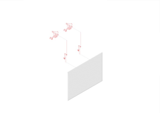
Exploded Axonometric Detail 1:50 - Conor Ryan McCormack
Down The Rabbit Hole_3B To Play
Down the Rabbit Hole_3B To Play.
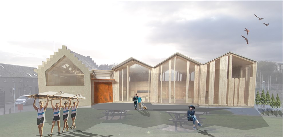
Exterior view of Sailing Club design in context - Lewis McLynn
Exterior image of model photoshopped into the site.
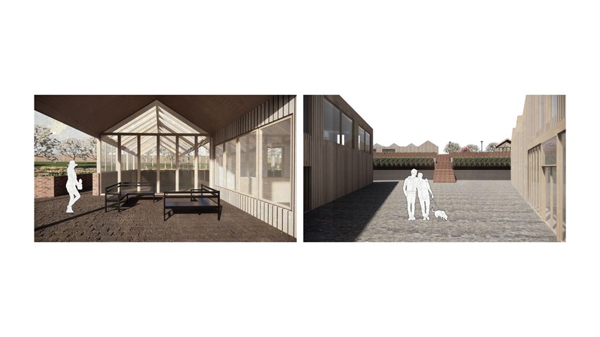
Left: View underneath the canopy of one of the greenhouse. Right: View on the lower platform between workshops towards the green terraces - Carla Feraru
Underneath the canopy of the greenhouse roof an intimate seating space is created and offers beautiful views of the community garden and orchards beyond. From the upper platform, one can descend on the steps towards the manufacturing workshops. Each landing provides an opportunity to stop for a moment on the green terraces where you can have a picnic or just soak in the sun.
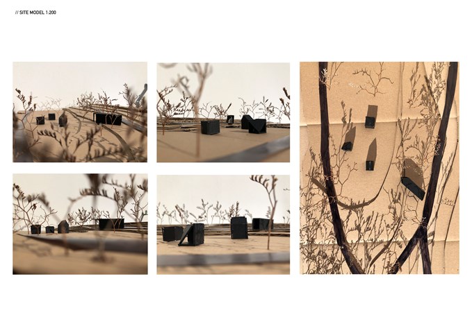
Site model 1:200 - Zuzanna Woznicka
This site model helped me to locate and connect pavilions. It was really important for me to understand how they collaborate together. I wanted to achieve the route that will lead from the exit to the entrance of the next pavilion, ending at the largest pavilion. The last pavilion design collaborates with the shapes of the rest three and captures an incredible view of the pavilions, river and tenements.
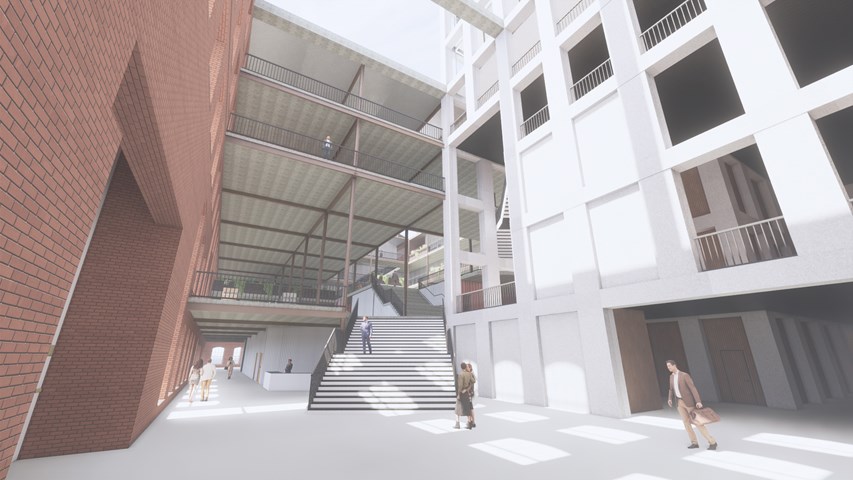
View from square side entrance - Andrew Devine
From the main entrance the routes through the building are highlighted, and a clear visual connection is made between the new stone tower and the rest of the building which assists the building's users in way finding in what is a large building.
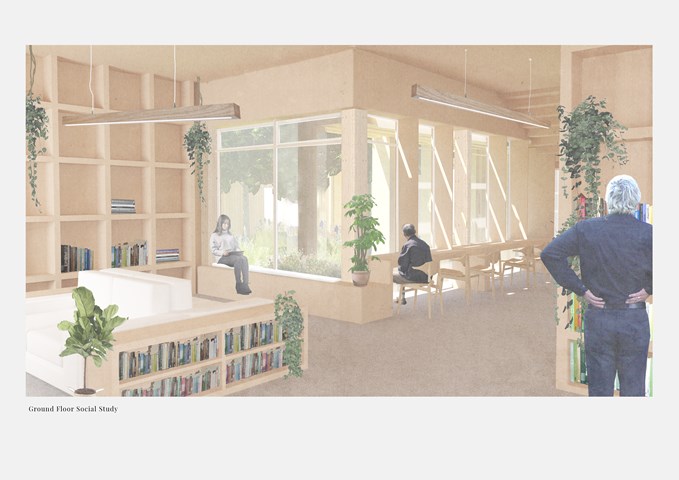
Ground Floor Social Study - Victoria Rozewska
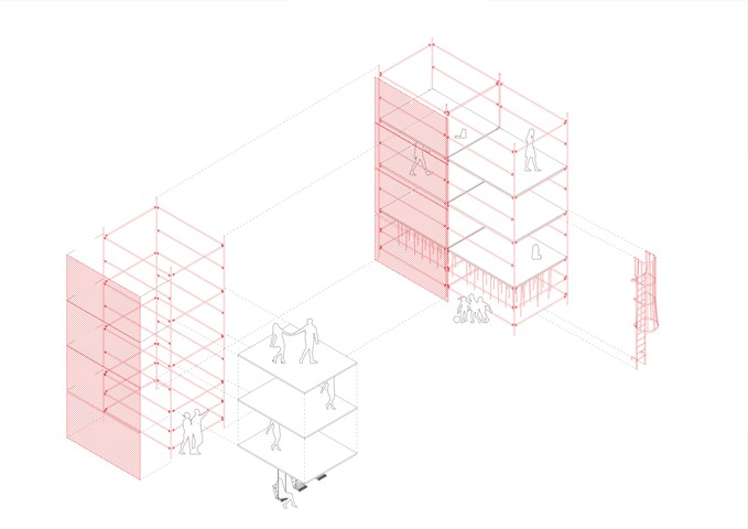
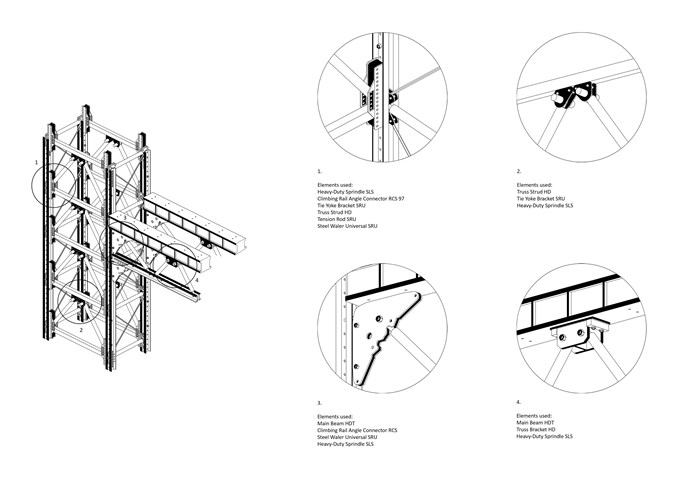
Scaffolding Structure Diagram 1:50 - Conor Ryan McCormack
Down The Rabbit Hole_3B To Play
Down the Rabbit Hole_3B To Play.
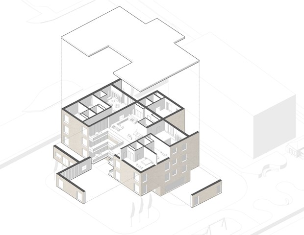
F. Moderate Dementia Housing - Adele Melas
The housing proposal is specifically targeted for individuals facing moderate stages of dementia, whom can no longer live entirely independently without forms of assistance. The concept embraces co-housing and intergenerational living with a young nurse practitioner, young carer, nurse or medical student, who are equipped to take on the role of the ‘carer’ by discretely offering assistance, in a non-institutionalised nature. Both residents would equally learn from one another, form a very strong friendship bond, and yet have their own privacy. Essentially, the two households join via the entrance-point communal kitchen and living room, and move into their own space through a progressive privacy layout.
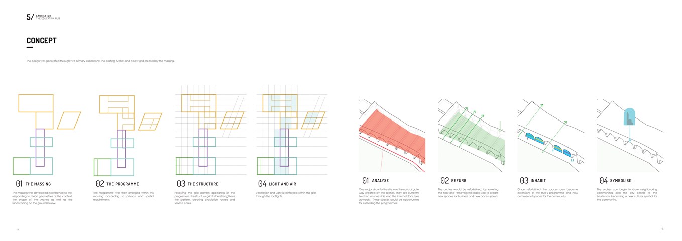
Conceptual Diagrams - Shivani Sarjan
Laurieston Education Hub

"To Engage" Studio Space Final Model - Samuel Sharkey
Studio space in the Blink Art Gallery.
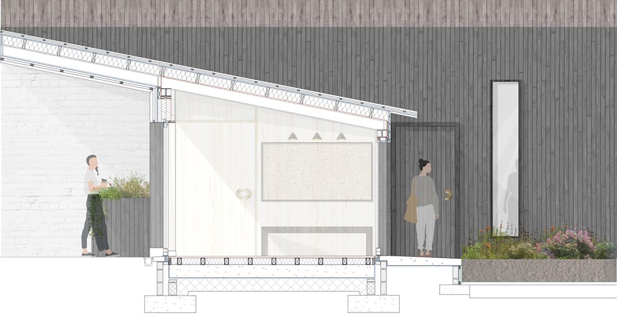
1:20 Technical Section Through Entrance Lobby - Eilidh McGuigan
The roofscape of the lobby and study carrells are specifically designed to enhance the user's experience within the building. The overhang on Market Street takes the user away from the street and creates a threshold into the building. The angle of the roof provides shelter from solar gain, creating a dark and intimate lobby space, emphasising the light and colours that shine in the wild flower garden. In addition to this, the roof is designed to gather rainfall with the large surface area and channel it into the central space to allow the flowers to grow.
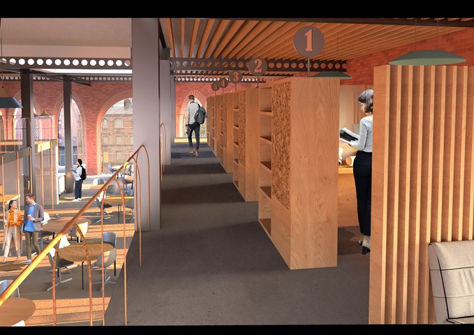
Interior View of the Mezzanine along the Study Bays - Shivani Sarjan
Laurieston Education Hub
This view shows the other opposite double height informal study space as seen along the study bays. These bays are acoustically protected by the wooden louvres and the cieling is lower to create a more private , quiet space.
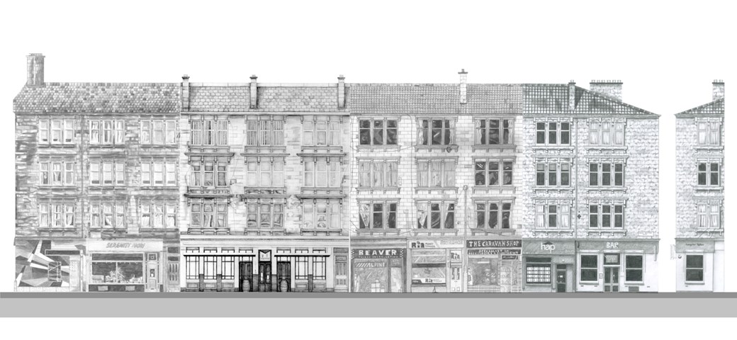
Street Façade - Laura Kennedy
1:50 Pencil study of the whole tenement block. This elevation was created by combining the different façade 'slices' drawn by various students in Unit 8.
Laura Kennedy, Sam Sharkey, Cara Thomson and Zuzia Grajewska
Laura Kennedy
Laura Kennedy, Sam Sharkey, Cara Thomson and Zuzia Grajewska
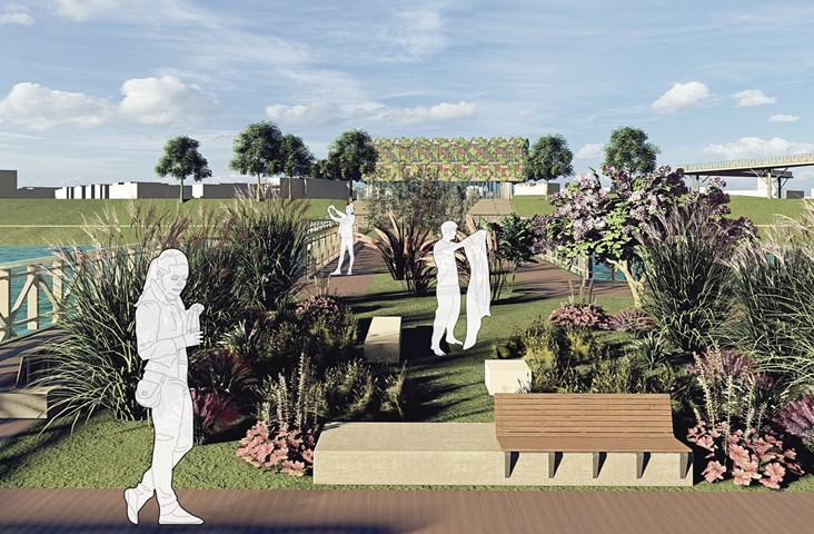
Bridge - Angelika Hajdasz
The bridge is a part of the masterplan that connects the Hub to Richmond Park.
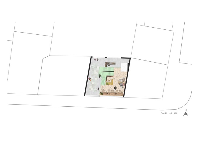
"To Engage" - Floor Plan 1:100 - Zuzanna Woznicka
In "To Engage project" we were meant to design the art gallery in the slice between the tenements. Since in this project we were quite limited with the form, I decided to focus a bit more on the interior design. I made a collage of the floor plan for each individual floor, to deliver the idea of the atmosphere I would like to achieve.
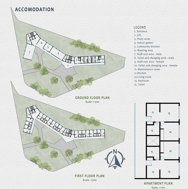
Accomodation - Mrunmayi Pandit
The accommodation area is a 2 storey building near the entrance having staff and communal areas on the ground floor and apartments on the first floor. The accommodation has a front façade made up of glass giving the entire view of the garden. Solar panels have been proposed on the roof. The energy generated from it can be used to light up the pathways.
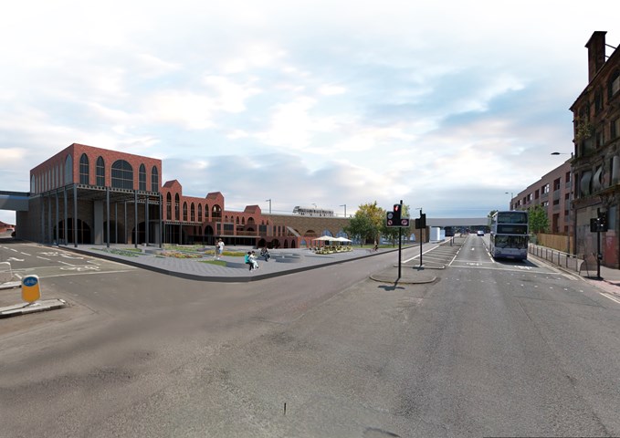
Exterior View of the Laurieston Education Hub along Gorbals Street - Shivani Sarjan
This exterior views shows the building along gorbals street in the opposite direction. It depicts the higher blocks' relationship with the landscaping, creating a protected area underneath.
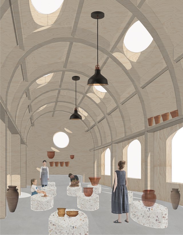
Potters workshop - Fatema Hassan
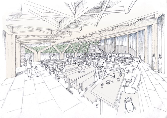
The pottery workshop is a vast space supported by arched timber frames that form a lattice where pots and vases can be laid to dry. The structure forms a top shelf where potters can use to store or dry ceramics. The overall atmosphere consists of circular light rays cast and moves throughout space and time as a natural spotlight within the workshop.
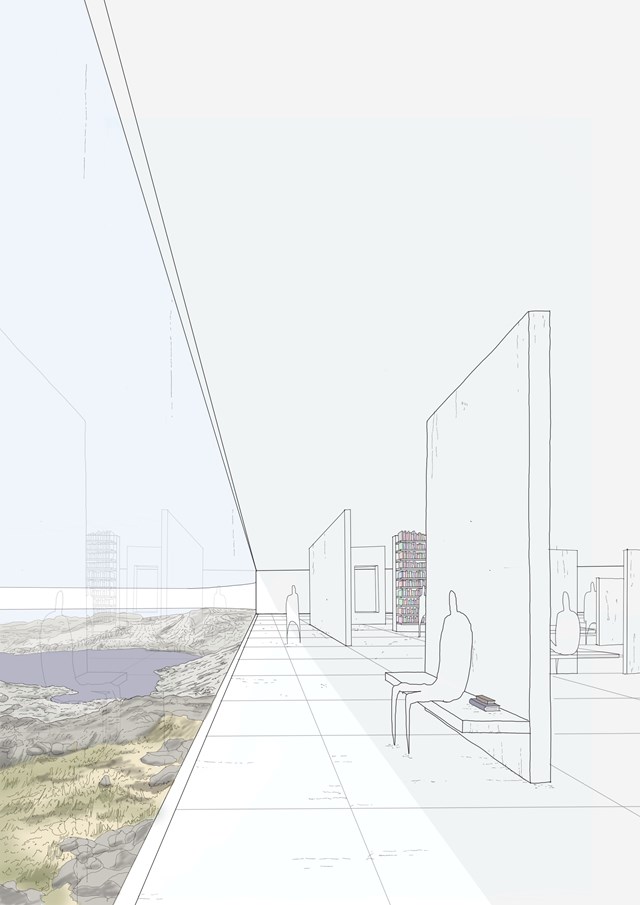
A Place for Learning - Daniel Kelly
On the lower level of the structure, small and intimate spaces are produced for the citizens to use as areas for reading, reflecting and conversing whilst enjoying elements of biohpilic design with a connection to nature.
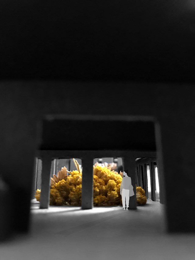
Entrance View Towards the Garden - Eilidh McGuigan
Upon entering the building, there is a strong connection between the user and the green space that the buildings encircles. The entrance lobby creates an intimate space with the dropped ceiling height, and allows the user to feel transported away from the busy street to a calmer realm to study in.
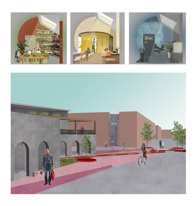
Approach to the 'safe wing' model - Asya Gumus
Each safe wing involves a different activity. Other designs include gardening and sensory therapy that reduces stress and anxiety that can surface due to progressing dementia. Each safe wing will include a different colour/ character/ material in accordance to the interventions use, such as red promoting energy, motivation and activity and blue promoting a calmer and less stressful environment. These colours are important for elderly design as it can slow the process of the developing dementia amongst the ageing population.
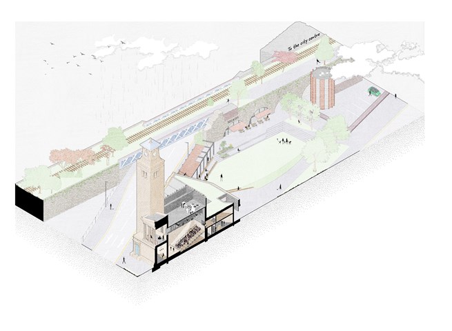
Isometric site section - Alfie Hollington
Design Studies 3b
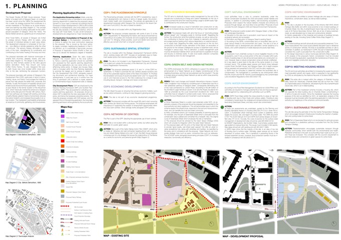
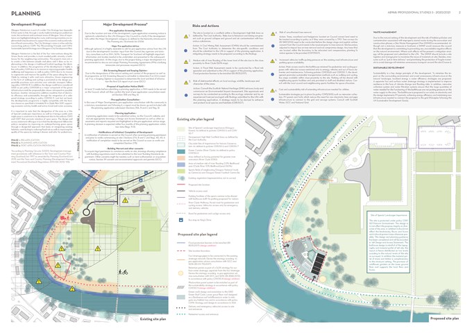
Planning - Adele Melas
Professional Studies
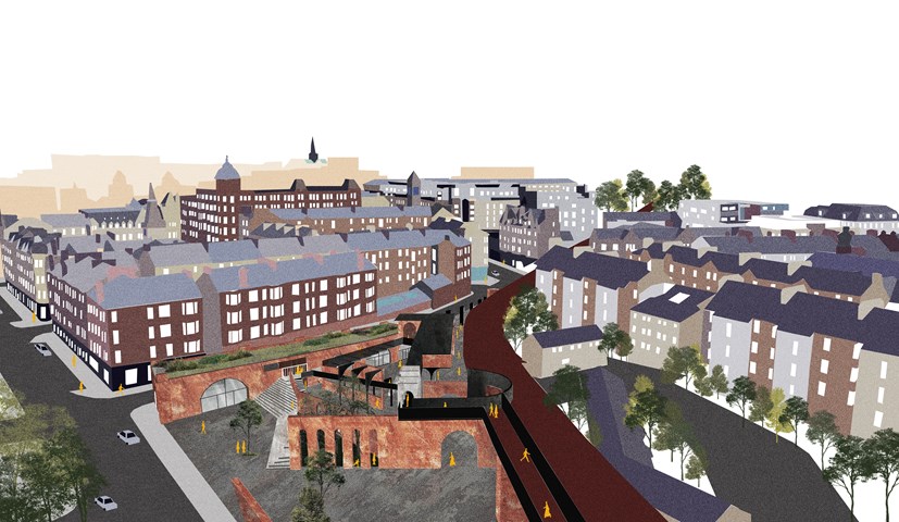
Urban Intervention of King Court Market. - Cham Zheng Chee
The balance of retaining and subtracting the existing structures introduces a channel of movement through the space, and then into the urban realm. The layers of urban depth in the designed liminal spaces diversify the various spatial divisions within the market, through the transition of conflicting polarities amongst the introduced in-between spaces.
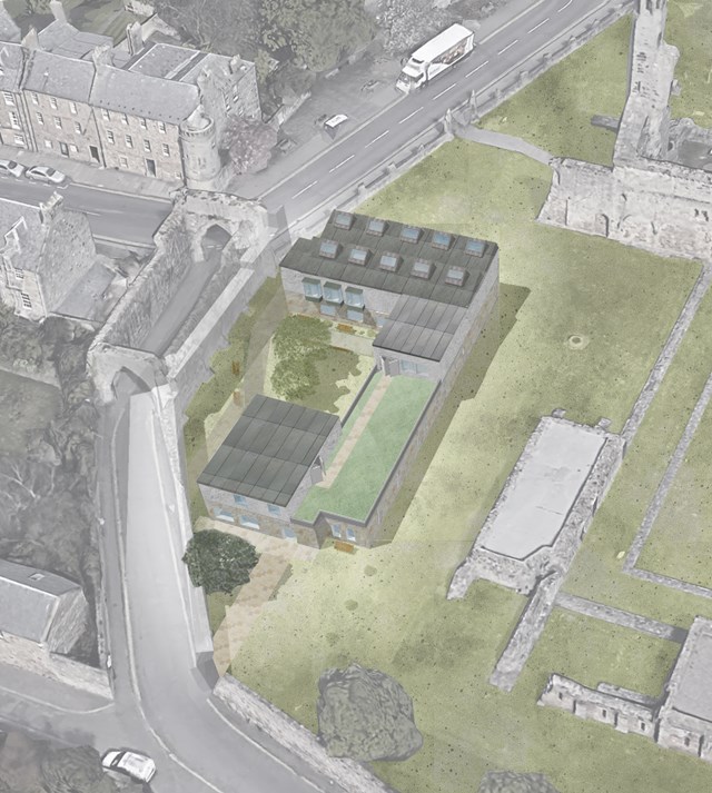
Bird's-eye view of The Pends site with proposal - Milosz Cwiklinski
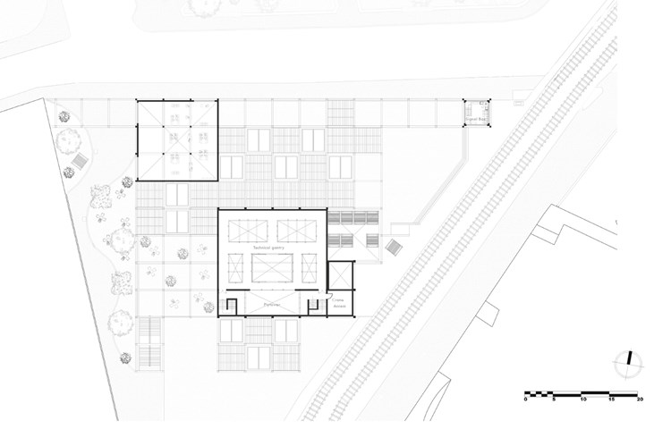
Second Floor Plan - Jakob Young
Undergraduate Thesis: Merchant Theatre

The History Timeline - Anna Rogowska
In order to gain a better understanding of the nature of current situation within Poland it is crucial to explore its rich, but painful history. To aid this, a timeline of the country’s past has been created. It gives a quick overview of the turbulent past, together with most important events directly impacting the modern outlook on foreigners in Poland.
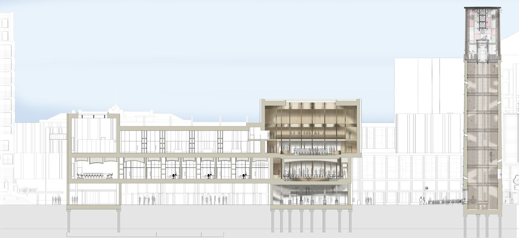
South Facing Section AA - 1:100 - Antony James Graham
This particular section demonstrates the important relationships between special quality, scale, atmosphere, materiality and hierarchy of space in relation to the remaining form of the building and context. The large bell tower is a symbolic gesture for gathering and offers a unique view across the city serving as a sentinel of the land and a beacon of hope for the people.
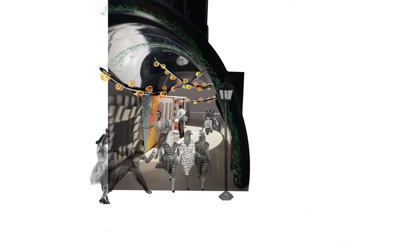
Tunnel Experience - Enbiya Yuecel
3B To Play
Old waterpipe used as tunnel model and carboard markets
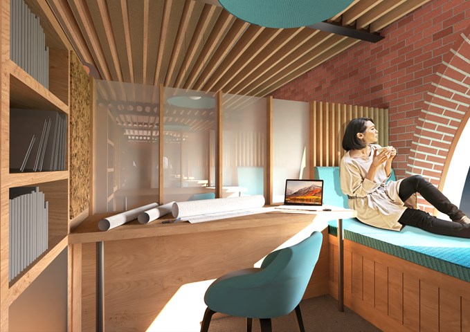
Interior View of the Study Bay - Shivani Sarjan
Laurieston Education Hub
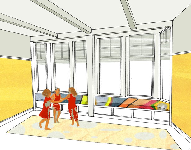
This view depicts the 'Study Bay' a custom piece designed to create a semi isolated space to study or work. It maintains a relationship with adjoing bays and centers around a large window with a shallow embrasure.
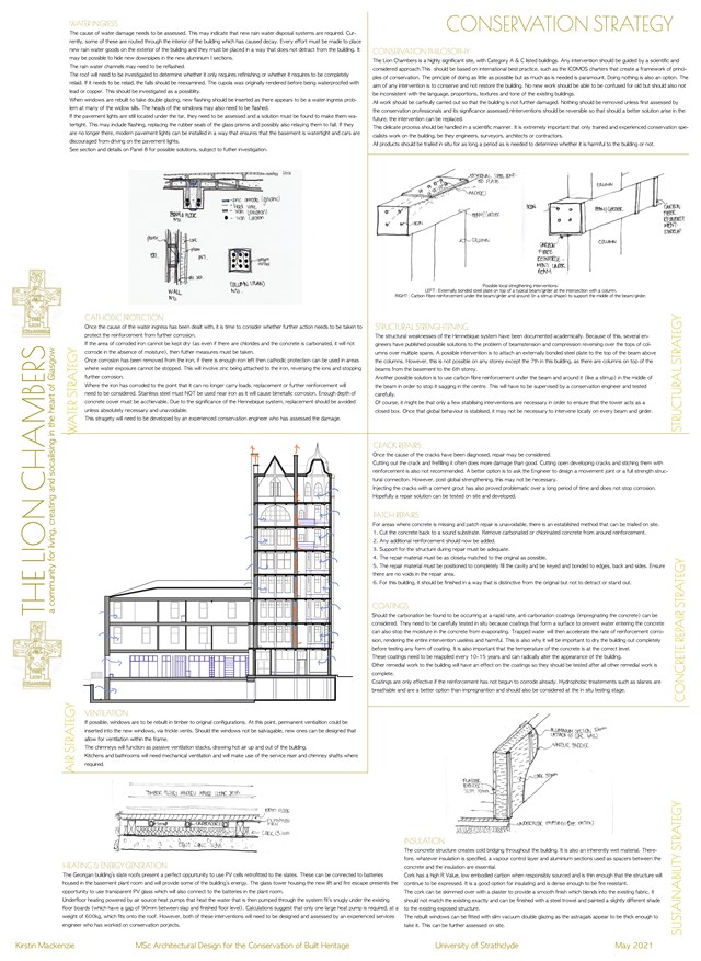
Conservation Strategy - Kirstin Mackenzie
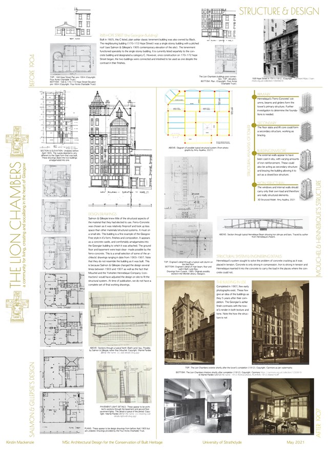
The Structure & Design of the Building - Kirstin Mackenzie
Models - Amelia Lepkowska
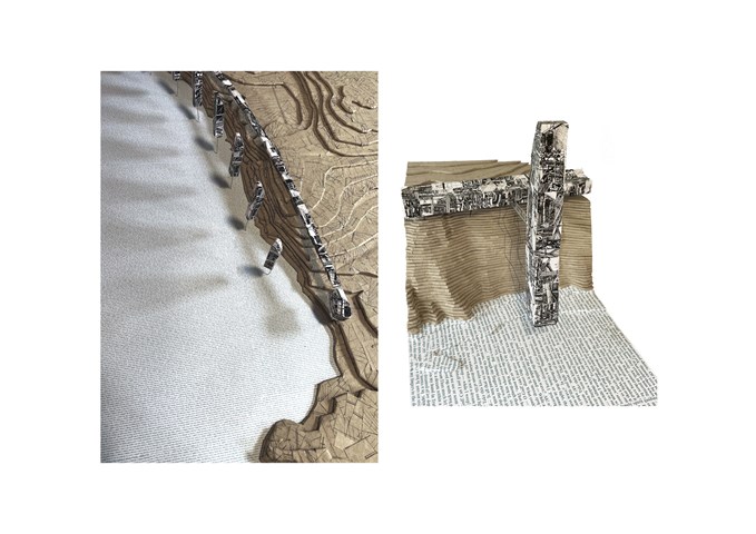
cardboard/cutouts of development drawings/cutouts of Edgar Allan Poe's poems about dreams

The Master Plan of an Individual Story - Kate Melhuish
The image shows the master plan in perspective, highlighting the Architectural Time Capsule in the foreground and along with other part of the master plan such as the proposed bridge, re-imagining of the Peoples Palace, New Housing Development and a more celebrated entrance of the north of the Green.
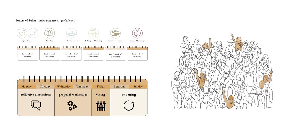
Programme for the Rhodope Council - Elena Stefanova
The Council decides on policies and laws in six sectors related to the local land and resources: agriculture, forestry, water resources, fishing and hunting, extractable resources, and renewable energy. Between the end of October and the beginning of December, a week of events is dedicated to each of the six sectors. Eligible members of the community have the opportunity to discuss previous progress, suggest, workshop, and vote on their proposals for the development of the region
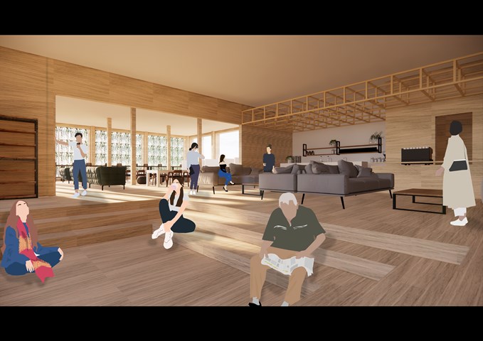
RENDERINGS: Co-Working Study Room - Gertie Leong Hei Li
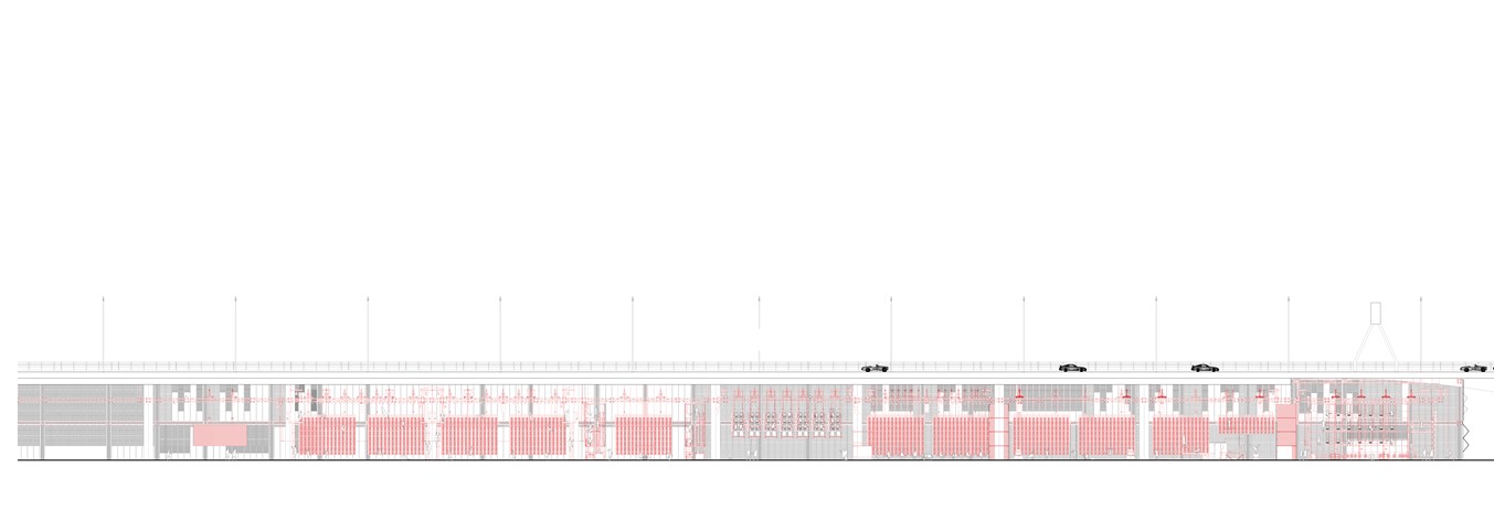
Section BB 1:100 - Conor Ryan McCormack
Down The Rabbit Hole_3B To Play
Down the Rabbit Hole_3B To Play.
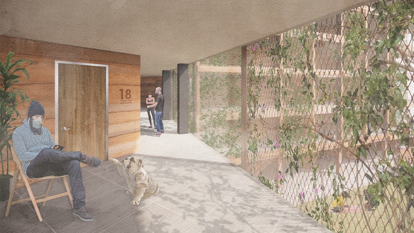
Circulation as an extension of the flat - Alfie Hollington
Design Studies 3a
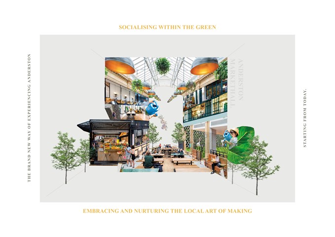
Design Manifesto - Gertie Leong Hei Li
The project design manifesto is to establish an art-related, green-connecting market hall within Anderston to tackle the problems of lack of greeneries, to promote art and cultural aspect within the site, and to tackle the shortage and fragile commercial aspect within the site in order to convenient the residents and thus, to vitalise and boost the energy within Anderston.
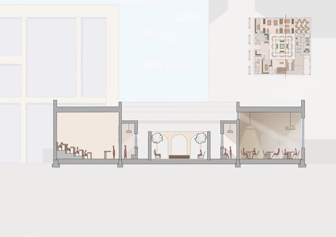
Section - Leena Hussain
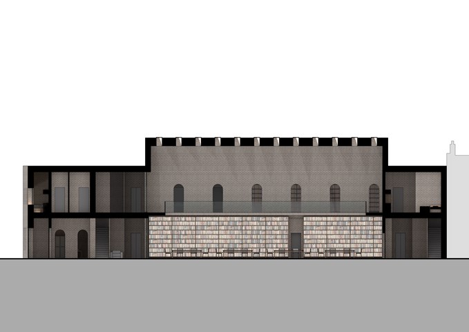
Section detailing a small lecture hall, an inner cloister, a courtyard and a reading room.
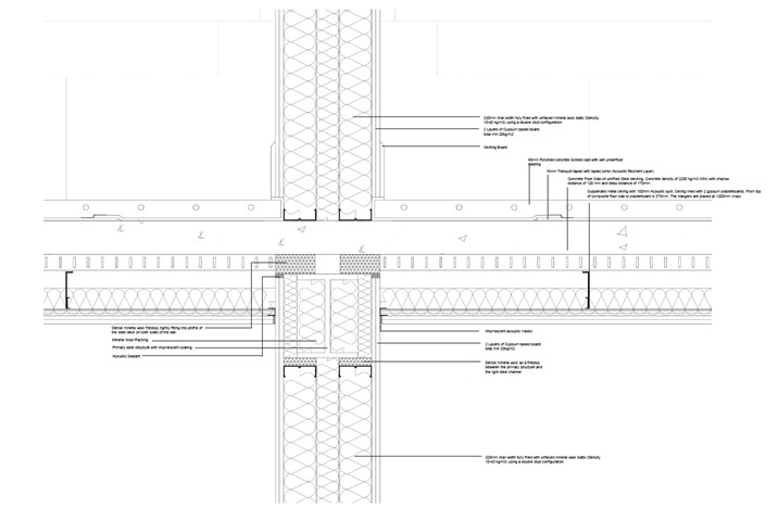
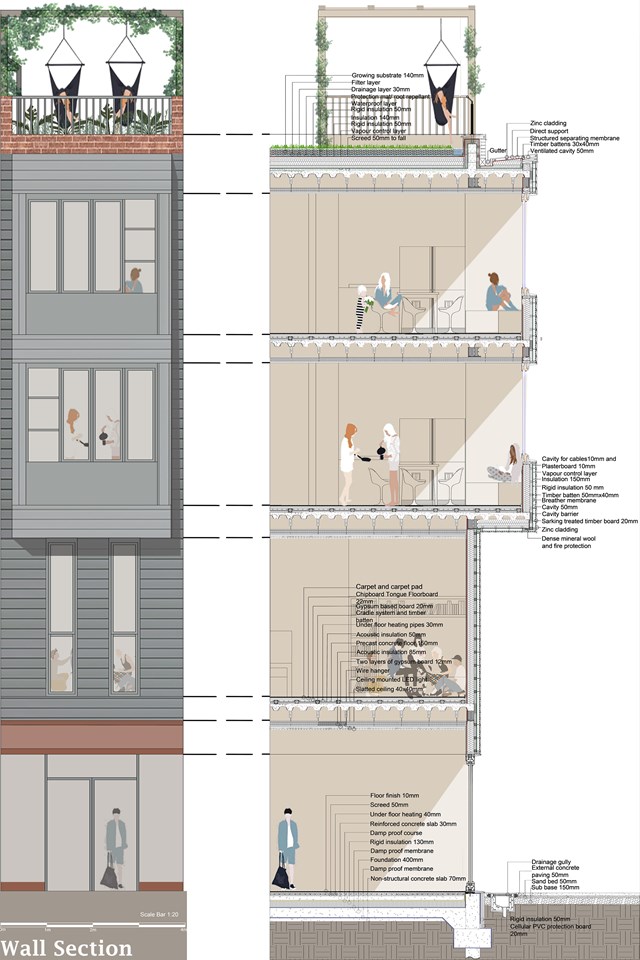
1:5 Technical Detail: Separating Wall & Separating Floor - Jakob Young
Housing Project: The Living Machine
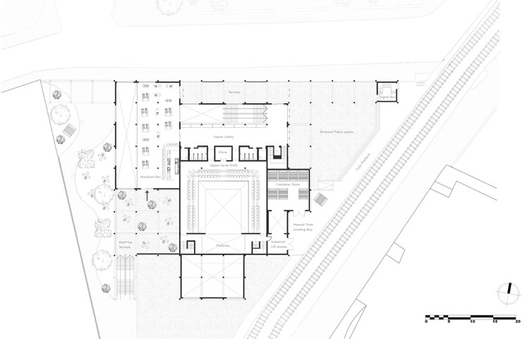
First Floor Plan - Jakob Young
Undergraduate Thesis: Merchant Theatre
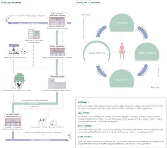
Fundamentals of The Lifeline - Shravan George
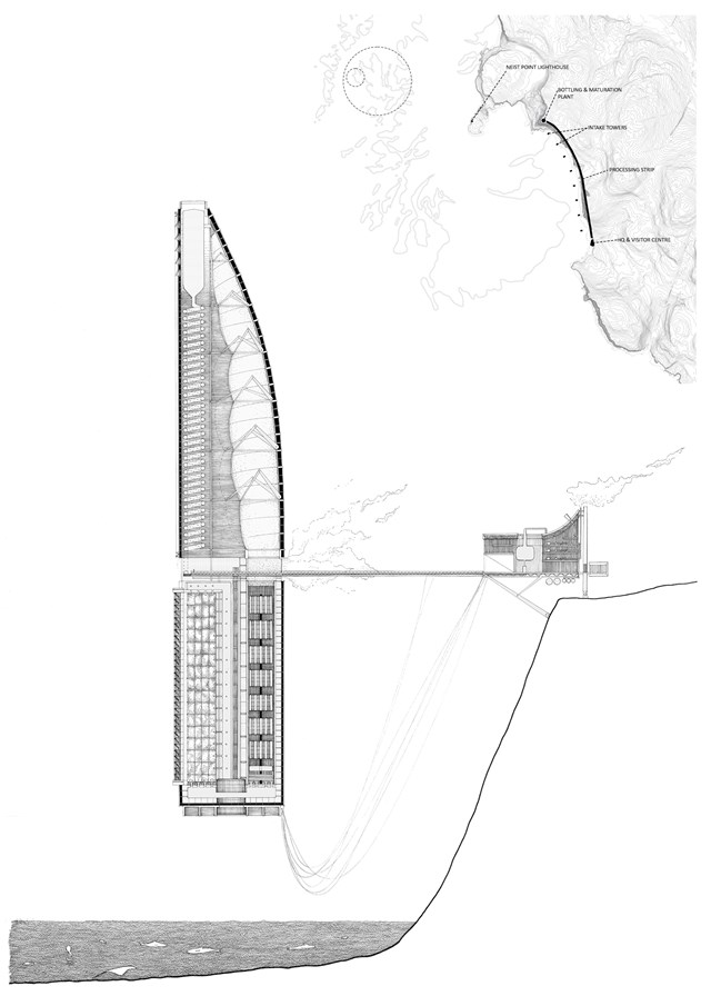
‘The Lifeline’ acknowledges London’s vast portfolio of abandoned infrastructure as an opportunity and an important medium for addressing the urgency at hand. At the heart of the project is a circular, zero-waste food production system that thrives on the flow of materials and waste products between the four food groups – Aeroponics, Aquaponics, Insect Farming and Algae Farming. These have been identified as four food groups that would be prevalent in our future diets based on research carried out in the 5A publication.
While the abandoned tunnels provide controlled environments that are vital for aeroponic and aquaponic systems, the retrofitted buildings serve as physical manifestations of ‘The Lifeline’ at the surface and accommodate research centres, insect farming facilities, administrative offices as well as social and educational areas for public use. The controlled growing environments in tunnels and the associated systems in stations are made in a modular fashion so that they would be able to adapt to modern food trends and advancements in technology. The heat generated by the existing tube network, which would otherwise be lost to the environment is harnessed to power The Lifeline. This makes it possible to produce food with no reliance on conventional sources of energy. Moreover, algae tubes installed in the streets help remove excess carbon dioxide in the atmosphere.

Andrew McCluskie
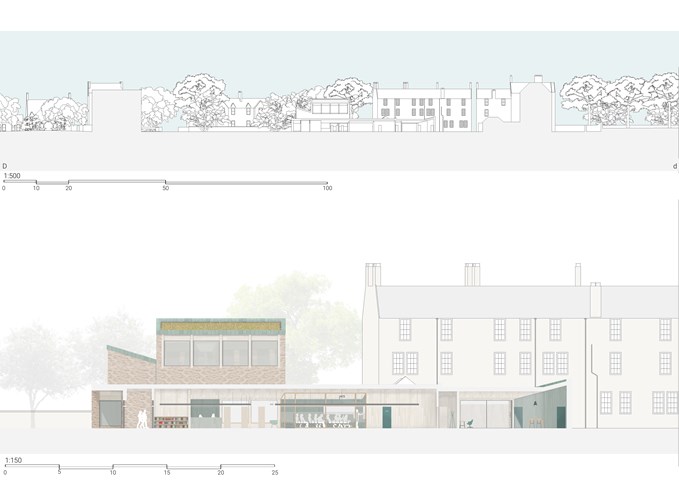
1:500 Elevation to Old Dumbarton Road
The façade is made mainly from stone slips formed from the existing on-site wall into which the new building embeds. Zinc Accents set within announce the programme within the wall sandstone. As the stone will match perfectly once weathered, the building should integrate with context as if it had always been there. In order to match the height datum of the existing wall, ceilings indoors have been raised to 4.5m which has resulted in better views to Benalder Bridge (the building’s physical connection in streetscape to Partick) from the Roofscape.
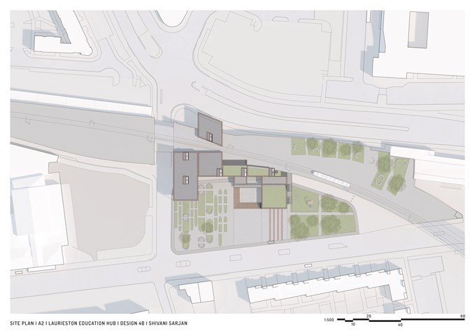
Site Plan - Shivani Sarjan
Laurieston Education Hub
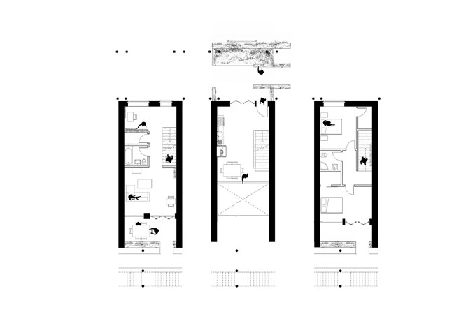
Apartment Type B: 1:50 - Conor Ryan McCormack
Allotment Living _3A To Play
Allotment Living_3A To Live.
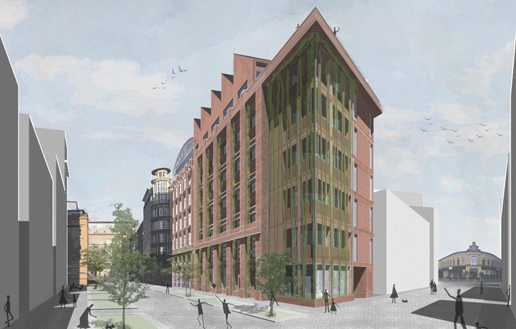
Housing Project: 'The Living Machine' - Jakob Young
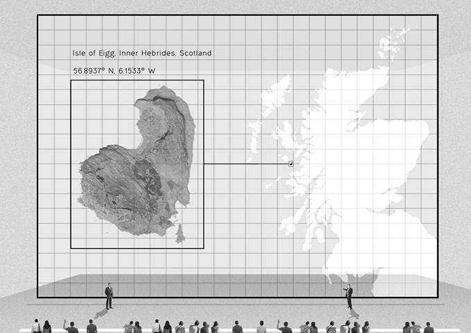
Site location - Daniel Kelly
The Scottish government proposed new Scottish new towns located on the highlands and islands to deal with the overpopulated central belt. One of these site locations is on the Inner Hebridean Isle of Eigg.
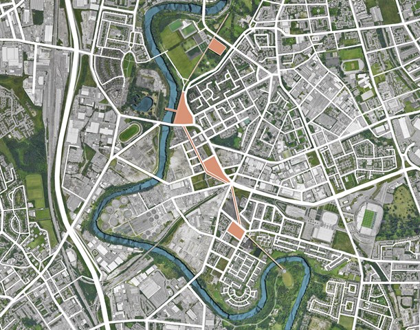
Immediate masterplan - Angelika Hajdasz
The project proposes a network of allotments connecting commonly used green areas of Glasgow (Glasgow Green, Richmond Park, Cuningar Loop) with the centre located on the opposite side of River Clyde from Richmond Park (Bridgeton). The masterplan proposes a pedestrian-only promenade located on French Street, which is connected to the Hub via viaduct. The route is established through series of interventions and allotments.
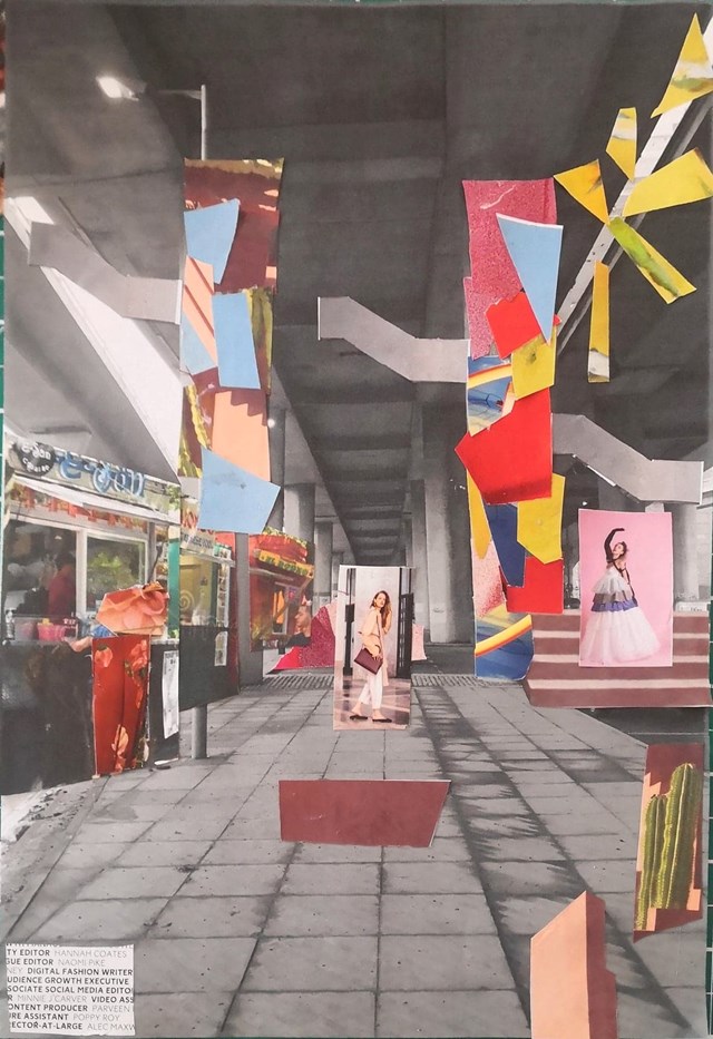
Handmade Collage, envisioning Concept. - Conor Ryan McCormack
Down The Rabbit Hole_3B To Play
Down the Rabbit Hole_3B To Play.
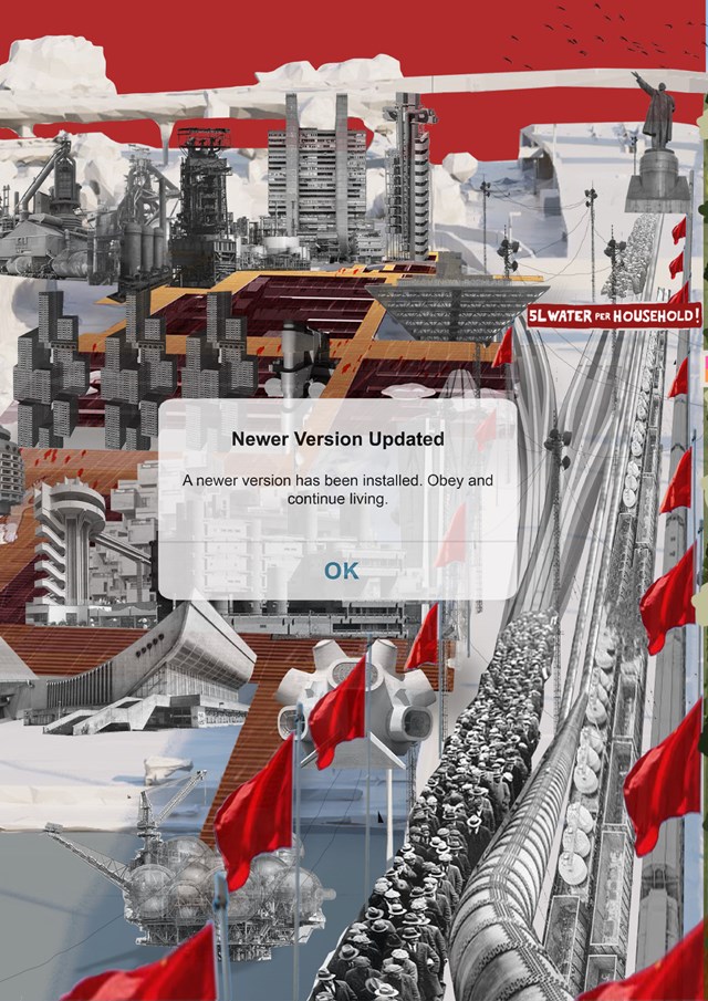
RULED OVER - Gertie Leong Hei Li
Design Studies: Workshop
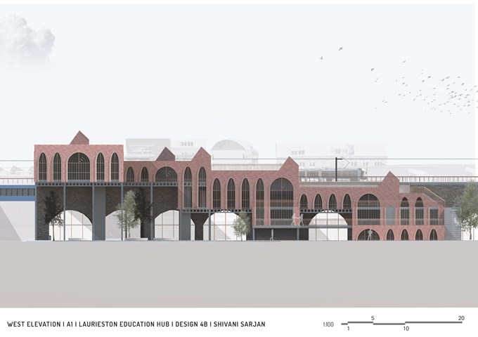
West Elevation - Shivani Sarjan
Laurieston Education Hub
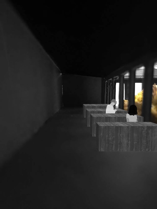
Study Booth View - Eilidh McGuigan
The main idea of this library design was to create a central focus around the wild flowers within the central garden space.
Within this, there was strong inspiration from the architect, Peter Zumthor, who believes, “A garden is a very intimate space. It requires care and protection. To do this, we encircle it and give it shelter. The garden then becomes a place.”
From this, I designed the study spaces around the garden so not only does the garden become a space to dwell and reflect, but the shelter also allows the person to be taken away from the street and left with the garden in a quiet intimate atmosphere.
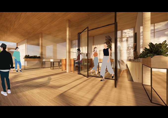
RENDERINGS: Creative Workshop with Balcony - Gertie Leong Hei Li
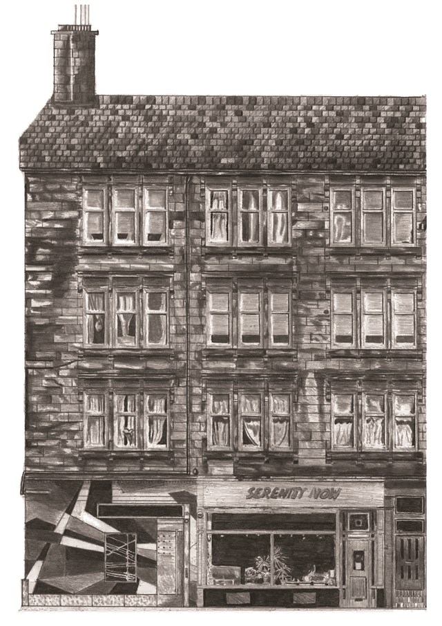
"To Engage" 1:50 Tenement Block Pencil Drawing - Samuel Sharkey
An exercise I will definitely take forward into future projects.
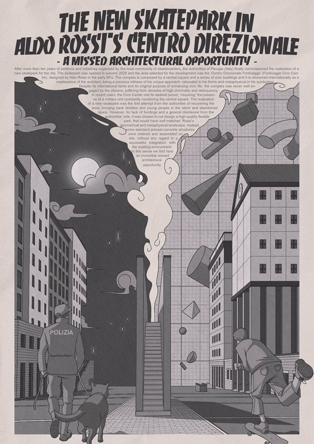
Cultural Studies Research Poster – Parallel Research - Giovanni Miscena
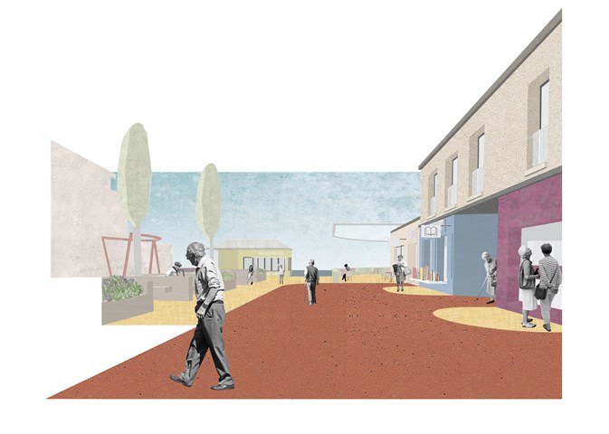
A. Entrance Buffer - Adele Melas
To avoid the implementation of a gated community, and strike a balance between safety and freedom, Entrance Buffer zones are located at the five entrance points of the neighbourhood, the majority of which are converted into green communal spaces. On the one hand, this allows social safety to be enforced and on the one hand and physical safety as green zones act as natural separators and means of slowing down the pace of movement. Importantly, accompanying each buffer is a Kiosk, which range from newspaper to coffee and flower stalls, and serve as discrete and functionally camouflaged security wardens. Hence, staff responsible for each kiosk have a dual role - to serve goods and act as security wardens for vulnerable individuals approaching these entrance/exit zones.
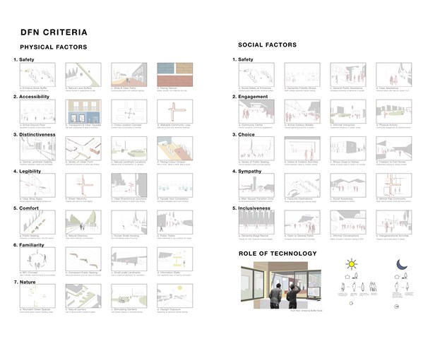
DFN Physical & Social Criteria - Adele Melas
Findings from Mitchell and Burton, the key pioneers in the field of dementia-friendly neighbourhood research, have distinguished six principles which should constitute a DFN: safety, accessibility, distinctiveness, legibility, comfort, and familiarity (Mitchell et al., 2010). However, these factors focus primarily on the physical environment of a neighbourhood. Thus, for the environment to play a more holistic role in managing and preventing dementia, social factors such as safety, engagement, choice, sympathy, and inclusiveness, are proposed to accompany the existing, physically orientated set of criteria.
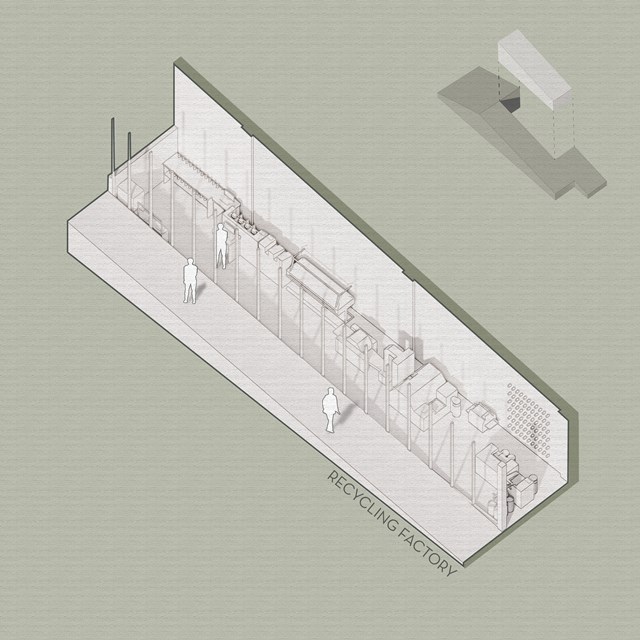
Recycling Factory - Viktoria Georgieva
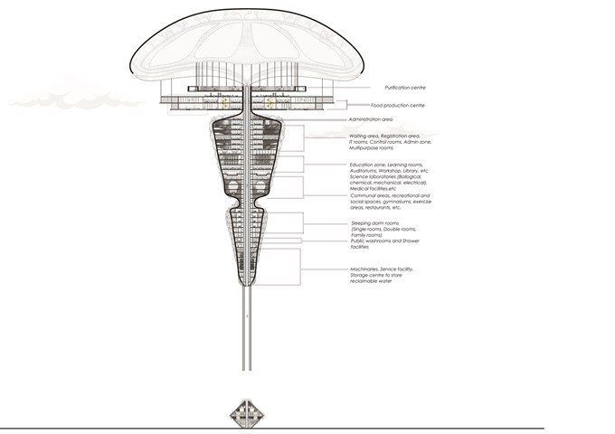
Long section of The Floating Facility and Plans - Sania Halim
The [PH] floating terraformer, as the name implies, is designed to float in the air using maglev technology. The repulsion induced by the structure’s magnetism and the earth’s magnetic field would regulate the buoyancy of the structure, causing it to migrate up to altitudes of 700m, where acidic contaminants typically congregate. Acidic materials, such as acid fog, will be absorbed by the porous membrane attached to the airbags and accumulated in the central purifier, where they will be neutralized by an alkaline solution formed by nitrogen-fixing microorganisms by biological activity and deposited in the purifier center. The water and salt generated during the neutralization process are fed to plants, trees, humans, and deserted areas, among other things.
Initial Location: Central Park, NY, USA
Program: 1500-2000 inhabitants anticipated
Total Height: 257.5 m
Status: Reviving atmosphere, Technological Research and Development
The terraformer will be seen as the first step towards a greener future without acid pollution, water scarcity and climate problems. Hence, reviving our ecosystem around the world part by part.
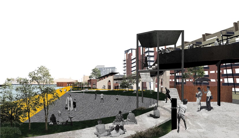
Urban Balcony 1- a perspective render. - Cham Zheng Chee
The entry of the Clyde promenade distributes the pedestrians in the form of an extensive urban balcony, a gradual gradient that eases into the site while distilling the permeable edges of the riverfront urban space that interacts with the adjacent building as well as the liminal spaces surrounding it.
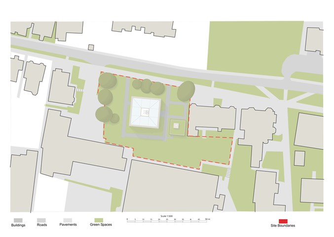
The Site - Freyja Lehnen
The project mainly occupies the upper half of the site as the site was already naturally split into two separate parts. The lower rectangle I left as it was in order to not disturb the view out off the neighbouring residential buildings.
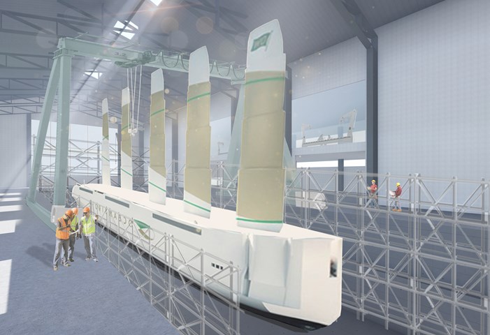
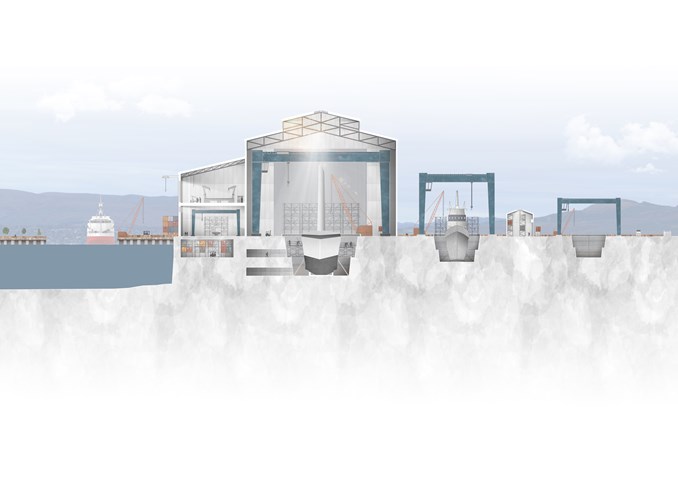
Interior on the Largest Graving Dock - Ellie Carroll
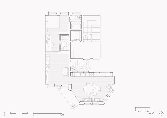
Example studio flat plan - Zachariasz Czerwinski
Design Studio 3A
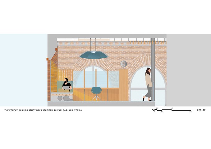
Section of 1 Study Bay and Balcony - Shivani Sarjan
Laurieston Education Hub
This Section cuts through one study bay and the mezzanine. It defines the deep embrasure created by the window which the bench fits into. The partition offers privacy without completely enclosing the user; using sheer fabric and spaced wooden elements. The shelf, defines the entrance to the space while providing a number for easy navigation. Finally, the large lighting element also provides a sound buffer.
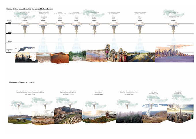
Circulation System for Acid Fog/Rain - Capture and Release Process - Sania Halim
The capture and release system of the floating terraformer of distributing water and cleaning air can be seen around the world, especially around the water-scarce lands and drought areas of North Africa, Egypt, etc, and deserted and devasted lands of Thar, Sahara, and Mohava, rainforests of Amazon and Africa and so on.
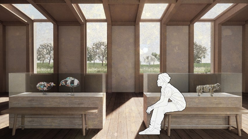
Interior view of the recycling museum - Carla Feraru
The recycling museum is seen as a standalone space for the local community as well as the last stop on the visitor tour. Here, objects made by local artists or produced in the workshop on-site from recyclable, reusable or by-products from the recovery facilities are displayed to encourage and celebrate the creative and innovative use of discarded materials.
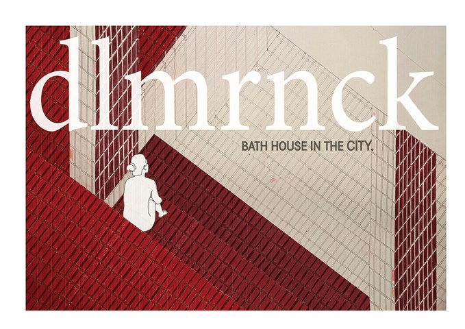
Materiality investigation - Jessica Gear
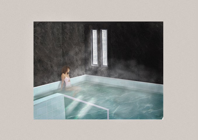
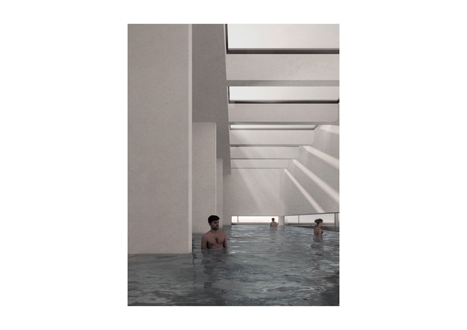
Colour pencil drawing of the interior quality in the bath house element of the scheme
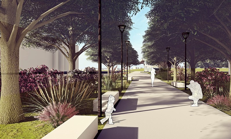
Promenade - Angelika Hajdasz
The Promenade is located on French Street, which currently is used as street parking. It is a pedestrian-only route, from which vehicles has been redirected to Colvend Street. By removing cars from the street, space became a safe and pleasing environment full of nature and small architecture to slow down a little, sit, relax and enjoy the view.
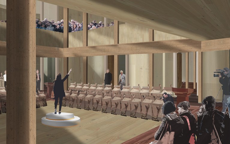
Main Chamber Presentation Visual - Antony James Graham
In the heart of the building is the main debating chamber, located on the first floor, where the public and representatives debate, discuss and partake in events, conversations and moments to make change and be heard in the community. The rich interior of woods is a contrast to the ridged stone façade. The main chamber is flooded with natural light creating an atmospheric space of light, shadow and materiality when the activity is high. The exposed structure adds to the character and spatial quality of the volume drawing attention upwards to the gallery and light above.
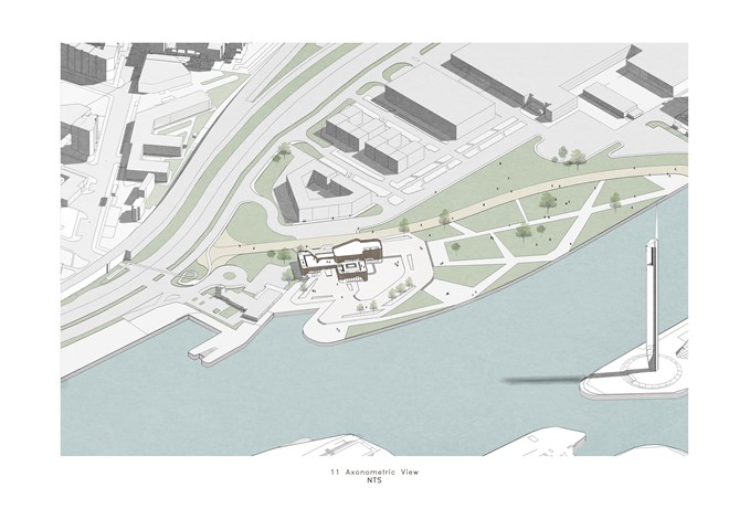
Axonometric View - Diyana Mohd Fuad
The building and the proposed masterplan.
Due to the lack of context, several elements were introduced into the site -
some of which are residential building blocks, and the wide open park.
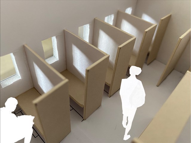
Study Carrel interior view - Lewis McLynn
Interior perspective from Library design.
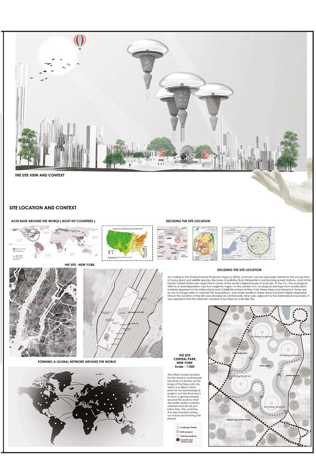
Welcome to the Grand opening of The Floating Terraformer, World Fair, Central Park, NY ( The Manifesto ) - Sania Halim
Pollution is one of the most significant challenges that humanity is facing right now. Pollution percentages have been rising exponentially since the 18th century’s industrial revolution. This industrial outbreak has caused a variety of environmental problems, including ozone layer destruction, decreased oxygen-to-carbon ratios, and acid deposition.
Acid rain washed out trees in Europe, wiped out wetlands in areas of Canada and the United States, and affected human health and crops in China, where the problem remains. The cause was sulphur dioxide and nitrogen oxides released by the combustion of fossil fuels in automobiles and manufacturing facilities such as smelters and coal-burning utilities. When these atmospheric toxins react with water and oxygen in the soil, they chemically convert into sulphuric and nitric acid. The ecosystem disruption caused by acidification is clearly seen in the Adirondack and Catskill Mountains of New York in the eastern United States. Many wetlands and streams in these regions are no longer capable of supporting aquatic populations, and water quality is severely impaired. To combat the acidity crisis, the project ‘the [PH] floating terraformer’ has been set out at the midst of New York City in Central Park. The project’s goal is to create a system that gently removes acid and toxins from the atmosphere while emitting zero carbon in the process.
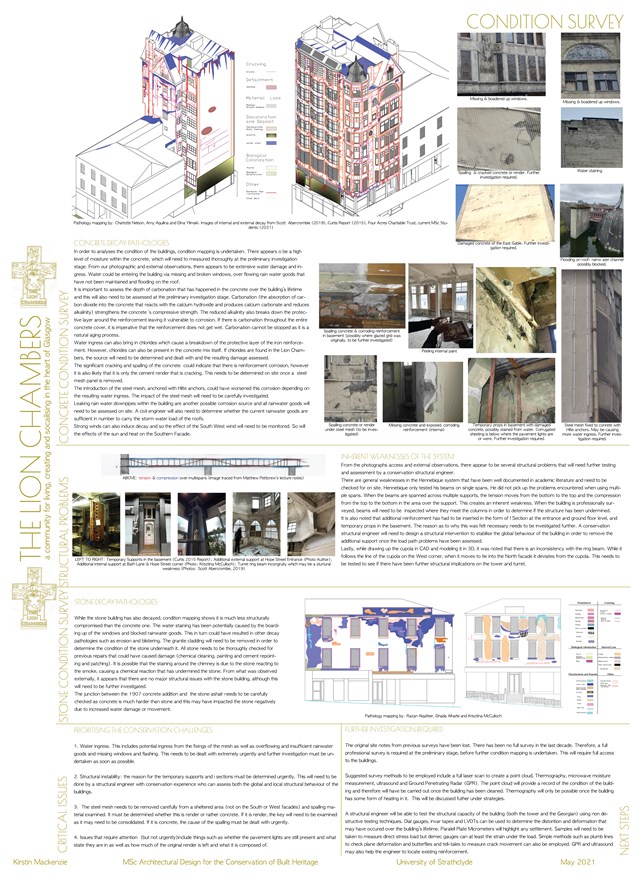
Condition Survey - Kirstin Mackenzie
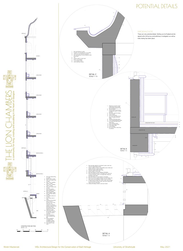
Potential Details - Kirstin Mackenzie
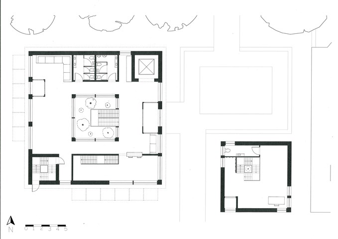
The Floorplans - Freyja Lehnen
The concept for the flooplans was to have an entrance area to the east, a more private area to the south and the north and west sides of the building are the main feature of each floor. There are also three points of circulation running on a diagonal through the building, the lift to the north-east, the main staircase in the middle and the fire stair to the south-west.
Andrew McCluskie
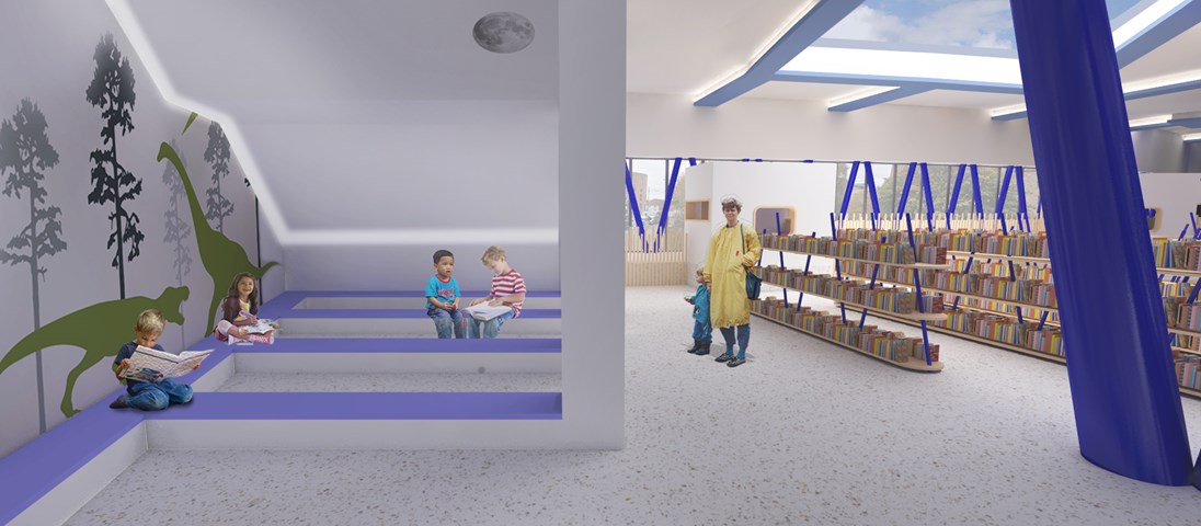
Reading Area for 4-5 year olds
After the design of the external stair above, the lighting conditions beneath created an opportunity for a “secret cave” space at the West end of the ground floor plan. This means 4-5 Year Old Children are provided with a space whose atmosphere is evocative of storybook setting. The wall decals are intended to add to this effect. A hidden strip LED will illuminate the space while its discretion ensures retention of the imaginative atmosphere.
In contrast, the book storage is in a more traditional Library format to help children make the transition to traditional libraries when they get older. The largest of the rooflights gives sky views from this area, opening up the internal experience while planting around will screen the books from afternoon sun.
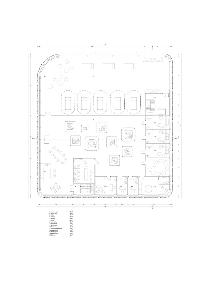
Second floor plan - Angelika Hajdasz
While H.E.R. focuses most on accidental counselling, there are mentoring rooms designed on the top floor of the centre. Mentors are qualified people who offer counselling sessions to those in need, without feeling ashamed of going to the psychiatric practice. The availability of services on-site at all times is a chance for hesitant ones to decide on seeking professional help on a ‘spur of the moment’ basis.
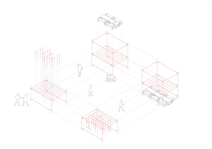
Scaffolding Structure Diagram 1:50 - Conor Ryan McCormack
Down The Rabbit Hole_3B To Play
Down the Rabbit Hole_3B To Play.
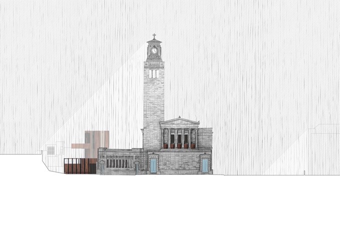
South Elevation - Alfie Hollington
Design Studies 3b
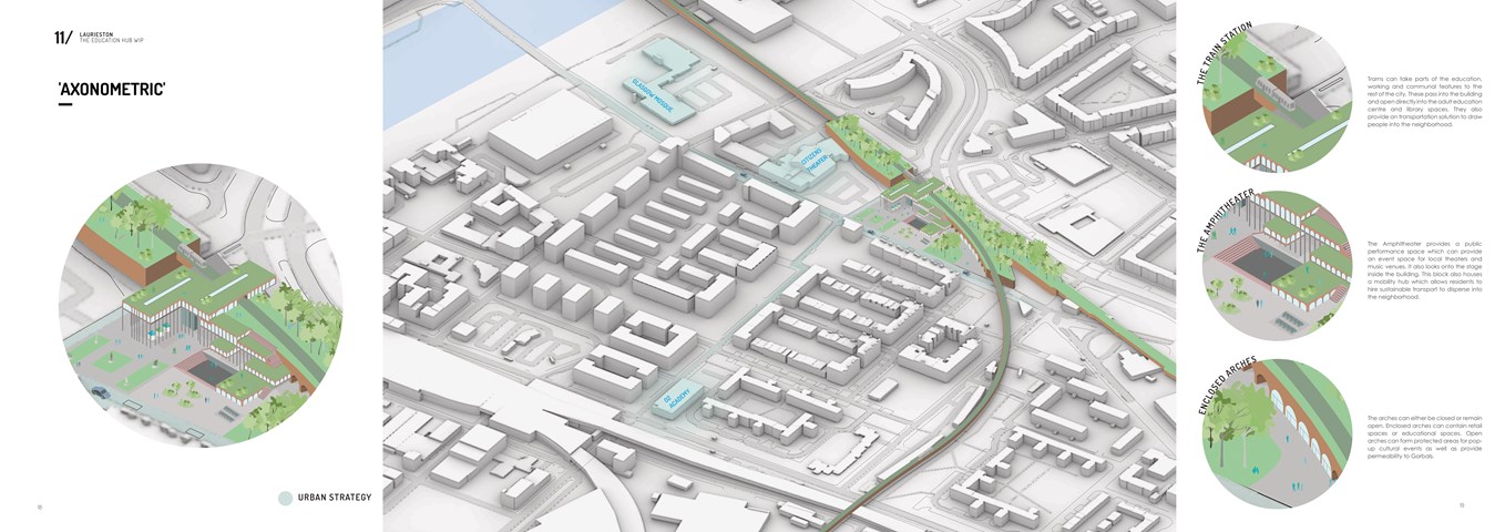
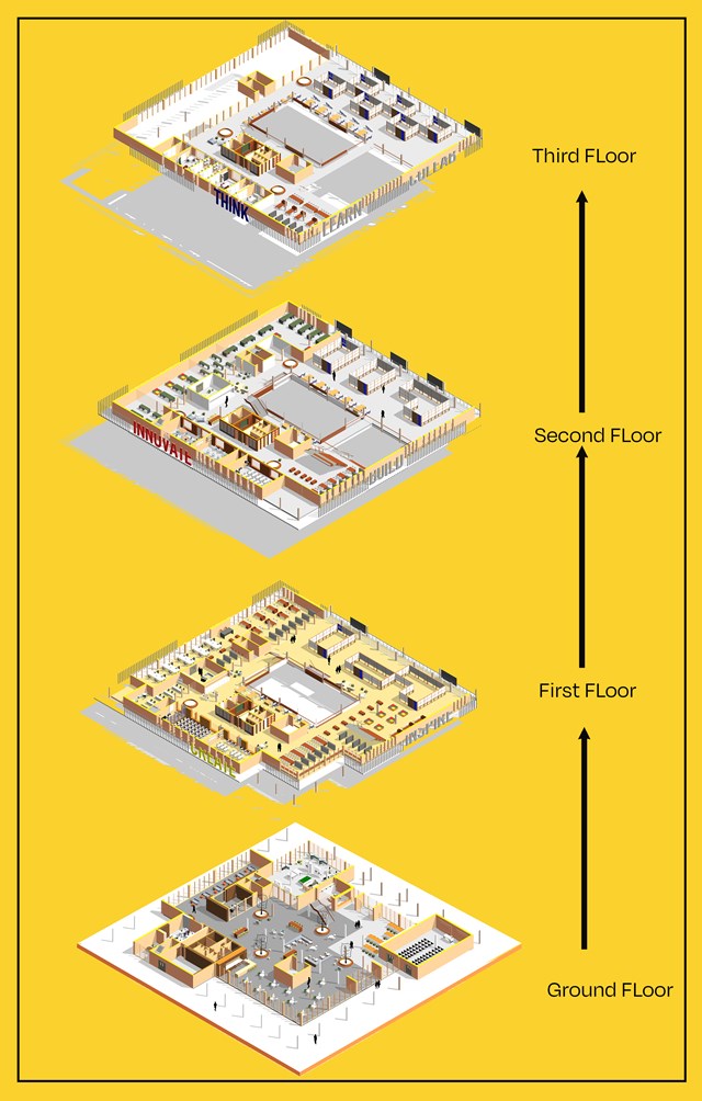
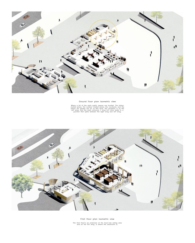
Axonometric Diagram - Shivani Sarjan
Laurieston Education Hub
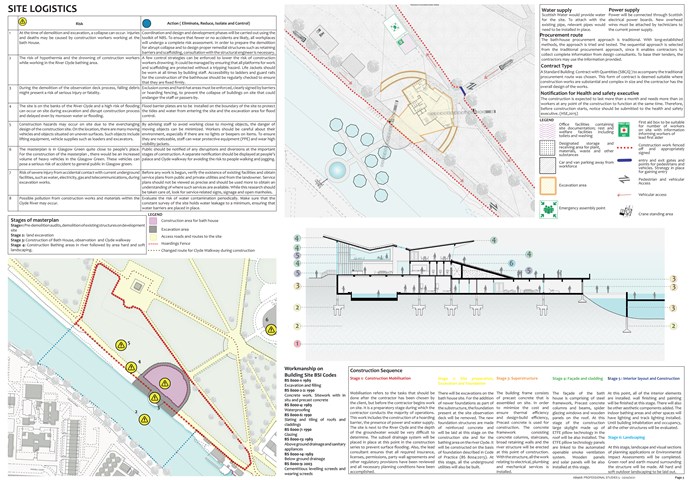
Site Logistics - Mrunmayi Pandit
Professional studies
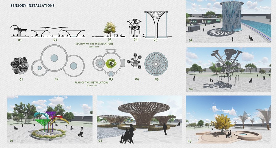
Sensory Installations - Mrunmayi Pandit
All sensory installations are inspired by the natural form of the tree and each of them depicts an element of nature. The first installation depicts lights and colour showing playfulness. The second and third one depicts wood and earth respectively showing natural landscape and sense of place. The fourth one depicts metal, Constructed to simulate the sense of sound. The fifth one depicts water giving the effect of rain and creating a soothing sound.
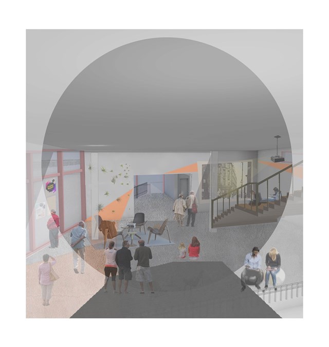
Interior view of the carers hub - Asya Gumus
This space is used as a joint activity space for both elderly with dementia and carers. Regularly organized movie nights, exhibitions, theatre and concerts will be held in this space for the locals to enjoy.
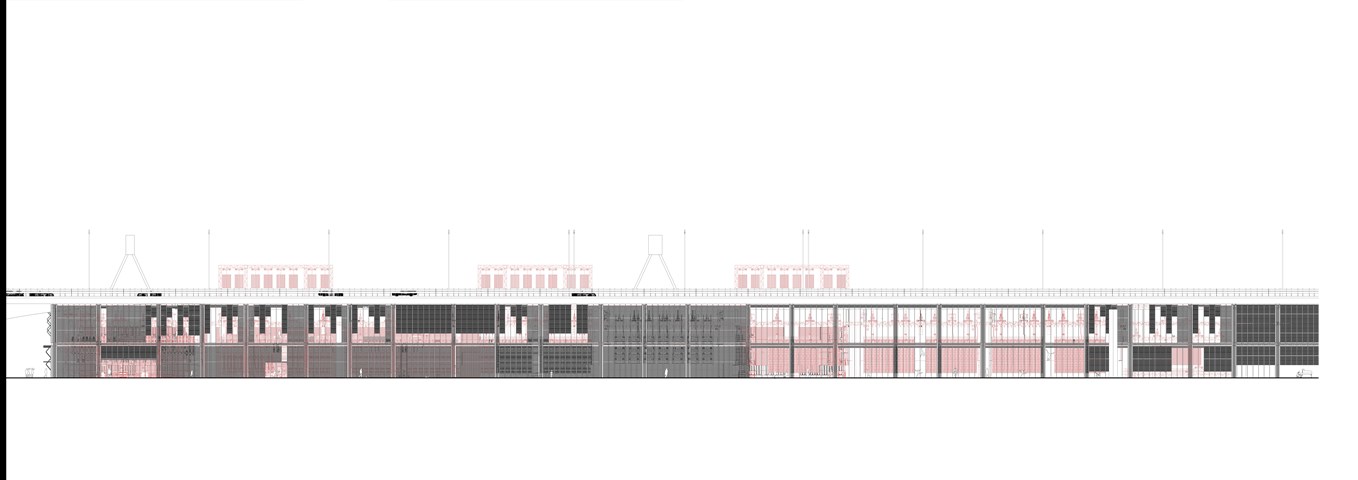
East Elevation 1:100 - Conor Ryan McCormack
Down The Rabbit Hole_3B To Play
Down the Rabbit Hole_3B To Play.
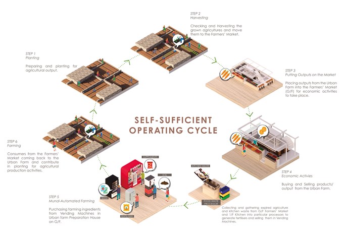
Self-sufficient Building Operating Cycle - Gertie Leong Hei Li
The building is promoting a self-sufficient operating cycle where customers from the Market will be able to contribute and participate in producing agricultural goods in the urban farm, then the outputs are to be sold back into the market. The Urban Farm operates with the 'Manual-Automatic' farming method where people come and purchase farming resources from vending machines, including fertilisers generated from any food waste in the Kitchen and Market hall. Moreover, Creative workshops are created to nurture the local art of making and the residents from Anderston will be able to come and enjoy the experience and share knowledge and ideas in the Co-Working Study Room.
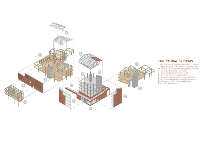
The Structure - Fiona Wylie
Construction of the building was heavily importance, taking sustainability and fire safety into account.
As an image for sustainability in the community, the majority of the structure is glulam post + beam with CLT floor panels, in attempts to reduce the amount of concrete used unless necessary. It’s lightweight, versatile, and provides a warm + natural aesthetic within the urban farm, reinforcing the idea of eco-industry.
Due to the tower being over 18m tall, it acts as an independent steel + concrete structure beside the timber structures, connected by an expansion joint. In case of fire the tower’s construction is non-combustible and a fire shutter can be placed in the atrium connecting the two structure types.
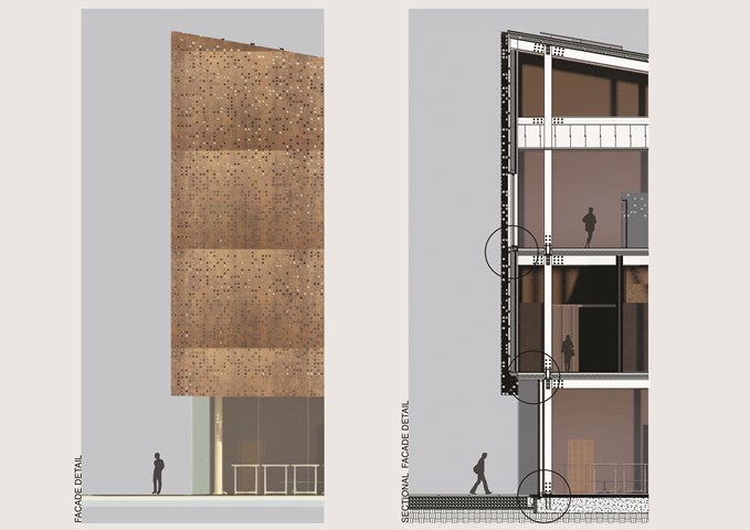
A weathered Corten steel facade was chosen to give the building a lightweight feel in contrast to the building’s size over the heavy historical wall, complimenting the colour of the surrounding red brick buildings in Tradeston. The metal is a nod to Tradeston’s metalwork history. The Matrix rainscreen cladding system align’s with the required A1 non-combustible facade buildup due to the height of the tower.
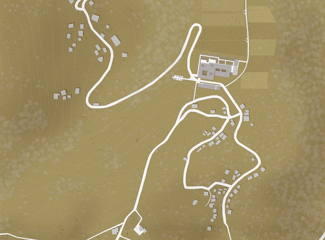
Site map of the village of Gela - Elena Stefanova
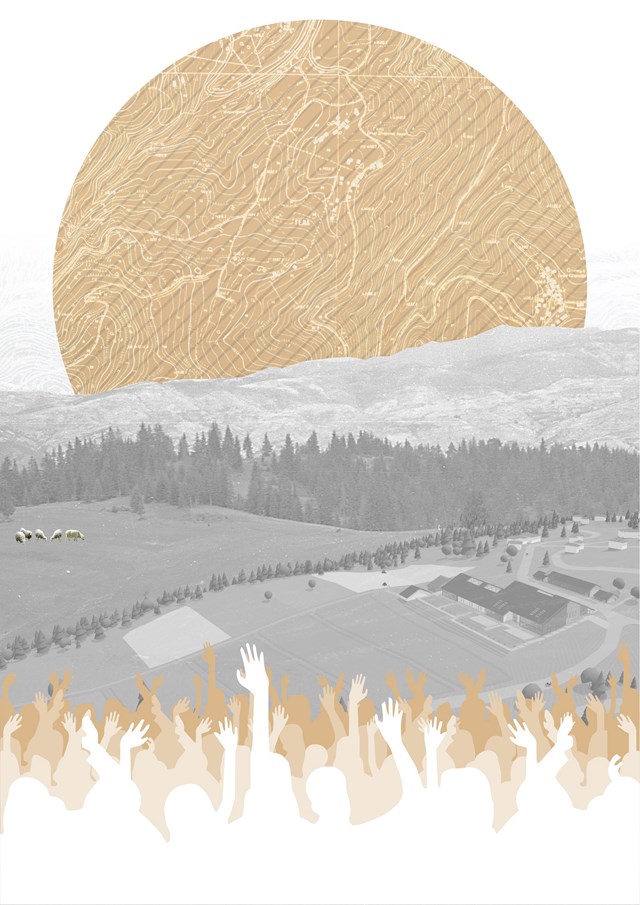
The site of the Rhodope Council and the Agrarian Institute is the village of Gela. Tucked away deep into the mountains, it used to be the site of a traditional gathering of local families
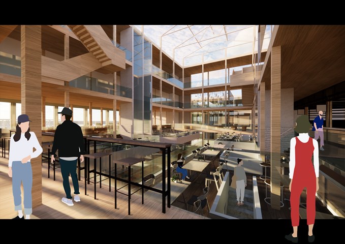
RENDERINGS: Kitchen/ Indoor Seatings - Gertie Leong Hei Li
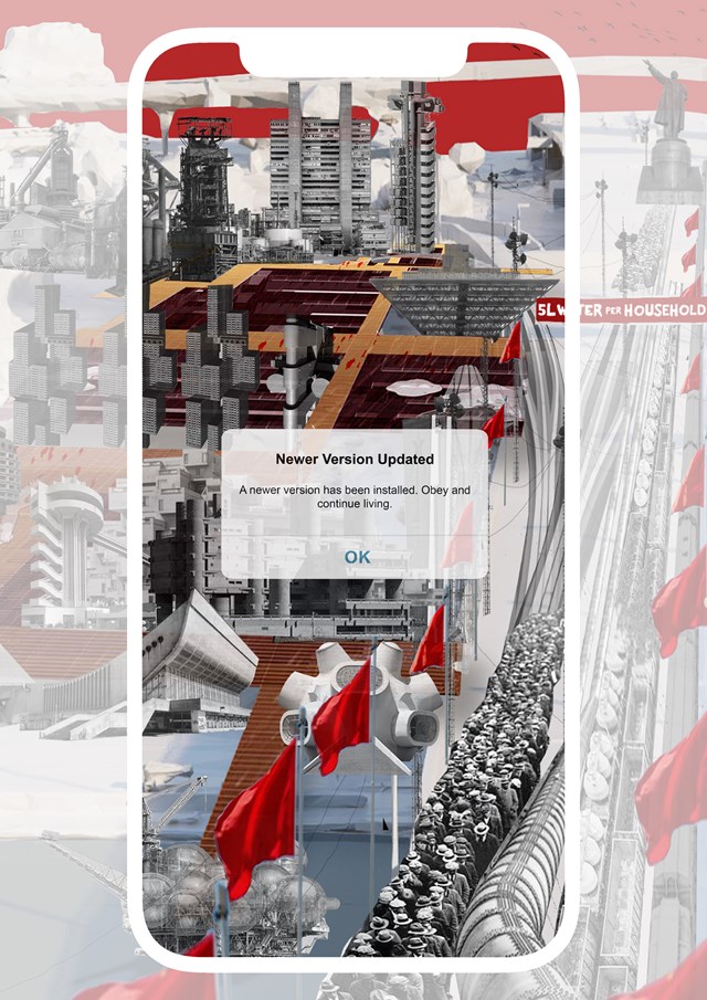
RULED OVER_v2 - Gertie Leong Hei Li
Design Studies: Workshop
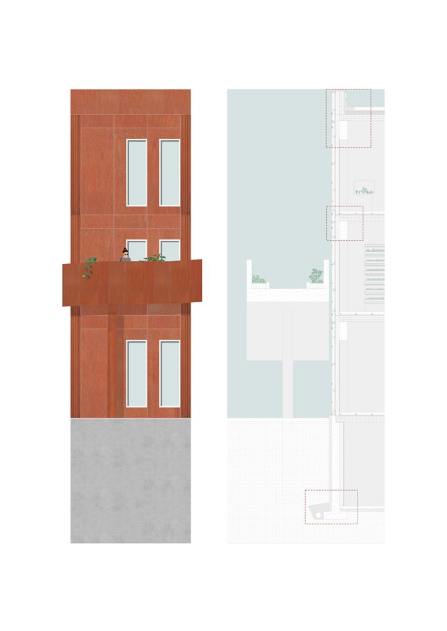
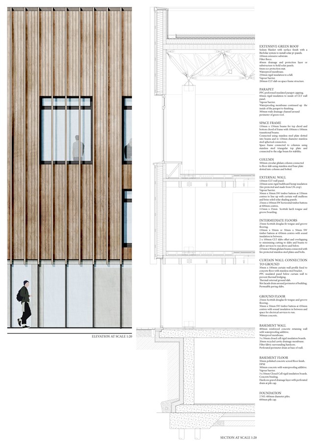
1:20 Detail Section & Elevation - Fiona Wylie
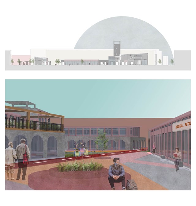
Section and exterior view of courtyard - Asya Gumus
Both images show the guiding masterplan route and individual buildings forming the central Anti-ageing hub.
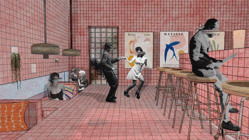
Changing Atmospheres throughout Spaces - Enbiya Yuecel
3B To Play
Second Star to the Right / 3B / To Play
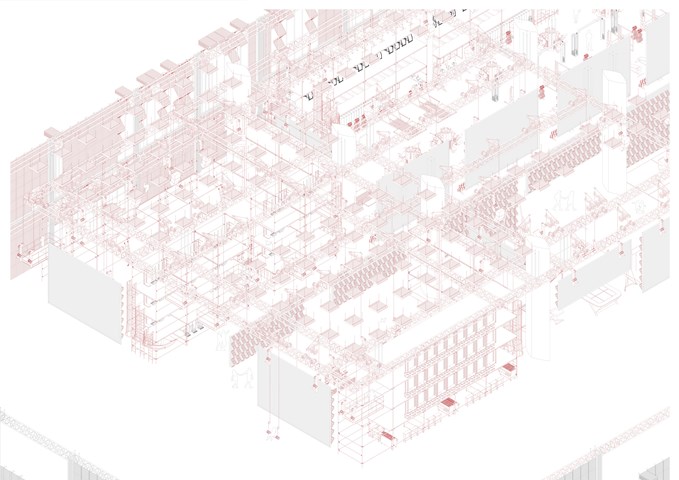
Exploded Axonometric Detail 1:50 - Conor Ryan McCormack
Down The Rabbit Hole_3B To Play
Down the Rabbit Hole_3B To Play.
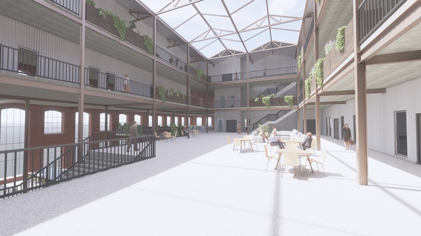
Main Atrium Space - Andrew Devine
This image highlights the structural elements of the existing cotton mill which, as well as the old wooden floorboards being repurposed to create planters around the atrium.
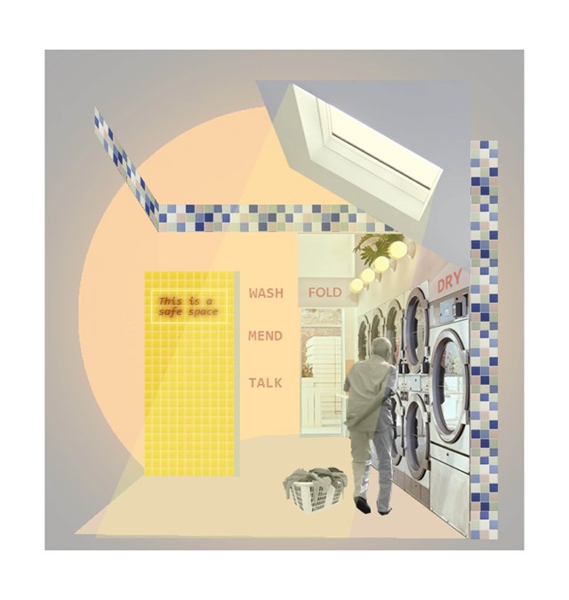
Example of a 'safe wing'- Laundrette - Asya Gumus
The laundrette is the most important medium sized intervention in this context as it is promotes an easy and independent activity that is also familiar to an elderly person. Informal encounters/ conversations can have a positive impact on an elderly persons daily life. The chosen coral/ yellow tones encourage social activity and invite the elderly to spend a longer times with their neighbours and other locals.
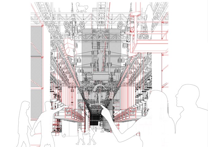
View of Consumption Space - Conor Ryan McCormack
Down the Rabbit Hole_3B To Play.
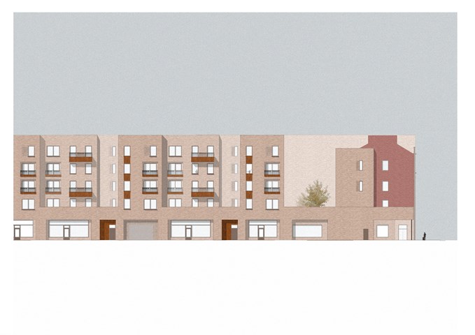
Street Facing Elevation - Sadie Sanchez-Ruiz Malan
To Live/Work
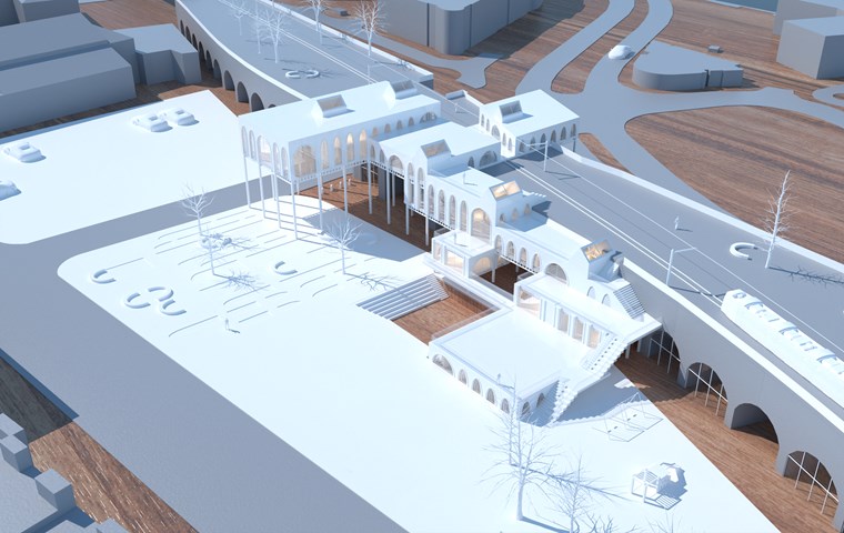
Aerial View of the Physical Model - Shivani Sarjan
This view of the Phigital model, shows the landscaping, the arches and how the buildings interact with them. It also shows the access routes to the building and the parking lot.
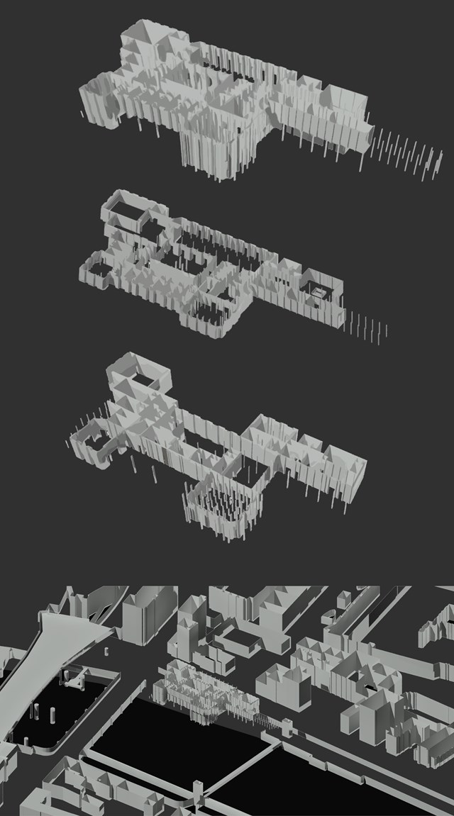
Exploded axonometric model in 3D Context site model - Antony James Graham
The 3D model allows for a thorough visual aid into the external and internal relationships of the building in relation the the special context of Clyde street, the River Clyde and the City centre of Glasgow. The model enables the floor plans, contextual plans and development investigation and research to be visually recognised in further detail.
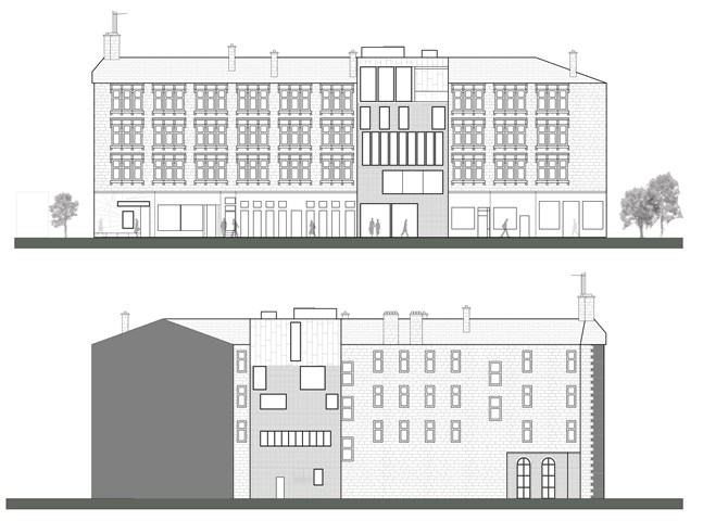
"To Engage" Blink Art Gallery CAD Elevations - Samuel Sharkey
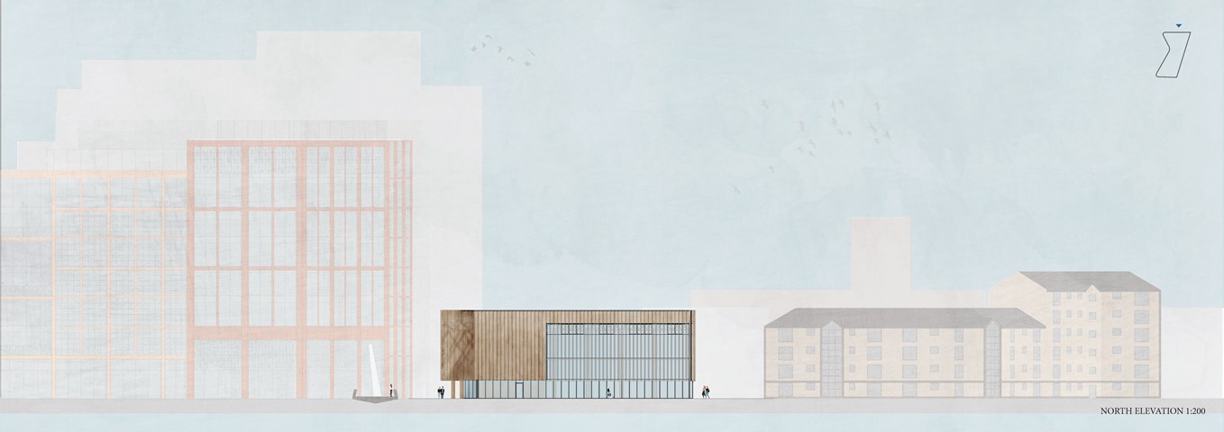
North and south elevations of the Kelvinbridge gallery in context.
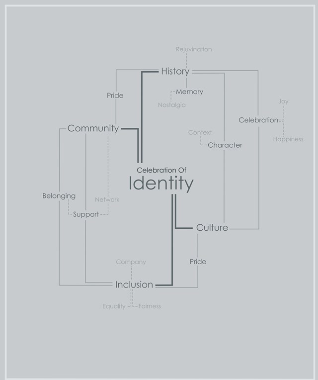
Mind-map Showing the Effects of Celebrating an Areas Identity - Kate Melhuish
There is a habit removing or hiding it history and not preserving buildings for use and signifying their importance leaving derelict site and buildings throughout the Clyde area. By removing these areas of importance from their neighbourhood in turn you lose the areas identity and this contributes to a loss of community and connection to the city along with perpetuation the rise in mental health issues. By celebrating a places identity and history, bringing these areas back to life for their communities we can bring people back together and create spaces for communities, increasing their connection to each other and to the city as a whole.
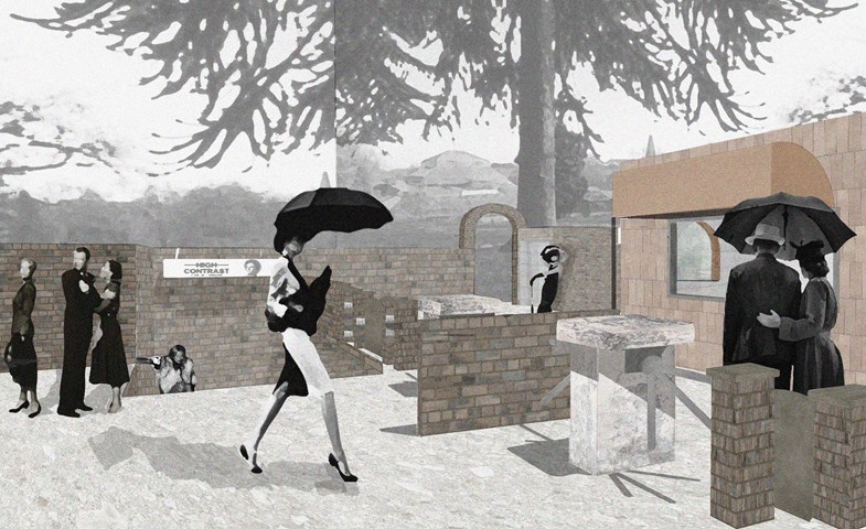
Discreet Glasgow Botanics Subway Style Entrance - Enbiya Yuecel
3B To Play
Second Star to the Right / 3B / To Play
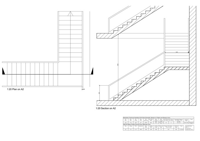
Stair Design - Laura Kennedy
1:20 Construction drawing of stair design. Using the technical handbook was vital to ensure that my design complied with the regulations.
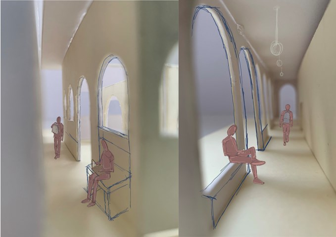
3D Internal Views - Leena Hussain
Sketch over model of inner cloister and entry walkway.
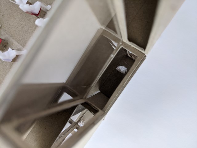
A Sense of Playfulness - Nathan Constable
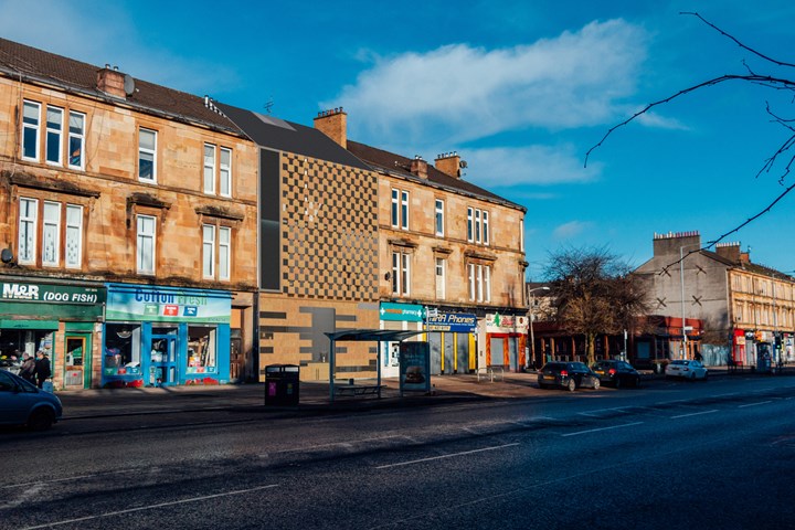
During the design process, a concept takes many turns. That is no more evident than here.
As can be seen in the initial sketches, the facade sat flush with the rest of the street. However, through digital and physical modelling and stretching the concept to its limits, a more attractive solution was found.
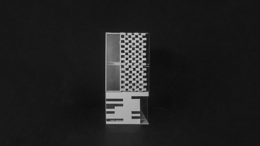
Initially for those walking at street level, they main attraction to the gallery was a paint marbled piece of art on the pavement which would utilise the colours chosen on the block idea and create a sense of arrival at the gallery. The chequerboard squares used in the very first concept drawing evolved to jut out into the street and allow those inside to view, connect and engage with the street from multiple angles (and later it was decided colours through the use of adhesives on glass), as well as create a sense of playfulness within the space and an additional draw for those on Byres Road or Great George Street. This was an idea taken from the themes used by Roderick Buchanan in his art.
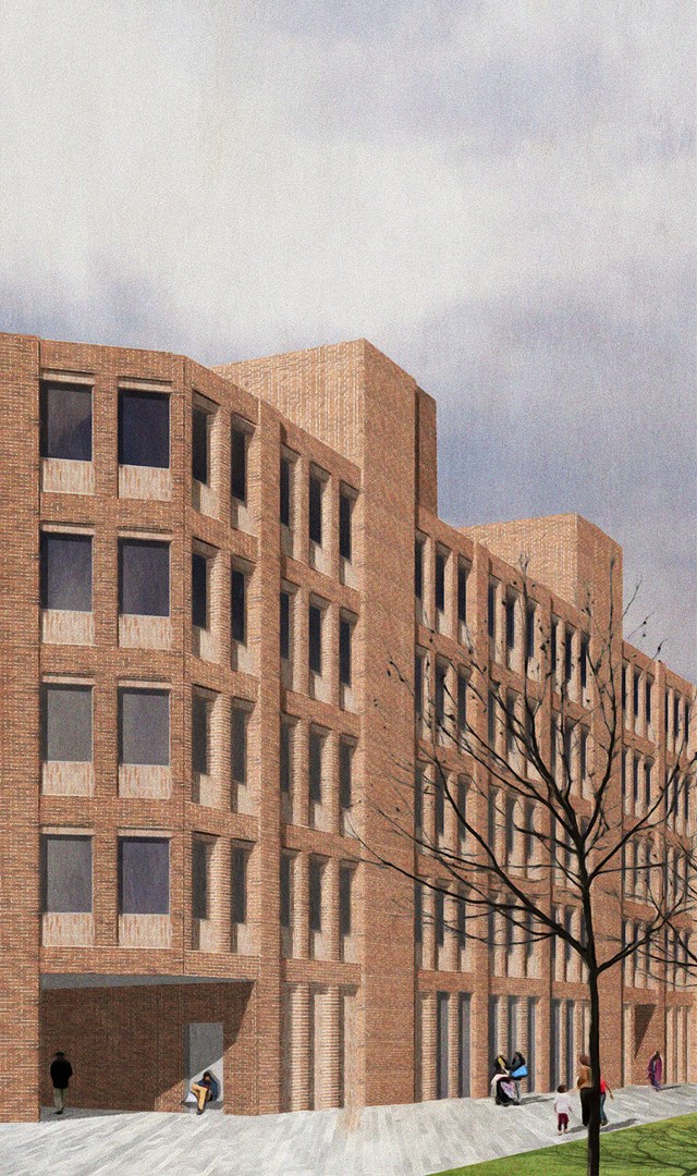
Design Studio 3A: Candleriggs Co-Housing - Zachariasz Czerwinski
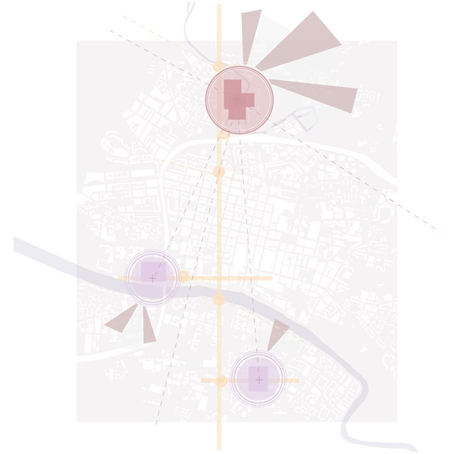
City Brief Diagram - Rebecca Irving
Sites were identified based on issues such as vacant and derelict land, feelings of safety, and areas of deprivation.

Arx | Plans and Sketches - Ami Coulter
The programme and activities of Arx are rooted in citizen ACTION. The current city space which embodies this energy most are its urban squares, symbolic spaces of communication, assembly and expression. Arx looks to embody the meaning of the word, become a fortress for the citizens, a refuge. An entity which can be equally and freely experienced by all users. Illustrated architecturally as a beacon within the city, re-appropriating architectural monuments of power / control / the state, and instead granting it to the citizens.
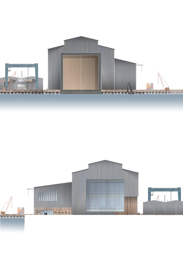
North and South Elevations of the Main Dock Shed - Ellie Carroll
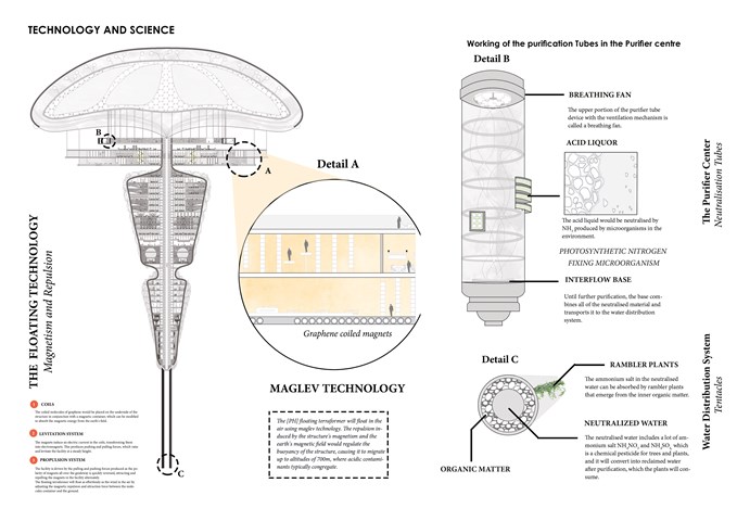
Maglev Technology / The Purifier Center / Water Distribution System - Sania Halim
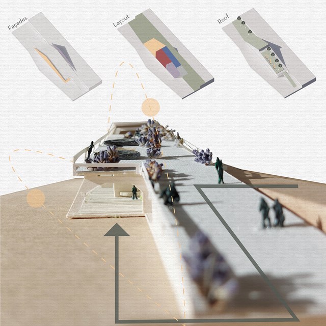
Concept - Viktoria Georgieva
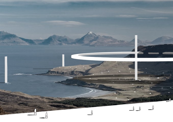
External Panoramic - Daniel Kelly
Perhaps what is most interesting is where the infrastructure intersect with the island’s topography, especially the mountainous areas. In this specific area to the north of the island the machines have carved out large, volumetric, atmospheric spaces that inspire the citizens to contemplate and become one with their minds within the atmospheric spaces provided.
The vertical elements of the infrastructure control the kinetic architecture whereas the human infrastructure is horizontal.
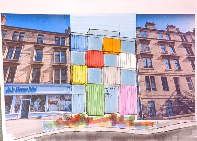
The Concept - Nathan Constable
As previously stated, colour is a key aspect used within this project and one that I want to feature in my future work.
Personally, I think a lot of architects shy away from using colour. I think it should be used for bold statements and that's exactly what I tried to do with this project - I wanted to create a gallery that looked like modern art, that contrasted its surroundings but still took aspects of them and twisted the rules to create a unique connection to the buildings' history. The rules of tenement design were brought into my design through the impression of verticality, continued floor levels to the blocks adjacent to my site and large windows to allow light into the spaces behind.
Key precedents for me included: the Mo-Tel House by Office S&M, the Mira Shopping Centre by Fondara and the Brandhorst Museum by Sauerbruch Hutton
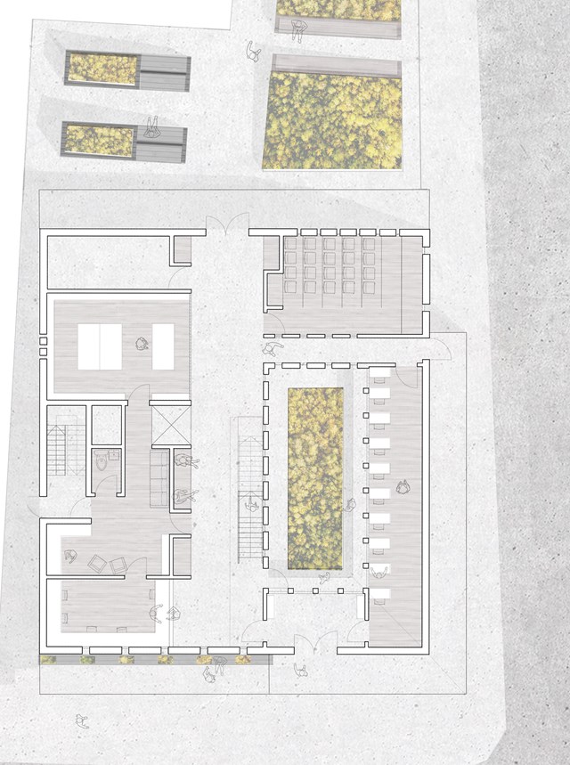
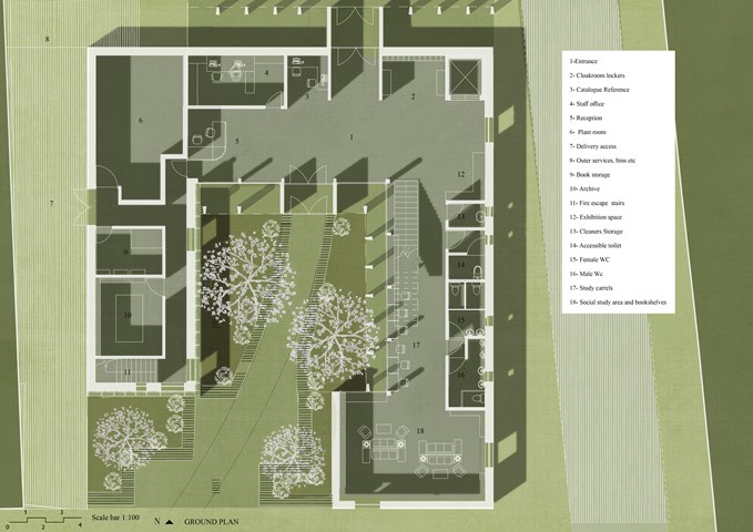
Ground Floor Plan Scale 1:100 - Eilidh McGuigan
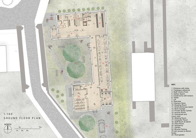
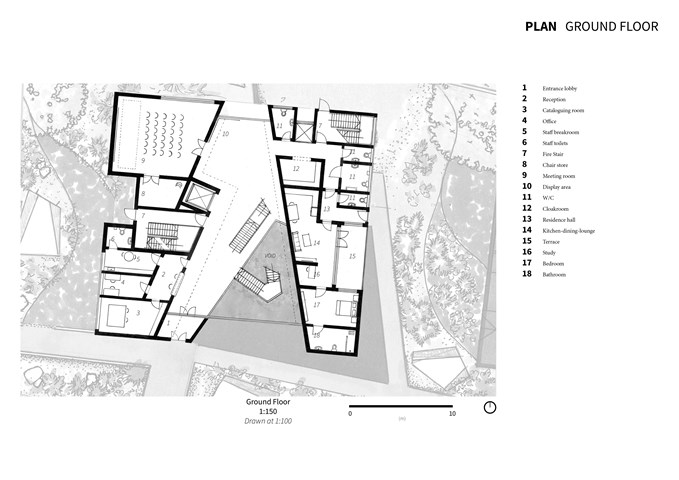
The ground floor plan showcases the main spaces of the building. To the left are the main service spaces that allow the building to function. This includes (from bottom to top) the reception, staff base, private fire stair, archive and plant room. The circulation space is given life with alcove benches facing the garden, and storage for students. By designing this space with a function, it prevents the circulation space from becoming a dead space, but gives it a bit of life and character.
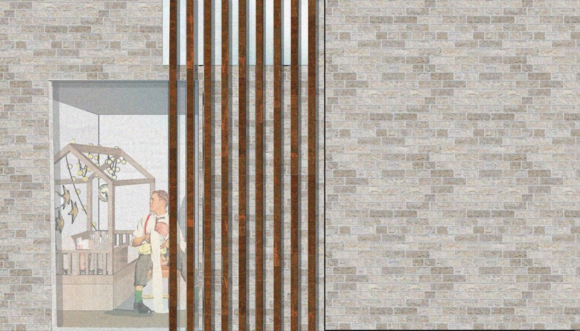
Window View - Enbiya Yuecel
An Urban Space opposite to Urban Life / 3A / To Live
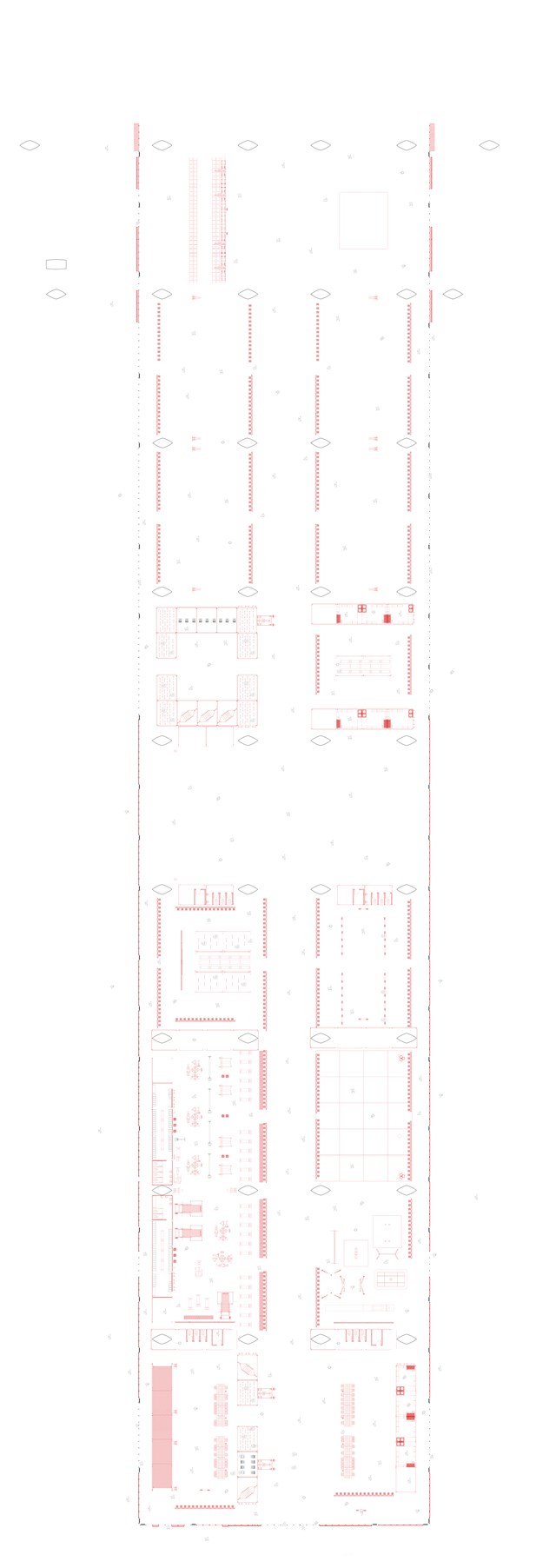
Ground Floor Plan 1:100 - Conor Ryan McCormack
Down The Rabbit Hole_3B To Play
Down the Rabbit Hole_3B To Play.
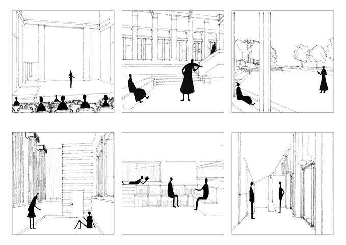
Storytelling spaces - Alfie Hollington
Design Studies 3b
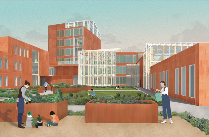
The Garden Approach - Fiona Wylie
The exterior view of the south side of the building, among the community gardening plots and the courtyard. Alongside the greenhouses, a secondary facade of algae growing panels are on the south side of the building to help generate renewable energy in the form of biomass, which then feeds back into an anaerobic digestor to create energy for the building.
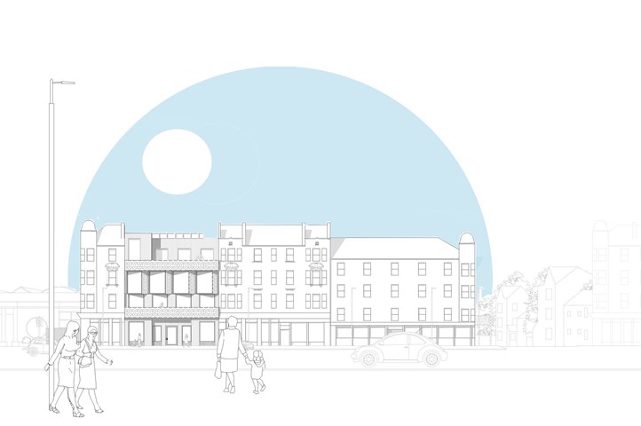
Elevation in Context - Eilish O'Donnell
I wanted to use this image to show my building in context, to play with the perspective by taking a simple CAD elevation and bringing it to life with movement and depth. This project has helped me develop my CAD skills and I aim to develop these skills further in year two.
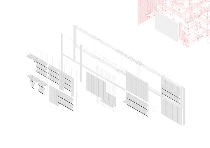
Exploded Axonometric Detail 1:50 - Conor Ryan McCormack
Down The Rabbit Hole_3B To Play
Down the Rabbit Hole_3B To Play.
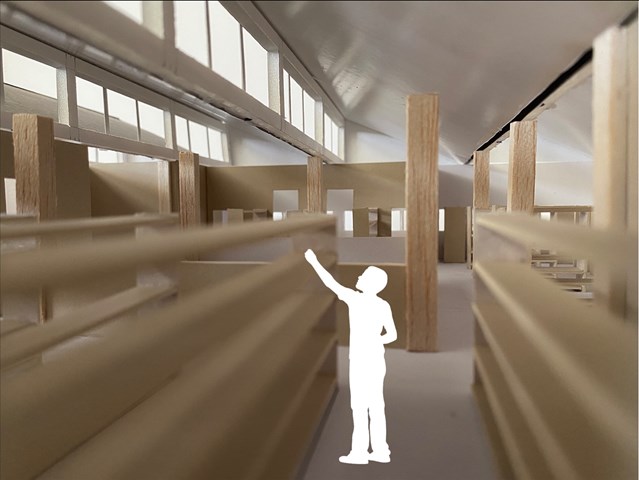
Second Floor interior view - Lewis McLynn
Interior perspective from Library design.
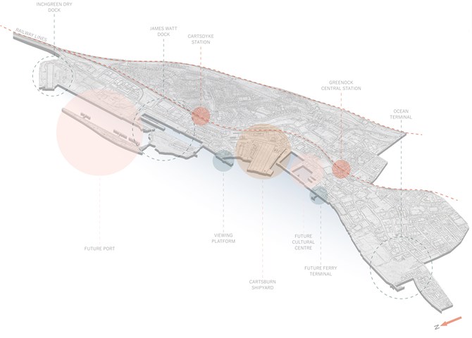
Future Riverfront Masterplan Diagram - Ellie Carroll
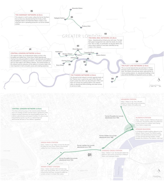
The Lifeline Network - Shravan George
The Lifeline consists of 5 distinct underground tunnel networks dotted across Greater London that are linked via the existing London Underground infrastructure. The produce that is grown in these networks is transported across the city at night using the Tube lines and is also made available at key Tube stations, markets and cafes.
The whole tunnel network extends for 50.3km, producing 17,605 tons of produce annually - fruits and vegetables for over 45,000 UK households and fish for almost 100,500 households. Notably, the network replaces 4600 hectares of traditional, unsustainable farmland which could have produced carbon emission equivalent to that of 2200 households. Moreover, The Lifeline also produces insects, generates employments for thousands of people and supports 10 local foodbanks.
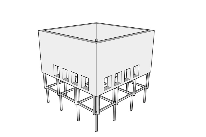
The Struture - Freyja Lehnen
The structure of the project is half load-bearing walls and half structural frame. The idea for this specific structural split came from tenement buildings that have stores in the lower portion of the building. The lower half is meant to be very open and advertising what is inside, whereas the upper half is more closed off and private.
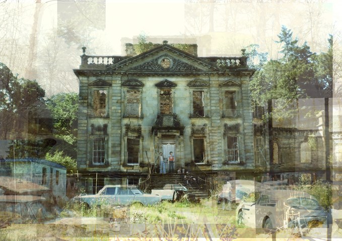
Mavisbank House / A Descent into Chaos - Eilidh McGuigan
The following artworks convey the regression of Mavisbank House. The Palladian villa was the first of its kind to be built in Scotland during the period of enlightenment, where it experienced an entourage of regimes. Originally built in 1727 by architect William Adam in collaboration with his client with intentions of being a stately family home, the building was erected with strict form and order which showed its stance in the local hierarchy. With being a sign of wealth and importance within the area, the building received high levels of care with a flock of maids and groundskeepers to maintain the property. Through time, and many pairs of hands, the building was eventually left in a state of hibernation after the property owner passed away. Eventually gutted by fire, the building was robbed of its elegance and hope of rejuvenation. The building then left in turmoil gradually disintegrated, finding purpose as a car park and scrap heap in the early 70s.
Within this project, I wanted to reveal how although the building may not stand with its intended character, I think the building is far more interesting now nature and time have allowed it age and develop its own charm.
I have compared the buildings in their two main phases of life through photo collage. In the first I show the building as if it had aged through time, maintaining the characteristics of the Palladian style with strong symmetry and organised features.
In the second I have shown how the building has truly deteriorated, veering away from its original style and descending into a state of chaos.
Personally I much prefer the style of the more chaotic artwork as I feel as though it represents the bitty and unpredictable life that the building has endured.
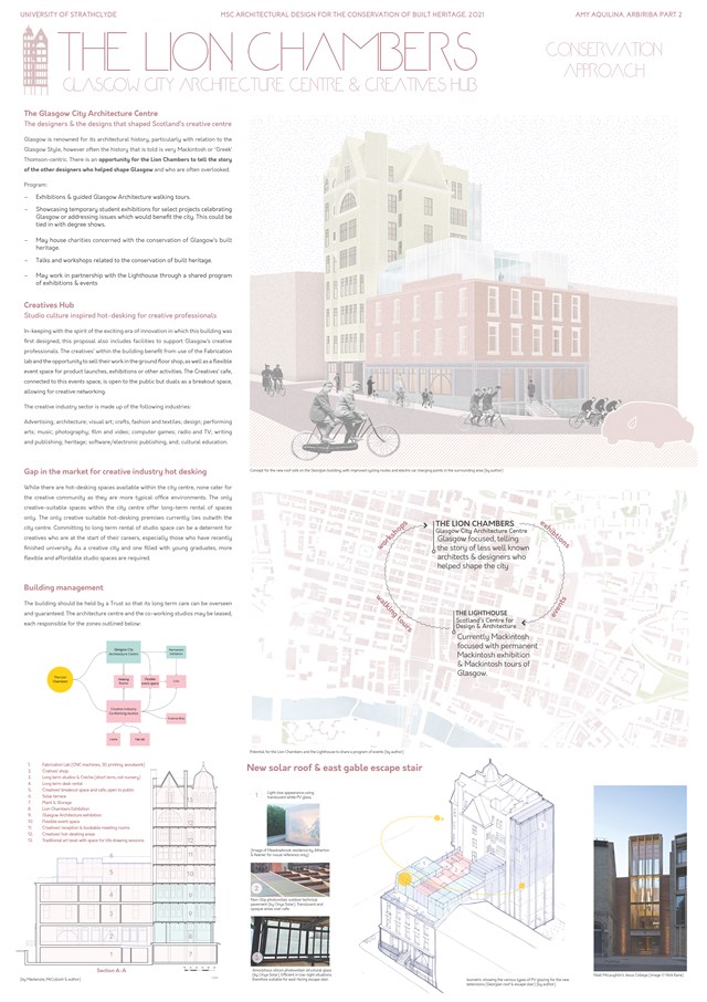
Conservation Approach: Concept - Amy Aquilina

Room 1 - Sadie Sanchez-Ruiz Malan
To Play
In the main performance space the studios are extruded through the floor as sculptural forms. The double height space features tall windows to the east, with shutters that can be opened at certain points in the music.
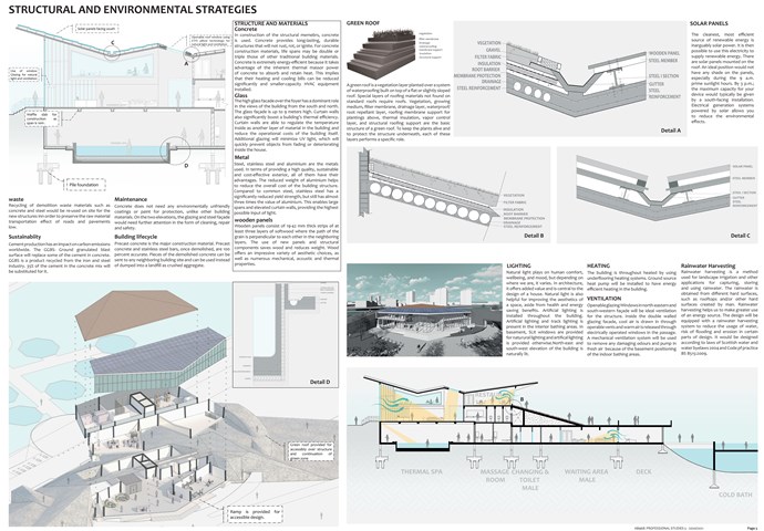
Structural and environmental strategies - Mrunmayi Pandit
Professional studies
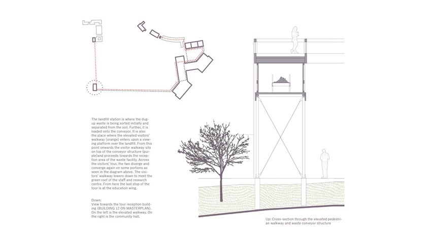
The elevated walkway - Carla Feraru
The landfill mining station is also the place where the elevated visitors’ walkway (orange) enters upon a viewing platform over the landfill. From this point onwards the visitor walkway sits on top of the conveyor structure (purple)and proceeds towards the reception area of the residual waste facility.
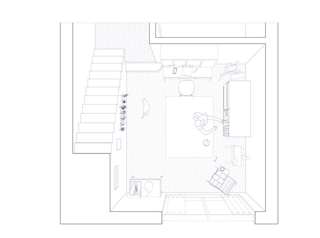
Art Studio/Shop Front - Flat type A - Giulia Panedigrano
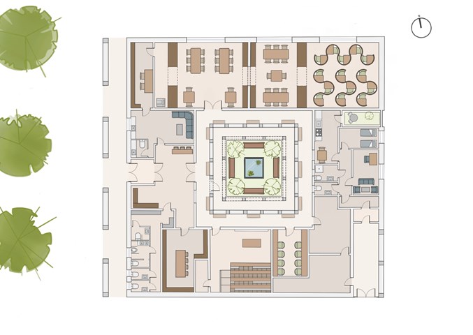
Floor Plan - Leena Hussain
Coloured floor plan drawn at 1:100
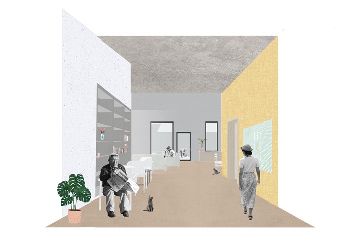
E. Severe Dementia Housing - Adele Melas
Level 3 Housing proposal is for individuals facing severe stages of dementia, whom require assistance 24/7. The proposal is bungalow in form, low is scale, domestic in style, and accessible in function. To battle isolation and enhance physical and social stimulation, residents live in small groups of 3-4 per household, and are encouraged to participate in all aspects of normal living to the best of their abilities. The immediate neighbourhood setting of the homes de-institutionalises the generic appearance of long, narrow, and dark double loaded corridors in conventional care homes. In the case of the neighbourhood, the ‘corridors’ between homes are in fact real life streets.
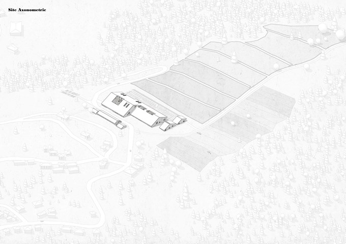
Site axonometric - Elena Stefanova
For the purposes of research and training, the Agrarian Institute has a flock of 45 sheep, pastures, and a model farm set up on site.
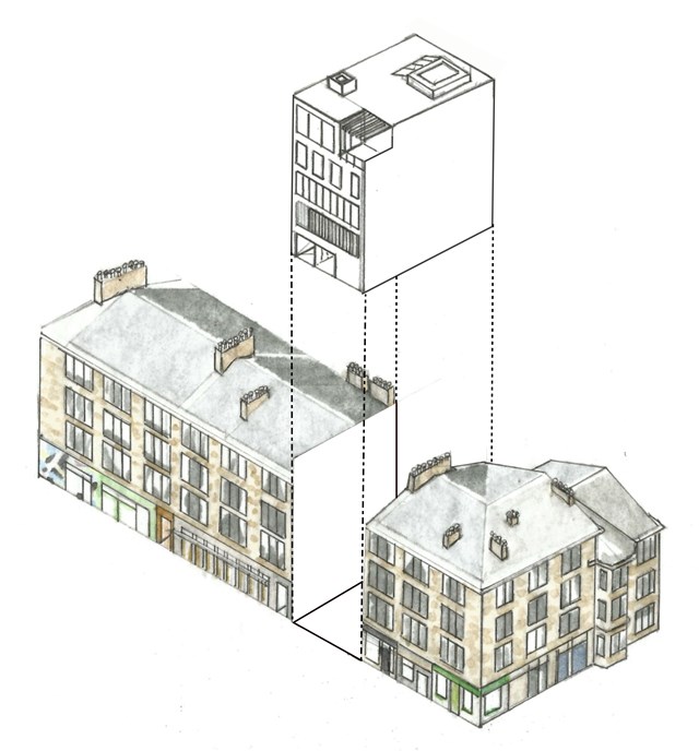
"To Engage" Block Axonometric - Samuel Sharkey
A useful preliminary sketch proposing the new Blink Art Gallery on site.
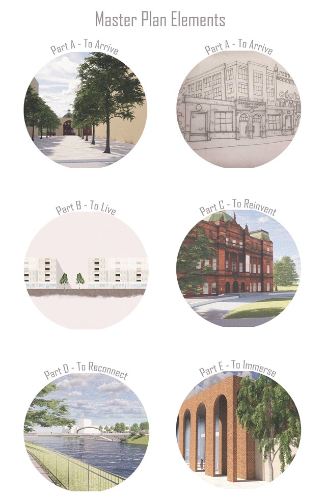
Element of the Master plan - Kate Melhuish
Part A looks at the creation of a more celebrated entrance on the north edge of Glasgow Green along with the re-implementation of the train station.
Part B Looks at the Redesigning of the Housing Development to give it greater connection with the green.
Part C looks at reinventing the Peoples Palace and reinstating it original purpose as a place to store the people memories.
Part D Looks at re-connecting the Gorbals with Glasgow green
Finally, Part E aim to immerse the user in a story or memory in this case that is the story of the washer woman.
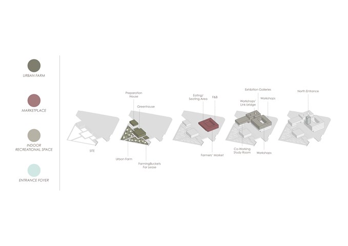
Site Massing and Accommodation - Gertie Leong Hei Li
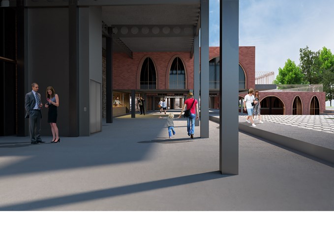
Exterior View of the Laurieston Education Hub along Cleland Street - Shivani Sarjan
Laurieston Education Hub
This view shows the new 'street' created underneath the building. The commercial spaces have street level service counters here to interact with the wider public. In the back light cannons drive sunlight underneath the building.
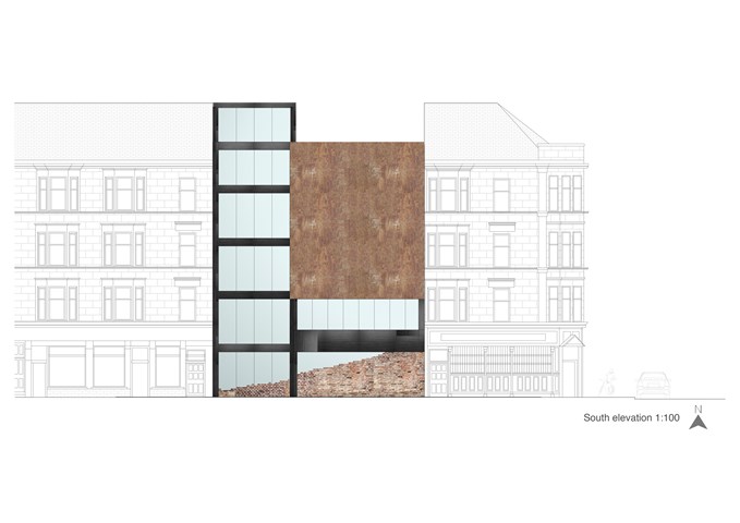
"To Engage" - South Elevation 1:100 - Zuzanna Woznicka
I proposed steel frame construction, in my design because it allows achieving long spans, large open spaces and is aesthetically fitting into the project.
In the south elevation are visible construction elements - steel beams and columns painted in black. A large recycled rusted steel panel is a decorative element and it doesn't have a shading function, I would imagine that made of the shipyard's remains welded into one piece.
Large windows should be made with solar controlled glazing (IGU), or ideally with electrochromic glazing.
At the bottom are recycled bricks which, are in the hall part purely aesthetic. Those brick main are a symbol of new rising from old; a reminder of Govan's heritage.
From the staff room side, the brick is also a structural element, non-load bearing.
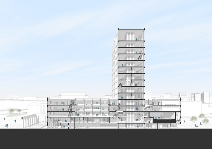
Long section - Andrew Devine
Section through the length of the building which shows the tower and how it intersects the existing building
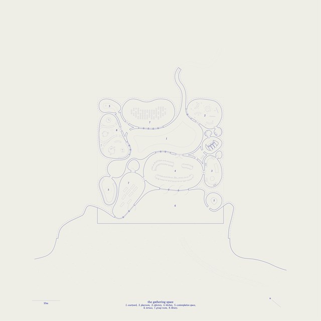
Arrangement of Gathering Space - Mairi Watson
A place for women and children to come together, fostering a sense of community and support.
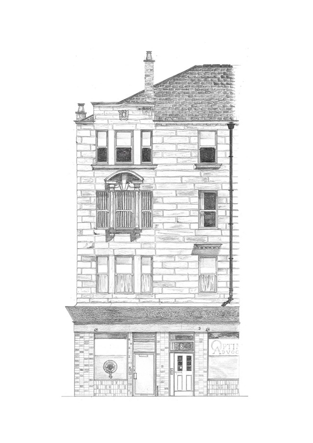
Tenement Section 1:50 - Eilish O'Donnell
For the "To Belong" project we were to work as a unit and survey a tenement block that we were assigned from Glasgow. We were to Survey the entire block as a group and then each person was to draw a small section and then we were to bring our drawings together to recreate the tenement block. This project gave me a better understanding of tenement structure and the tenement's place in Glasgow's history.
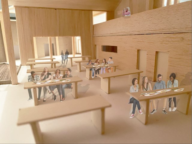
Interior view of Sailing Club dining hall - Lewis McLynn
Interior shot from design model with some photoshop people for scale.
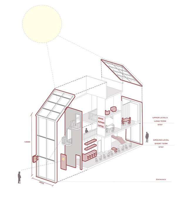
Model of a 'safe wing'- Advice cafe - Asya Gumus
This diagram shows one example of a 'safe wing'. The ground floor is designed for quick and short term access/ support making it easy for residents to drop in without an appointment and seek support over the counter. The staff are dementia trained and will have the skills to support elderly resident needs. The upper levels are designed for longer stay where private councelling can be arranged and support group meetings can take place. Transparency, signage and familiarity within the design allow locals to feel comfortable when visiting.
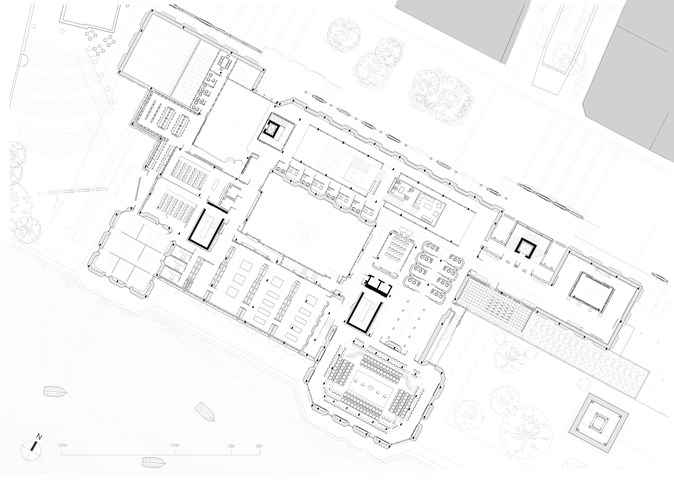
First Floor Plan - 1:100 - Antony James Graham
The first floor plan explores the educational and political nature of the building that offers further assistance in these fields for the public to learn, engage and participate in activities relating to Glasgow's heritage, culture, political and social status through workshops, galleries, lecture spaces, consultation rooms and the large main debating chamber.
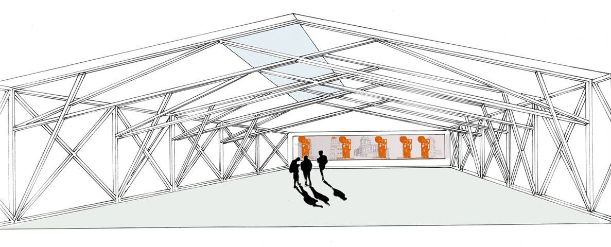
The Lion Chambers - Proposed Design, Georgian Building Vertical Extension - Krisztina McCulloch
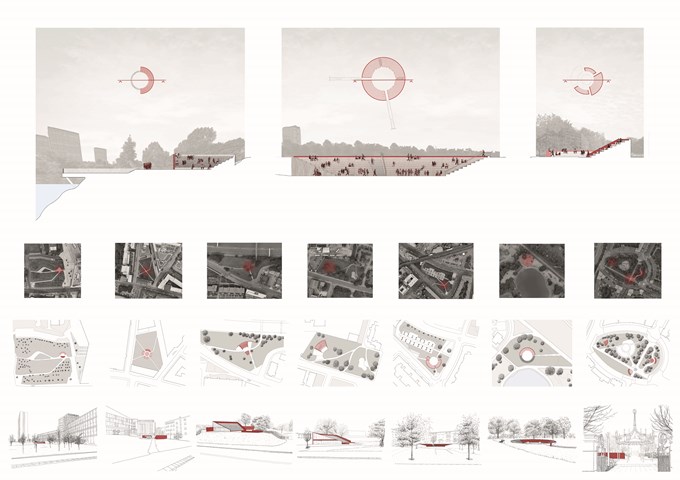
Pnyx | Sections, Plans and Sketches - Ami Coulter
The Pnyx are designed to encourage citizens to DISCUSS, enveloping pause points in the city. In Glasgow, these are often formed by green spaces offering the opportunity to slow down or stop for a moment. These spaces grant a particular opportunity for primary and secondary engagement with the programme. The reintroduction of the ancient form which has since been adopted and privatised, also reinstates the identifiable form associated with engagement in the public realm. Accessible to all, allowing citizens to gather together in their common moments.
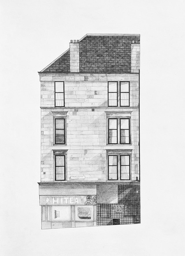
"to belong" - Nathan Constable
For this project, we had to recreate a "slice" of the tenement facade where our "to engage" project was situated through pencil drawing. This involved figuring out the sizes of all the aspects solely through digital investigation and then using these to mock up the "slice" as accurately as possible.
Students in particular may recognise this block as it is on the corner of Byres Road and Great George Street.
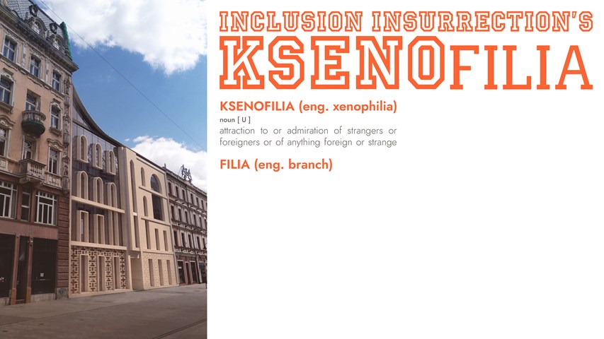
KSENOfilia - Anna Rogowska
The proposed building - KSENOfilia includes the new office as well as an array of spaces encouraging dialogue and cooperation of people from all backgrounds, nationalities and religions. From a café with performance space, through a recording studio, to a multicultural content focused library, space will be provided to give voice to those excluded from mainstream intellectual and artistic discourse controlled by systemic racism. The form of the building was created through a playful mixture of different architectural styles from countries with considerable number of immigrants in Poland. Deconstruction and synthesis of forms, details, patterns, and rhythms led to creation of a design with a diverse and simultaneously unified identity. Just as all the styles come together in this one architectural piece, so shall all cultures in Inclusion Insurrection’s hopeful vision of the country’s future.
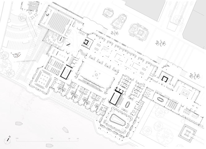
Ground Floor Plan - 1:100 - Antony James Graham
The ground floor plan is home to the public elements of the building allowing free movement and interaction for cultural, political and social events and activities. Multiple entrances from the newly pedestrianised Clyde street and off the Clyde walkways frontage enter into gallery spaces, forums and into a multitude of free spaces detailed to fit a programme that assists the public in educational, personal and leisure related matters. The main spaces consist of large events forum spaces, a large public auditorium, free space lecture spaces, public representative offices and a public debating chamber. The entire building is present to respond to public needs and give voice to the individual and community that need to be heard in a building that is publicly directed and observed.
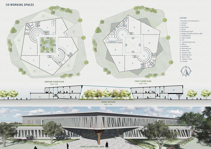
Co-working Spaces - Mrunmayi Pandit
Surrounded by green spaces, the pentagonal two-storey block nested in metal and glass envelope opens up into interior and exterior green landscape. A circulation area is provided surrounding the indoor garden. Spaces are divided into public areas on the ground floor and private areas on the first. Indoor small community gathering areas are also proposed on both floors along with offices, Café, Library, and multipurpose areas. Accessible toilets have been provided as per the needs of people with disabilities. Glass and metal Pattern has been created to balance light and shadow And having transparency in spaces. The pattern on the façade allows a controlled amount of daylight into the spaces. The metal mesh sheet façade is used for ventilation and light.
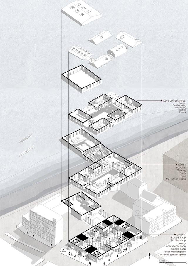
Exploded Axonometric - Fatema Hassan
The workshop spaces are situated on the top floor in varying forms overlooking the courtyard garden. The void of the courtyard garden serves as a light well to penetrate light into lower public floors. Floors are connected by stairwells and stairwells that lead directly to the outside, these stairwells also lead you up to the food hall and top floor workshops. Ultimately, the whole proposed form is two separate volumes connected by public routes and gardens for a unique journey through spaces of various activities.
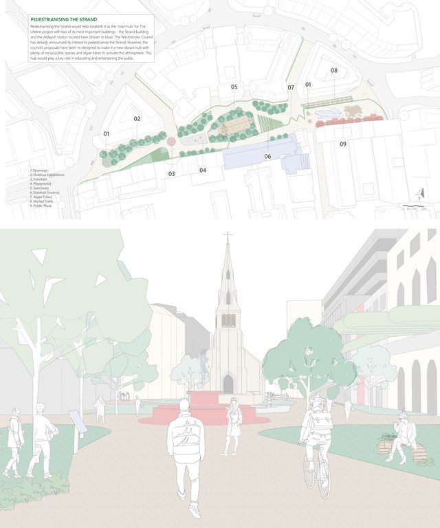
Pedestrianising the Strand - Shravan George
The Strand building and Aldwych station are located in the famous Strand in London, a place that is historically significant and is frequented by locals and tourists alike. Pedestrianising the Strand expands opportunities for the public to interact with The Lifeline. The newly pedestrianised street would have markets, plazas, social areas, exhibitions and opportunities for the public to get a glimpse of food production in the tunnels. This is consistent with Westminster city council’s vision to remove vehicular traffic from the area by the end of this year.
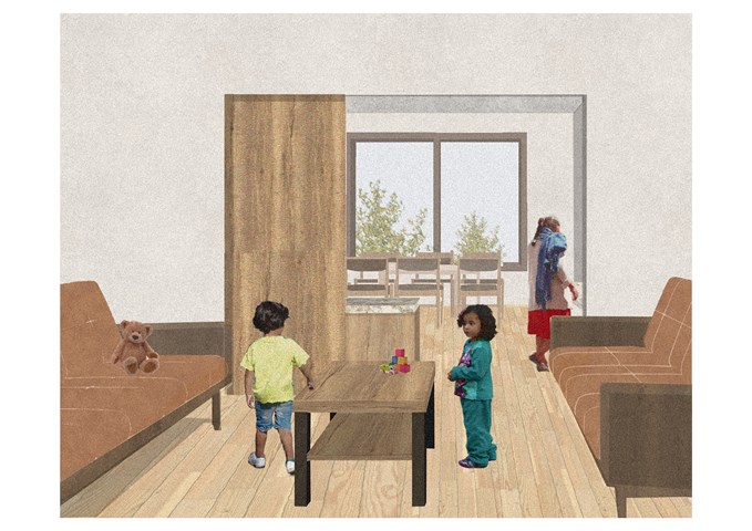
Double Aspect Living Space - Sadie Sanchez-Ruiz Malan
To Live/Work
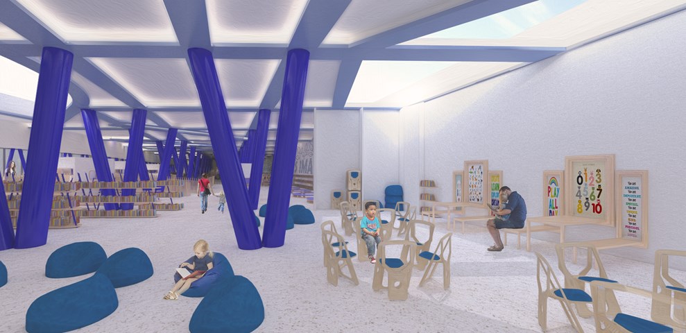
Andrew McCluskie
Flexible Workshop Space
The Flexible workshopping space is designed to host School Trip Groups as well as everyday workshops for pre-school aged children that will be run by Centre Staff. As such the seating can be completely removed, folding away or stored in a bespoke unit built off of the retaining wall. A palate of light stained Larch is used for the furniture to maximise daylighting potential at the rear of the building.
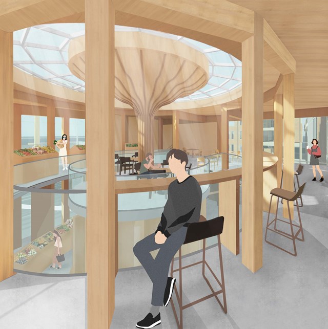
The Market Seating - Fiona Wylie
Interior view of the cafe seating area above the public market stall, highlighting the glulam and CLT construction for a warm, earthy atmosphere.
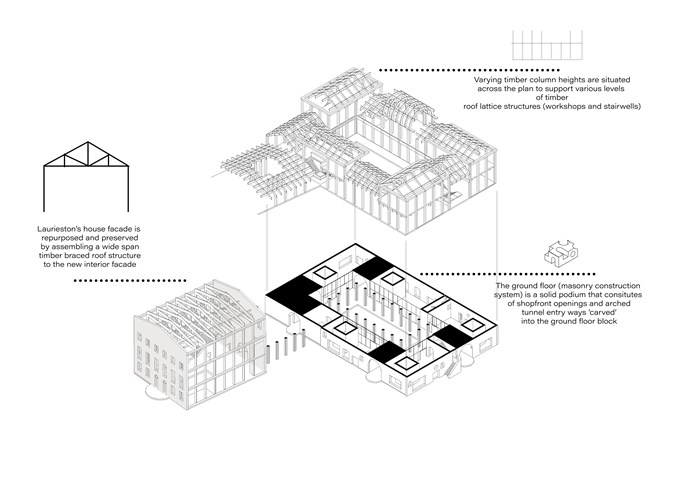
Structural appraisal - Fatema Hassan
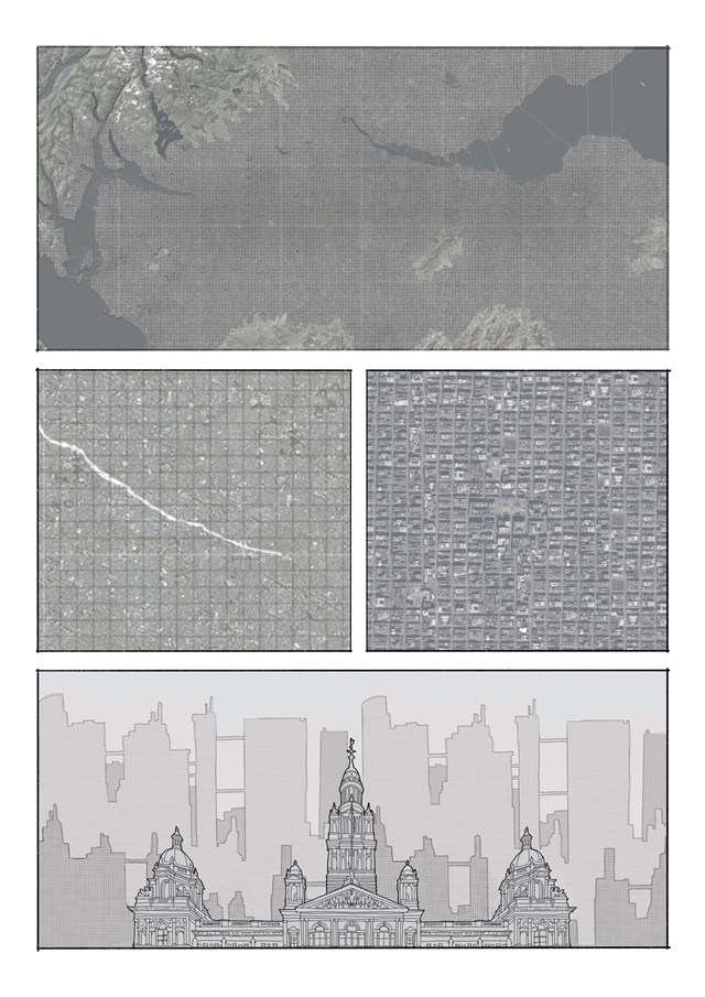
Overpopulation of Scotland's central belt - Daniel Kelly
Represented in comic book form, a fictional narrative of a future Scottish central belt is created. Here, the urban density has evolved into a conjoined megacity that covers the whole central belt area. Issues such as overcrowding and overpopulation have arisen, leading the government to develop population redistribution strategies.
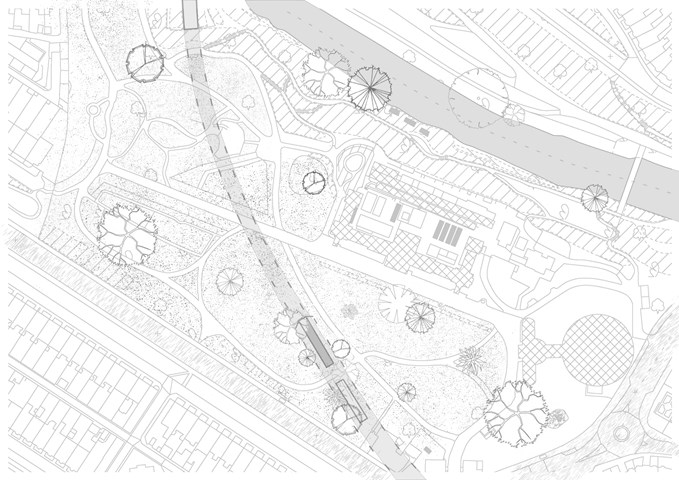
Glasgow Botanic Garden Railway Station Site Plan - Enbiya Yuecel
3B To Play
Second Star to the Right / 3B / To Play
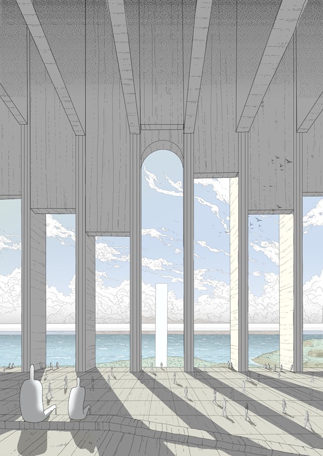
The Forum - Daniel Kelly
The central focal point and meeting space of City X: The forum. This hand drawn image shows a view westward from the islands main public space towards the Isle of Rum.
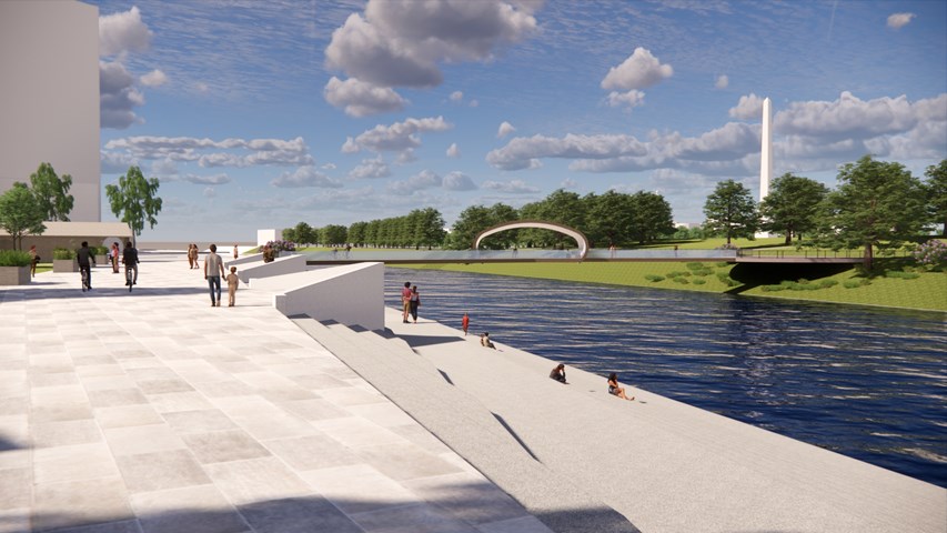
External Visual Showing Connection to River - Kate Melhuish
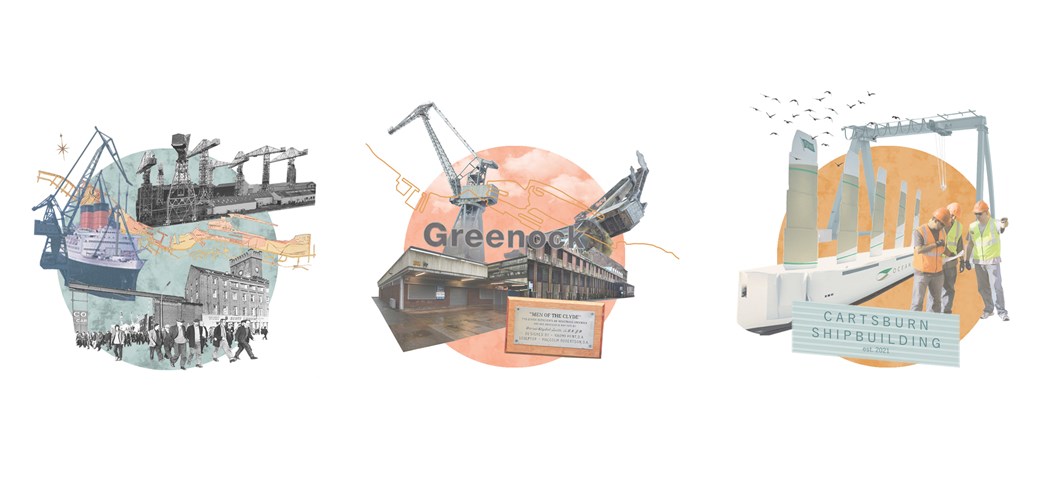
Collages representing the Past, Present and Future of Greenock - Ellie Carroll
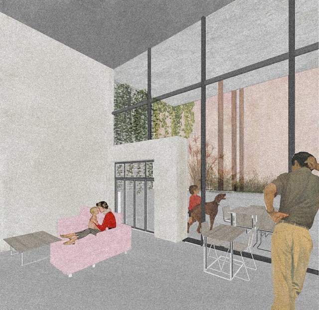
View of Main Living Space - Conor Ryan McCormack
Allotment Living _3A To Play
Allotment Living_3A To Live.
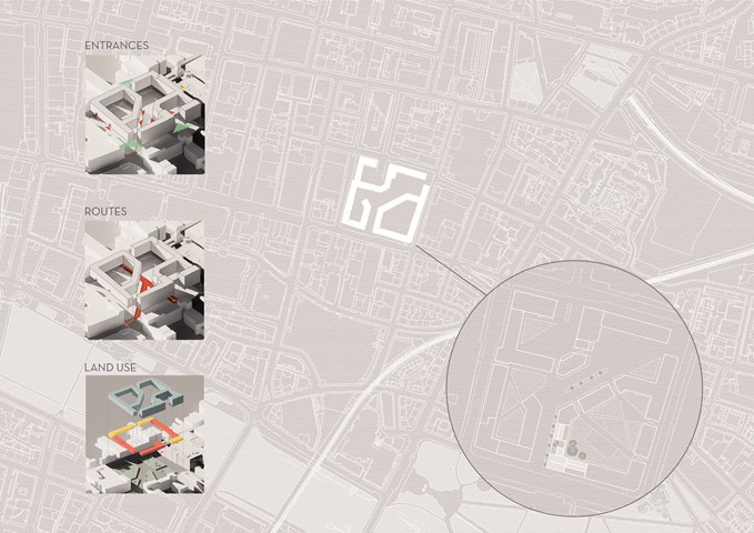
Masterplan Strategy - Viktoria Georgieva
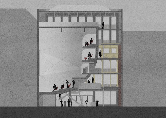
Cinema Section - Anthony Mazeli
This section shows the cinema functionality through sight lines and projector throw. It also depicts the building programme with a spacious bar area on the ground level to encourage socialisation while maintaining a safe distance, hall areas with alternating floating bridges leading to cinema, and a gallery area on the 5th floor.
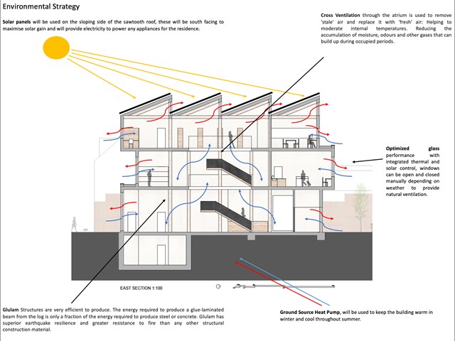
Environmental Strategy Diagram - Lewis McLynn
Section drawing produced for the Library Project which displays the environmental strategies for my design.
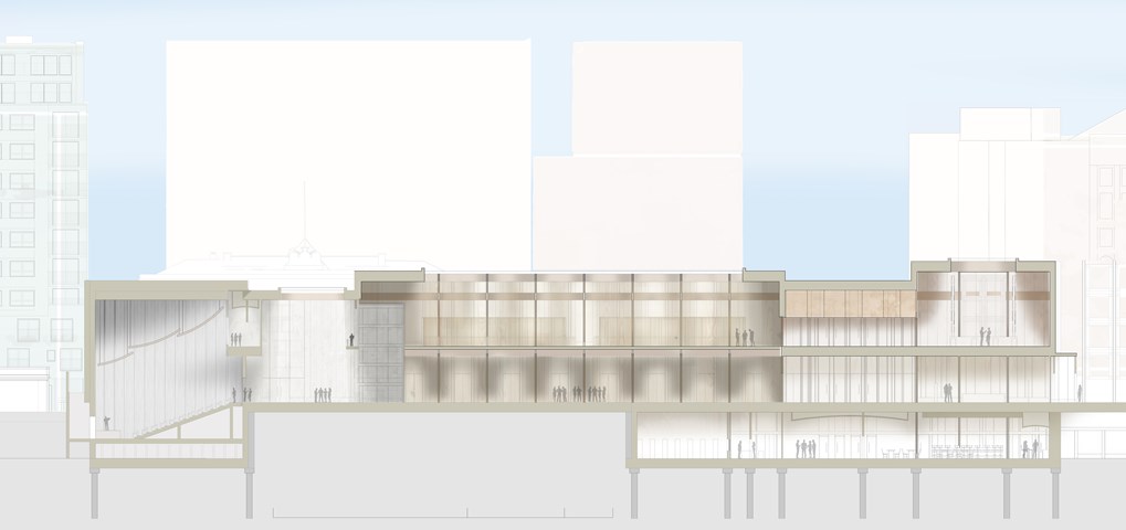
Main Forum Section BB - 1:100 - Antony James Graham
Section BB illustrates the diverse range in scale, hierarchy and spatial change throughout the building programme. Light is a crucial factor in enhancing the atmosphere, materiality and quality of the space, which is controlled by large overhead skylights that can be operated to change depending on the activity of the space. From Right to the left the public can be seen travelling through the building, rising and descending through gallery spaces, forums and media spaces that all offer opportunities to interact, learn and be heard.
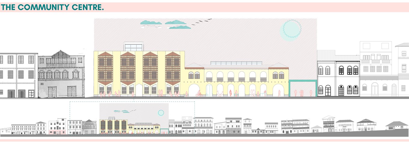
Elevation Of Ndia Kuu street. - Alamin Mandhry
Great care is taken when designing the facade of the community centre. The proportions of the buildings and architectural elements, materiality and other Swahili architectural elements like decorative fascia boards played an important role during design. The building is divided into two volumes to ensure seamlessly it fits into the street elevation.
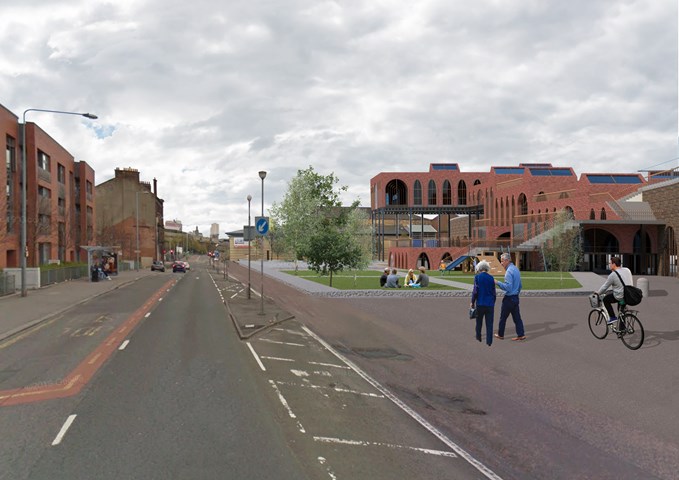
Exterior View of the Laurieston Education Hub along Gorbals Street - Shivani Sarjan
This exterior view shows the whole site along Gorbals Street. The landscaping opens to the road in some places but is more protected by trees in some. The Blocks also gemetrically respond to the residential development accross the road.
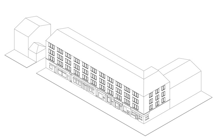
Axonometric of Glasgow Tenements - Laura Kennedy
1:200 Axonometric of the existing tenement block on Great Western Road. Used as part of AB108 site analysis to help understand the rules of the street.
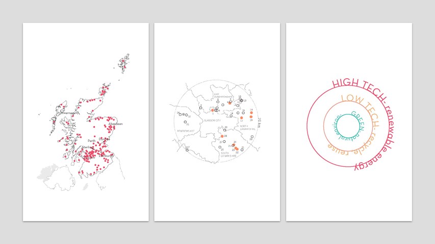
Site selection and remediation framework - Carla Feraru
In Scotland, there are approximately 200 closed landfills with many more soon reaching capacity. This thesis looked at devising a framework that could be applied to remediate and valorise not only one but multiple of these historical landfills. The thesis proposes a trifold approach depending on the taxonomy of each landfill: green remediation, low-tech remediation and high-tech remediation. This project sets to test the high-tech strategy on the chosen site of Kilgarth Triangle.
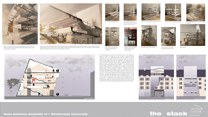
THE STACK - Ross A Aivaliotis
Presentation drawings and model in progress.
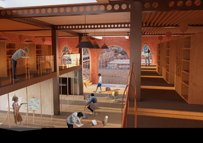
Interior View of the Entrance along the Study Bays - Shivani Sarjan
Laurieston Education Hub
This view shows the entrance as seen from the mezzanine. The entrance is centered along the main space creating a double height space which draws visitors in. the casselated beams are exposed to create the illusion of strong enclosure, while the brick detailing creates a human scale haptic environment along the walls.
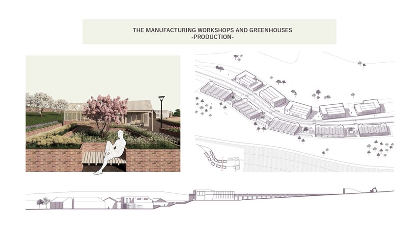
The manufacturing workshops and greenhouses - Carla Feraru
The production area of the masterplan is composed of greenhouses, communal gardens and workshops for local entrepreneurs. A central spine runs between the two levels hosting the production buildings and acts both as a ‘shopping street’ as well as an ‘urban’ intervention that mitigates the changes in level through publicly accessible green terraces. The layout follows the topography of the site, with the sinuous distribution of the volumes and their staggered layout allowing for unique views and daylight penetration.
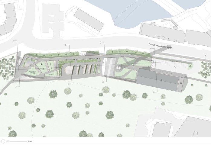
Andrew McCluskie
1:200 Landscaping And Curtilage Plan
1. Green Buffer to Old Dumbarton Road with Café Seating
2. Entrance Courtyard with Outdoor Gathering Stair
3. Roof Terrace with Rooflight Planters at the Park Level
4. Play Area
5. Community Beacon inside Repurposed Hospital Flue
6. Queen Mother Maternity Reading Green
7. Book Gifting and Distribution Building
8. Refuse and Community Recycling
9. Car Park
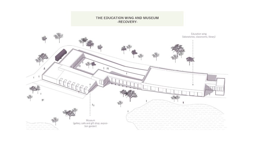
The education wing and museum - Carla Feraru
In addition to the recovery facilities and associated staff and research centre, great importance was given to the education of the community and visitors alike, about the new industry. As such, an education centre, as well as a recycling museum, were included in the recovery area of the masterplan. The education centre is seen as a key space for the local community to use. Free access to the laboratories, classrooms and library are given to school groups and visitors alike, encouraging participation and knowledge gathering about the issues at hand.
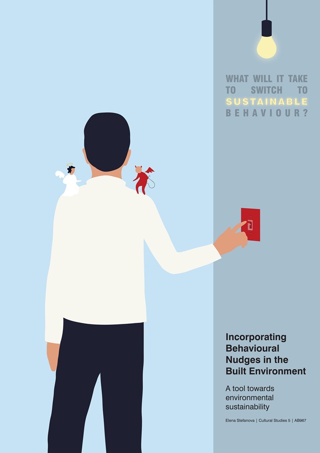
Poster Submission - Elena Stefanova
Postgraduate Dissertation
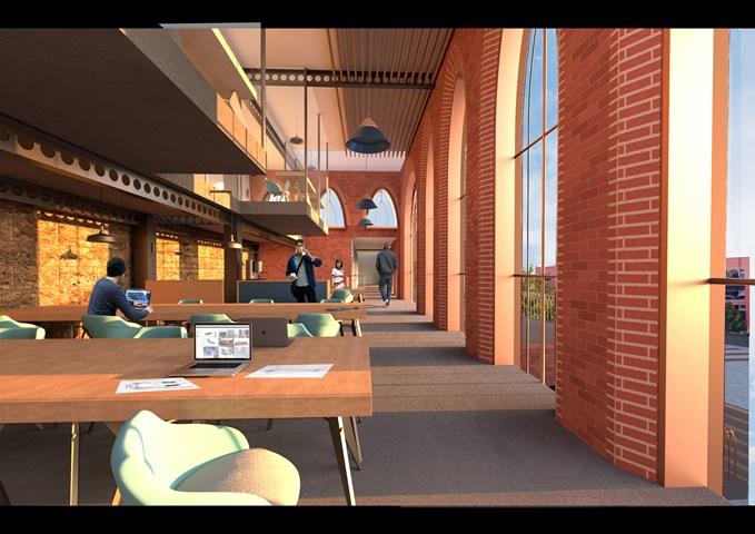
Interior View of the Co-Working Space - Shivani Sarjan
Laurieston Education Hub
The co-working spaces is large open space designed for hot-desking as 'offices' become more flexible. It is a more public with its own elevator. The block also incudes more private spaces in the mezzanine above and meeting rooms. It opens onto two outdoor terraces and directly connects to the cafe block below.
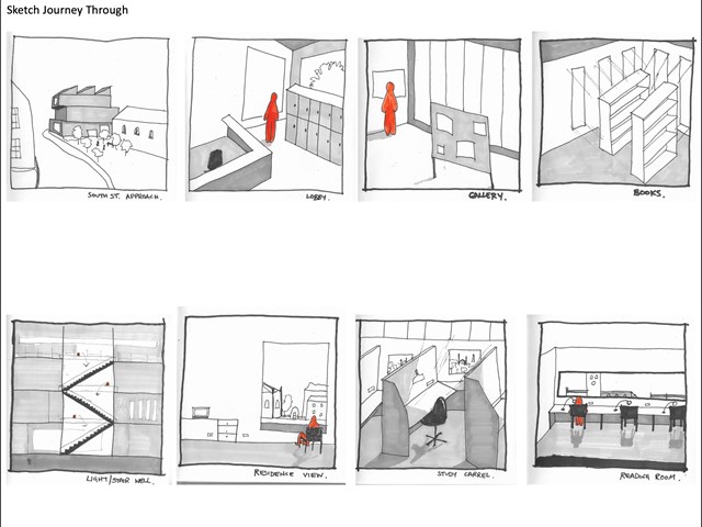
Sketch journey through library design - Lewis McLynn
Quick sketches I produced for AB210 Library Project to generate ideas of how the journey to and through the building would look and feel.
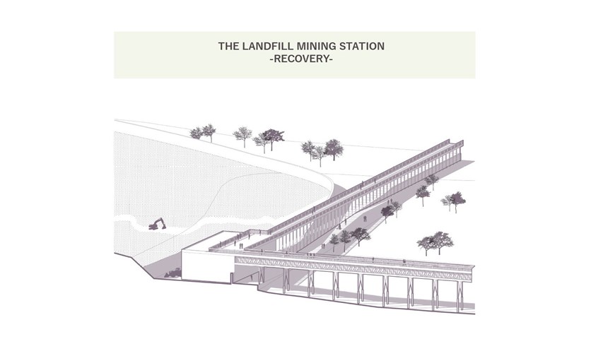
The landfill mining station - Carla Feraru
The first component of the masterplan pertaining to the recovery part of the brief is the landfill mining station. Located by the landfill mound, The landfill station is where the dug-up waste is being sorted initially and separated from the soil fraction. Further, it is loaded onto the conveyor and proceeds towards the recovery buildings.
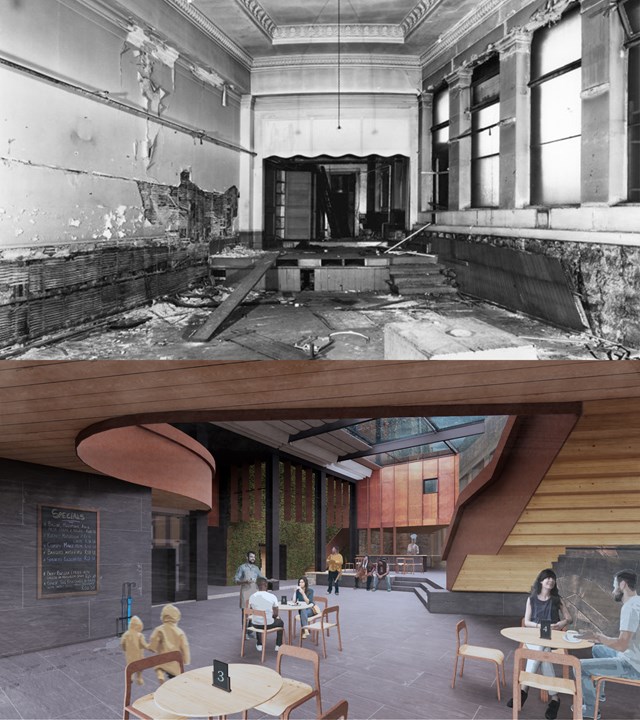
Storytellers Court - Before and After - Alfie Hollington
Design Studies 3b
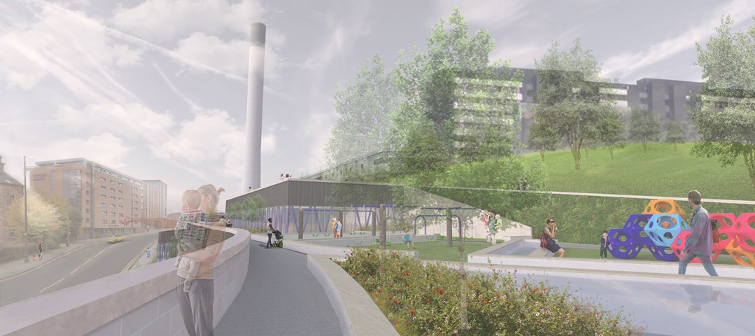
Andrew McCluskie
Play Area and Roofscape
Traditionally, a day out to a play area is almost exclusively a children's activity, with parent(s) acting as chaperone, arriving at the park, finding a bench and sitting on the outskirts of the space on which to wait. Partick Imagination Library's play area is conceived so that parents as well as their children are located within the play space, with the aim to get parents more involved with play, or facilitate social interaction between parents of more independent children. The Living Walls and integrated Raised Planters continue the atmosphere of the neighbouring Park onto the building roofscape.
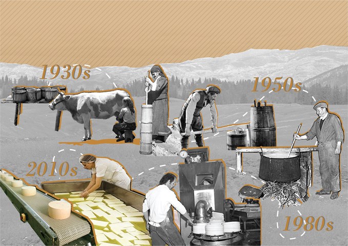
Dairy industry - Elena Stefanova
The dairy industry in the Rhodopes has changed and adapted over the years.
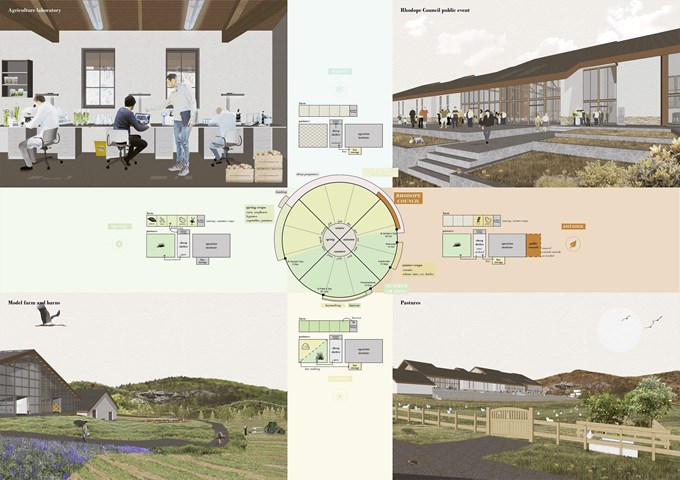
Seasonality of the building's programme - Elena Stefanova
The functions of the Rhodope Council and the Agrarian Institute are determined by the seasonal rhythm of the land and resources. Together they create a system where each component plays its role at a given time and supports the functions of the other components.
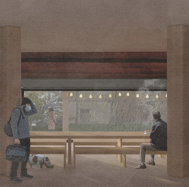
Soup kitchen - Alfie Hollington
Design Studies 3a
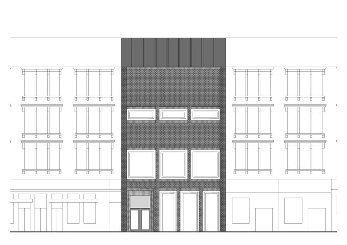
Front Elevation - Laura Kennedy
1:50 Front Elevation of final gallery proposal. Emphasis on material choice and how proposal sits within immediate tenement context.
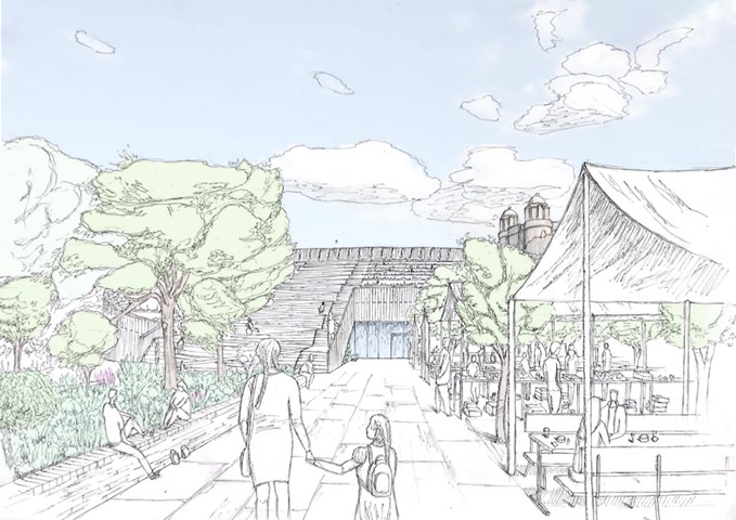
External Market View - Finlay Ulrichsen
The design brings together the various communities of the surrounding area under the ethos for sustainability,
teaching the residents and the next generation about a direction for a better future for Glasgow and the Townhead
area. Creating a safe and relaxing environment for users in the site, an environment where a parent can
bring their child to experience nature and sustainability in their very own local community.
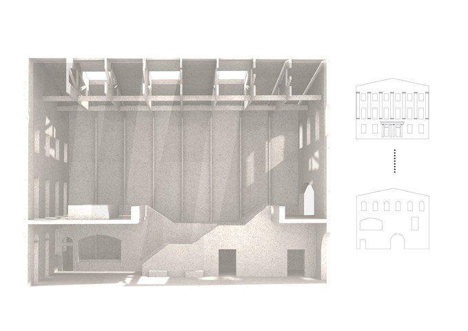
Sciographical study of the main markethall - Fatema Hassan
This shadow model emphasizes the spatial environment of the main market hall. A sense of outline and shadows have a heavy influence on the overall spatial experience of the visitors. This sketch filters and shows light penetrating through the old and new facade throughout the day in a pattern. The timber frame structure supporting the roof and skylights extends through all heights of the market hall's form. The structural columns give a sense of order in a dynamic and clustered space where many activities happen in.
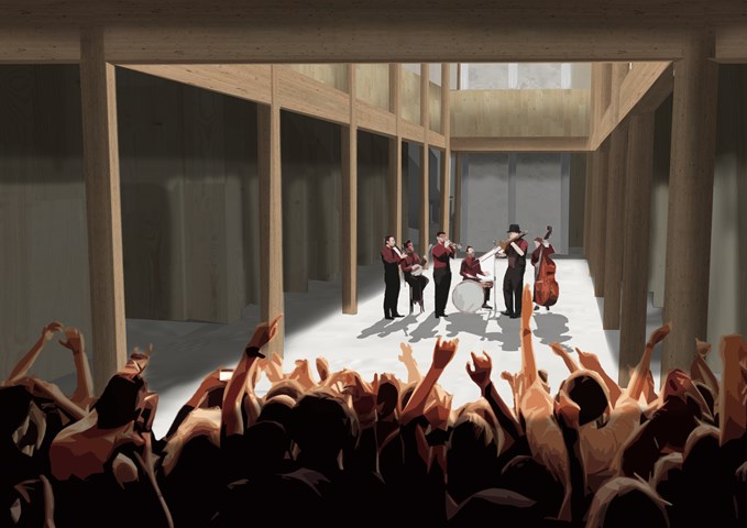
Main Public Forum - Antony James Graham
The main forum space is a long double heighted volume that acts as a free space allowing for flexible function and use to accommodate the building programme to serve the communities of Glasgow. This space can be interpreted as a cultural venue, art gallery or a social gathering space where the surrounding amenities cater to public needs. A common factor in the buildings overall aesthetic and character is the use of stone, wood, light and shadow to create exciting, atmospheric and inviting spaces.
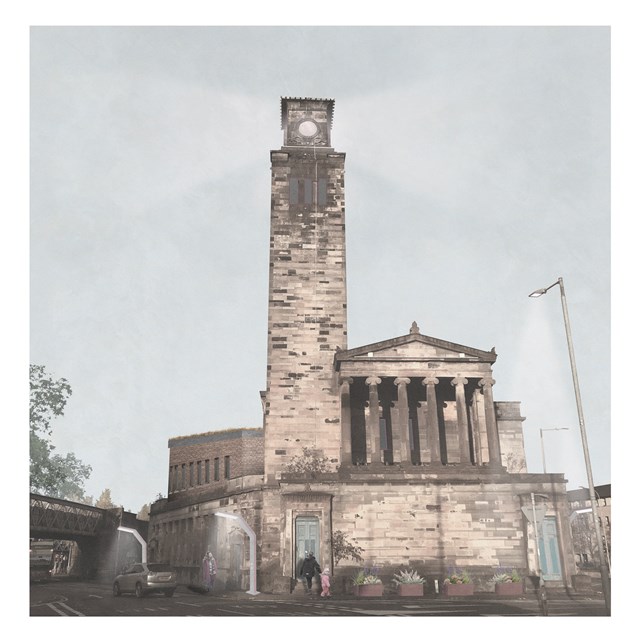
South Satellite - Rebecca Irving
The South satellite transforms Old Caledonia Road Church into another centre for unpaid care and domestic work. This would primarily serve existing communities in the Gorbals and in Laureiston. A tower element is included to form a connection to the other sites for sisterhood which helps establish cohesion throughout the scales.
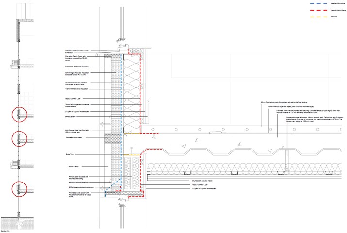
1:5 Technical Detail: Separating Floor to External Wall - Jakob Young
Housing Project: The Living Machine
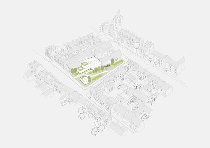
Development- Market Street Site Strategy - Victoria Rozewska
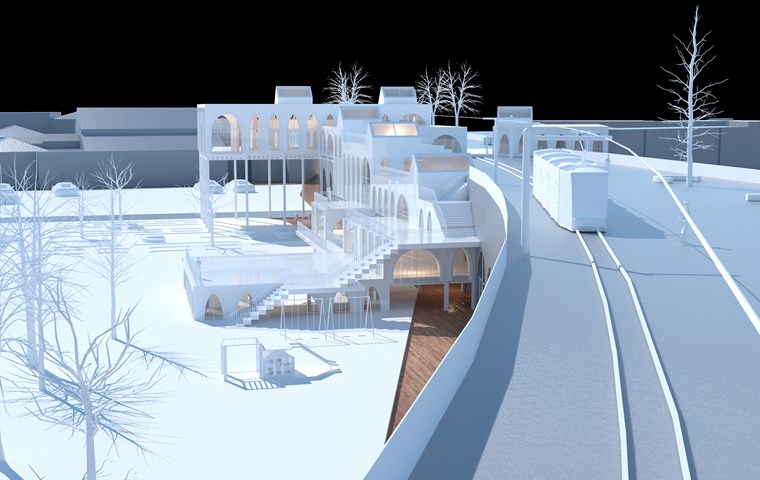
View of Physical Model along the Tram Line - Shivani Sarjan
This is a view of a the phigital model from along the refurbished railway. It depicts the new tram line as well as how the building steps onto and over the arches.
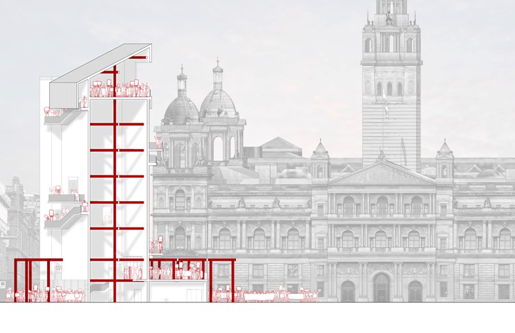
George Square Arx | During Protest - Ami Coulter
The design centres on verticality, drawing the users up to be eye to eye with the City Chambers – a very prominent power/political symbol within the city. At this height there is an honesty of position, the citizens can see what is happening in their city, as they ascend, they are offered a panoptic view unhindered.
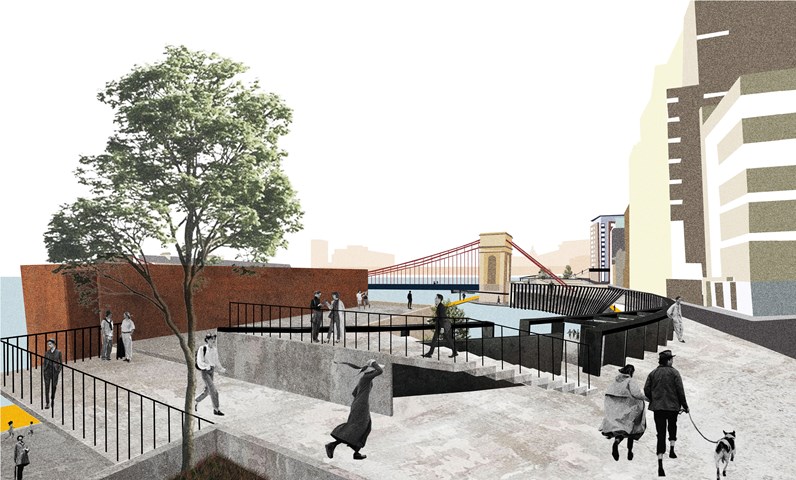
Urban Balcony 2- a perspective render. - Cham Zheng Chee
The intertwining of human activities explores the mutual spillage spaces of the streets and the river, accentuating liminal experiences within the urban space
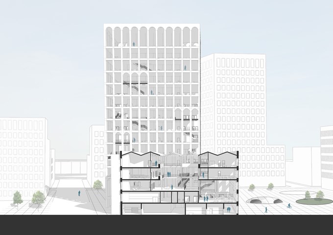
Short Section - Andrew Devine
Section through the atrium space, highlighting the existing roof structure carried through into the new proposal. The scale of the wider masterplan can also be seen in this image as well as an idea of the public square and grey water collection scheme.
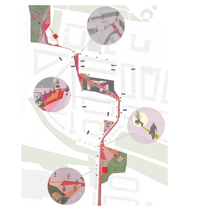
Proposed Site Plan - Asya Gumus
A series of small interventions that connect Alexandra park and Duke street were included along the main route of the masterplan. Different colours were used to guide/ navigate elderly locals to a public bench, shelter or seating area, promoting an accessible, social and diverse environment.
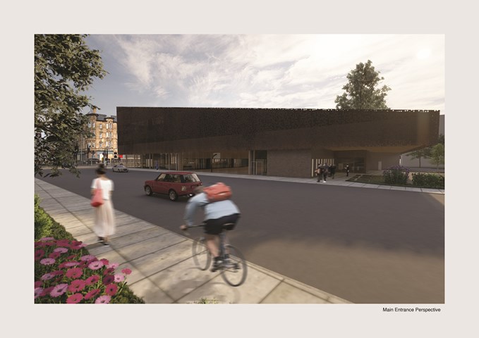
Brown Building Front Perspective - Carlson Ko
The revitalization of Laurieston which is currently a bank is currently shut downed and unused is been implemented with a building that is able to design base from the site context and how it would relate to the surrounding historical buildings.
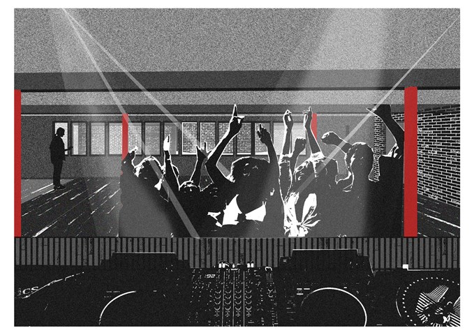
Room 2 - Sadie Sanchez-Ruiz Malan
To Play
The 3rd floor performance space is more compressed, as a nod to Glasgow’s basement clubs. It has a visual link to the main performance space, so that the studio sculptures are always present in the experience.
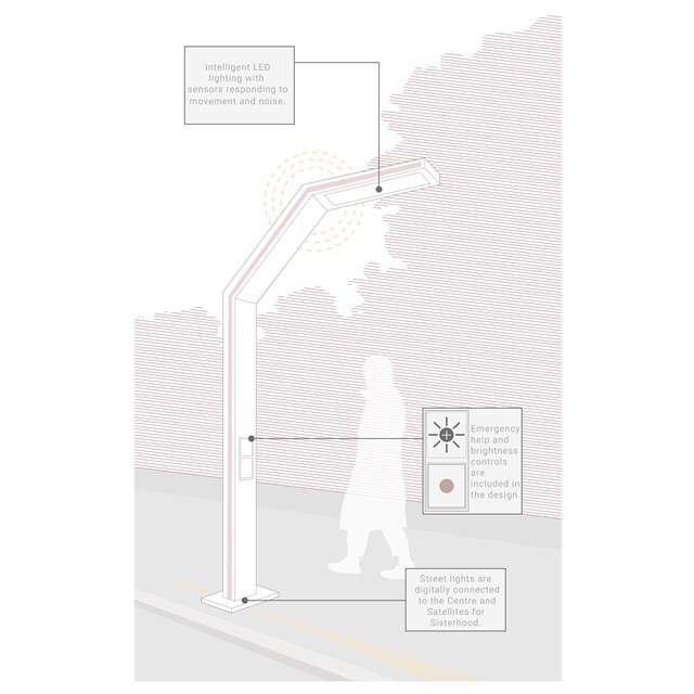
Streetlights - Rebecca Irving
The streetlight was imagined in response to the reality that women feel threatened by cities, night time, and strangers. It acts as a physical representation of safety in the city. It emits light which responds to movement and noise, and also includes brightness and emergency help controls.
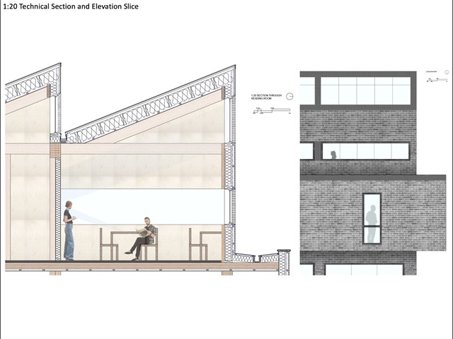
1:20 Technical Section and Elevation - Lewis McLynn
Technical Section through main reading room in Library and accompanying elevation slice.
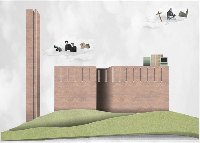
St. Brides Church Artwork - Lewis McLynn
Comparative artwork produced for Cultural Studies.
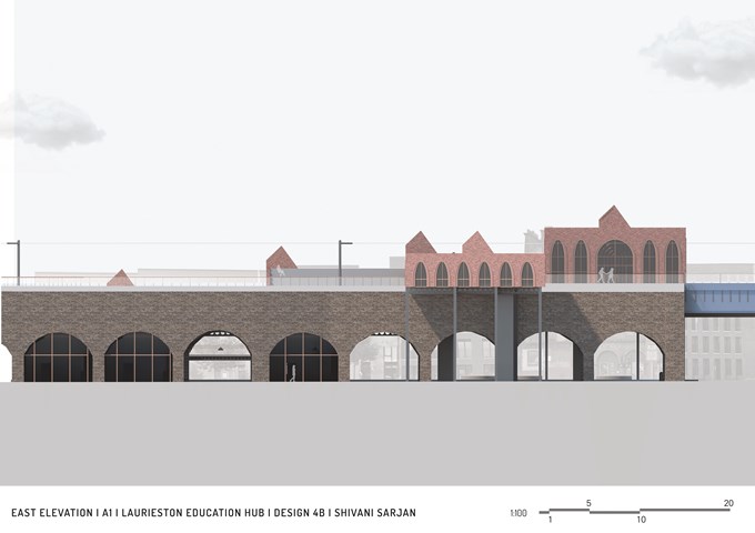
East Elevation - Shivani Sarjan
Laurieston Education Hub
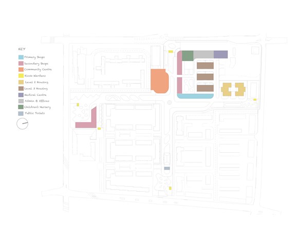
DFN Proposed Buildings - Adele Melas
The DFN masterplan proposal includes the following buildings: Primary Shops, Secondary Shops, Community Centre, Kiosk Wardens, Moderate Dementia Housing (Level 2), Severe Dementia Housing (Level 3), Medical and Health Centre, Admin Offices, Children's Nursery, and Public Toilets.
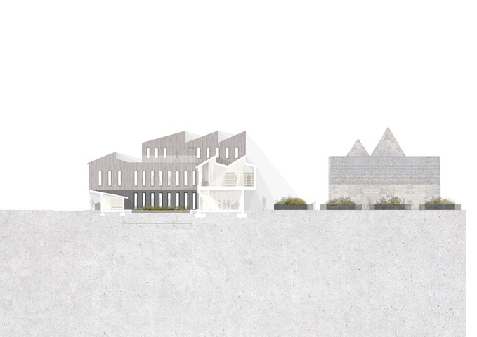
Long Section Through Wild Flower Garden - Eilidh McGuigan
This long section displays the direct correlation from all areas within the building to the greenspace in the centre of the design.
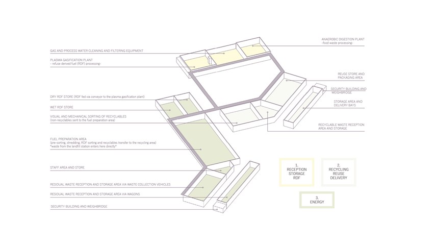
Distribution of spaces inside the main recovery buildings - Carla Feraru
The new industry proposes an integrated approach to waste management in such a way that resource recovery is maximised at each step in the circular economy chain. The entirety of the waste stream is divided into three categories: food waste, recyclables and residual waste. Each waste stream is processed on-site, minimising transportation distances, costs and pollution associated with the current waste management model.
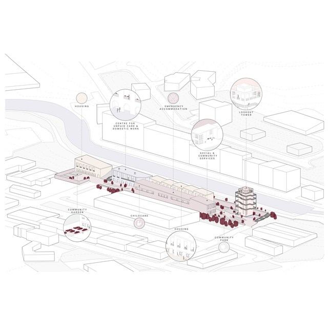
Centre for Sisterhood Axonometric - Rebecca Irving
Key spaces include a centre for unpaid care and domestic work, housing blocks, social and community services, a lookout tower, and community park. It is hoped that the shared spaces would be primarily operated and used by residents of the centre, however, community members from surrounding neighbourhoods would also be invited to make use of the community spaces.
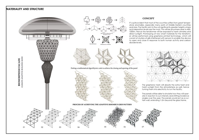
The Facade - Sania Halim
It’s quite evident that most of the countries suffer from great temperature anomalies, especially many parts of Middle Eastern countries and Asia. The facility aims to flow at significantly greater heights where acid deposition levels are the most. This will be anywhere near to 400-1000m. Hence the terraformer will be exposed to harsh climates and direct sunlight. Prototyping of new smart materials for the terraformer will be performed using graphene printed technology, which will consist of clusters of gills interfaced with sensors to enable the device to open and close in response to both human activity and carbon dioxide levels.
The graphene mesh will absorb the extra heat and harsh sunlight from the atmosphere as well, hence turning them into electricity to run the facility. The panels will be able to simulate how they will operate in reaction to sun intensity and shifting incidence angles over the year. The panels would act as a curtain wall, extending 1-2m beyond the glass frame. The façade of the terraformer will have star shaped panels inspired from biomorphism, projecting out 2m, and will have implementation of advanced detection system designed to integrate the needs of the regions climate.
The panels will be able to simulate how they will operate in reaction to sun intensity and shifting incidence angles over the year. The panels will reduce glare, improve daylight penetration when needed, less reliance on artificial lighting and over 50 percent reduction in solar gain, which results in a reduction of co2 emissions by 1750 tonnes per year.
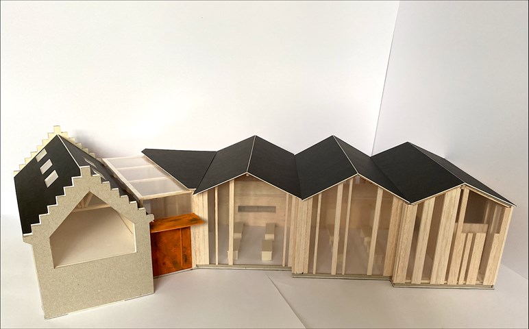
1:50 Sailing Club Design Model - Lewis McLynn
Final model I produced for AB208 Sailing Club project.
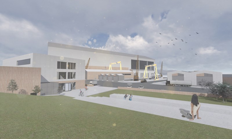
View of the Shipyard from the Education Hub's Green Space - Ellie Carroll
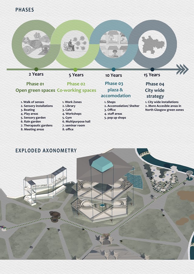
Phases - Mrunmayi Pandit
The program is divided into 4 phases as development in 2-5 10 and 15 years. Phase one consist of leisure spaces such as sensory trail, gardens, and accessible boating. Phase 2 is a built space which is co-working spaces, workshops, library, etc Phase 3 is for plaza and Accommodation for future commercial and shelter needs. Phase 4 is to provide sensory spaces all over the city as a small intervention or in form of a sensory place.
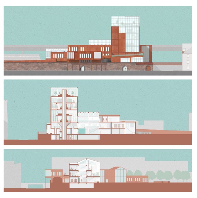
Elevation and Sections - Fiona Wylie
The north elevation, a long section through the growing tower, the seed library, the main atrium, and production spaces, and a short section through the main atrium, hydroponic growing spaces, and the main greenhouse.
The growing "tree" tower is inspired by Frank Lloyd Wright's Johnson Wax Research Tower, with alternating mezzanine floors to allow for double-height vertical farming spaces as the main production zone of the building. The roots of the tower start at the lower ground floor entrance, with a seed library and archive surrounding the main circulation core of the tower.
The main greenhouse off of the atrium acts as a buffer zone for solar gain and passive heating/cooling throughout the building, which then goes into the main atrium which acts as a thermal stack where hot air can exit through vents.
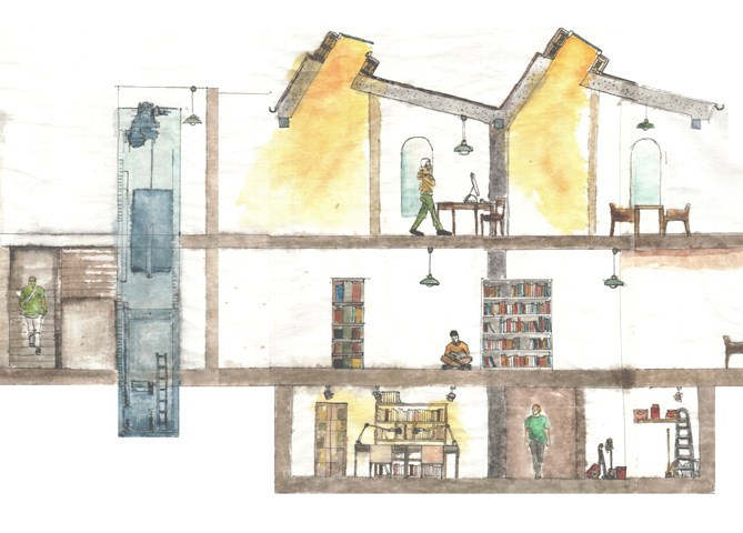
Library Proposal - Expository Sectional Drawing - fineliner & watercolour (1:35) - Milosz Cwiklinski
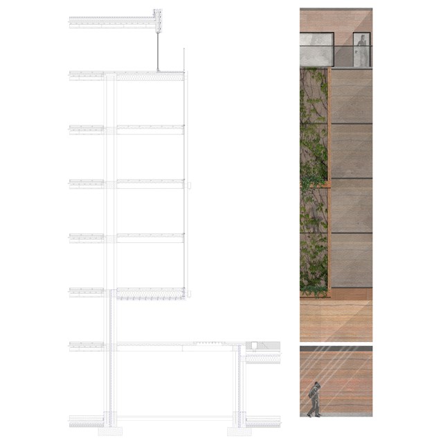
Technical section and elevation - Alfie Hollington
Design Studies 3a
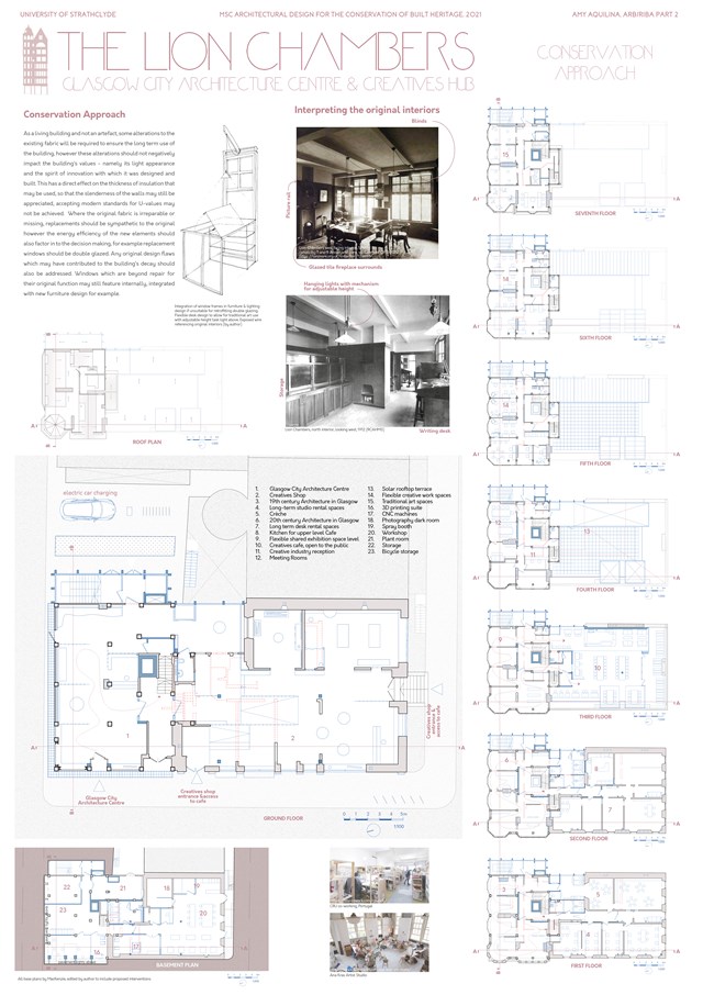
Conservation Approach: Floor plans - Amy Aquilina
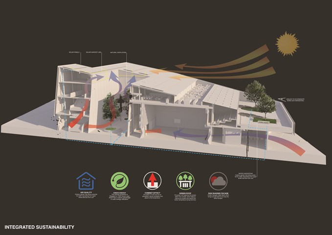
Integrated Sustainablity - Carlson Ko
To show sustainability has been taught through the building as how Global Warming is one of the factors that is in every designers mind now. Sustainability goals that are mostly integrated into a building are introduce here allowing the community to understand and learn from the positive effects and ways to contribute the world.
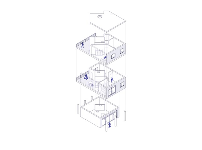
Flat Type B - Exploded Axonometric - Giulia Panedigrano
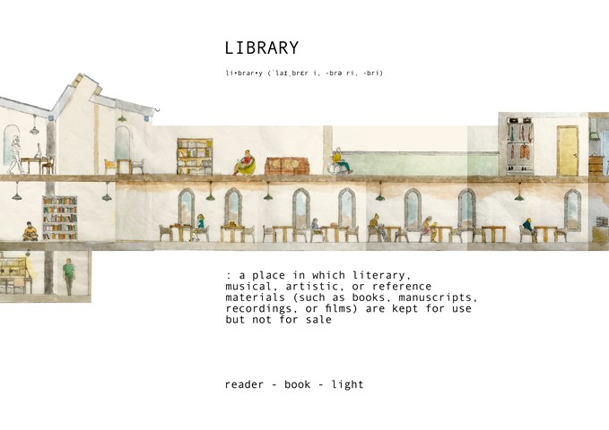
Library Proposal - Expository Sectional Drawing - fineliner & watercolour (1:35) - Milosz Cwiklinski
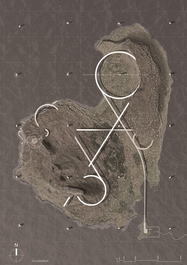
City X: Masterplan - Daniel Kelly
City X consists of a linear, continuous route that facilitates the post-scarcity society into an intense space for self-learning, contemplation, reflection and the arts. It can be used as a means of travel throughout the island whilst also facilitating and consuming the needs of the culture. This creates a journey of experiences that aims to re-sensitise the citizens to the surroundings, leading ultimately to a realignment with nature.
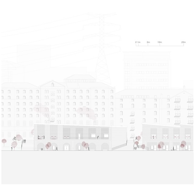
Centre for Unpaid Care and Domestic Work Elevation - Rebecca Irving
Externally, it is hoped that the streets would be activated by the activities from within and there would be a strong presence of natural community surveillance by the placement of openings, balconies, and windows across the elevations.
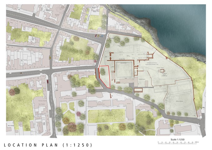
Location Plan (1:1250) for The Pends Site in St Andrews - Milosz Cwiklinski
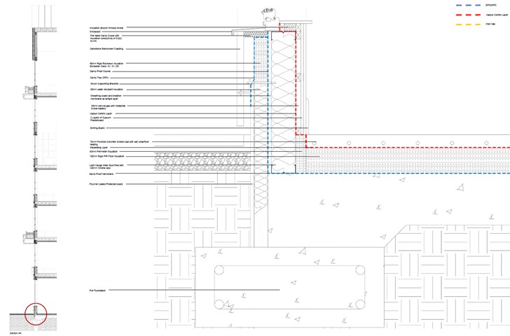
1:5 Technical Detail: Ground Floor to External Wall - Jakob Young
Housing Project: The Living Machine
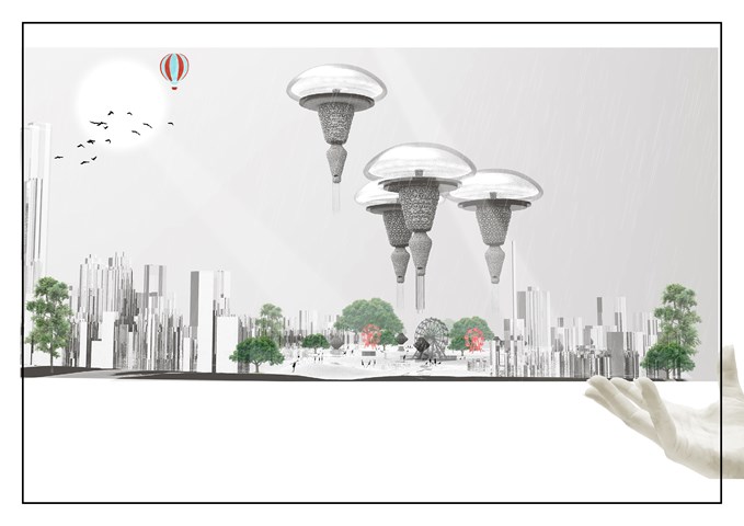
The Floating Terraformer tackling Water scarcity and Acid Deposition Around the world - Sania Halim
The project is setting is at the World fair because it gives a great opportunity for bringing everyone together in one place and inform them about the new technology that the worlds been encountering at the moment and encourage them all to be a part of it. A world’s fair in 2021 would bring millions of visitors and with them hundreds of millions of investments for the floating terraformer, a state of the art of technology. Other likely benefits of a New York world’s fair would include physical improvements to the city, the sprucing up of cultural and civic buildings throughout the metropolitan area; and renewed enthusiasm for the project in the eyes of the world. With its theme of connections, the fair would bestow greater recognition for the facility. It would be a world’s fair doubling as a civic celebration.
By the year 2070, Most of our cityscapes like New York will be cleaned from inside and out, and the water scarcity problems will be at bay. Hence our future will be secured and much greener and happier.
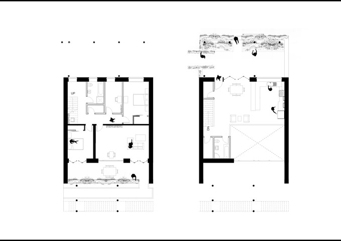
Apartment Type A: 1:50 - Conor Ryan McCormack
Allotment Living _3A To Play
Allotment Living_3A To Live.
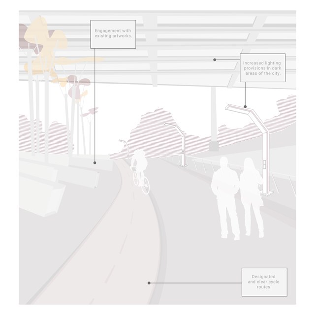
M8 Underpass - Rebecca Irving
Ideas at the city scale include improving existing green spaces by increasing provisions of lighting and to ensure a community presence in such spaces. The M8 underpass, which leads pedestrians and cyclists to the centre for sisterhood, should also see improved lighting provisions and allow clear cycle routes.
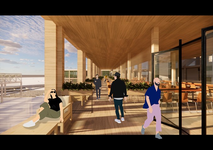
RENDERINGS: Kitchen/ Outdoor Seatings - Gertie Leong Hei Li
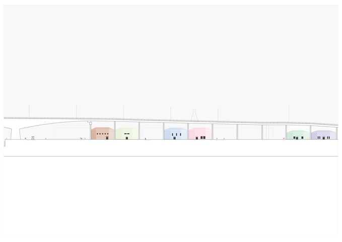
Street Elevation - East, 1:700 - Giulia Panedigrano
The pods aim to incorporate and re-interpret the same modularity within the M8: here, too, there is one commercial activity within each pair of pillars, and here, too, some variation is guaranteed by different colours, different elevations, different uses etc.
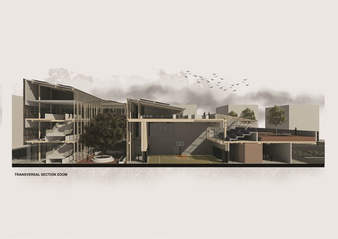
Transversal Sectional Perspective Zoom - Carlson Ko
Drawing that shows the connection from the commercial area connected to the gymnasium. This would introduce great activities around Laurieston and how it would interact within the community and accessibility. Private Restaurant that would introduce jobs and great private time to have a greater view of Laurieston to Gorbals and Tradeston. Courtyard that would allow an interesting interaction with passerby within the building and with the curiosity will attract community to interact within the building.
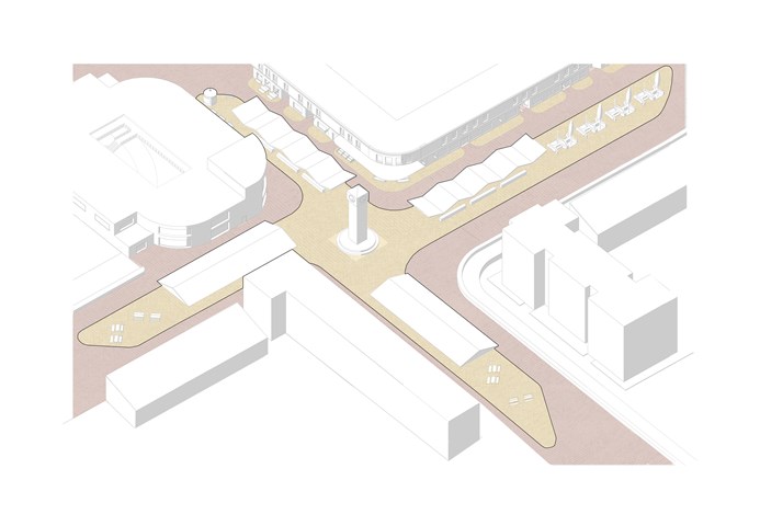
C. Cross - Adele Melas
As a common characteristic of crosses over time, both in history and in the present, a tall clock-tower is placed to mark the centre of the Laurieston Cross. This functions as a prominent landmark for orientation in the masterplan as it is visible from all parts of the neighbourhood. The streets in each bearing meet the cross as a market, forming a vibrant and active dwelling and transition zone, and further emphasising the literal shape of a cross across the site. The roofs over the markets exposed to the High Street (north and west wing) are structured in as rigid rippled effect, symbolising
the rhythm and pattern of individuals shops in the High Street facade, whose life can be continued onto the streets.
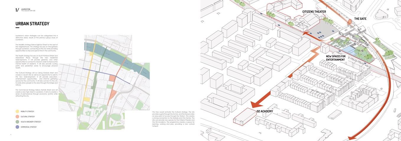
Urban Strategy - Shivani Sarjan
Laurieston Education Hub
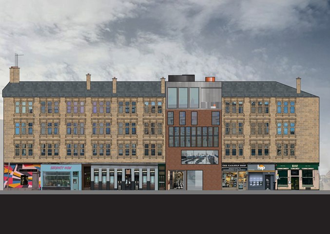
"To Engage" Blink Gallery Final Render - Samuel Sharkey
The Blink Art Gallery is designed to stand out from the blonde sandstone tenement block. The Gallery works against the rules of the block facade with a modern twist on the traditional triple sash and case windows.
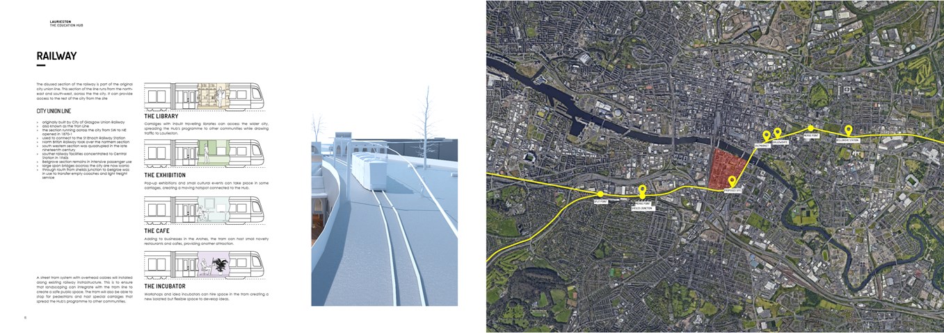
The Railway Line - Shivani Sarjan
Laurieston Education Hub
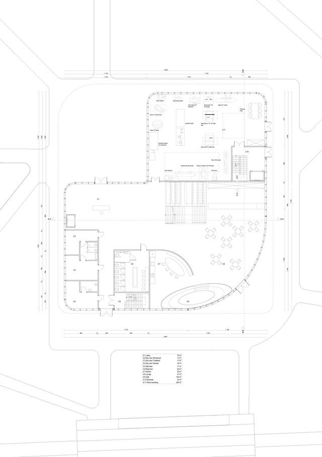
Ground floor plan - Angelika Hajdasz
The ground floor plan consists of a woodworking workshop, daycare, café and lounge areas.
The centre provides multiple opportunities to expand someone’s interest and share talents. The activities offered to women are woodworking, which helps to boost productivity and sense of achievement, which boosts self-esteem as a side effect. Another important space in the building is the sewing workshop, a place where women can express their creativity through fashion and clothes.
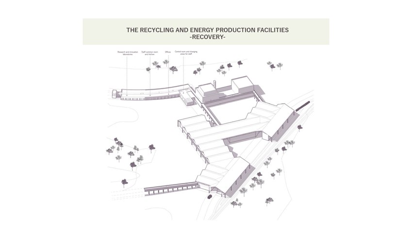
The recycling and energy production facilities - Carla Feraru
The main recovery area of the masterplan is expressed through a series of spaces hosting a material recovery facility, an anaerobic plant, and a plasma gasification plant. These three components work together to manage incoming waste streams, retrieving reusable and recyclable products and turning the rest into energy and valuable by-products.
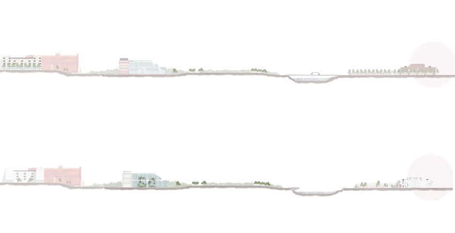
The Master plan of an Individual Story in Elevation and Section - Kate Melhuish
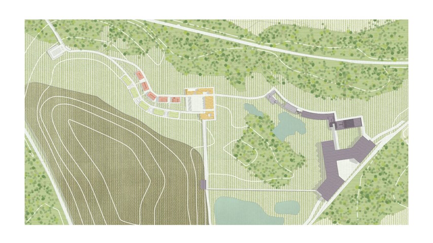
Proposed masterplan - Carla Feraru
The masterplan follows a village-like typology, where a collection of buildings of various scales and functions are symbiotically employed across the site. After the mining process is completed, the landfill mound is remediated into a woodland whilst the masterplan, already established as a central hub of recovery production and consumption within the community, continues to perform these functions long into the future, sustaining the economic activities of the area.
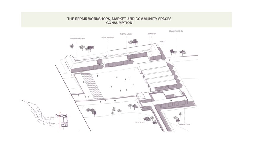
The repair workshops, market and community spaces - Carla Feraru
The consumption area is envisioned as a central space for gathering and leisure. Multiple routes converge to and from the square, making it a focal point for the masterplan and local communities. The buildings here host, on the lower platform a market as well as public workshops for the community, a material library and a repair shop. In addition, a community kitchen and meeting spaces for community groups are incorporated on this level. On the upper platform, the visitor centre is located to the left of the main community hall, a flexible space that allows the local residents to gather informally.
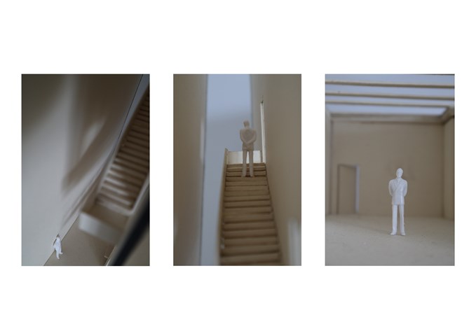
"To Engage" - Section Model 1:50 - Zuzanna Woznicka
Few shots of my physical model at a scale of 1:50. It was my first experience of building a sectional model, I understood how hard and time consuming it is, however, the model helped me to visualize how the building will work and feel the real scale. I want to definitely do more models in the future and try new materials and techniques.
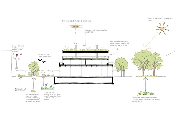
Biodiversity Section - Rachel McLure
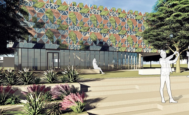
H.E.R. - Angelika Hajdasz
The main idea behind H.E.R. is “accidental counselling”, which means that participants are the support group for each other, alongside mentors, who are always there to lend an ear. That is a key point that makes the centre different from a mental health facility, it is not there to treat people in a traditional way. It is there to support through creating the community and space to open up about personal struggles and reach out to friends, who are going through similar problems and help one another, just like friends do.
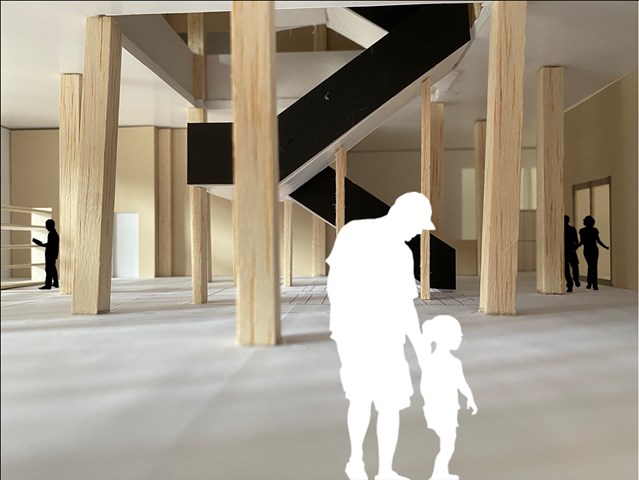
Ground Floor interior view - Lewis McLynn
Interior perspective from Library design.
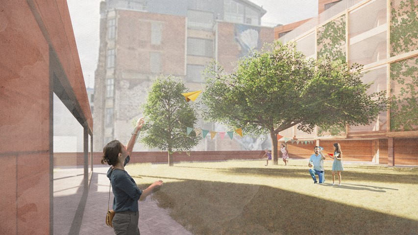
Resident's garden - Alfie Hollington
Design Studies 3a
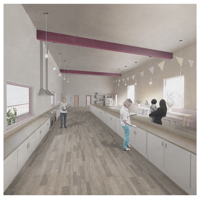
Centre Shared Kitchen - Rebecca Irving
A communal kitchen and dining space in the centre for unpaid care & domestic work.
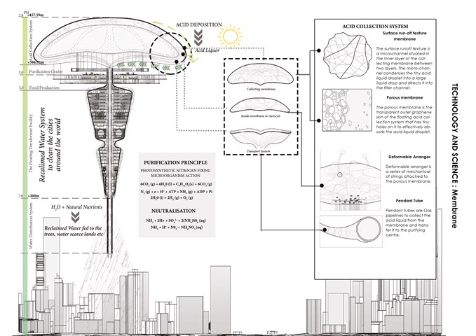
The brain of the Facility: Membrane - Sania Halim
the brain of the facility: the membrane. It’s divided into three parts. The outer membrane or the collecting membrane, the inner membrane, and the transport system. The collecting membrane is further divided into two parts, the surface run-off texture which is a microchannel situated in the inner layer of the collecting membrane that condenses the tiny acid liquid droplets and directs them to the filter channel. And the porous membrane, which has a transparent outer graphene skin with tiny holes on it that effectively absorb the big acid droplets coming from the filter channel.
Last but not the least the transport system consists of pendant tubes that acts as gas pipelines to collect the acid liquid from the membrane and transfer it to the purification center.
Inspiration of the project taken from: PH Conditioner skyscapper, Evolo, 2012
Sania Halim
Inspiration of the project taken from: PH Conditioner skyscapper, Evolo, 2012
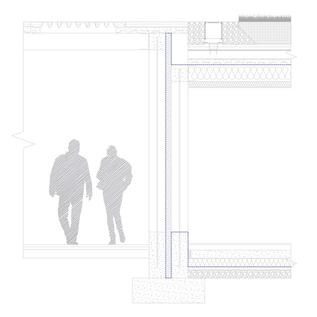
Technical close-up - Alfie Hollington
Design Studies 3a
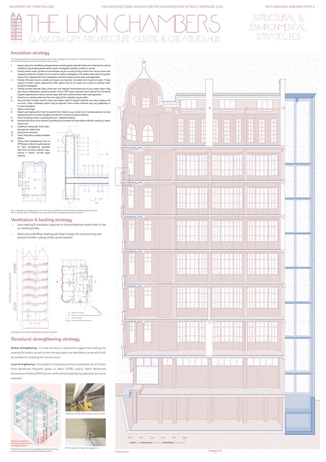
Structural & Environmental Strategies - Amy Aquilina
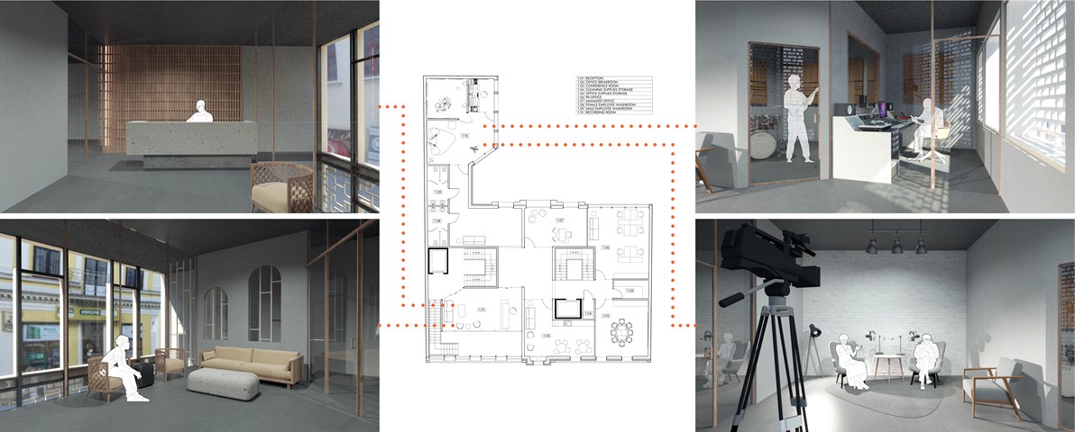
First Floor Plan - Anna Rogowska
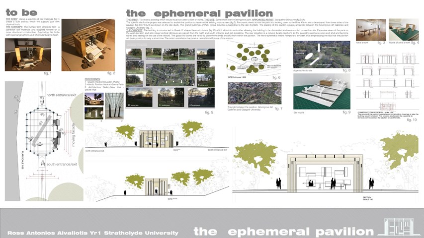
THE EPHEMERAL PAVILION - Ross A Aivaliotis
THE CONCEPT: The building is constructed in Greek ‘Π’ shaped beams/columns which slide into each other allowing the building to be dismantled and reassembled on another site. Expansive views of the park on the west elevation and side views/ vertical glimpses are gained from the north and south entrance and exit elevations. The rear elevation is a moving façade, as the swivelling apertures open and shut and become tables and seating for the use of the visitors. The glass roof allows the visitor to observe the trees and sky from within the pavilion. The word ephemeral means ‘temporary’ in Greek thus emphasizing the fact that the pavilion will be in position for only a short time. The artist’s installation becomes a central stand for use of the visitors.
Artwork by Jacqueline Donachie
Ross A Aivaliotis
Artwork by Jacqueline Donachie
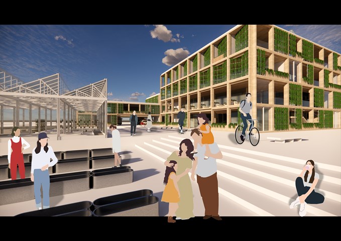
RENDERINGS: Urban Farm/ East Entrance - Gertie Leong Hei Li
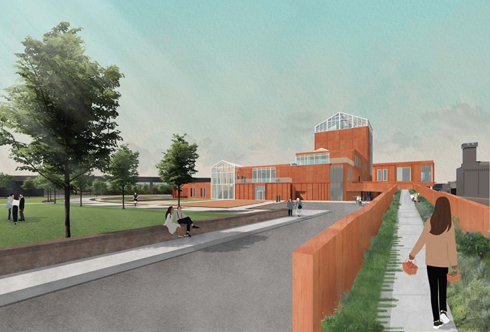
The Ramp Entrance - public access directly to the market, restaurant, garden spaces, and new public park - Fiona Wylie
The site rests on a plinth that is 3.5m above the main street level, and has an existing ramped entrance. To continue the pedestrian walkway in Tradeston's proposed new masterplan, people can directly access the market and gardens without having to go through the whole building. To promote more exterior access, as the site ramps up, so does the building, with a nature path. The nature path wraps around the building, providing direct access from that side of the building to the restaurant, the market seating, the growing areas, and the main greenhouse, all while continuing a green journey to experience the building and create views over the historical wall to the rest of Glasgow.
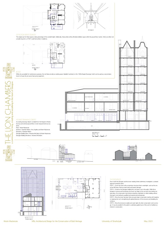
Conservation Design Proposal - Kirstin Mackenzie
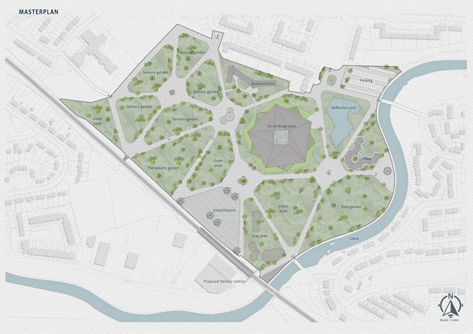
Masterplan - Mrunmayi Pandit
The sensorial hub will encourage community involvement in achieving the goal of effective planning. It will create a place for the stimulation of the senses through green spaces. It will also provide a platform for self-created employment opportunities and sell them. This also ensures that people with disabilities learn the skill and will be able to teach others. It will provide the community with a safe and secure place to roam, educate, work and stay. The sensorial hub has 7 entrances in total. Pathway connecting to the station and site, railway station, and bridges over the canal is proposed for better access. The master plan is designed in a way to create a direct connection with all the surrounding communities. It has been divided into spaces such as gardens, a Reflection pool, amphitheater, Build spaces, parking and a Boating deck.
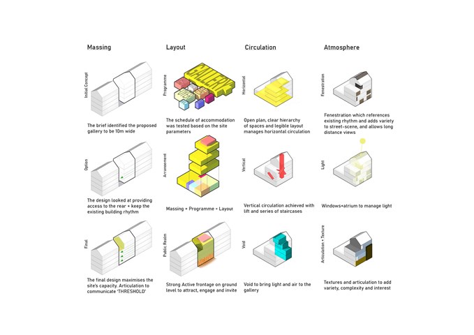
Threshold Gallery: Design Principles - Ilja Anosovs
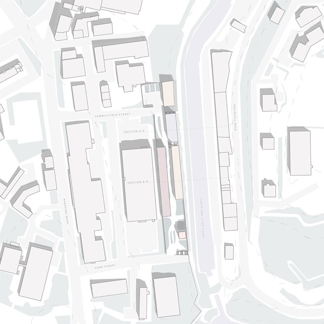
Centre for Sisterhood Site Plan - Rebecca Irving
The centre for sisterhood design response developed based on brief requirements and existing site context- such as the residential building at Speirs Wharf. 5 key blocks were established with a central corridor linking typologies. Inclusion of green space throughout the site was driven by the aspiration to include safe, enjoyable outdoor spaces for women.
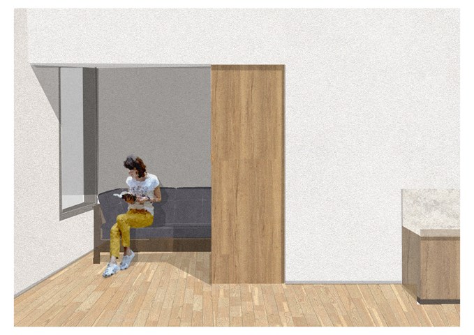
Space to Escape - Sadie Sanchez-Ruiz Malan
To Live/Work
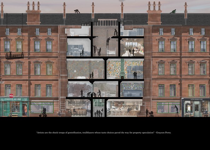
Stage 2: The Artist Renovation - Jakob Young
Cultural Studies Triptych: Inequality Street
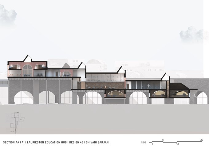
Section AA - Shivani Sarjan
Laurieston Education Hub
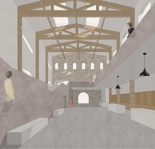
Market hall foyer space - Fatema Hassan
This view shows the plaster render staircase that leads to the upper spaces including the food hall, workshops, and cafe. On the left, rentable kiosk spaces for people to advertise and sell products beneath a high ceiling braced in exposed timber construction and bathed in skylight light.
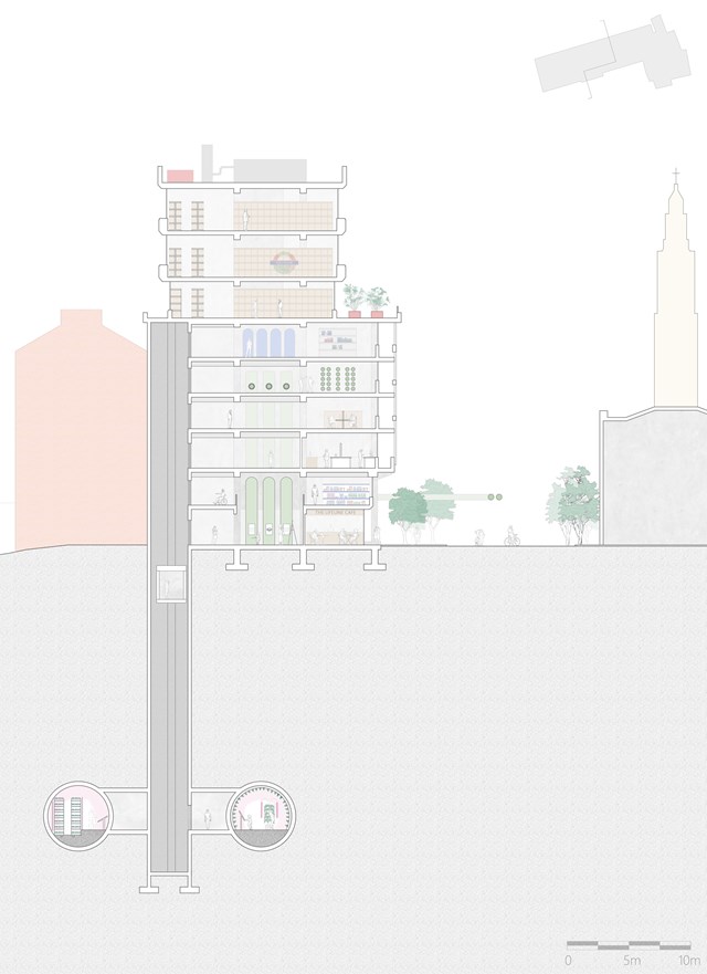
Cross Section of The Lifeline HQ - Shravan George
This section illustrates the HQ's connections to the tunnels below as well as to the newly pedestrianised Strand.
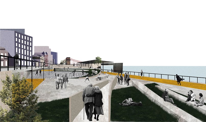
Urban Balcony 3- a perspective render. - Cham Zheng Chee
Like a balcony, it possess contemplative means, gravitational gestureS, and perhaps an out-of-body experience; with all in a singular experience.
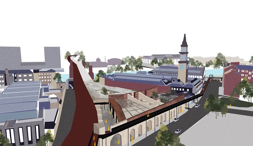
Urban Intervention of Interstitial Spaces. - Cham Zheng Chee
Like a balcony, it creates a vast continuum of space with the city- awakening of the juxtaposition between the wide grasp of the city and the speckle of present self, translated in the vessel of an elevated pedestrian bridge against the city.
The design proposal revitalizes one of the abandoned interstitial spaces in the city. The space shares the same railway line adjacent to the market space which allowed the liminal space within the urban realm to be continued. The façade facing the Bridgegate street is retained as the frame from its past. The pedestrian bridge along the railway stems towards the edge environment along the river, propelling human flow from the city centre.
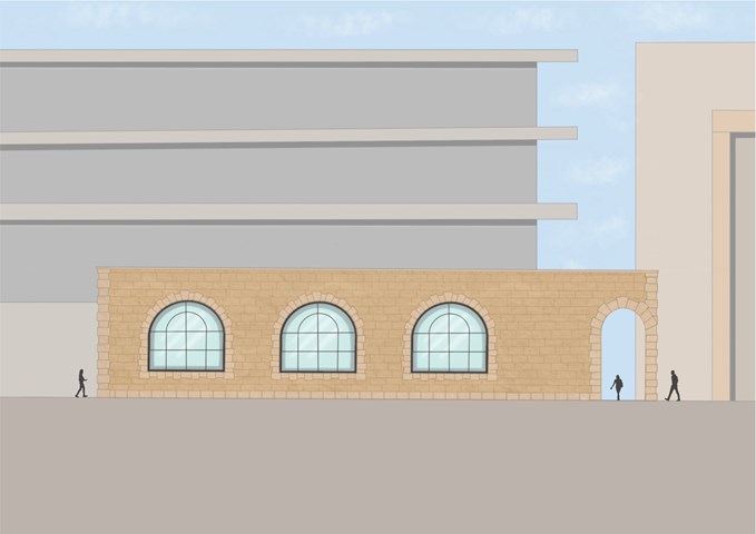
South Elevation - Leena Hussain
Large arched windows belong to the reading room.
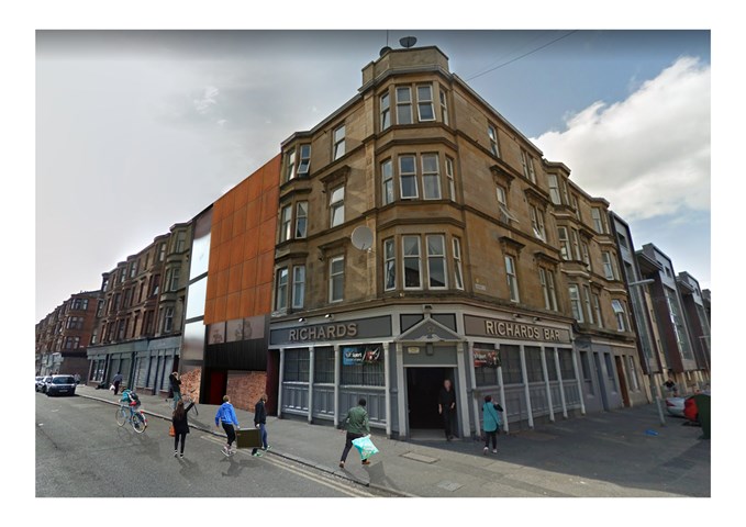
"To Engage" - 3D view - Zuzanna Woznicka
3D view of my design is a photomontage of the physical model, photography and patterns. It was quite challenging because I had to work from 3 point perspective, which is still quite new to me. This project definitely made me understand that I still have a lot to learn about the drawing basics such as perspective, shadows and geometry. There is a lot to learn about digital design, which I am really excited about.
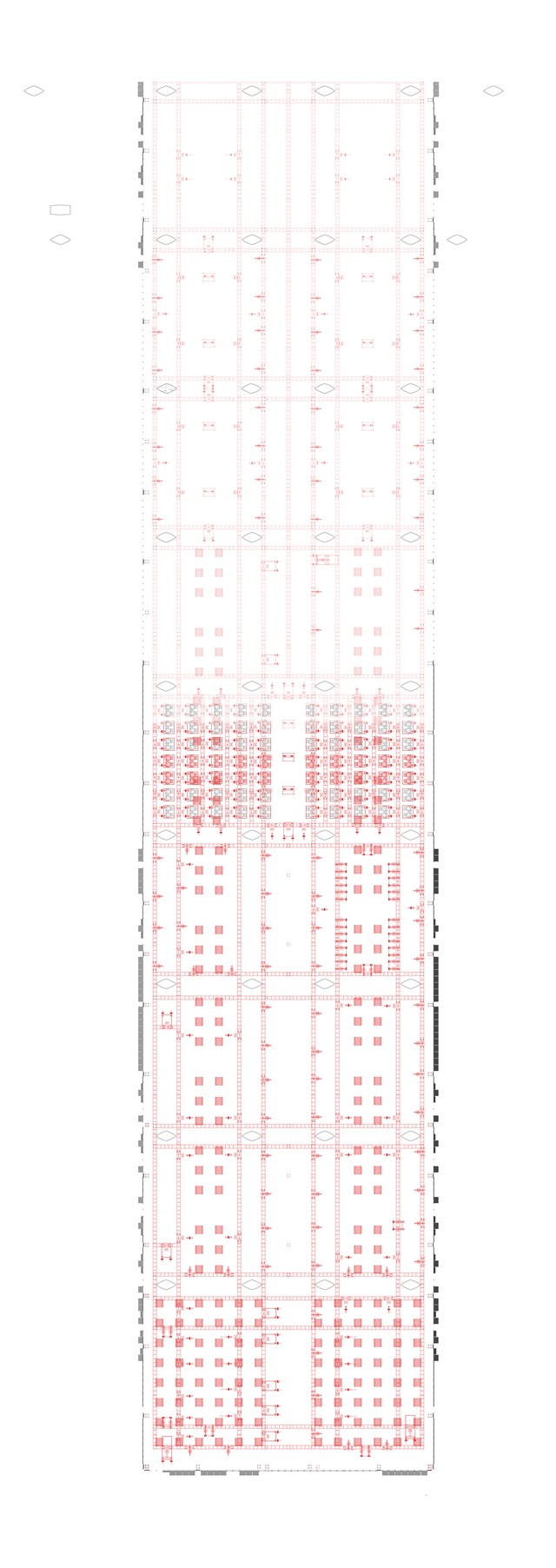
Scaffolding Structure Plan 1:100 - Conor Ryan McCormack
Down The Rabbit Hole_3B To Play
Down the Rabbit Hole_3B To Play.
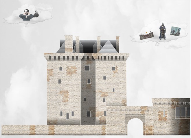
Borthwick Castle Artwork - Lewis McLynn
Comparative artwork produced for Cultural Studies.
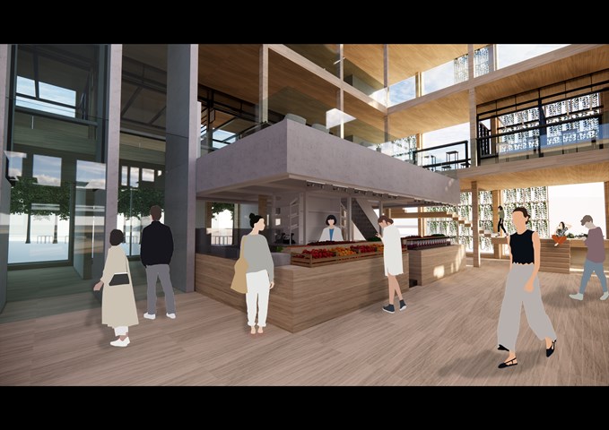
RENDERINGS: Markethall's Stalls activities - Gertie Leong Hei Li
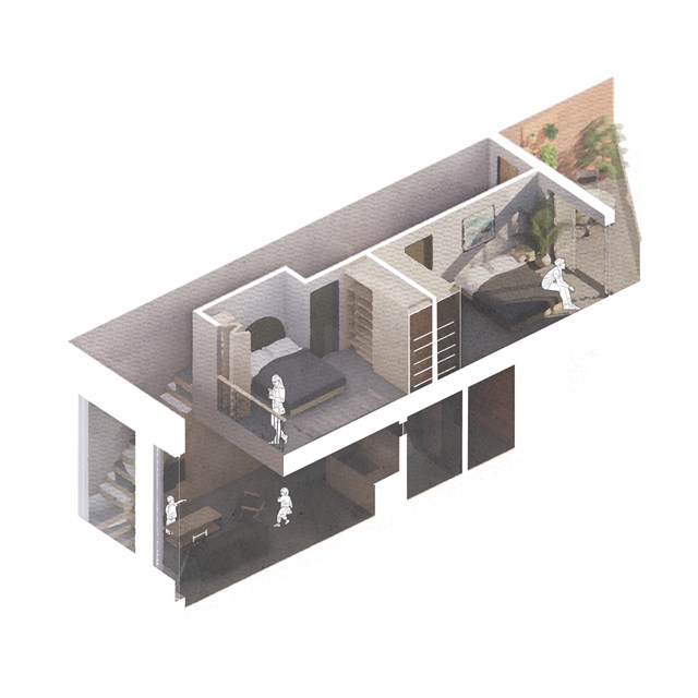
Isometric flat section - Alfie Hollington
Design Studies 3a
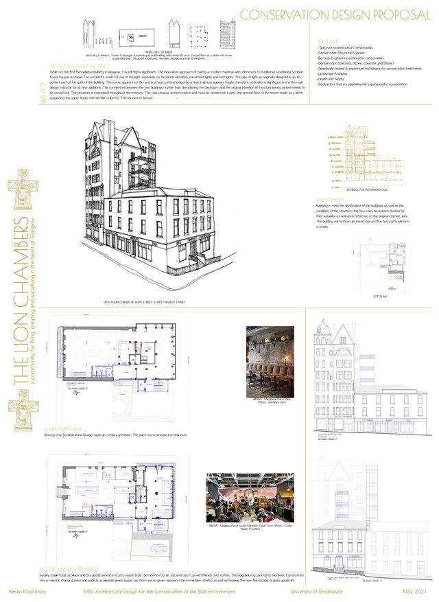
Conservation Design Proposal - Kirstin Mackenzie
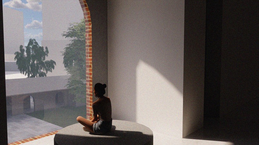
Internal Visual Showing Atmosphere - Kate Melhuish
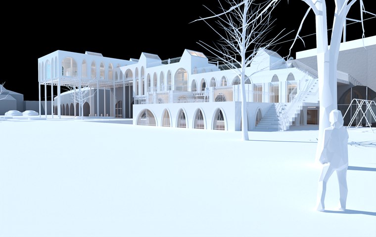
View of Physical Model along Gorbals Street - Shivani Sarjan
This view of the phigital model depicts the building from the landscaping, clearly showing the user's ability to 'climb' the building to the spaces above.
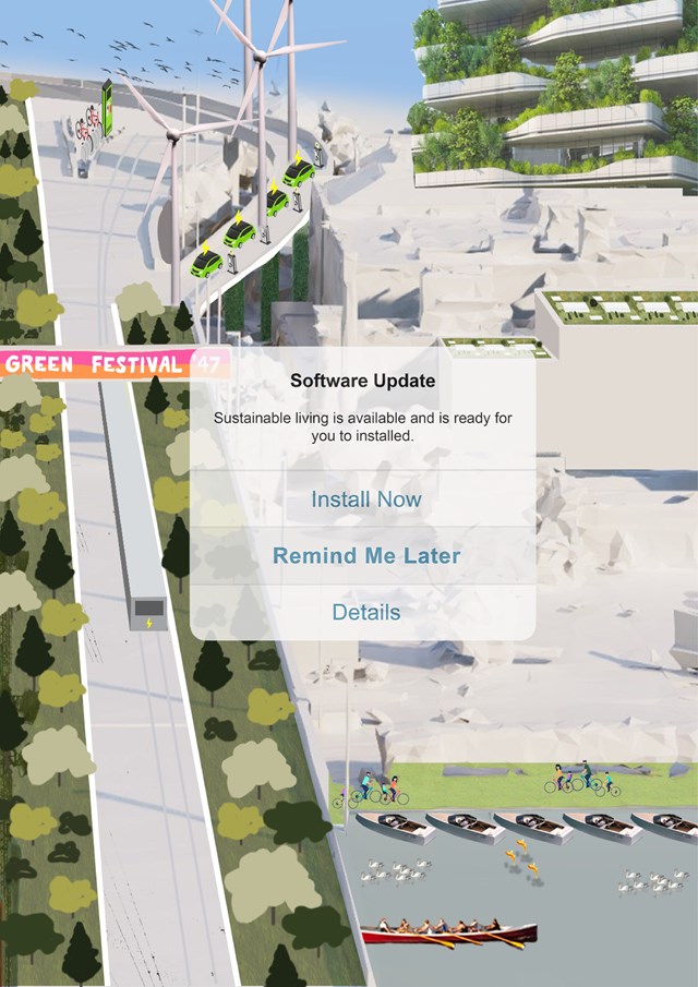
SELF-INITIATED - Gertie Leong Hei Li
Design Studies: Workshop
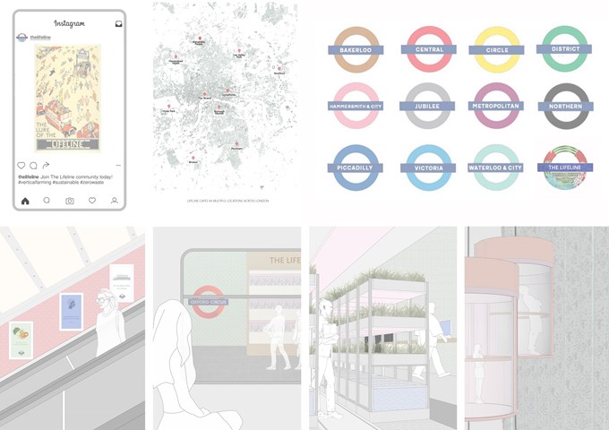
Integration into everyday life - Shravan George
These visuals show how The Lifeline becomes an integral part of the daily lives of over 2 million Londoners who use the Tube everyday. The innovative and sustainable food production methods are manifested outside the hubs by means of vending machines at busy Tube stations, Lifeline cafes dotted across London, as well as posters and visual media. Social media plays a crucial role in educating the younger generation as well.
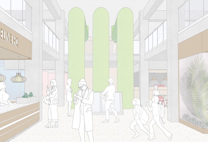
The Lifeline HQ - Shravan George
This visual shows how the interiors of The Lifeline HQ capture all the different food production groups in one space and serve as a portal for the pubic to experience them.
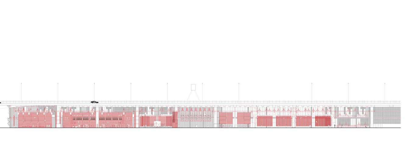
Section AA 1:100 - Conor Ryan McCormack
Down The Rabbit Hole_3B To Play
Down the Rabbit Hole_3B To Play.

Labelled Site Plan of the Shipyard - Ellie Carroll
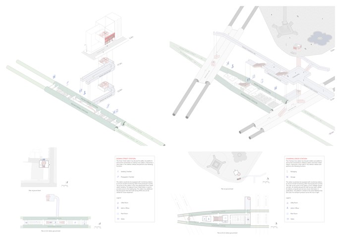
The Stations - Shravan George
Down Street – abandoned station takes care of seeding and germination processes.
Charing Cross – active station takes care of packaging and storage. It also helps link The Lifeline to the Tube network (in this case, to the Bakerloo line).
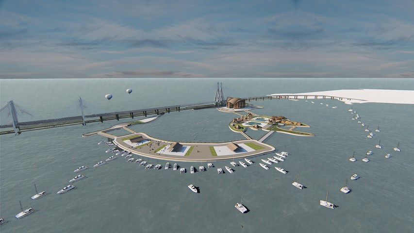
An Ephemeral Festival on a Floating Archipelago - Sowmya Mantha
Design Studies
In a rapidly developing world, high levels of stress have become an integral part of peoples fast paced lives. The proposed floating Archipelago concept is an initiation to uplift people and place by bringing together the issues in conjunction. Once the wellness of people is adhered to, through therapeutic benefits of water, it would then provide these individuals with an opportunity to pause and reflect upon themselves and together grow as a healthier community.
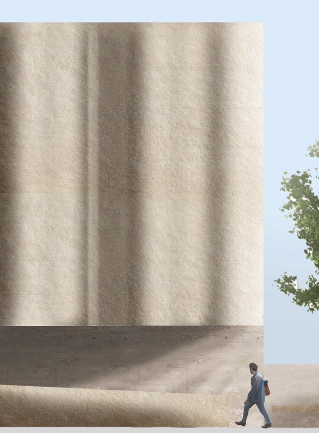
External stone render - 1:20 - Antony James Graham
This visual demonstrates the significance and importance of the buildings façade that relates to the 'STONE CITY' of Glasgow, a fluent and consistent trend that has been a major influence on the development and research into the projects growth. The vast majority of the building relates to the architectural pallet, materiality and character of the Stone city, Glasgow 'City of Facades' as a reminder to the historical and cultural heritage, identity and importance as we develop buildings in our modern climate.
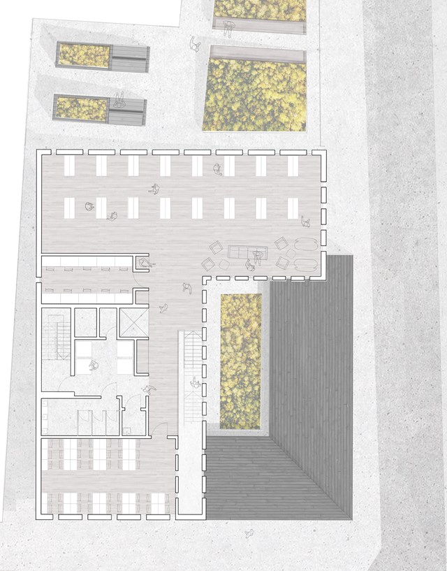
First Floor Plan Scale 1:100 - Eilidh McGuigan
The first floor plan follows a similar theory, with service spaces kept to the left. From Bottom to top lie the reading room, toilet facilities, print room, private storage, computer base, and main library space.
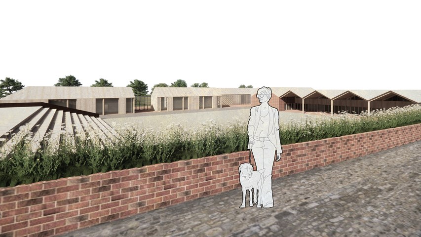
View from the upper terrace of the consumption area down towards the square - Carla Feraru
The amphitheater seating not only makes the transition between the upper and lower level of the site at this point but is imagined to be used in conjunction with the ‘square’ and act as spectators seating for activities such as concerts, theatre shows and movie displays. During weekends, the indoor market ‘spills’ onto the square and local residents and visitors alike are invited to sell unwanted goods or sustainably produced products here. Together with the ‘shopping street’, this area of the master plan is designed and imagined as a walk-through town. Despite the language of the masterplan following clues and conditions from the urban environment, the surrounding park context is highlighted and enhanced.
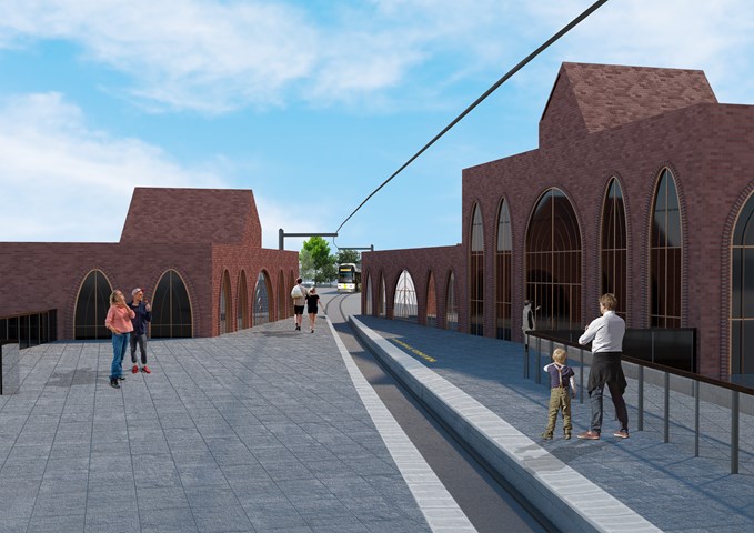
Exterior View of the Laurieston Education Hub from the Tram Station - Shivani Sarjan
Laurieston Education Hub
This exterior renders depicts the station and entrance as seen from the bridge. It shows the stations seamless indoor outdoor relationship with the block. The paving steps up to allow visitors to easily exit the tram. It then steps down to the landscaping beyond.
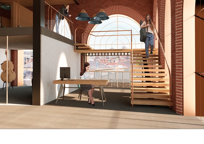
Interior View of the Reception - Shivani Sarjan
Laurieston Education Hub
This is the administrative reception as you enter the primary space from the station. A lightweight staircase wraps around a simple reception space across from the administrative office. This semi private block is open to the public and visitors and the receotion provides the first point of contact within the building,
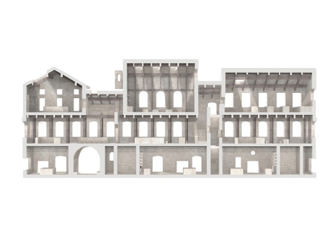
Sciographical study of the sectional model - Fatema Hassan
This section highlights and emphasizes the contrast and structural relationship between the inner and outer facades. The outer facade is a series of carved openings into the masonry wall while the inner facade is composed of the grid of timber columns making it a transparent facade to the interior courtyard.
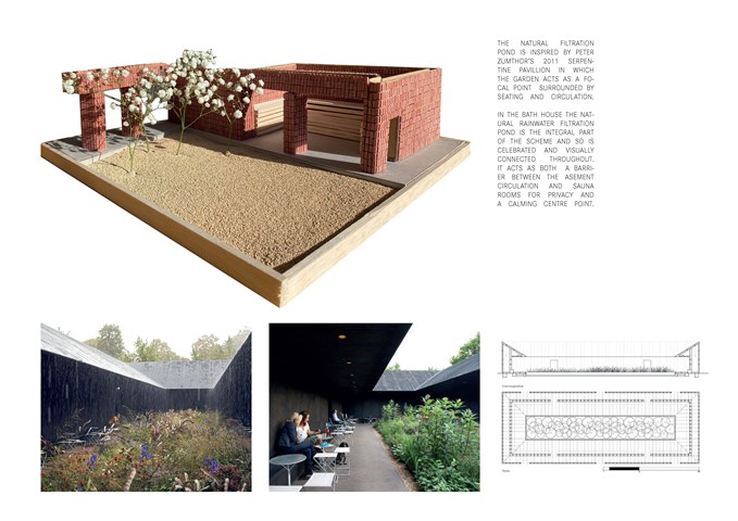
Courtyard Model 1:35 - Jessica Gear
Model of the filtration courtyard exploring the relationship of materiality between the basement circulation, filtration pond and onlooking sauna rooms.
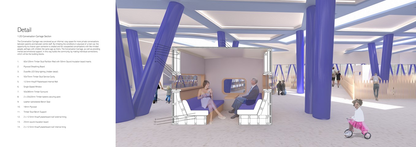
Andrew McCluskie
1:20 Conversation Carriage Section
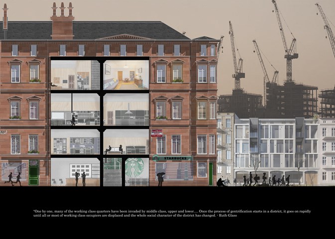
Stage 3: The Displacement - Jakob Young
Cultural Studies Triptych: Inequality Street
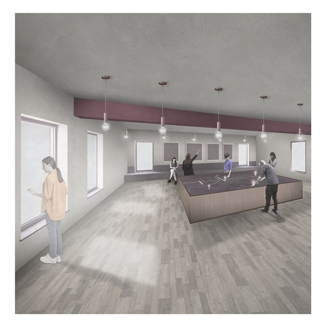
City Satellite Control Centre - Rebecca Irving
The city centre site adopts a piece of vacant land in the city and focusses on improving feelings of safety by introducing another lookout tower.
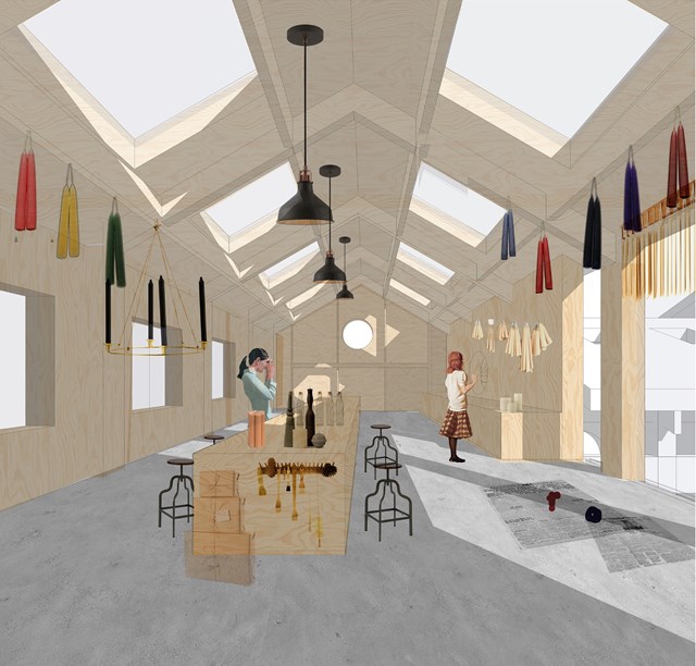
Candle making workshop - Fatema Hassan
Candles are hung on the timber frame to dry. The workshop is well lit with eight skylights aligned symmetrically against the main counter. The timber frame extends to the end of the space to form a grid of timber columns and beams to place candles ready to be packaged.
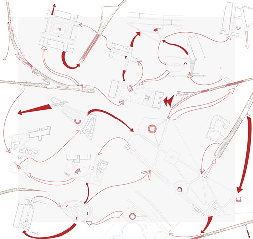
Connectivity of an Open City - Ami Coulter
Toward an Open City is an important infrastructure though it does not solve all the problems – as there can be no final solution. Through providing a renewed circular programme of interventions which continuously feed each other, it provides new and varied modes of citizen engagement at different scales, in different locations. Ultimately, building a climate which is more open; accepting of the other, adaptable, respectful and understanding.
Inspired by Guy Debord, Psychogeographical guide to Paris 1957. Lazzaroni, 2012.
Ami Coulter
Inspired by Guy Debord, Psychogeographical guide to Paris 1957. Lazzaroni, 2012.
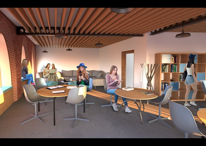
Interior View of the Youth Club - Shivani Sarjan
Laurieston Education Hub
The Youth Club is a dedicated space in the Hub for teenagers to gather and use independently. This room adjoins two auxilliary spaces for study and counselling.
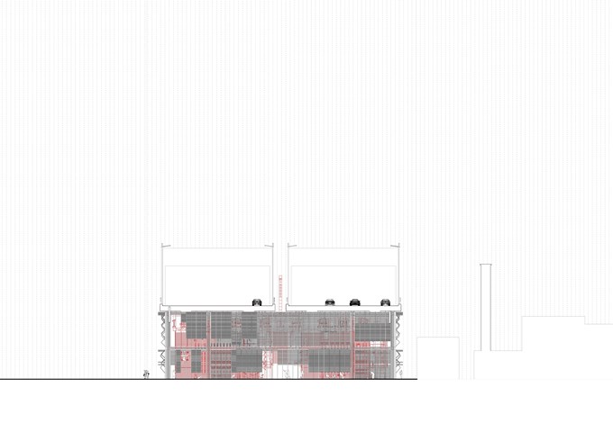
South Elevation 1:100 - Conor Ryan McCormack
Down The Rabbit Hole_3B To Play
Down the Rabbit Hole_3B To Play.
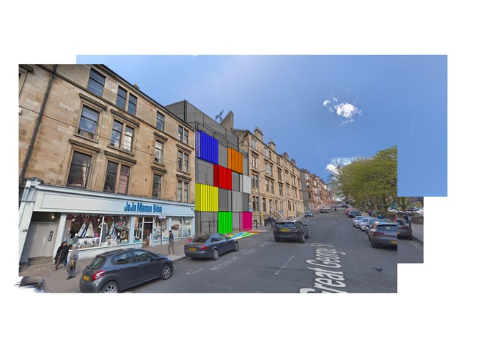
Photomontage - Nathan Constable
Finally, then, is the finished concept. This was my first ever photoshop attempt and used a full SketchUp digital model and Google Maps images to create this photomontage.
Thank you very much for looking at just a glimpse of my architecture folio from this year!
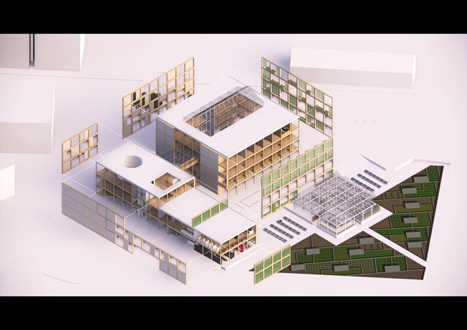
Exploded Axonometric View of the Facade - Gertie Leong Hei Li
The facade was designed to be modular where pieces can be replaced and restored very easily. There are three different types of variation, including Solid Walls, Glass Features and Green Walls.
Green walls are to be placed facing the South and East side of the site where solid walls are featured on the North and West side of the site, designed with holes, which are to deliver a sneak peek of what's going on inside the building from the pedestrians.
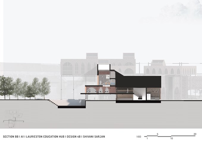
Section BB - Shivani Sarjan
Laurieston Education Hub
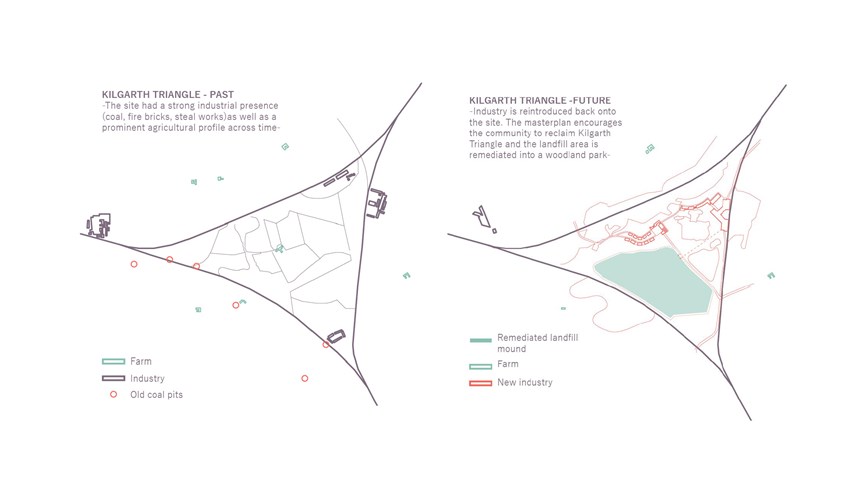
Past conditions and proposed masterplan - Carla Feraru
Historically associated with an array of industrial activities, today the site of Kilgarth Landfill sits derelict, awaiting a new life. The role of the new industry would not only remediate the land, returning it to the ever-expanding surrounding communities, it would also create new and diverse employment opportunities in the process.
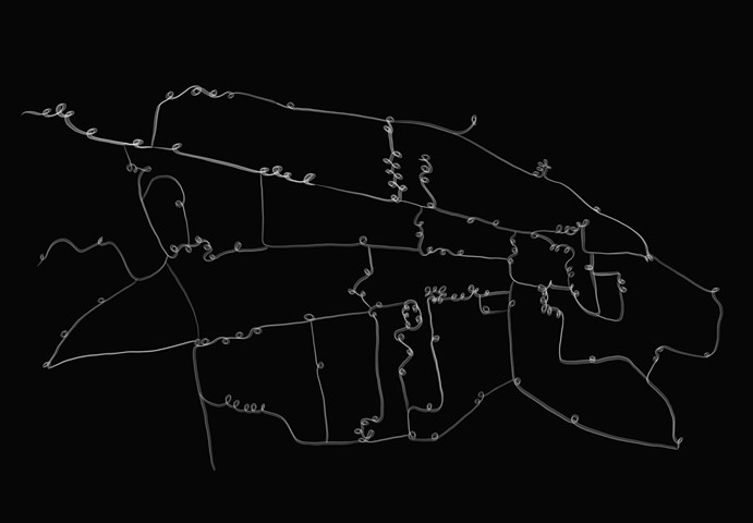
St Andrews Townscape Map - Leena Hussain
A map of St Andrews where each loop represents an arch within the town.
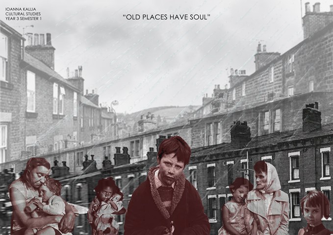
CULTURAL STUDIES- URBAN HOUSING - Kallia Ioanna
Terraced Houses are significant and need to be treated with respect, as they form the foundation of cheap housing in Glasgow since the 1960s. People’s history is written in these houses and should not be kept and hidden away.
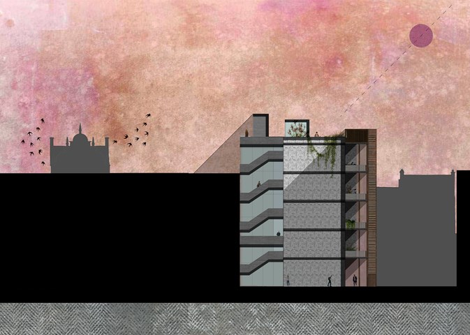
North Elevation 1:100 - Conor Ryan McCormack
Allotment Living _3A To Play
Allotment Living_3A To Live.
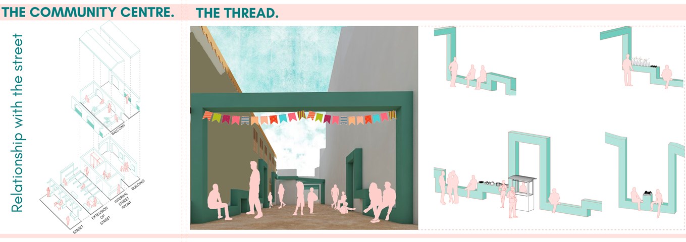
Alamin Mandhry
Not only is the relationship between the street and the building is maintained using barazas (stone bench) for people to meet, relax and sell goods, an internal street with the same barazas is created. The internal street is lined with dakas (outdoor porches) used as shops, restaurants and a space for people to play, socialise and relax. A visual link is created using the balconies on the first floor that over look the street and internal street.
The connection between the hub and the dhow yard is enhanced using a "thread" that weaves through the the street providing spaces for activities such as socialising, commerce and playing that already take place on the street.
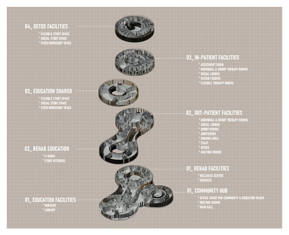
Program - Laura Krumina
Rehabilitation can be a long and complicated process. Without integration between phases, this can very quickly turn into an isolated environment. We need to redesign the way we approach this as just having rehabilitation facilities without integration within the community can emphasise further problems. I propose a facility that blends these boundaries and accommodates a healthy rehabilitation environment that concentrates on four aspects of recovery: Body_Soul_Mind_Hearth.
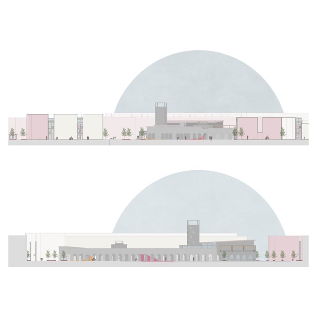
Elevations in context - Asya Gumus
The top elevation shows the 'safe wings' in context and the elevation below shows transparency/ access between street and larger intervention.
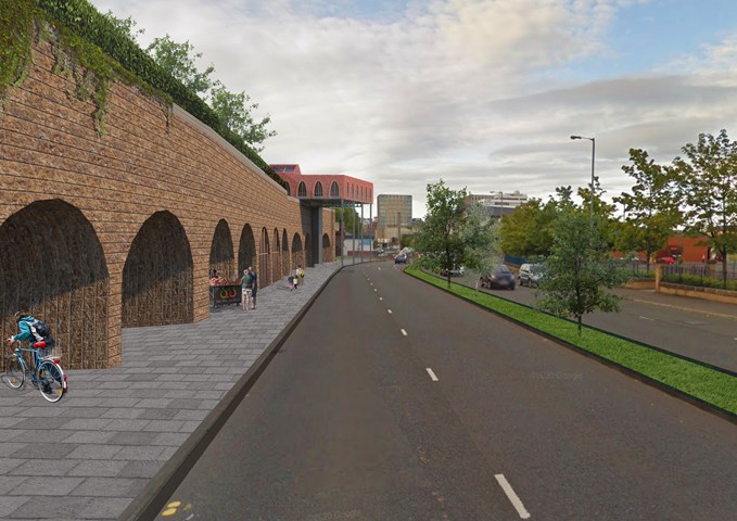
Exterior View of the Laurieston Education Hub along Laurieston Street - Shivani Sarjan
This is a view of the east block along Laurieston Road. It shows the subtle interaction with the Gorbals, inviting the community to go through the arches.
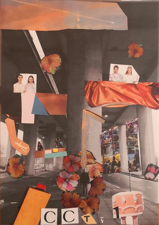
Handmade Collage, envisioning Concept. - Conor Ryan McCormack
Down The Rabbit Hole_3B To Play
Down the Rabbit Hole_3B To Play.
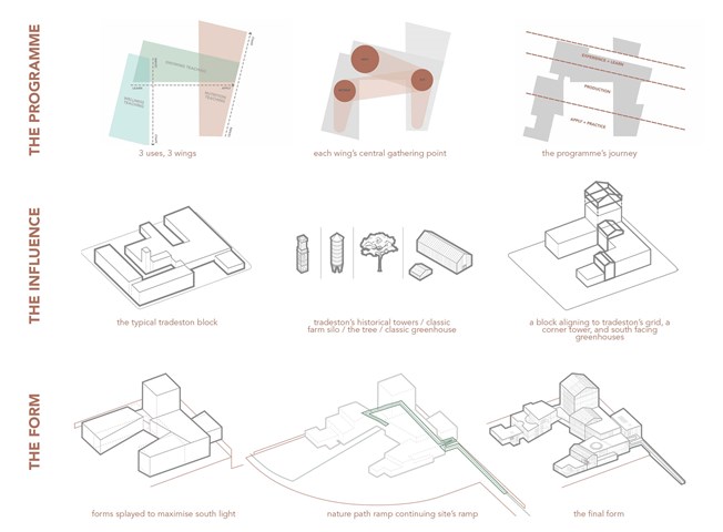
Concept Development - the programme / the influence / the form - Fiona Wylie
The programme influences the form, splitting the building into 3 wings containing its 3 uses, tapering through use, to learn or to apply knowledge. The linear placement of programme reflects the journey of production: learning how to, seeing it done, and then doing it yourself. In each wing, there is a round central gathering point to break up the orthogonal qualities of the production spaces in the building, and promote community interaction.
Looking at the exterior form, the perimeter of the building is parallel to the boundaries of the historical 5m tall perimeter wall of the site, whilst the interior is splayed to maximise south light for greenhouse production. When the concept meets the context, inspiration was taken from the typical solid Tradeston block with u-shaped voids, mixed with the tower typologies of the historical Tradeston tower in its context, the classic agriculture silo, the tree, the typical greenhouse, and tradeston's peaked roofs, to come to a final form.
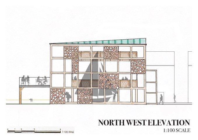
AB208: The Sailing Club North East Technical Section Showing Gathering Space - Sophie Lathan
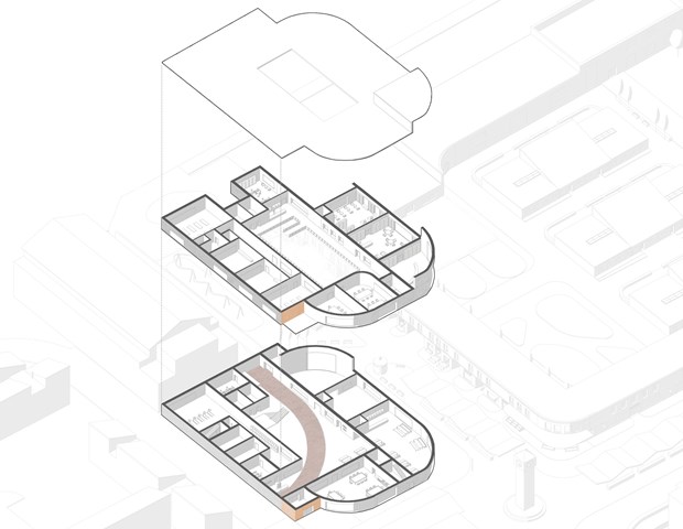
G. Community Centre - Adele Melas
The Community Centre offers indoor venues for residents with dementia to enjoy leisure activities alone, with friends, family, or general members of the public. As the DFN encourages engagement with social and physical factors in the outdoor environment, the essence of this is brought internally within the community building. This is executed by continuing of the red path, the distinct orange entrance which responds to the High Street colour rhythm the internal skylight and courtyard, and exposure of light external materials on the interior facade which increase natural light reflected in the space. The building's curves, gently winding edges, surfaces, and paths, are regarded as more legible to dementia-users.
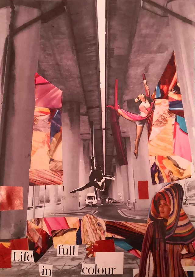
Handmade Collage, envisioning Concept. - Conor Ryan McCormack
Down The Rabbit Hole_3B To Play
Down the Rabbit Hole_3B To Play.
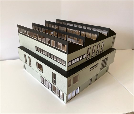
1:50 Model of Library design - Lewis McLynn
Exterior shot of my design model for the Library project in AB210.
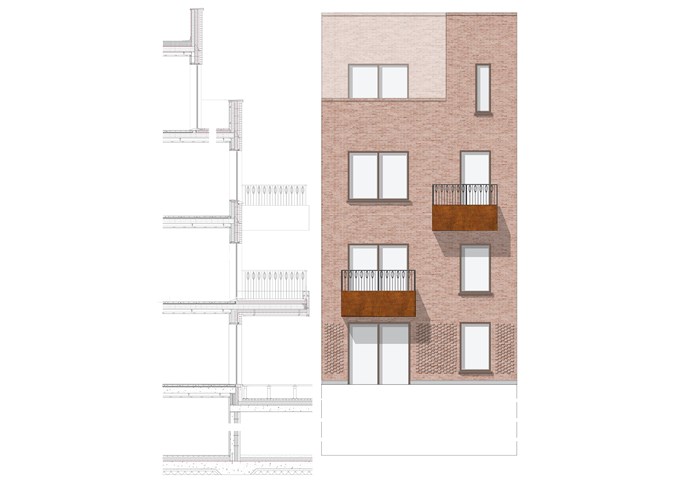
Elevation Detail Study - Sadie Sanchez-Ruiz Malan
To Live/Work
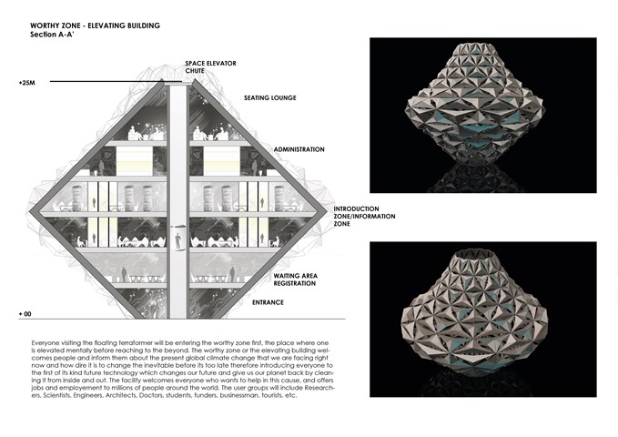
Elevating Building - Entry Zone - Sania Halim
Everyone visiting the floating terraformer will be entering the worthy zone first, the place where one is elevated mentally before reaching to the beyond. The worthy zone or the elevating building welcomes people and inform them about the present global climate change that we are facing right now and how dire it is to change the inevitable before its too late therefore introducing everyone to the first of its kind future technology which changes our future and give us our planet back by cleaning it from inside and out. The facility welcomes everyone who wants to help in this cause and offers jobs and employment to millions of people around the world. The user groups will include Researchers, Scientists, Engineers, Architects, Doctors, students, funders, businessmen, tourists, etc.
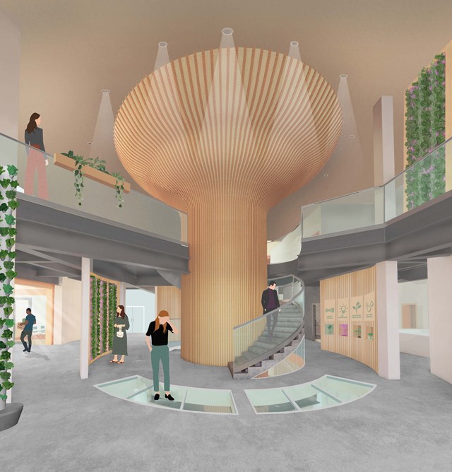
The Main Entrance - Fiona Wylie
After entering the building from Cook street and rising up through the building, the main entrance acts as a "tree" base for the rest of the growing tower, with a glass floor looking down into the seed library. At the center of it is introductory information about hydroponic growing, and the space splits off into the learning spaces, the main atrium, growing spaces, and the wellness wing.
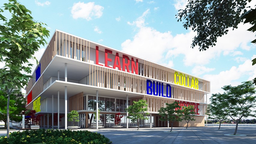
Exterior view - Idris Jacobs
View of the Riverside Vocational Centre looking from the main entrance
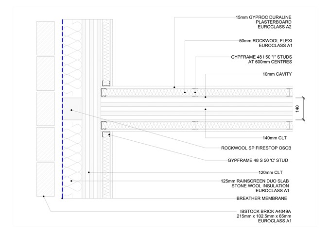
Plan section, junction of separating wall and external wall at 1:5 - Giulia Panedigrano
Technology Studies
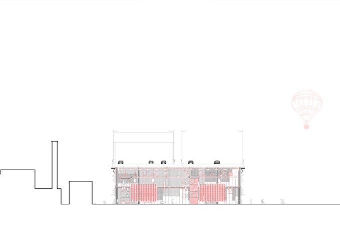
Section DD 1:100 - Conor Ryan McCormack
Down The Rabbit Hole_3B To Play
Down the Rabbit Hole_3B To Play.
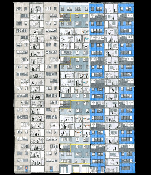
Cultural Studies 3A - The Glaswegian Tower Block over Time - Zoe Bennett
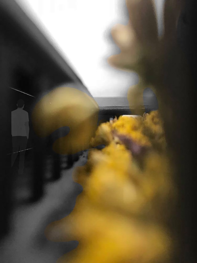
View Back to the Entrance Lobby Through Wild Flower Garden. - Eilidh McGuigan
By designing the circulation space around the central wild flower garden, it strengthens the connection between the person and the outdoors. With views from every room to this lush green space, the library aims to improve the publics wellbeing and responds to the sustainable design outcomes.
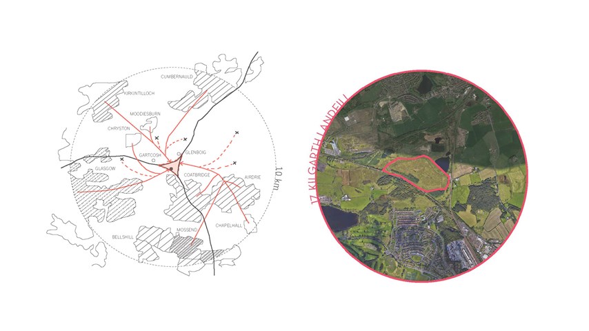
Site location - Carla Feraru
The new resource mining industry transcends the function of managing waste and it looks at how resources can be recovered, reprocesses and consumed sustainably so that they don’t become waste in the first place. Whilst at this stage the need to consider the whole journey of our resources is highlighted, no one selection of spaces would work for each context. From this point onwards, the principles set will be tested about the chosen site of Kilgarth Triangle, where the brief will evolve and be defined in close relation to the specificity of the site and the local context.
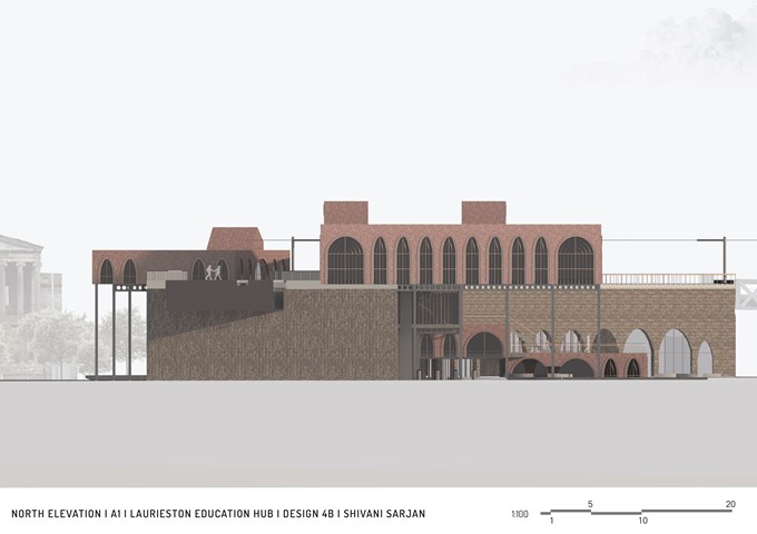
North Elevation - Shivani Sarjan
Laurieston Education Hub
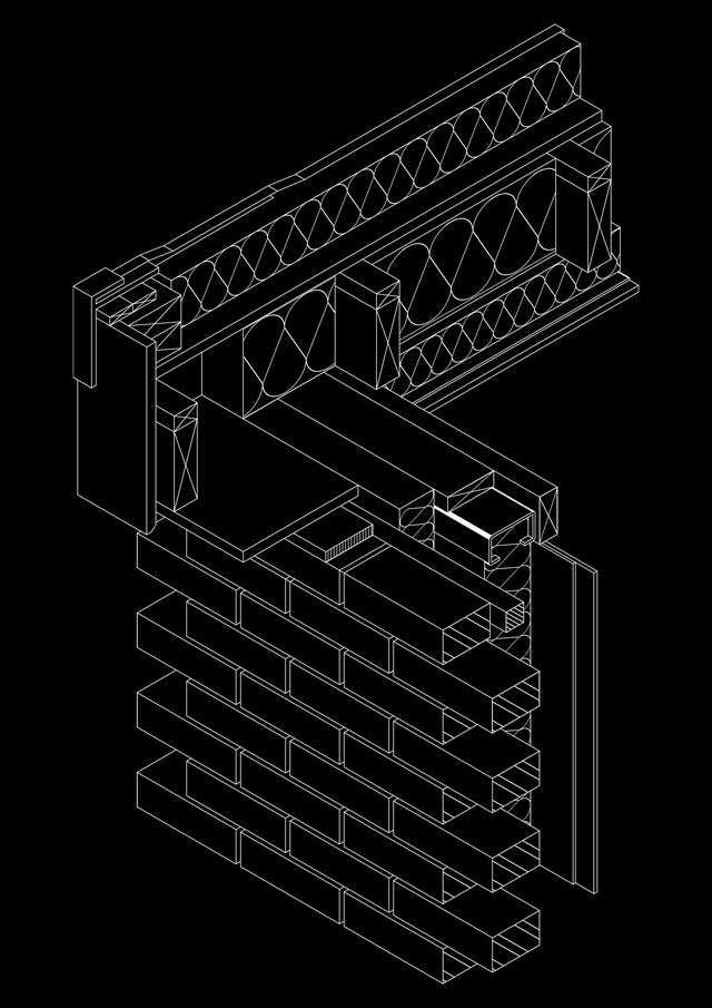
Technical Drawing of Steel Frame - Timber Flat Roof - Yousoef M Mayet
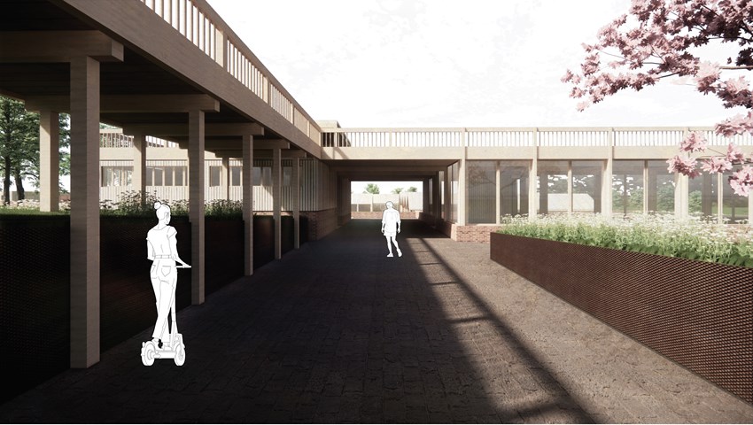
Arrival to the visitor tour reception building - Carla Feraru
The visitor tour is a very important component of the masterplan. Its role is to contribute towards better integration of waste management processes and society. By giving people the opportunity to observe first hand the activity associated with processing waste, they are encouraged to change their consumption and disposal behaviours.
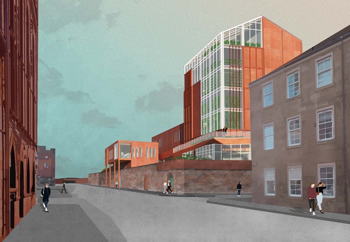
The Cook Street Entrance - Fiona Wylie
As existing, the tall historical wall surrounding the site creates an imposing barrier along Cook Street, but this proposal plays with the thresholds along the street edge, to make it more inviting. The placement on the corner emphasizes visibility and transparency from a distance, with the restaurant perched over the sidewalk to create a clear entrance, and the growing production clearly visible as a green beacon.
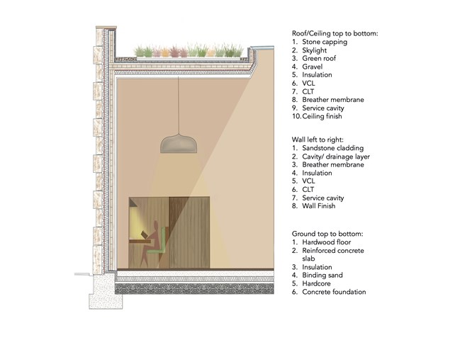
1:20 Section - Leena Hussain
Section from reading room detailing materials and lighting.
