Site Gallery - Physical Model

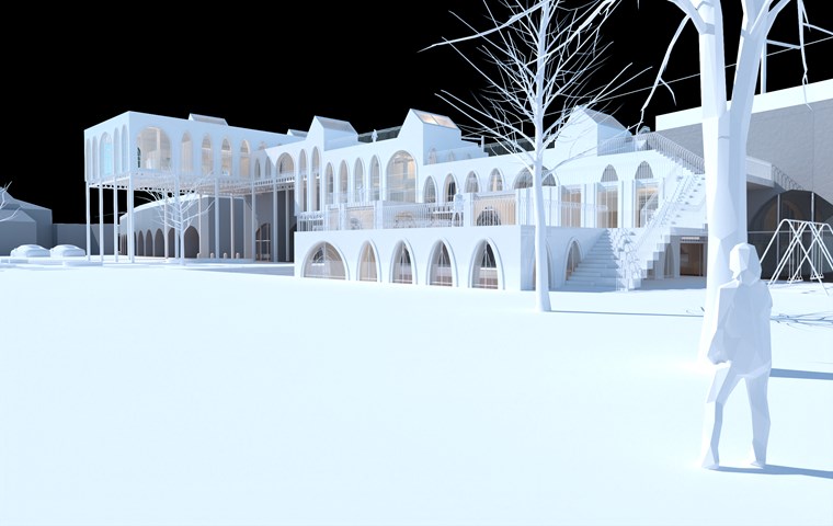
View of Physical Model along Gorbals Street - Shivani Sarjan
This view of the phigital model depicts the building from the landscaping, clearly showing the user's ability to 'climb' the building to the spaces above.

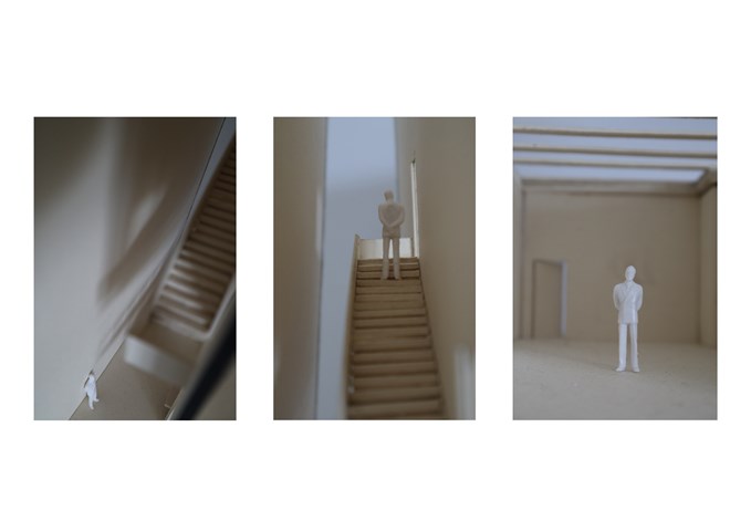
"To Engage" - Section Model 1:50 - Zuzanna Woznicka
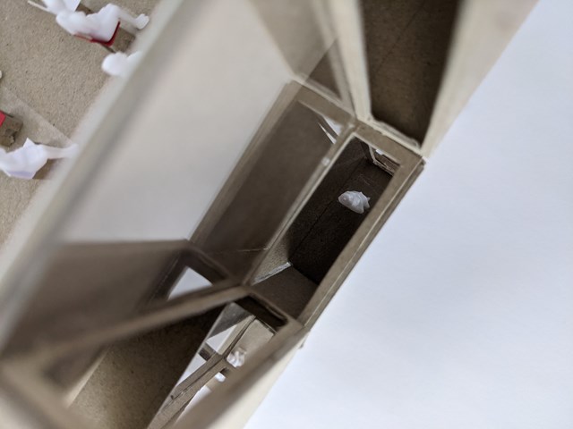
Few shots of my physical model at a scale of 1:50. It was my first experience of building a sectional model, I understood how hard and time consuming it is, however, the model helped me to visualize how the building will work and feel the real scale. I want to definitely do more models in the future and try new materials and techniques.

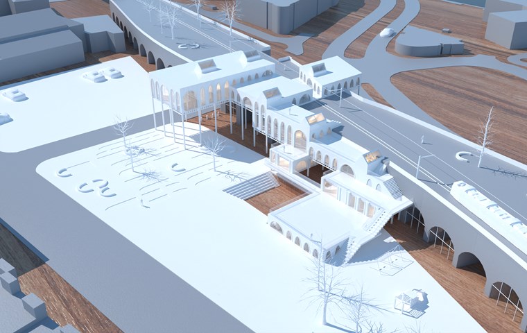
Aerial View of the Physical Model - Shivani Sarjan
This view of the Phigital model, shows the landscaping, the arches and how the buildings interact with them. It also shows the access routes to the building and the parking lot.

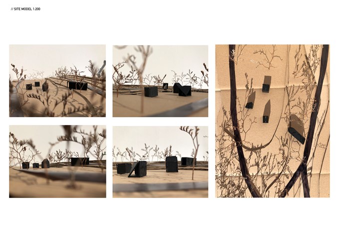
Site model 1:200 - Zuzanna Woznicka
This site model helped me to locate and connect pavilions. It was really important for me to understand how they collaborate together. I wanted to achieve the route that will lead from the exit to the entrance of the next pavilion, ending at the largest pavilion. The last pavilion design collaborates with the shapes of the rest three and captures an incredible view of the pavilions, river and tenements.

"To Engage" - 3D view - Zuzanna Woznicka
3D view of my design is a photomontage of the physical model, photography and patterns. It was quite challenging because I had to work from 3 point perspective, which is still quite new to me. This project definitely made me understand that I still have a lot to learn about the drawing basics such as perspective, shadows and geometry. There is a lot to learn about digital design, which I am really excited about.

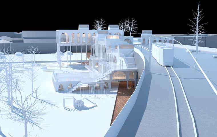
View of Physical Model along the Tram Line - Shivani Sarjan
This is a view of a the phigital model from along the refurbished railway. It depicts the new tram line as well as how the building steps onto and over the arches.

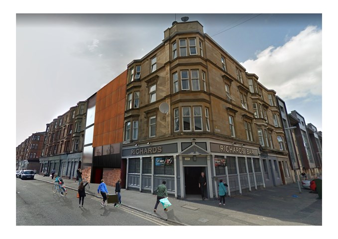
A Sense of Playfulness - Nathan Constable
During the design process, a concept takes many turns. That is no more evident than here.
As can be seen in the initial sketches, the facade sat flush with the rest of the street. However, through digital and physical modelling and stretching the concept to its limits, a more attractive solution was found.
Initially for those walking at street level, they main attraction to the gallery was a paint marbled piece of art on the pavement which would utilise the colours chosen on the block idea and create a sense of arrival at the gallery. The chequerboard squares used in the very first concept drawing evolved to jut out into the street and allow those inside to view, connect and engage with the street from multiple angles (and later it was decided colours through the use of adhesives on glass), as well as create a sense of playfulness within the space and an additional draw for those on Byres Road or Great George Street. This was an idea taken from the themes used by Roderick Buchanan in his art.
