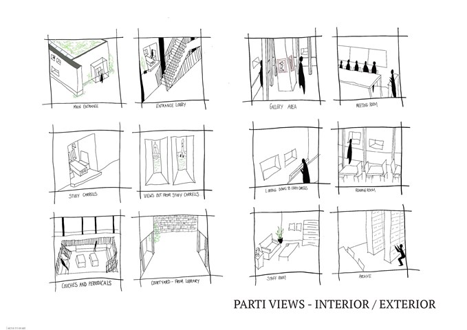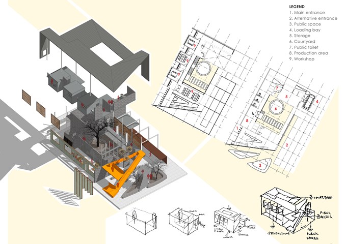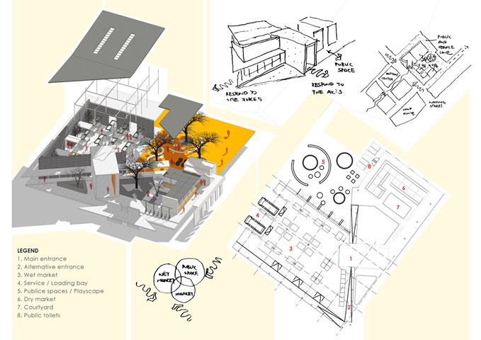
AB210: Parti Sketches of Interior and Exterior Views - Sophie Lathan

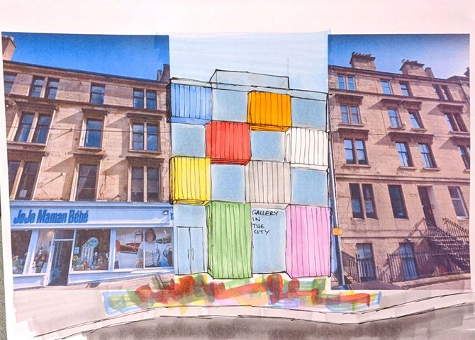
The Concept - Nathan Constable
As previously stated, colour is a key aspect used within this project and one that I want to feature in my future work.
Personally, I think a lot of architects shy away from using colour. I think it should be used for bold statements and that's exactly what I tried to do with this project - I wanted to create a gallery that looked like modern art, that contrasted its surroundings but still took aspects of them and twisted the rules to create a unique connection to the buildings' history. The rules of tenement design were brought into my design through the impression of verticality, continued floor levels to the blocks adjacent to my site and large windows to allow light into the spaces behind.
Key precedents for me included: the Mo-Tel House by Office S&M, the Mira Shopping Centre by Fondara and the Brandhorst Museum by Sauerbruch Hutton


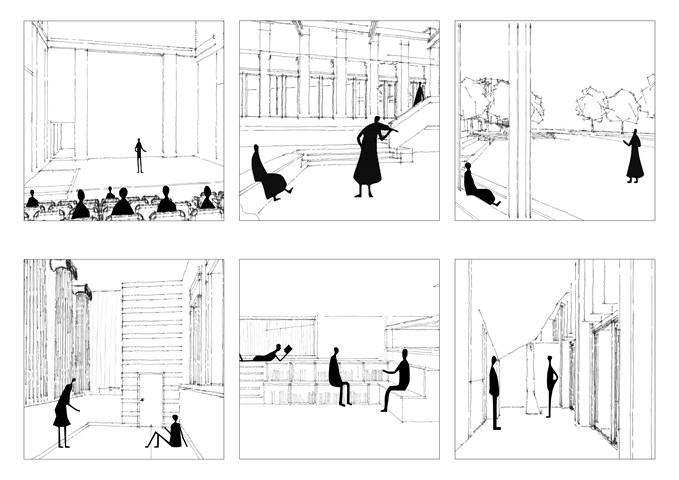
Arx | Plans and Sketches - Ami Coulter
The programme and activities of Arx are rooted in citizen ACTION. The current city space which embodies this energy most are its urban squares, symbolic spaces of communication, assembly and expression. Arx looks to embody the meaning of the word, become a fortress for the citizens, a refuge. An entity which can be equally and freely experienced by all users. Illustrated architecturally as a beacon within the city, re-appropriating architectural monuments of power / control / the state, and instead granting it to the citizens.

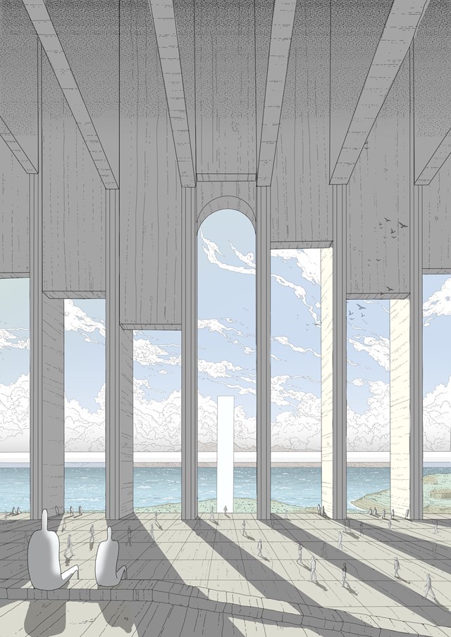
The Forum - Daniel Kelly
The central focal point and meeting space of City X: The forum. This hand drawn image shows a view westward from the islands main public space towards the Isle of Rum.

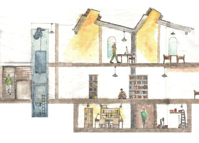
Library Proposal - Expository Sectional Drawing - fineliner & watercolour (1:35) - Milosz Cwiklinski

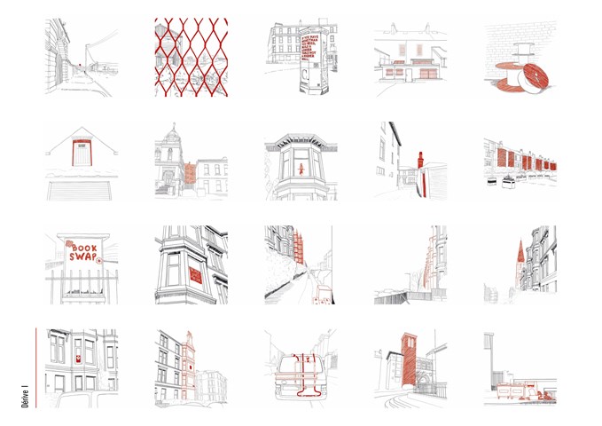
Glasgow Dérive - Ami Coulter
From dérive’s, various patterns which draw in the wanderer were noted: Beacon elements that break the skyline, Changes in pattern, material, colour, or texture, Key provocative elements, posters, artworks, activist boards etc., Repetition and rhythm, Layering and depth, Specific elements of intrigue which don’t seem to fit formally or are unexpected.

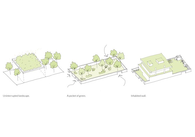
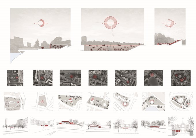
Pnyx | Sections, Plans and Sketches - Ami Coulter
The Pnyx are designed to encourage citizens to DISCUSS, enveloping pause points in the city. In Glasgow, these are often formed by green spaces offering the opportunity to slow down or stop for a moment. These spaces grant a particular opportunity for primary and secondary engagement with the programme. The reintroduction of the ancient form which has since been adopted and privatised, also reinstates the identifiable form associated with engagement in the public realm. Accessible to all, allowing citizens to gather together in their common moments.

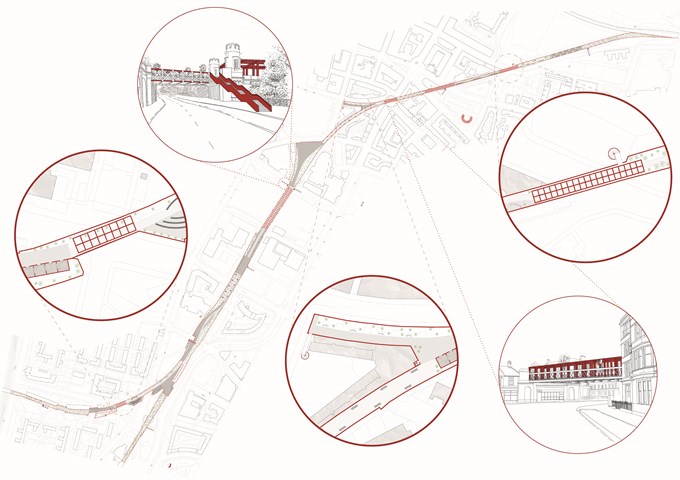
Iter | Plan and Sketches - Ami Coulter
Iter looks to surpass boundaries, slow citizens down, allow time and space to THINK and experience others. In Glasgow, it assumes a largely disused railway track which flows through the centre of the city. The focus is on holistic connection, the experience of layering another street or Iter, within the city, and the connection points introduced. It offers a new completely pedestrianised route, removing the intrusion and speed of the car, returning freedom of movement over the speed of movement. It draws people closer together and transcends boundaries whilst utilising acts of compression and connecting different parts of the city similar to Luchtsingel in Rotterdam.

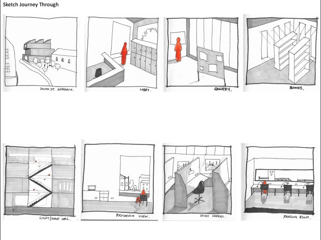
Sketch journey through library design - Lewis McLynn
Quick sketches I produced for AB210 Library Project to generate ideas of how the journey to and through the building would look and feel.
