Site Gallery - Render
- All tags
- #Design Studies
- #Render
- #Interior Views
- #Section
- #Elevation
- #Exterior Views
- #Drawings
- #Floor Plan
- #Views
- #Education
- #Urban Design
- #Axonometric
- #Technical Drawing
- #Diagram
- #Laurieston
- #Perspective
- #Model
- #Site Plan
- #Art Gallery
- #3D
- #collage
- #Exploded Axonometric
- #sketch
- #Masterplan
- #Concept
- #Diagrams
- #Site
- #Front Elevation
- #Housing
- #Renderings
- #Community Centre
- #Technical Design
- #Plans
- #conservation design project
- #Context
- #hand drawing
- #isometric
- #Public spaces
- #Technical Studies
- #landscaping
- #Structure
- #Cultural Studies
- #History
- #Dementia
- #Neighbourhood
- #Professional Studies
- #Art Gallery in the City
- #Environment
- #photomontage
- #Sustainable production
- #Construction
- #detailing
- #M8
- #Market
- #Physical Model
- #Programme
- #street elevation
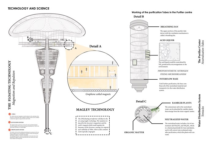
Maglev Technology / The Purifier Center / Water Distribution System - Sania Halim
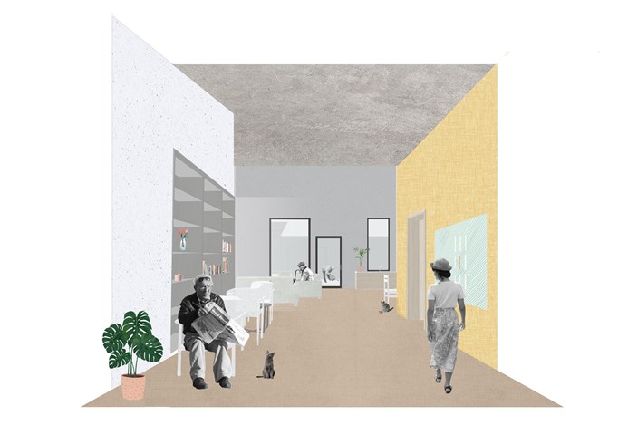
E. Severe Dementia Housing - Adele Melas
Level 3 Housing proposal is for individuals facing severe stages of dementia, whom require assistance 24/7. The proposal is bungalow in form, low is scale, domestic in style, and accessible in function. To battle isolation and enhance physical and social stimulation, residents live in small groups of 3-4 per household, and are encouraged to participate in all aspects of normal living to the best of their abilities. The immediate neighbourhood setting of the homes de-institutionalises the generic appearance of long, narrow, and dark double loaded corridors in conventional care homes. In the case of the neighbourhood, the ‘corridors’ between homes are in fact real life streets.
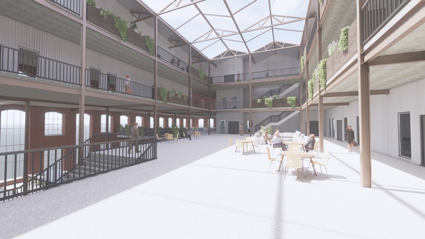
Main Atrium Space - Andrew Devine
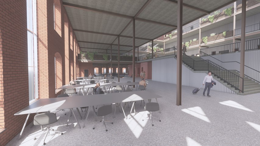
This image highlights the structural elements of the existing cotton mill which, as well as the old wooden floorboards being repurposed to create planters around the atrium.
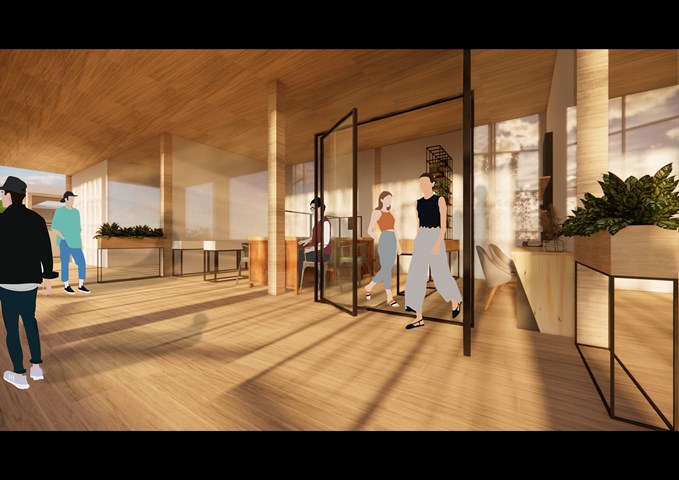
RENDERINGS: Creative Workshop with Balcony - Gertie Leong Hei Li
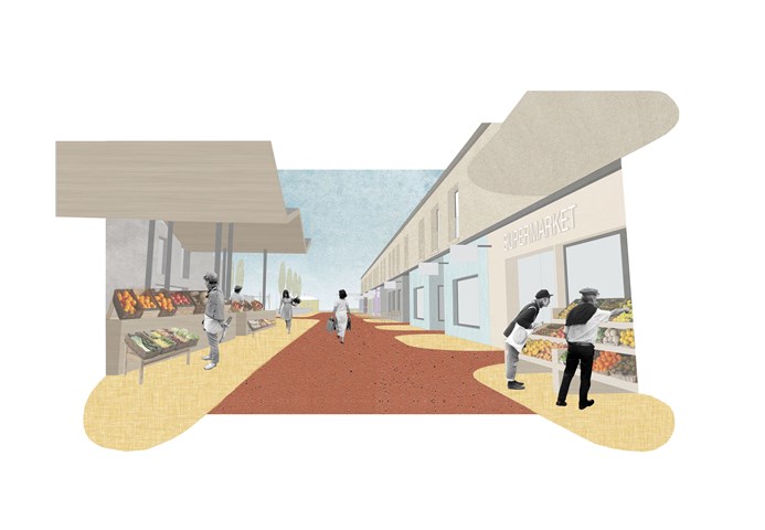
D. High Street - Adele Melas
The High Street is a prominent feature of the dementia-friendly neighbourhood and is key to enhancing factors including normality, accessibility and inclusiveness. In an attempt to capture a sense of normality for residents, many care homes have often implemented false interpretations of streets in their design - many times as internal elements, which are not functional but simply stand as inactive façades. The ethos of the High Street is to ensure the façades and use of specific shops are legible and distinct, which is achieved through distinguished colour use, clear signs, and bringing shop activity beyond the facade where possible. With time and recurring exposure, familiarity of the shops will increase. In accordance with the fundamental needs of users in terms of services and shops, the DFN proposal provides a range of primary and secondary facilities; 500m-800m from level 2 and 3 dementia housing.
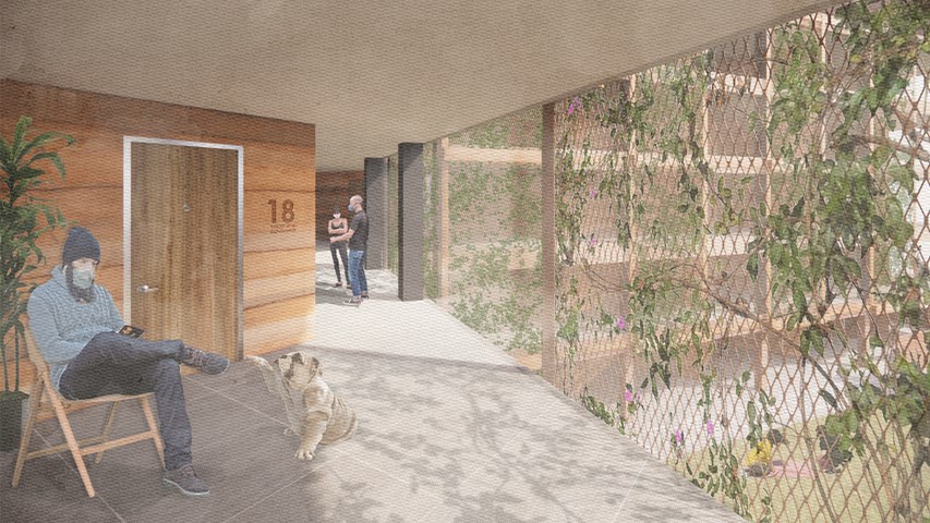
Circulation as an extension of the flat - Alfie Hollington
Design Studies 3a
Andrew McCluskie
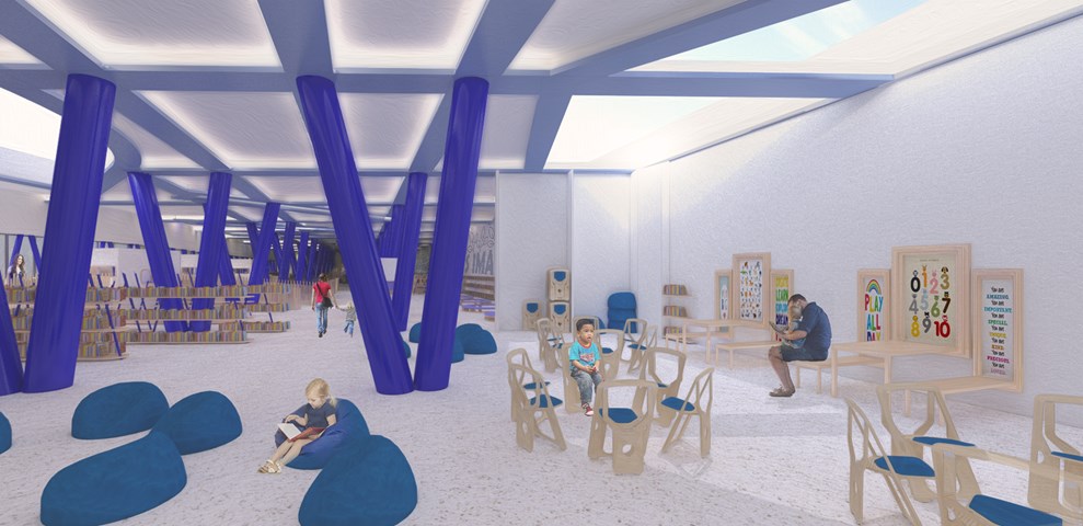
Flexible Workshop Space
The Flexible workshopping space is designed to host School Trip Groups as well as everyday workshops for pre-school aged children that will be run by Centre Staff. As such the seating can be completely removed, folding away or stored in a bespoke unit built off of the retaining wall. A palate of light stained Larch is used for the furniture to maximise daylighting potential at the rear of the building.
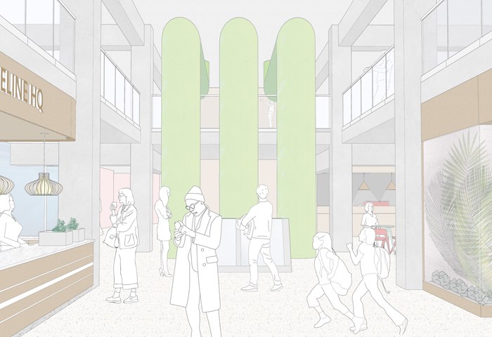
The Lifeline HQ - Shravan George
This visual shows how the interiors of The Lifeline HQ capture all the different food production groups in one space and serve as a portal for the pubic to experience them.
Andrew McCluskie
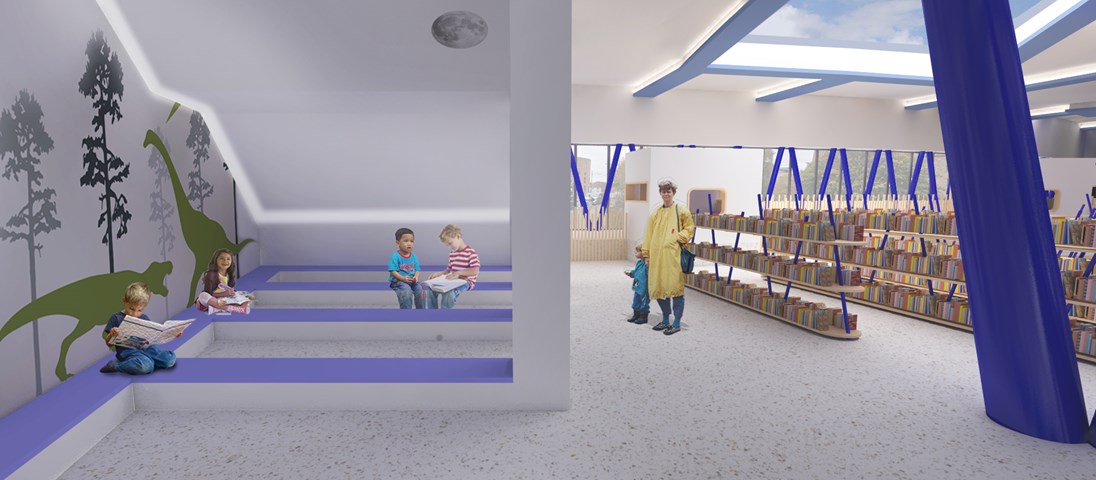
Reading Area for 4-5 year olds
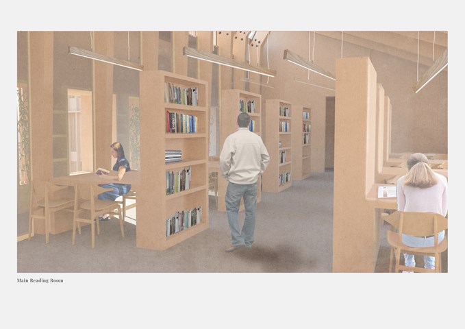
After the design of the external stair above, the lighting conditions beneath created an opportunity for a “secret cave” space at the West end of the ground floor plan. This means 4-5 Year Old Children are provided with a space whose atmosphere is evocative of storybook setting. The wall decals are intended to add to this effect. A hidden strip LED will illuminate the space while its discretion ensures retention of the imaginative atmosphere.
In contrast, the book storage is in a more traditional Library format to help children make the transition to traditional libraries when they get older. The largest of the rooflights gives sky views from this area, opening up the internal experience while planting around will screen the books from afternoon sun.
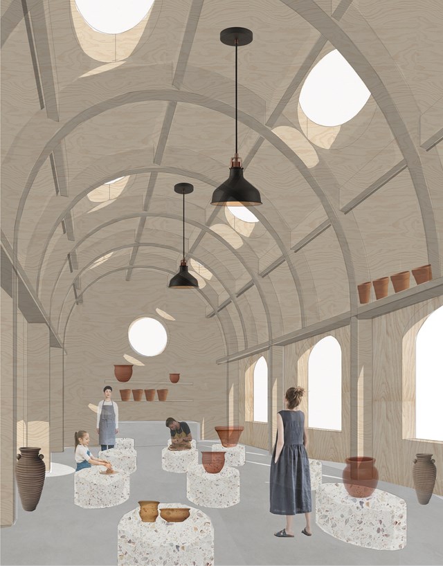
Potters workshop - Fatema Hassan
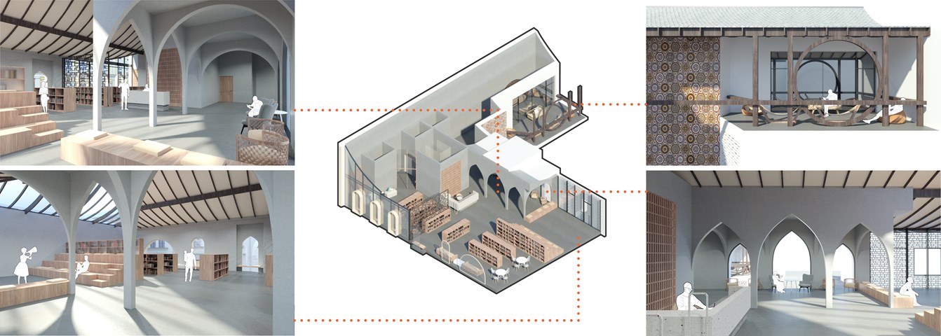
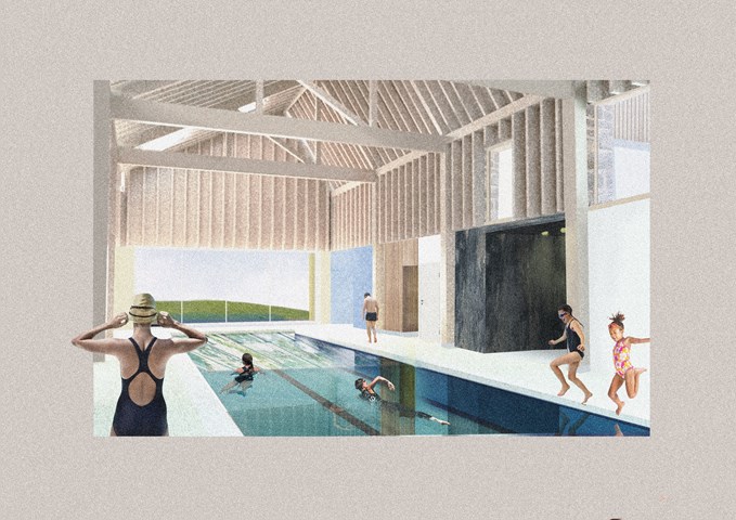
The pottery workshop is a vast space supported by arched timber frames that form a lattice where pots and vases can be laid to dry. The structure forms a top shelf where potters can use to store or dry ceramics. The overall atmosphere consists of circular light rays cast and moves throughout space and time as a natural spotlight within the workshop.
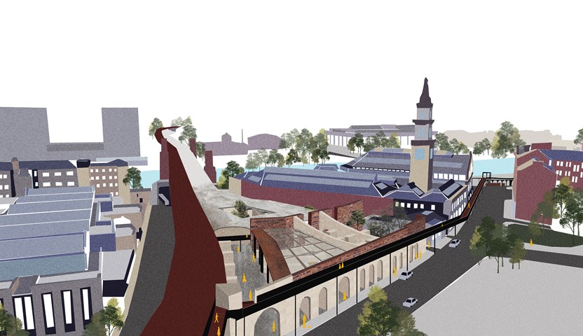
Urban Intervention of Interstitial Spaces. - Cham Zheng Chee
Like a balcony, it creates a vast continuum of space with the city- awakening of the juxtaposition between the wide grasp of the city and the speckle of present self, translated in the vessel of an elevated pedestrian bridge against the city.
The design proposal revitalizes one of the abandoned interstitial spaces in the city. The space shares the same railway line adjacent to the market space which allowed the liminal space within the urban realm to be continued. The façade facing the Bridgegate street is retained as the frame from its past. The pedestrian bridge along the railway stems towards the edge environment along the river, propelling human flow from the city centre.
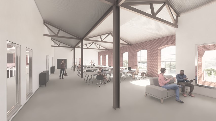
Working Space - Andrew Devine
Image showing a typical quiet working space off of the atrium.
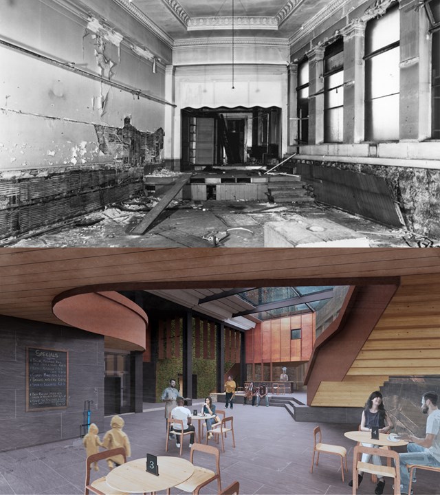
Storytellers Court - Before and After - Alfie Hollington
Design Studies 3b
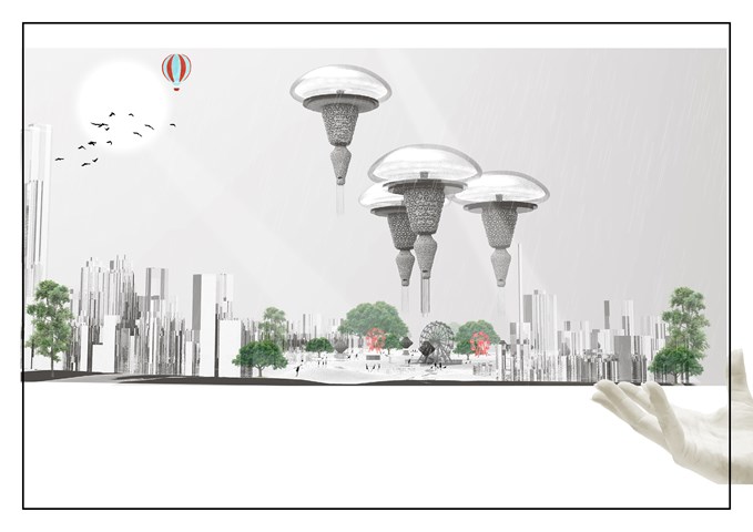
The Floating Terraformer tackling Water scarcity and Acid Deposition Around the world - Sania Halim
The project is setting is at the World fair because it gives a great opportunity for bringing everyone together in one place and inform them about the new technology that the worlds been encountering at the moment and encourage them all to be a part of it. A world’s fair in 2021 would bring millions of visitors and with them hundreds of millions of investments for the floating terraformer, a state of the art of technology. Other likely benefits of a New York world’s fair would include physical improvements to the city, the sprucing up of cultural and civic buildings throughout the metropolitan area; and renewed enthusiasm for the project in the eyes of the world. With its theme of connections, the fair would bestow greater recognition for the facility. It would be a world’s fair doubling as a civic celebration.
By the year 2070, Most of our cityscapes like New York will be cleaned from inside and out, and the water scarcity problems will be at bay. Hence our future will be secured and much greener and happier.
Main Chamber Presentation Visual - Antony James Graham
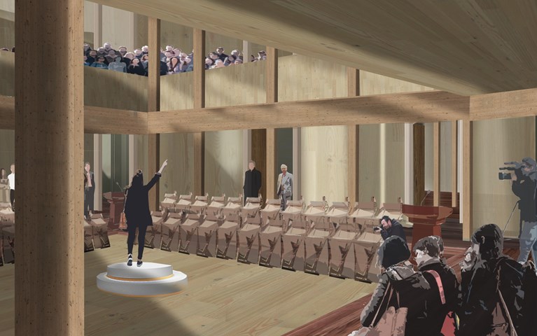
In the heart of the building is the main debating chamber, located on the first floor, where the public and representatives debate, discuss and partake in events, conversations and moments to make change and be heard in the community. The rich interior of woods is a contrast to the ridged stone façade. The main chamber is flooded with natural light creating an atmospheric space of light, shadow and materiality when the activity is high. The exposed structure adds to the character and spatial quality of the volume drawing attention upwards to the gallery and light above.
Site Plan of Part E of the Masterplan - Kate Melhuish
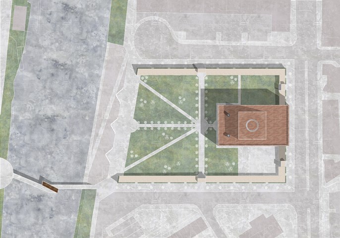
The Building aims to provide an immersive experience celebrating the Story of the Glasgow Washer Woman. This story if split into three parts.
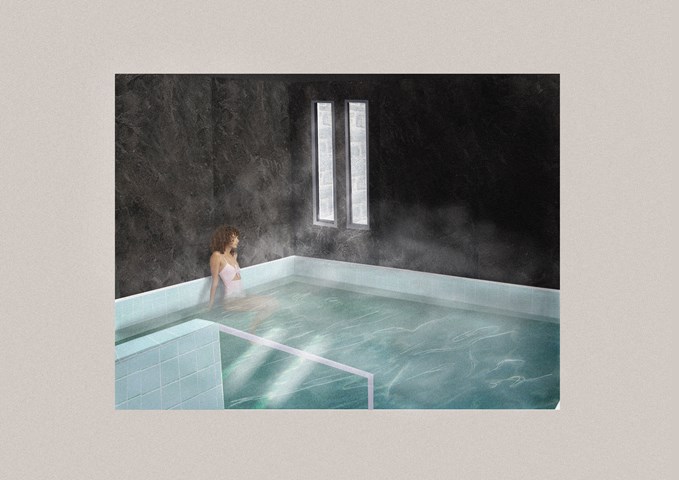
Part 1 is the Glasgow washer woman: The collective act of washing and getting clean has been prevalent throughout Glasgow's history. Before the creation of the bathhouse, or Steamie, the women from a certain area would gather together and head down to the river to perform the ritual of cleaning. The washing of cloths became a social and community activity, a time for women to communicate and support one another.
Part 2 is the Goddess Clota: Depicted as a lone washer woman seated on the edge of the river or a ford the Goddess Clota was the Celtic deity of the Clyde. They worshiped the water and regarded the river as sources of fertility. The Clyde was known as the purifying as it carried large amounts of mud to sea when it flooded. an earlier name for it was Clwyd meaning heard from a distance. These qualities of the river were reflected in the Goddess she was known to be pure and hold the divine ear.
Part 3 Is the Bean Nighe who is depicted as a lone washer woman. She is a female spirit or banshee, a messenger from the other-world. She can be seen washing blood from cloths at the ford of a river, it is believed that these are the cloths of those about to die. If approached with caution, a person may be able to get between her and the river they are entitled to the granting of three wishes or the telling of three truths. This varies within different versions of the legend.
View along the inside of the tower - Andrew Devine
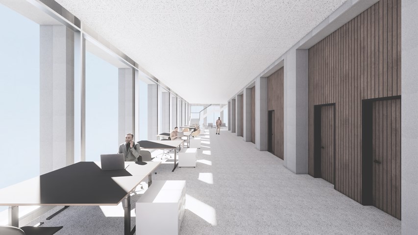
This image highlights the expressed structural stone elements on both the inside and outside.
Andrew McCluskie
1:20 Conversation Carriage Section
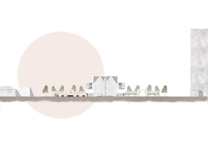
Section through the Main Building Showing Some Immersive Rooms - Kate Melhuish
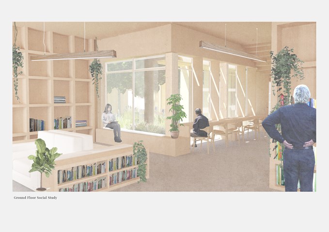
Ground Floor Social Study - Victoria Rozewska
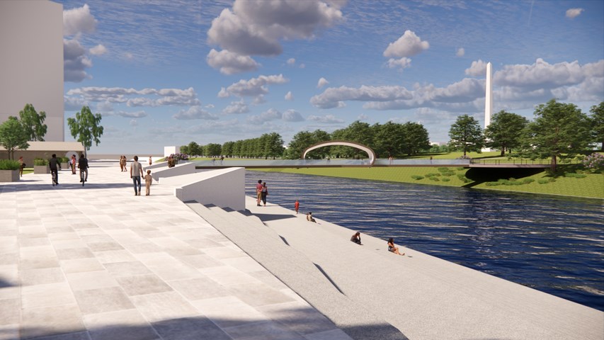
External Visual Showing Connection to River - Kate Melhuish
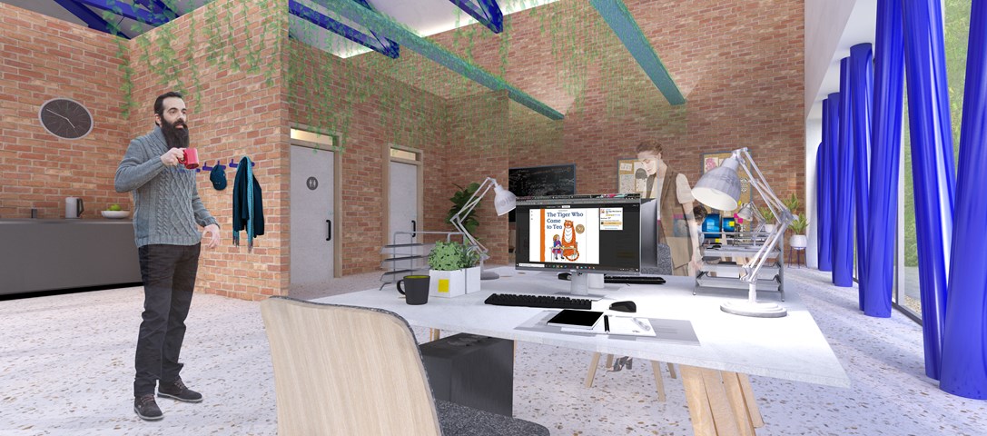
Andrew McCluskie
Distribution Admin Space
The Existing Building has been adapted to host the the Book Distribution related programme elements, thereby using the existing structure on site to portray the existing functions of the two organisations. The existing building has fell victim to a few unsympathetic extensions, which will be removed and brick partitions in the distribution building are formed from reclaimed brick kept aside during demolition. The glazed façade and additional dark blue steelwork provide a visual link both to the new façade elements and the rest of the scheme. Biophilic Design has been linked psychologically to stress relief, so the admin office includes plants within and a view to the living retaining wall and the new Reading Green it neighbours. This contributes to a relaxed atmosphere within the spacious office.
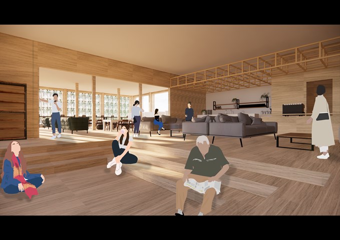
RENDERINGS: Co-Working Study Room - Gertie Leong Hei Li
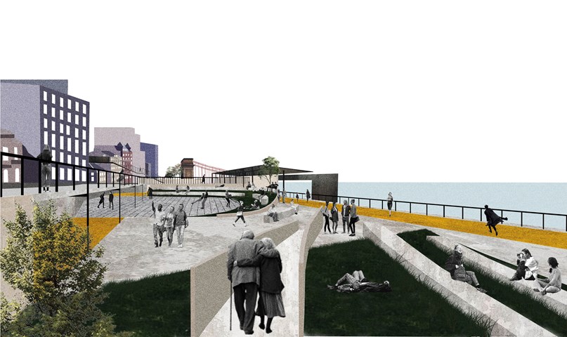
Urban Balcony 3- a perspective render. - Cham Zheng Chee
Like a balcony, it possess contemplative means, gravitational gestureS, and perhaps an out-of-body experience; with all in a singular experience.
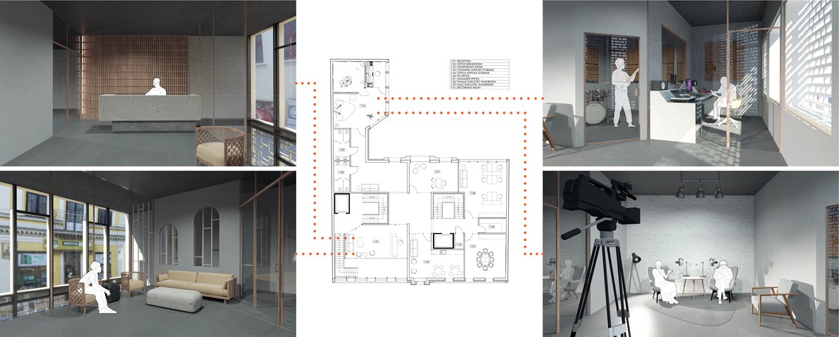
First Floor Plan - Anna Rogowska
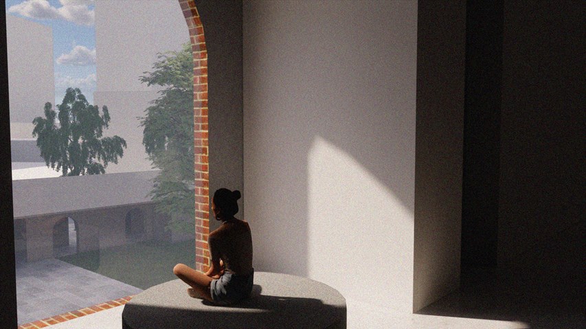
Internal Visual Showing Atmosphere - Kate Melhuish
Andrew McCluskie
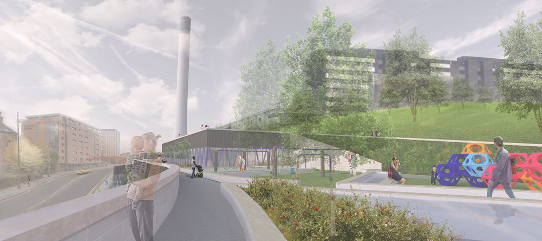
Play Area and Roofscape
Traditionally, a day out to a play area is almost exclusively a children's activity, with parent(s) acting as chaperone, arriving at the park, finding a bench and sitting on the outskirts of the space on which to wait. Partick Imagination Library's play area is conceived so that parents as well as their children are located within the play space, with the aim to get parents more involved with play, or facilitate social interaction between parents of more independent children. The Living Walls and integrated Raised Planters continue the atmosphere of the neighbouring Park onto the building roofscape.
The Main Entrance - Fiona Wylie
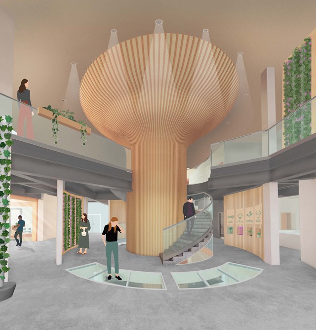
After entering the building from Cook street and rising up through the building, the main entrance acts as a "tree" base for the rest of the growing tower, with a glass floor looking down into the seed library. At the center of it is introductory information about hydroponic growing, and the space splits off into the learning spaces, the main atrium, growing spaces, and the wellness wing.
G. Community Centre - Adele Melas
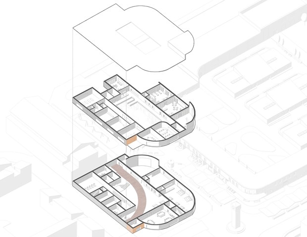
The Community Centre offers indoor venues for residents with dementia to enjoy leisure activities alone, with friends, family, or general members of the public. As the DFN encourages engagement with social and physical factors in the outdoor environment, the essence of this is brought internally within the community building. This is executed by continuing of the red path, the distinct orange entrance which responds to the High Street colour rhythm the internal skylight and courtyard, and exposure of light external materials on the interior facade which increase natural light reflected in the space. The building's curves, gently winding edges, surfaces, and paths, are regarded as more legible to dementia-users.
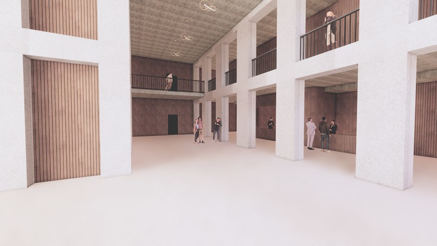
Main Public Forum - Antony James Graham
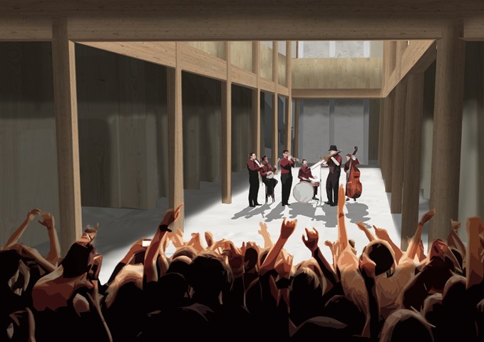
The main forum space is a long double heighted volume that acts as a free space allowing for flexible function and use to accommodate the building programme to serve the communities of Glasgow. This space can be interpreted as a cultural venue, art gallery or a social gathering space where the surrounding amenities cater to public needs. A common factor in the buildings overall aesthetic and character is the use of stone, wood, light and shadow to create exciting, atmospheric and inviting spaces.
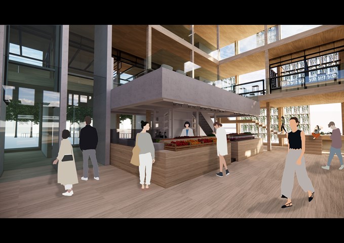
RENDERINGS: Markethall's Stalls activities - Gertie Leong Hei Li
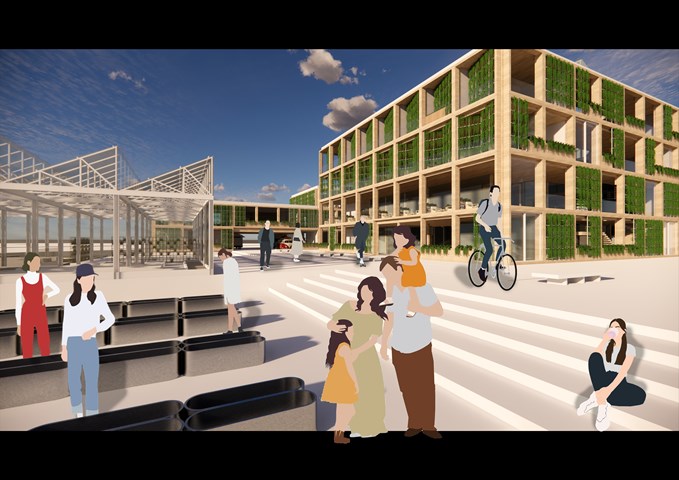
RENDERINGS: Urban Farm/ East Entrance - Gertie Leong Hei Li
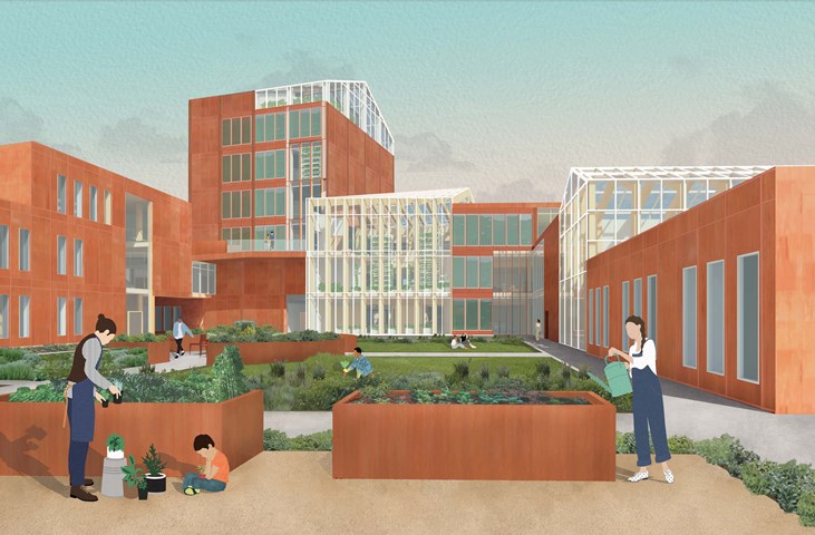
The Garden Approach - Fiona Wylie
The exterior view of the south side of the building, among the community gardening plots and the courtyard. Alongside the greenhouses, a secondary facade of algae growing panels are on the south side of the building to help generate renewable energy in the form of biomass, which then feeds back into an anaerobic digestor to create energy for the building.
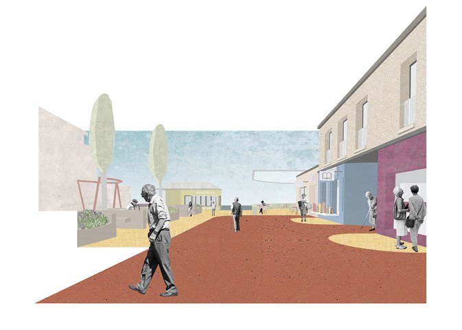
A. Entrance Buffer - Adele Melas
To avoid the implementation of a gated community, and strike a balance between safety and freedom, Entrance Buffer zones are located at the five entrance points of the neighbourhood, the majority of which are converted into green communal spaces. On the one hand, this allows social safety to be enforced and on the one hand and physical safety as green zones act as natural separators and means of slowing down the pace of movement. Importantly, accompanying each buffer is a Kiosk, which range from newspaper to coffee and flower stalls, and serve as discrete and functionally camouflaged security wardens. Hence, staff responsible for each kiosk have a dual role - to serve goods and act as security wardens for vulnerable individuals approaching these entrance/exit zones.
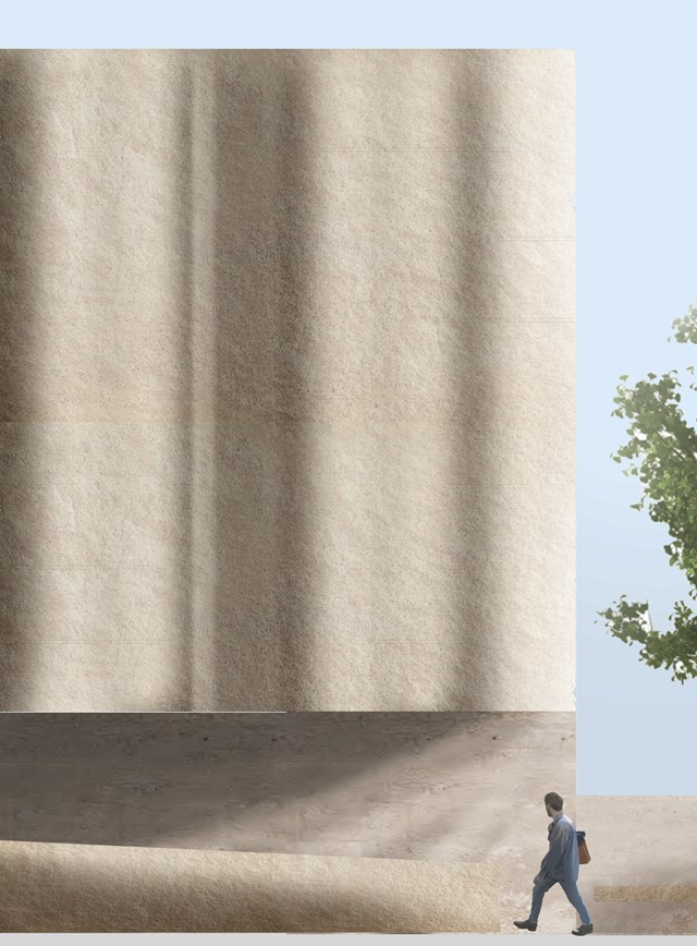
External stone render - 1:20 - Antony James Graham
This visual demonstrates the significance and importance of the buildings façade that relates to the 'STONE CITY' of Glasgow, a fluent and consistent trend that has been a major influence on the development and research into the projects growth. The vast majority of the building relates to the architectural pallet, materiality and character of the Stone city, Glasgow 'City of Facades' as a reminder to the historical and cultural heritage, identity and importance as we develop buildings in our modern climate.
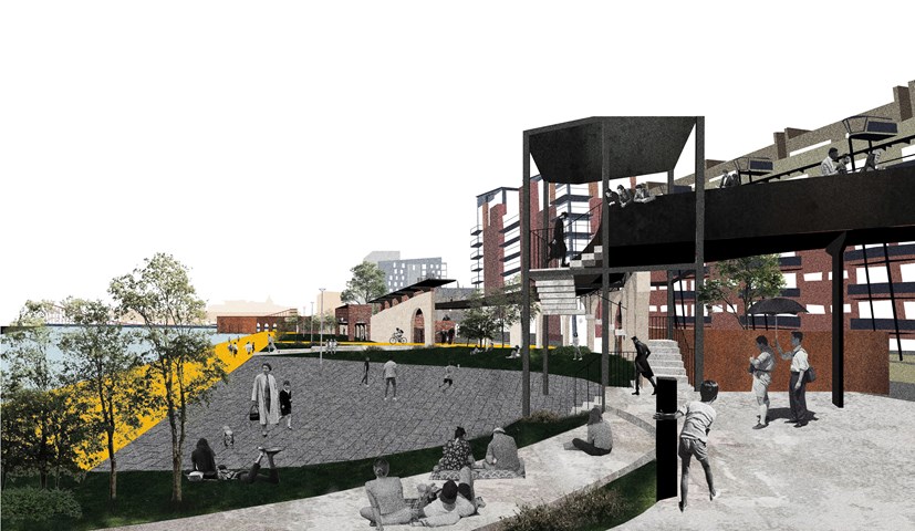
Urban Balcony 1- a perspective render. - Cham Zheng Chee
The entry of the Clyde promenade distributes the pedestrians in the form of an extensive urban balcony, a gradual gradient that eases into the site while distilling the permeable edges of the riverfront urban space that interacts with the adjacent building as well as the liminal spaces surrounding it.
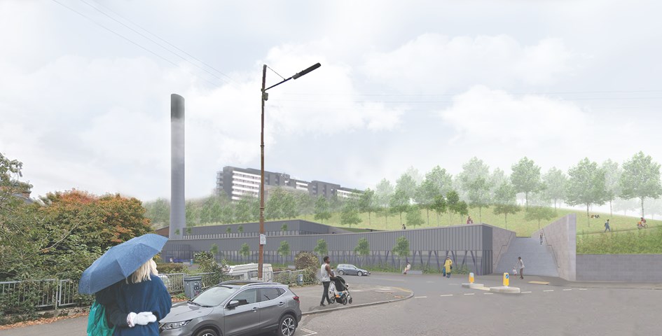
Andrew McCluskie
View from Benalder Street Bridge
Initial analysis of Yorkhill Park, which the site is bound by, revealed a need for improved access and public realm. Therefore the access stairs were rotated to receive pedestrians from Partick and accentuate their desired path. The scheme will also provide disabled access to Yorkhill Park for the first time. A green buffer and internal balustrades will ensure privacy in the main library space and increase biodiversity on site.
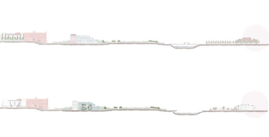
The Master plan of an Individual Story in Elevation and Section - Kate Melhuish
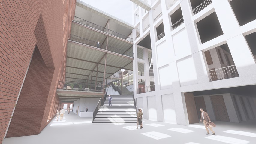
View from square side entrance - Andrew Devine
From the main entrance the routes through the building are highlighted, and a clear visual connection is made between the new stone tower and the rest of the building which assists the building's users in way finding in what is a large building.
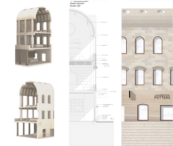
Technical detail - Fatema Hassan
In comparison, a rendered model interprets the differences between the interior and exterior elevations of the selected region to cut through. The technical section highlights the material relations of the facade with the interior activities.
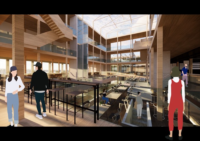
RENDERINGS: Kitchen/ Indoor Seatings - Gertie Leong Hei Li
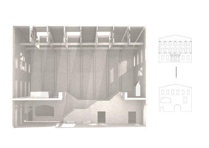
Sciographical study of the main markethall - Fatema Hassan
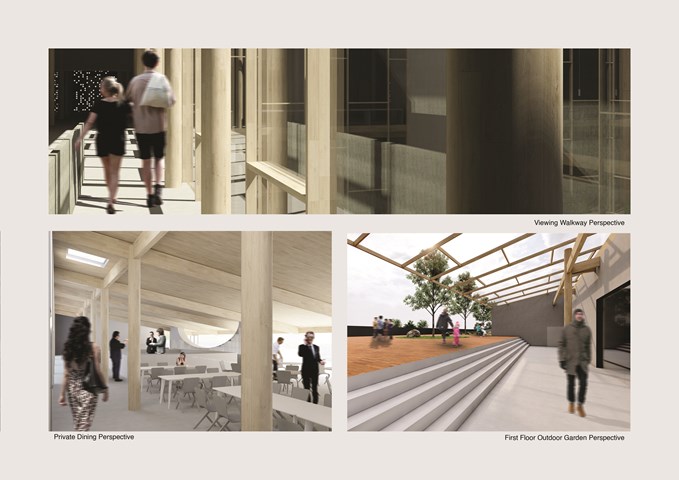
This shadow model emphasizes the spatial environment of the main market hall. A sense of outline and shadows have a heavy influence on the overall spatial experience of the visitors. This sketch filters and shows light penetrating through the old and new facade throughout the day in a pattern. The timber frame structure supporting the roof and skylights extends through all heights of the market hall's form. The structural columns give a sense of order in a dynamic and clustered space where many activities happen in.
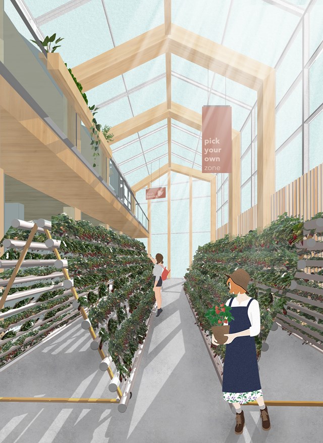
The U-Pick Greenhouse - Fiona Wylie
Off of the public market space, there is a dedicated greenhouse where people can pick their own berries, right off of the plants. This promotes a level of transparency within indoor growing, and allows the community to get hands-on knowledge about where their food comes from.
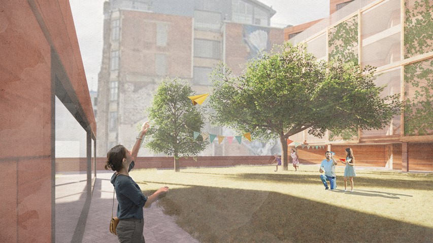
Resident's garden - Alfie Hollington
Design Studies 3a
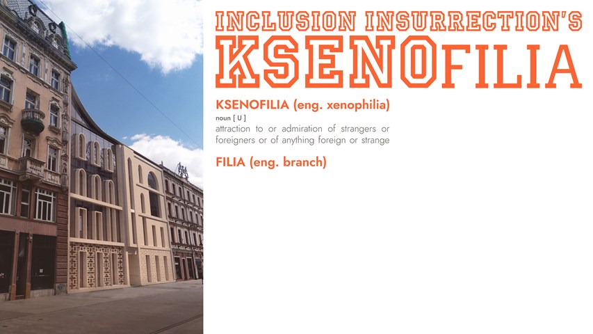
KSENOfilia - Anna Rogowska
The proposed building - KSENOfilia includes the new office as well as an array of spaces encouraging dialogue and cooperation of people from all backgrounds, nationalities and religions. From a café with performance space, through a recording studio, to a multicultural content focused library, space will be provided to give voice to those excluded from mainstream intellectual and artistic discourse controlled by systemic racism. The form of the building was created through a playful mixture of different architectural styles from countries with considerable number of immigrants in Poland. Deconstruction and synthesis of forms, details, patterns, and rhythms led to creation of a design with a diverse and simultaneously unified identity. Just as all the styles come together in this one architectural piece, so shall all cultures in Inclusion Insurrection’s hopeful vision of the country’s future.
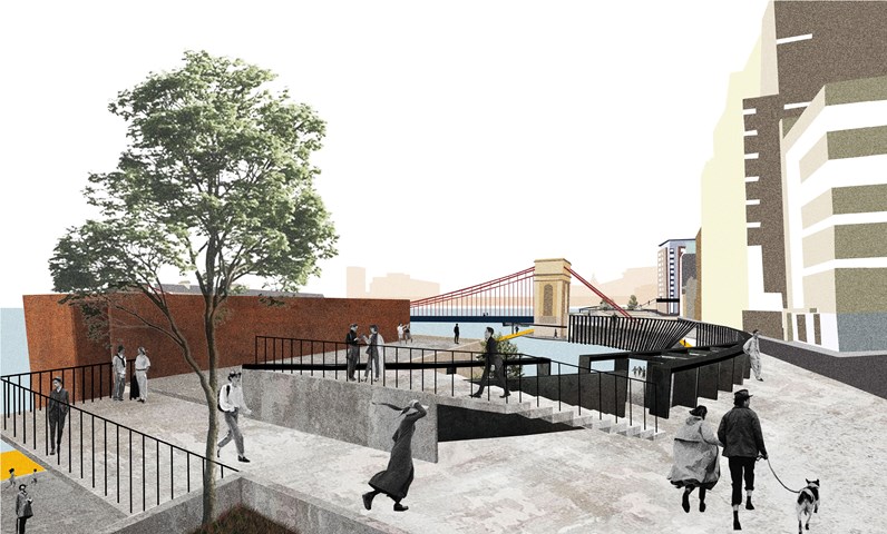
Urban Balcony 2- a perspective render. - Cham Zheng Chee
The intertwining of human activities explores the mutual spillage spaces of the streets and the river, accentuating liminal experiences within the urban space
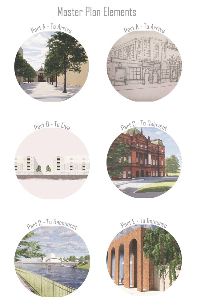
Element of the Master plan - Kate Melhuish
Part A looks at the creation of a more celebrated entrance on the north edge of Glasgow Green along with the re-implementation of the train station.
Part B Looks at the Redesigning of the Housing Development to give it greater connection with the green.
Part C looks at reinventing the Peoples Palace and reinstating it original purpose as a place to store the people memories.
Part D Looks at re-connecting the Gorbals with Glasgow green
Finally, Part E aim to immerse the user in a story or memory in this case that is the story of the washer woman.
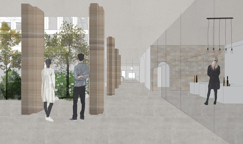
Arcade between shops and courtyard - Fatema Hassan
This region within the ground floor connects all entrances from all edges of the site to the central courtyard and shops. It is open to the outside and sheltered with a cantilever that forms the first floor. All shops have curtain walls facing the interior courtyard to absorb light penetrating through.
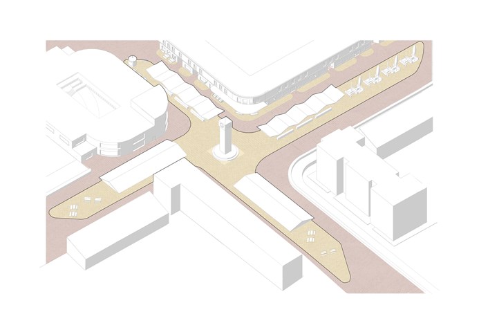
C. Cross - Adele Melas
As a common characteristic of crosses over time, both in history and in the present, a tall clock-tower is placed to mark the centre of the Laurieston Cross. This functions as a prominent landmark for orientation in the masterplan as it is visible from all parts of the neighbourhood. The streets in each bearing meet the cross as a market, forming a vibrant and active dwelling and transition zone, and further emphasising the literal shape of a cross across the site. The roofs over the markets exposed to the High Street (north and west wing) are structured in as rigid rippled effect, symbolising
the rhythm and pattern of individuals shops in the High Street facade, whose life can be continued onto the streets.
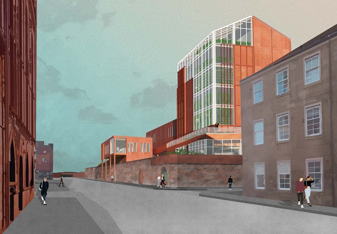
The Cook Street Entrance - Fiona Wylie
As existing, the tall historical wall surrounding the site creates an imposing barrier along Cook Street, but this proposal plays with the thresholds along the street edge, to make it more inviting. The placement on the corner emphasizes visibility and transparency from a distance, with the restaurant perched over the sidewalk to create a clear entrance, and the growing production clearly visible as a green beacon.
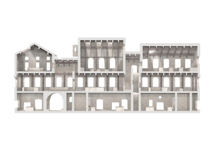
Sciographical study of the sectional model - Fatema Hassan
This section highlights and emphasizes the contrast and structural relationship between the inner and outer facades. The outer facade is a series of carved openings into the masonry wall while the inner facade is composed of the grid of timber columns making it a transparent facade to the interior courtyard.
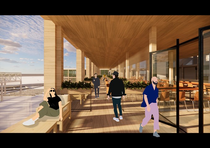
RENDERINGS: Kitchen/ Outdoor Seatings - Gertie Leong Hei Li
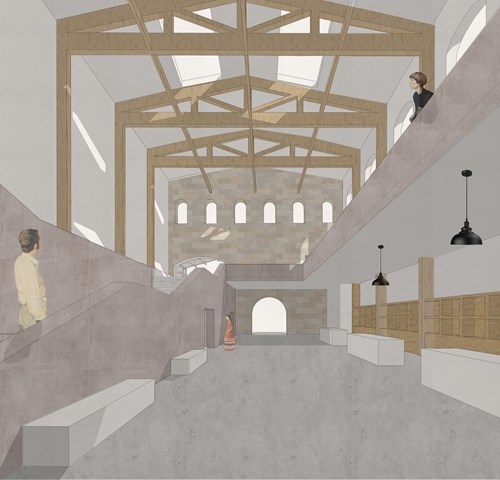
Market hall foyer space - Fatema Hassan
This view shows the plaster render staircase that leads to the upper spaces including the food hall, workshops, and cafe. On the left, rentable kiosk spaces for people to advertise and sell products beneath a high ceiling braced in exposed timber construction and bathed in skylight light.
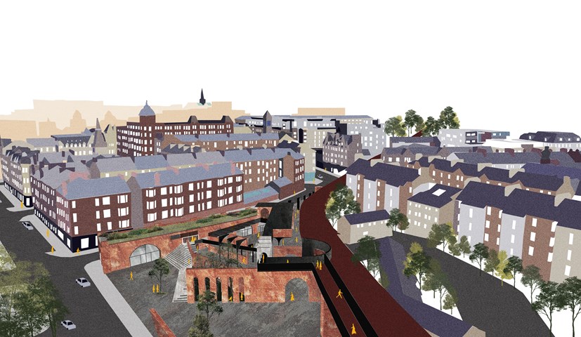
Urban Intervention of King Court Market. - Cham Zheng Chee
The balance of retaining and subtracting the existing structures introduces a channel of movement through the space, and then into the urban realm. The layers of urban depth in the designed liminal spaces diversify the various spatial divisions within the market, through the transition of conflicting polarities amongst the introduced in-between spaces.
Pottery showroom and shop - Fatema Hassan
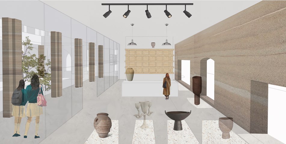
The pottery showroom is situated on the ground floor and lit with sunlight penetrating through the carved openings in the load-bearing rammed earth wall. Further light and views appear left through the central courtyard garden and rammed earth columns.
Candle making workshop - Fatema Hassan
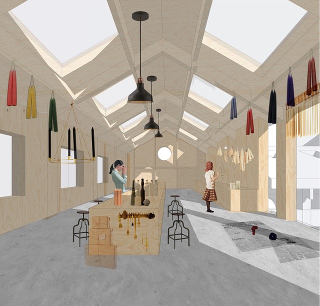
Candles are hung on the timber frame to dry. The workshop is well lit with eight skylights aligned symmetrically against the main counter. The timber frame extends to the end of the space to form a grid of timber columns and beams to place candles ready to be packaged.
B. Street - Adele Melas
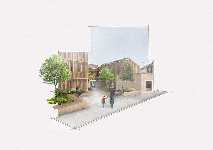
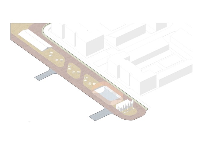
All Entrance Buffers, besides the west wing, stem into streets which meet at the heart of the dementia-friendly neighbourhood - the Cross. The Streets are fully pedestrianised and are vibrant with life, both as transitional zones and dwelling points. As explained in the criteria, these are divided in accordance with the colour of the paving - red implying the former and yellow the latter. Similarly to landmarks, familiarity of their use is gained with time, particularly through the eyes of dementia-users. This allows the use of outdoor environments to be sustained as dementia-friendly, for instance as pedestrian paths are maintained unobstructed, wide, and directional.
F. Moderate Dementia Housing - Adele Melas
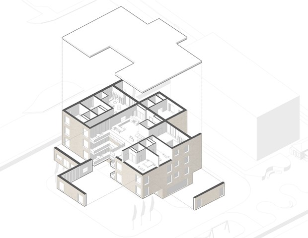
The housing proposal is specifically targeted for individuals facing moderate stages of dementia, whom can no longer live entirely independently without forms of assistance. The concept embraces co-housing and intergenerational living with a young nurse practitioner, young carer, nurse or medical student, who are equipped to take on the role of the ‘carer’ by discretely offering assistance, in a non-institutionalised nature. Both residents would equally learn from one another, form a very strong friendship bond, and yet have their own privacy. Essentially, the two households join via the entrance-point communal kitchen and living room, and move into their own space through a progressive privacy layout.
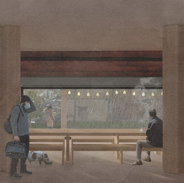
Soup kitchen - Alfie Hollington
Design Studies 3a

The Master Plan of an Individual Story - Kate Melhuish
The image shows the master plan in perspective, highlighting the Architectural Time Capsule in the foreground and along with other part of the master plan such as the proposed bridge, re-imagining of the Peoples Palace, New Housing Development and a more celebrated entrance of the north of the Green.
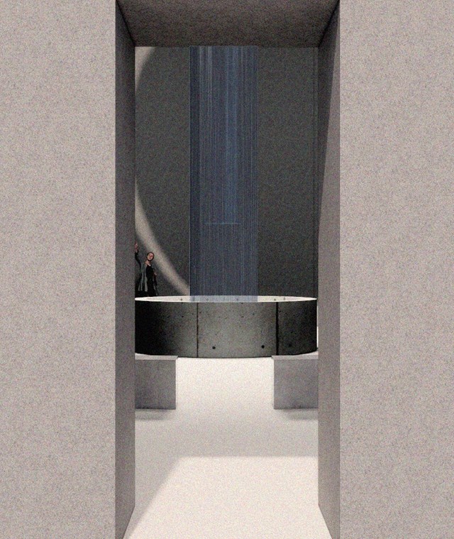
Internal Visual Showing Atmosphere - Kate Melhuish
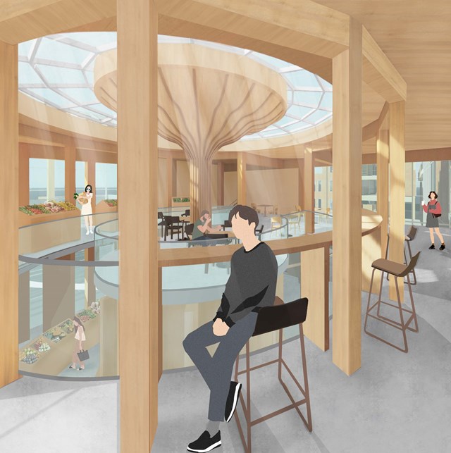
The Market Seating - Fiona Wylie
Interior view of the cafe seating area above the public market stall, highlighting the glulam and CLT construction for a warm, earthy atmosphere.
