Site Gallery - Concept
- All tags
- #Design Studies
- #Render
- #Interior Views
- #Section
- #Elevation
- #Exterior Views
- #Drawings
- #Floor Plan
- #Views
- #Education
- #Urban Design
- #Axonometric
- #Technical Drawing
- #Diagram
- #Laurieston
- #Perspective
- #Model
- #Site Plan
- #Art Gallery
- #3D
- #collage
- #Exploded Axonometric
- #sketch
- #Masterplan
- #Concept
- #Diagrams
- #Site
- #Front Elevation
- #Housing
- #Renderings
- #Community Centre
- #Technical Design
- #Plans
- #conservation design project
- #Context
- #hand drawing
- #isometric
- #Public spaces
- #Technical Studies
- #landscaping
- #Structure
- #Cultural Studies
- #History
- #Dementia
- #Neighbourhood
- #Professional Studies
- #Art Gallery in the City
- #Environment
- #photomontage
- #Sustainable production
- #Construction
- #detailing
- #M8
- #Market
- #Physical Model
- #Programme
- #street elevation
Connectivity of an Open City - Ami Coulter
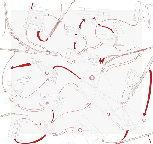
Toward an Open City is an important infrastructure though it does not solve all the problems – as there can be no final solution. Through providing a renewed circular programme of interventions which continuously feed each other, it provides new and varied modes of citizen engagement at different scales, in different locations. Ultimately, building a climate which is more open; accepting of the other, adaptable, respectful and understanding.
Inspired by Guy Debord, Psychogeographical guide to Paris 1957. Lazzaroni, 2012.
Ami Coulter
Inspired by Guy Debord, Psychogeographical guide to Paris 1957. Lazzaroni, 2012.
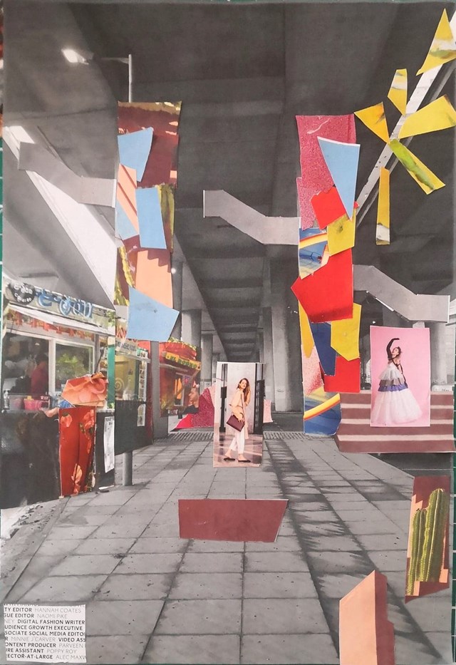
Handmade Collage, envisioning Concept. - Conor Ryan McCormack
Down The Rabbit Hole_3B To Play
Down the Rabbit Hole_3B To Play.
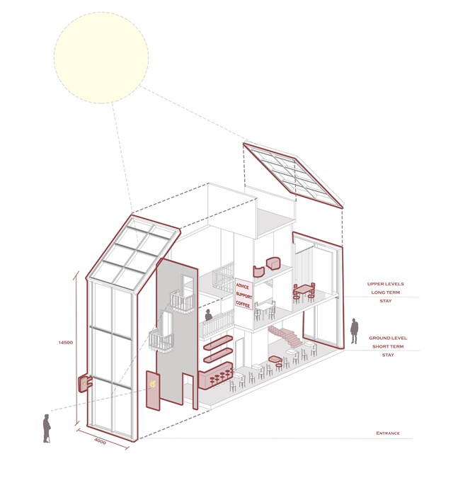
Model of a 'safe wing'- Advice cafe - Asya Gumus
This diagram shows one example of a 'safe wing'. The ground floor is designed for quick and short term access/ support making it easy for residents to drop in without an appointment and seek support over the counter. The staff are dementia trained and will have the skills to support elderly resident needs. The upper levels are designed for longer stay where private councelling can be arranged and support group meetings can take place. Transparency, signage and familiarity within the design allow locals to feel comfortable when visiting.
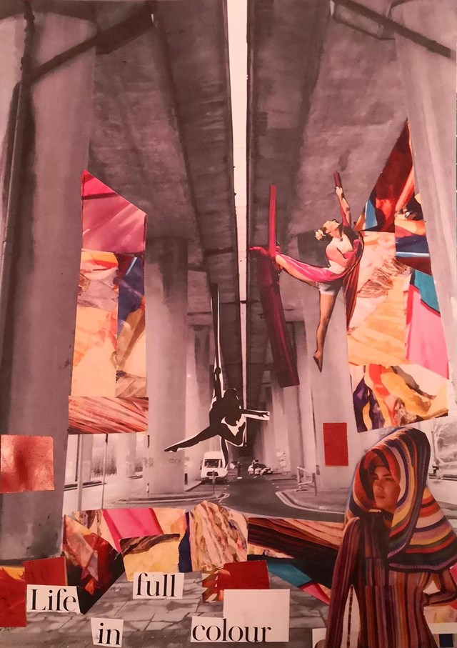
Handmade Collage, envisioning Concept. - Conor Ryan McCormack
Down The Rabbit Hole_3B To Play
Down the Rabbit Hole_3B To Play.
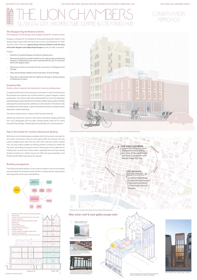
Conservation Approach: Concept - Amy Aquilina
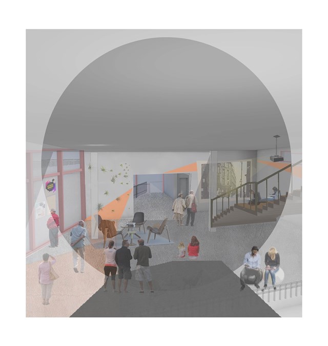
Interior view of the carers hub - Asya Gumus
This space is used as a joint activity space for both elderly with dementia and carers. Regularly organized movie nights, exhibitions, theatre and concerts will be held in this space for the locals to enjoy.
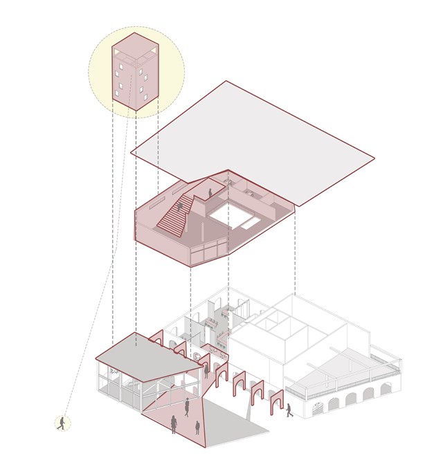
Model of the carers hub - Asya Gumus
This building is split in to the three. The ground floor invites the locals to join in coworker activities/ workshops and start up businesses, the middle floor proposes an activity space for both elderly residents with dementia and carers and the tower proposes private studio spaces that view the neighbourhood.
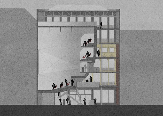
Cinema Section - Anthony Mazeli
This section shows the cinema functionality through sight lines and projector throw. It also depicts the building programme with a spacious bar area on the ground level to encourage socialisation while maintaining a safe distance, hall areas with alternating floating bridges leading to cinema, and a gallery area on the 5th floor.
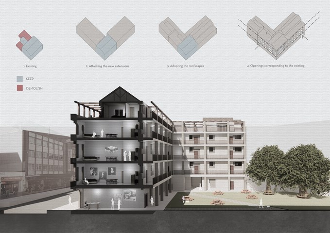
Site Section - Viktoria Georgieva
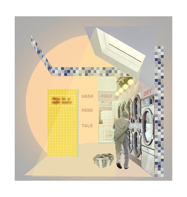
Example of a 'safe wing'- Laundrette - Asya Gumus
The laundrette is the most important medium sized intervention in this context as it is promotes an easy and independent activity that is also familiar to an elderly person. Informal encounters/ conversations can have a positive impact on an elderly persons daily life. The chosen coral/ yellow tones encourage social activity and invite the elderly to spend a longer times with their neighbours and other locals.
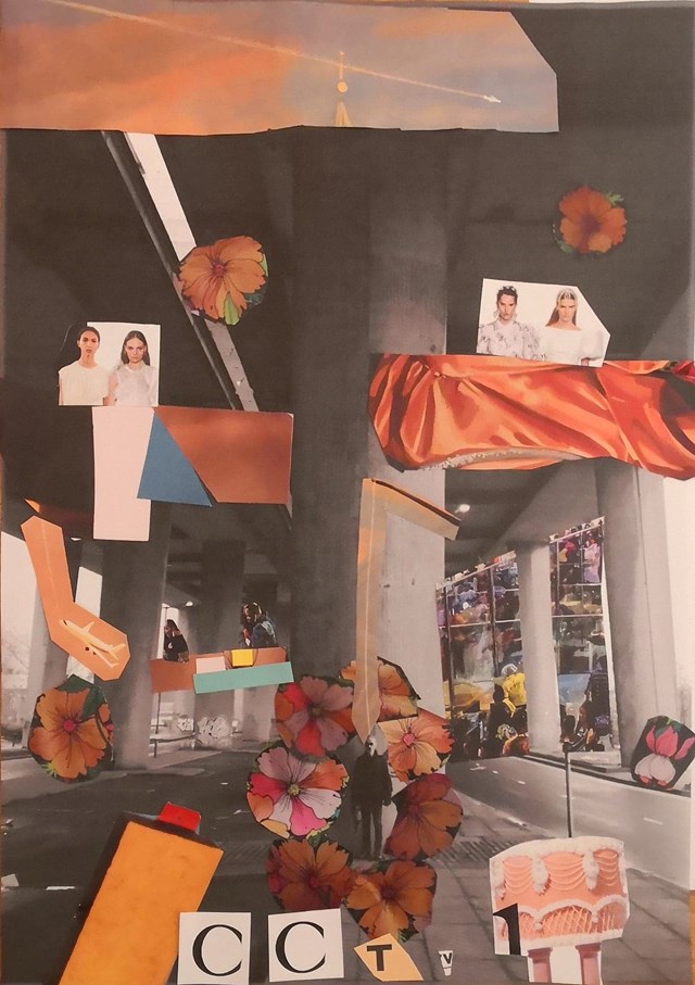
Handmade Collage, envisioning Concept. - Conor Ryan McCormack
Down The Rabbit Hole_3B To Play
Down the Rabbit Hole_3B To Play.

Proposed care model - Asya Gumus
This diagram shows the proposed care model establishing the location and different scales of the interventions.
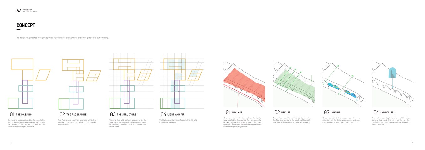
Conceptual Diagrams - Shivani Sarjan
Laurieston Education Hub
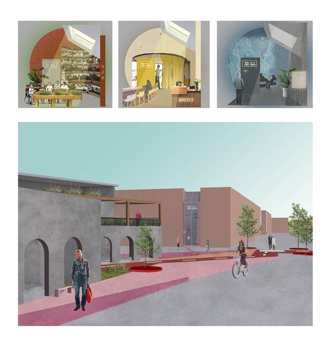
Approach to the 'safe wing' model - Asya Gumus
Each safe wing involves a different activity. Other designs include gardening and sensory therapy that reduces stress and anxiety that can surface due to progressing dementia. Each safe wing will include a different colour/ character/ material in accordance to the interventions use, such as red promoting energy, motivation and activity and blue promoting a calmer and less stressful environment. These colours are important for elderly design as it can slow the process of the developing dementia amongst the ageing population.
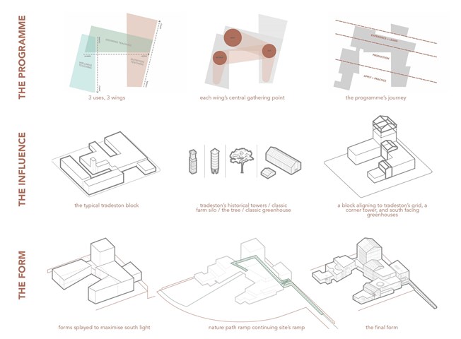
Concept Development - the programme / the influence / the form - Fiona Wylie
The programme influences the form, splitting the building into 3 wings containing its 3 uses, tapering through use, to learn or to apply knowledge. The linear placement of programme reflects the journey of production: learning how to, seeing it done, and then doing it yourself. In each wing, there is a round central gathering point to break up the orthogonal qualities of the production spaces in the building, and promote community interaction.
Looking at the exterior form, the perimeter of the building is parallel to the boundaries of the historical 5m tall perimeter wall of the site, whilst the interior is splayed to maximise south light for greenhouse production. When the concept meets the context, inspiration was taken from the typical solid Tradeston block with u-shaped voids, mixed with the tower typologies of the historical Tradeston tower in its context, the classic agriculture silo, the tree, the typical greenhouse, and tradeston's peaked roofs, to come to a final form.
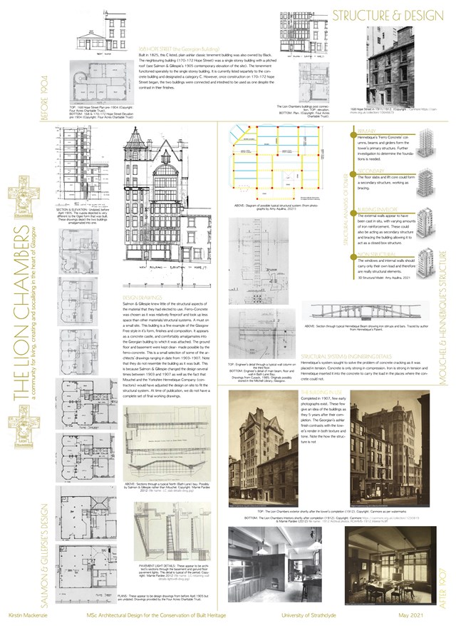
The Structure & Design of the Building - Kirstin Mackenzie
