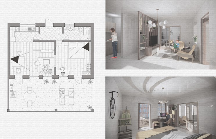
Site Gallery - 3D
- All tags
- #Design Studies
- #Render
- #Interior Views
- #Section
- #Elevation
- #Exterior Views
- #Drawings
- #Floor Plan
- #Views
- #Education
- #Urban Design
- #Axonometric
- #Technical Drawing
- #Diagram
- #Laurieston
- #Perspective
- #Model
- #Site Plan
- #Art Gallery
- #3D
- #collage
- #Exploded Axonometric
- #sketch
- #Masterplan
- #Concept
- #Diagrams
- #Site
- #Front Elevation
- #Housing
- #Renderings
- #Community Centre
- #Technical Design
- #Plans
- #conservation design project
- #Context
- #hand drawing
- #isometric
- #Public spaces
- #Technical Studies
- #landscaping
- #Structure
- #Cultural Studies
- #History
- #Dementia
- #Neighbourhood
- #Professional Studies
- #Art Gallery in the City
- #Environment
- #photomontage
- #Sustainable production
- #Construction
- #detailing
- #M8
- #Market
- #Physical Model
- #Programme
- #street elevation
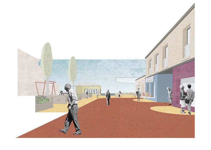
A. Entrance Buffer - Adele Melas
To avoid the implementation of a gated community, and strike a balance between safety and freedom, Entrance Buffer zones are located at the five entrance points of the neighbourhood, the majority of which are converted into green communal spaces. On the one hand, this allows social safety to be enforced and on the one hand and physical safety as green zones act as natural separators and means of slowing down the pace of movement. Importantly, accompanying each buffer is a Kiosk, which range from newspaper to coffee and flower stalls, and serve as discrete and functionally camouflaged security wardens. Hence, staff responsible for each kiosk have a dual role - to serve goods and act as security wardens for vulnerable individuals approaching these entrance/exit zones.
Andrew McCluskie
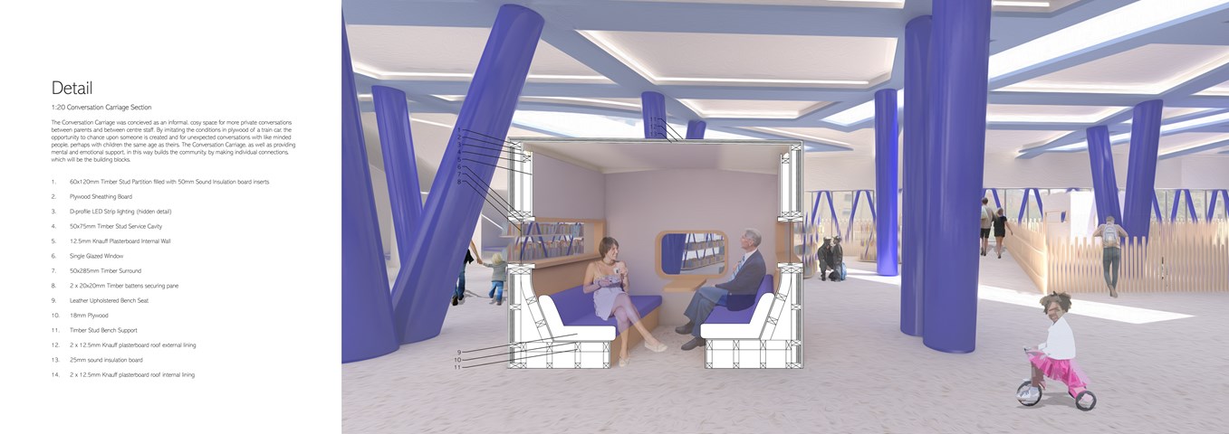
1:20 Conversation Carriage Section
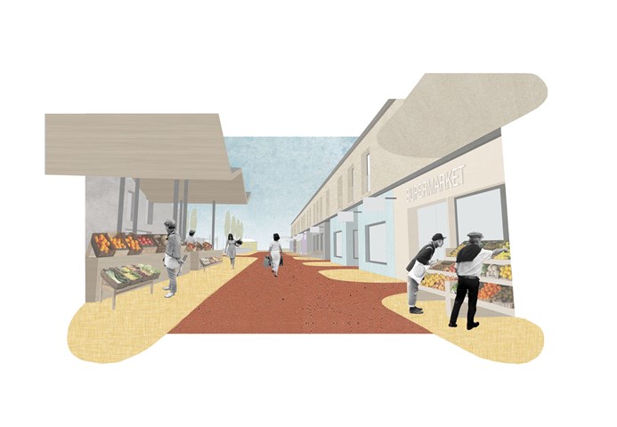
D. High Street - Adele Melas
The High Street is a prominent feature of the dementia-friendly neighbourhood and is key to enhancing factors including normality, accessibility and inclusiveness. In an attempt to capture a sense of normality for residents, many care homes have often implemented false interpretations of streets in their design - many times as internal elements, which are not functional but simply stand as inactive façades. The ethos of the High Street is to ensure the façades and use of specific shops are legible and distinct, which is achieved through distinguished colour use, clear signs, and bringing shop activity beyond the facade where possible. With time and recurring exposure, familiarity of the shops will increase. In accordance with the fundamental needs of users in terms of services and shops, the DFN proposal provides a range of primary and secondary facilities; 500m-800m from level 2 and 3 dementia housing.
Andrew McCluskie
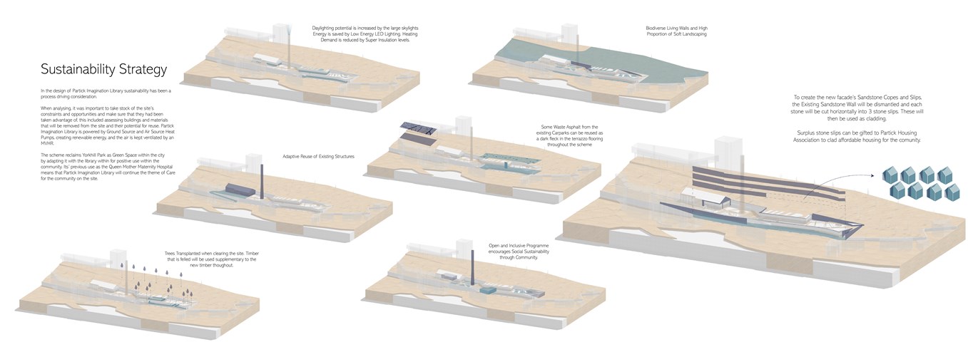
Sutainability Diagrams
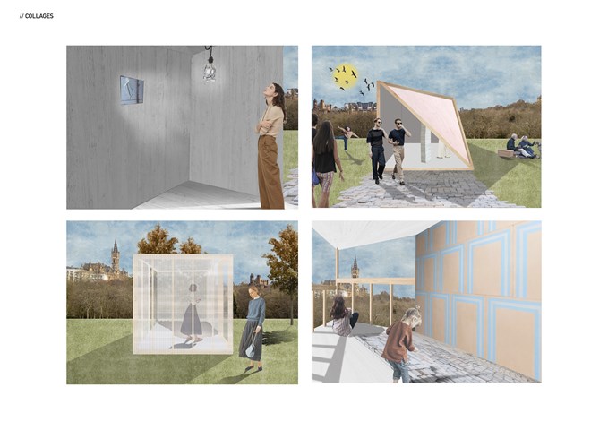
"To See" - Series of collages - Zuzanna Woznicka
Semester one project "To See".
Series of collages capturing the internal or external character of the temporary pavilions. Collages were made in Photoshop over the hand-drawn sketches.
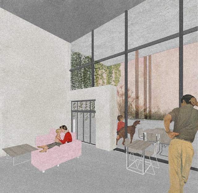
View of Main Living Space - Conor Ryan McCormack
Allotment Living _3A To Play
Allotment Living_3A To Live.
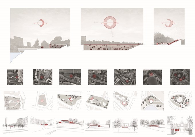
Pnyx | Sections, Plans and Sketches - Ami Coulter
The Pnyx are designed to encourage citizens to DISCUSS, enveloping pause points in the city. In Glasgow, these are often formed by green spaces offering the opportunity to slow down or stop for a moment. These spaces grant a particular opportunity for primary and secondary engagement with the programme. The reintroduction of the ancient form which has since been adopted and privatised, also reinstates the identifiable form associated with engagement in the public realm. Accessible to all, allowing citizens to gather together in their common moments.
Andrew McCluskie
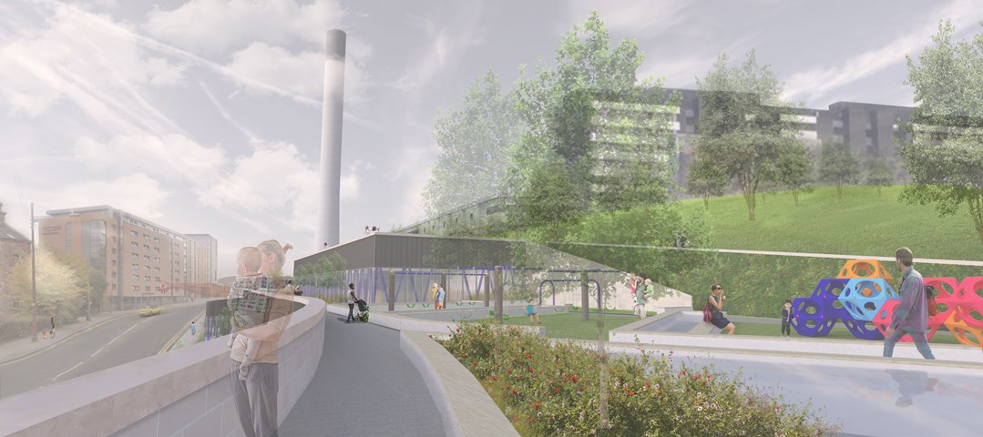
Play Area and Roofscape
Traditionally, a day out to a play area is almost exclusively a children's activity, with parent(s) acting as chaperone, arriving at the park, finding a bench and sitting on the outskirts of the space on which to wait. Partick Imagination Library's play area is conceived so that parents as well as their children are located within the play space, with the aim to get parents more involved with play, or facilitate social interaction between parents of more independent children. The Living Walls and integrated Raised Planters continue the atmosphere of the neighbouring Park onto the building roofscape.
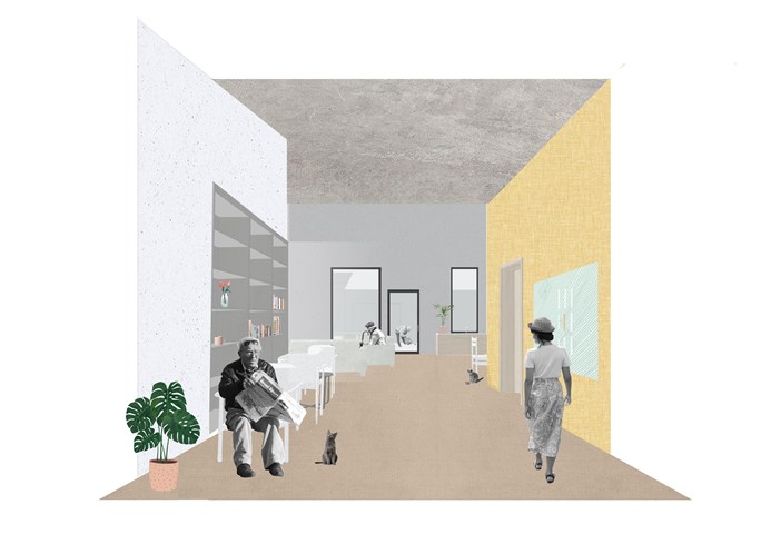
E. Severe Dementia Housing - Adele Melas
Level 3 Housing proposal is for individuals facing severe stages of dementia, whom require assistance 24/7. The proposal is bungalow in form, low is scale, domestic in style, and accessible in function. To battle isolation and enhance physical and social stimulation, residents live in small groups of 3-4 per household, and are encouraged to participate in all aspects of normal living to the best of their abilities. The immediate neighbourhood setting of the homes de-institutionalises the generic appearance of long, narrow, and dark double loaded corridors in conventional care homes. In the case of the neighbourhood, the ‘corridors’ between homes are in fact real life streets.
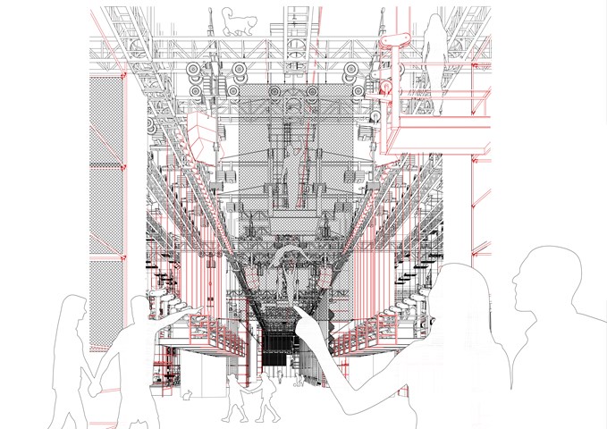
View of Consumption Space - Conor Ryan McCormack
Down the Rabbit Hole_3B To Play.
Andrew McCluskie
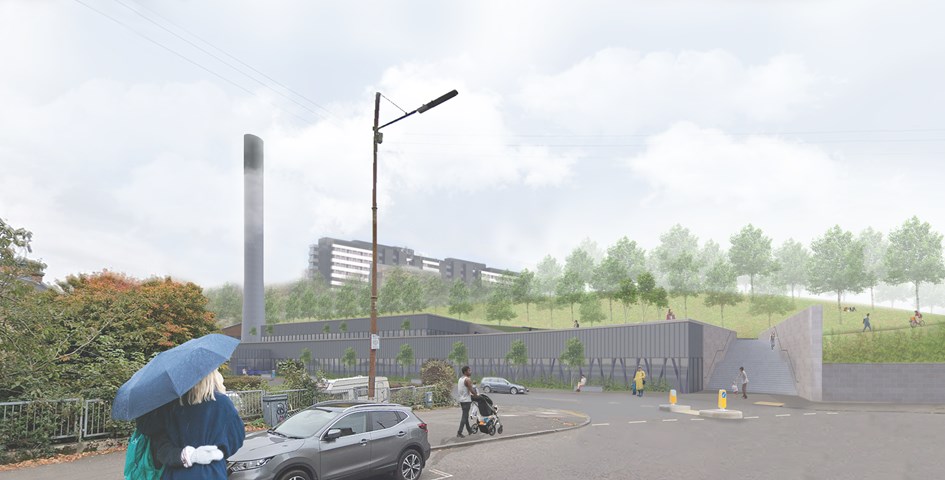
View from Benalder Street Bridge
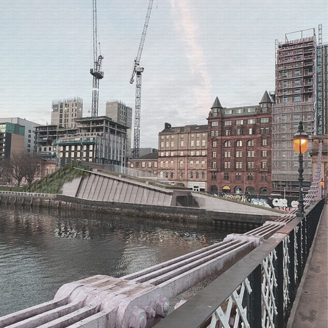
Initial analysis of Yorkhill Park, which the site is bound by, revealed a need for improved access and public realm. Therefore the access stairs were rotated to receive pedestrians from Partick and accentuate their desired path. The scheme will also provide disabled access to Yorkhill Park for the first time. A green buffer and internal balustrades will ensure privacy in the main library space and increase biodiversity on site.
Andrew McCluskie
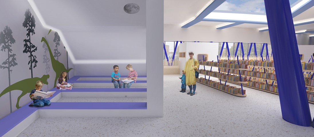
Reading Area for 4-5 year olds
After the design of the external stair above, the lighting conditions beneath created an opportunity for a “secret cave” space at the West end of the ground floor plan. This means 4-5 Year Old Children are provided with a space whose atmosphere is evocative of storybook setting. The wall decals are intended to add to this effect. A hidden strip LED will illuminate the space while its discretion ensures retention of the imaginative atmosphere.
In contrast, the book storage is in a more traditional Library format to help children make the transition to traditional libraries when they get older. The largest of the rooflights gives sky views from this area, opening up the internal experience while planting around will screen the books from afternoon sun.
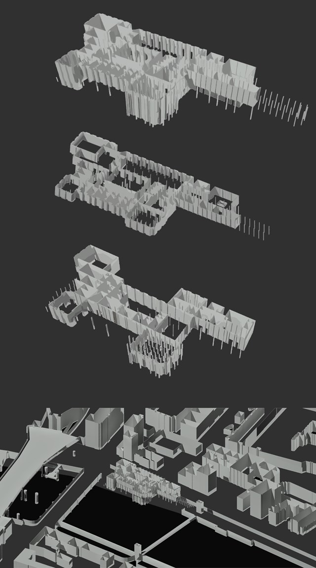
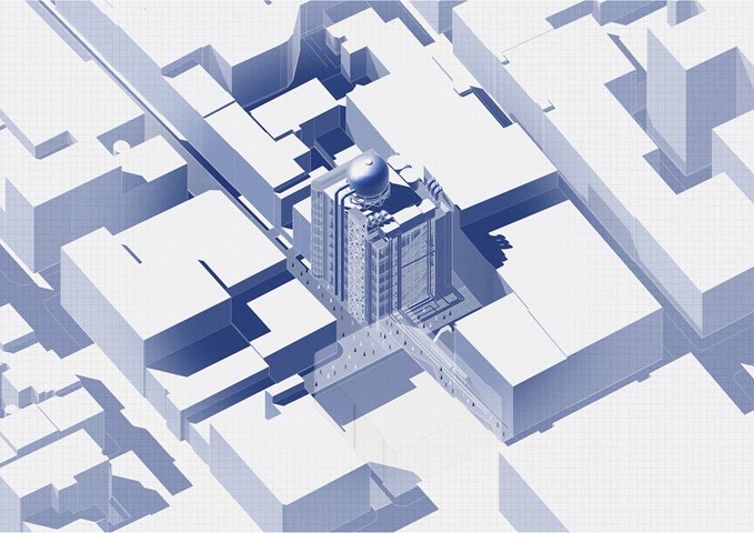
Exploded axonometric model in 3D Context site model - Antony James Graham
The 3D model allows for a thorough visual aid into the external and internal relationships of the building in relation the the special context of Clyde street, the River Clyde and the City centre of Glasgow. The model enables the floor plans, contextual plans and development investigation and research to be visually recognised in further detail.
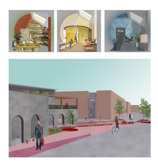
Approach to the 'safe wing' model - Asya Gumus
Each safe wing involves a different activity. Other designs include gardening and sensory therapy that reduces stress and anxiety that can surface due to progressing dementia. Each safe wing will include a different colour/ character/ material in accordance to the interventions use, such as red promoting energy, motivation and activity and blue promoting a calmer and less stressful environment. These colours are important for elderly design as it can slow the process of the developing dementia amongst the ageing population.
Andrew McCluskie
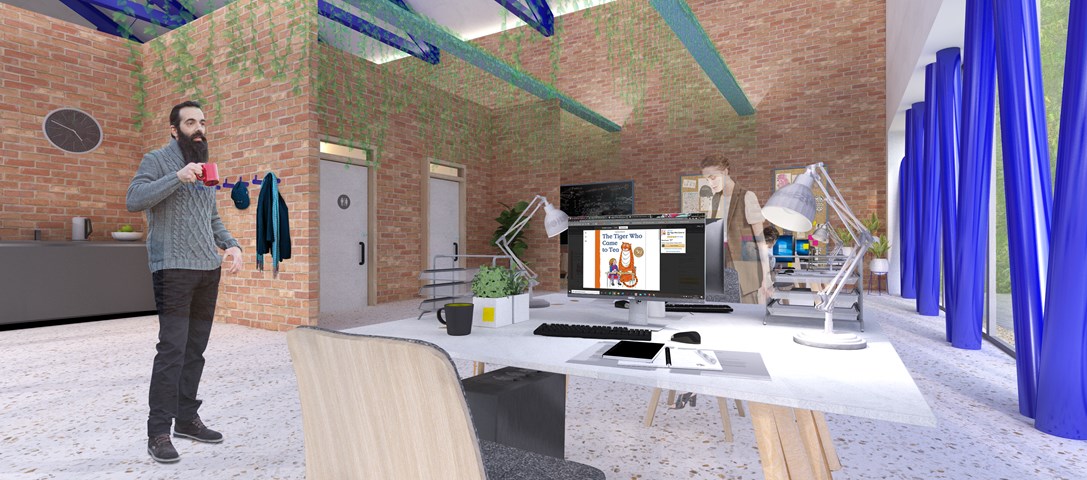
Distribution Admin Space
The Existing Building has been adapted to host the the Book Distribution related programme elements, thereby using the existing structure on site to portray the existing functions of the two organisations. The existing building has fell victim to a few unsympathetic extensions, which will be removed and brick partitions in the distribution building are formed from reclaimed brick kept aside during demolition. The glazed façade and additional dark blue steelwork provide a visual link both to the new façade elements and the rest of the scheme. Biophilic Design has been linked psychologically to stress relief, so the admin office includes plants within and a view to the living retaining wall and the new Reading Green it neighbours. This contributes to a relaxed atmosphere within the spacious office.
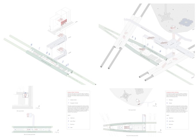
The Stations - Shravan George
Down Street – abandoned station takes care of seeding and germination processes.
Charing Cross – active station takes care of packaging and storage. It also helps link The Lifeline to the Tube network (in this case, to the Bakerloo line).
