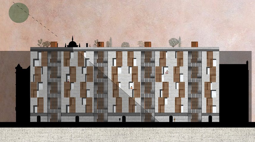
Site Gallery - Elevation
- All tags
- #Design Studies
- #Render
- #Interior Views
- #Section
- #Elevation
- #Exterior Views
- #Drawings
- #Floor Plan
- #Views
- #Education
- #Urban Design
- #Axonometric
- #Technical Drawing
- #Diagram
- #Laurieston
- #Perspective
- #Model
- #Site Plan
- #Art Gallery
- #3D
- #collage
- #Exploded Axonometric
- #sketch
- #Masterplan
- #Concept
- #Diagrams
- #Site
- #Front Elevation
- #Housing
- #Renderings
- #Community Centre
- #Technical Design
- #Plans
- #conservation design project
- #Context
- #hand drawing
- #isometric
- #Public spaces
- #Technical Studies
- #landscaping
- #Structure
- #Cultural Studies
- #History
- #Dementia
- #Neighbourhood
- #Professional Studies
- #Art Gallery in the City
- #Environment
- #photomontage
- #Sustainable production
- #Construction
- #detailing
- #M8
- #Market
- #Physical Model
- #Programme
- #street elevation
Andrew McCluskie
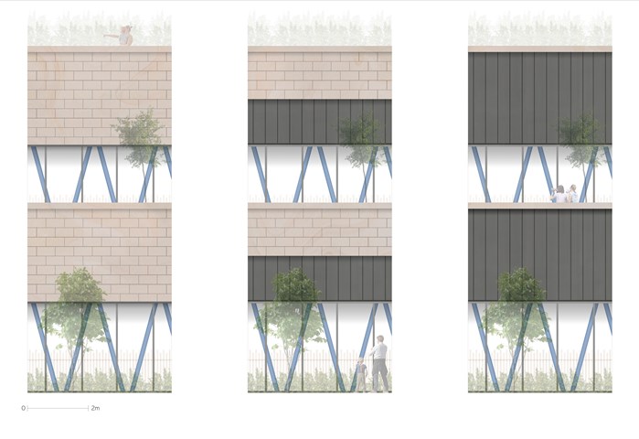
1:20 Façade Accent Testing
These images were created to decide the extents of Standing Seam Zinc within the Repurposed Sandstone Slips as well as to investigate how they would interact with the structural columns. The third test with the most zinc was chosen as it created the most layering and depth.
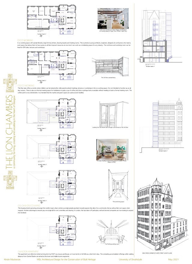
Conservation Design Proposal - Kirstin Mackenzie
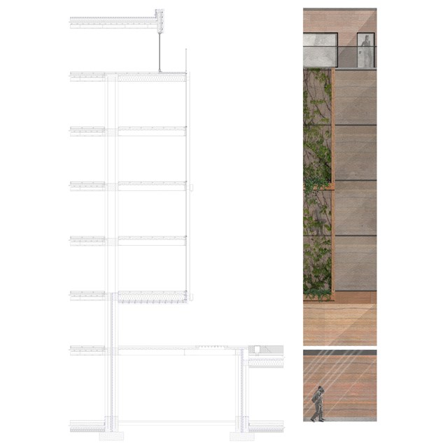
Technical section and elevation - Alfie Hollington
Design Studies 3a
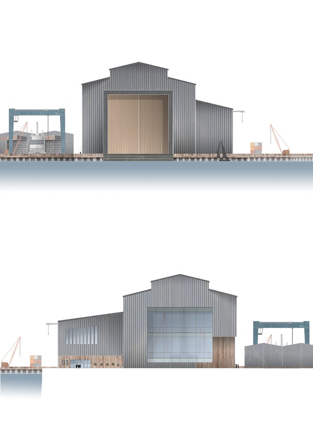
North and South Elevations of the Main Dock Shed - Ellie Carroll
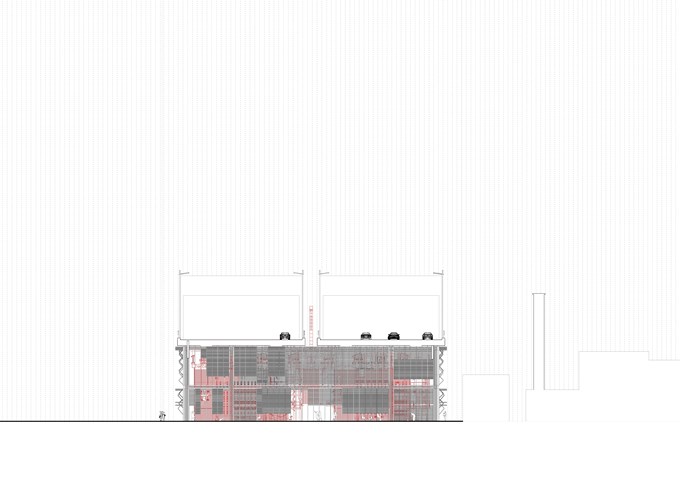
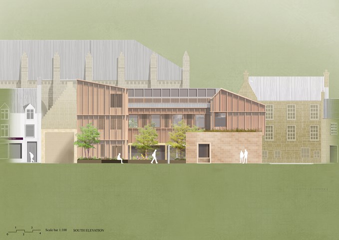
South Elevation 1:100 - Conor Ryan McCormack
Down The Rabbit Hole_3B To Play
Down the Rabbit Hole_3B To Play.
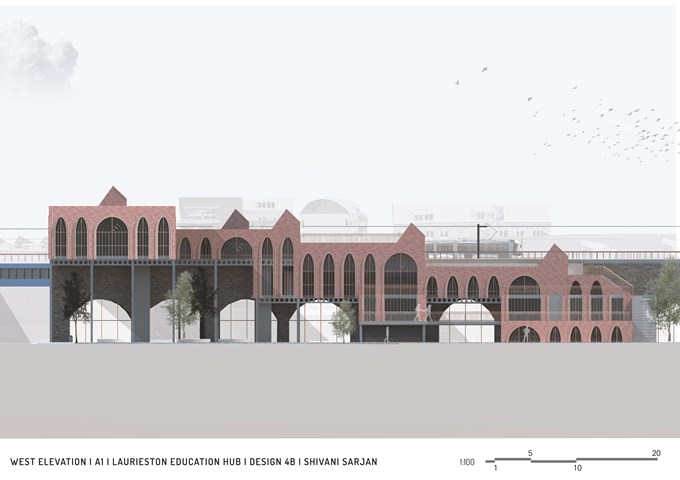
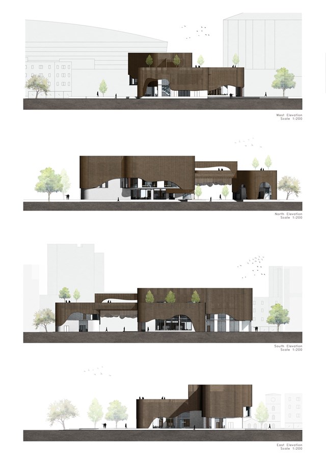
West Elevation - Shivani Sarjan
Laurieston Education Hub
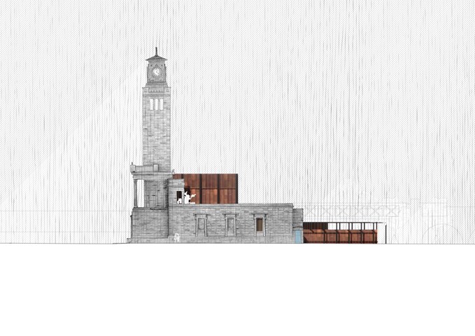
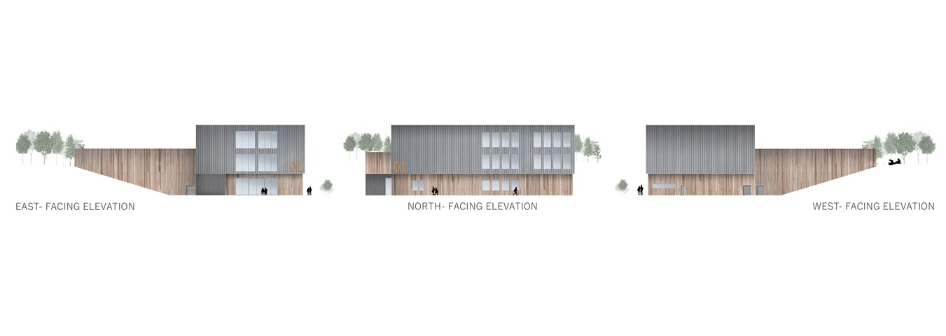
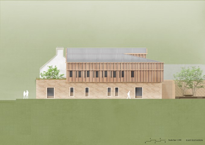
East Elevation - Alfie Hollington
Design Studies 3b
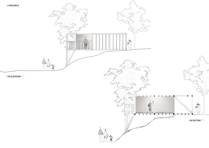
Section and elevation 1:50 - Zuzanna Woznicka
My first attempt at section and elevation, a combination of hand drawing and photomontage.
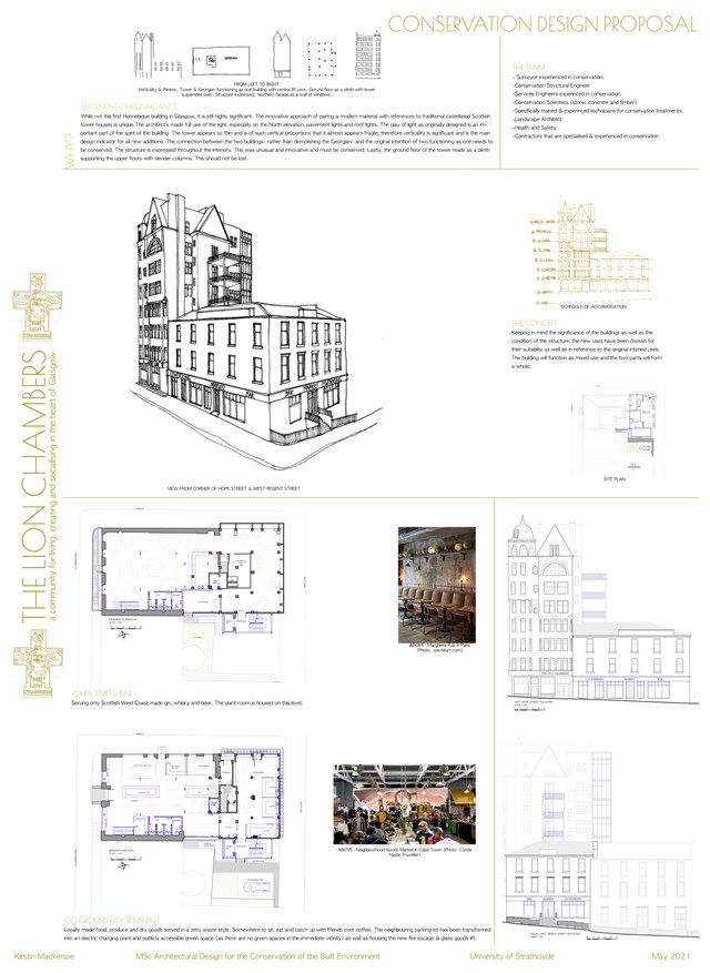
Conservation Design Proposal - Kirstin Mackenzie
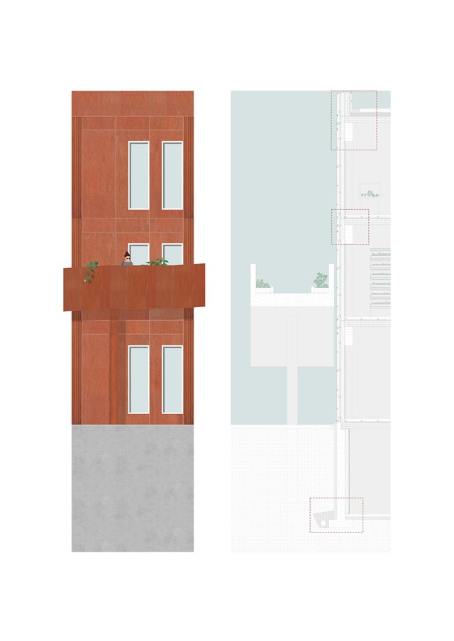
1:20 Detail Section & Elevation - Fiona Wylie
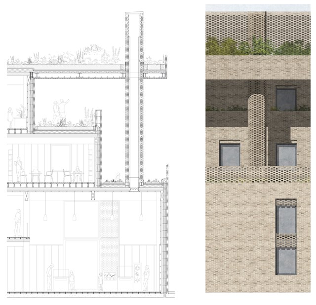
Technical Section and Elevation - Rachel McLure
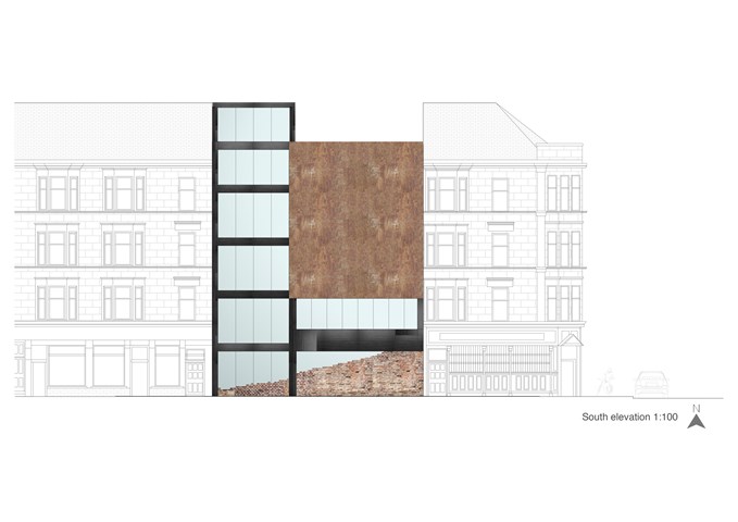
"To Engage" - South Elevation 1:100 - Zuzanna Woznicka
I proposed steel frame construction, in my design because it allows achieving long spans, large open spaces and is aesthetically fitting into the project.
In the south elevation are visible construction elements - steel beams and columns painted in black. A large recycled rusted steel panel is a decorative element and it doesn't have a shading function, I would imagine that made of the shipyard's remains welded into one piece.
Large windows should be made with solar controlled glazing (IGU), or ideally with electrochromic glazing.
At the bottom are recycled bricks which, are in the hall part purely aesthetic. Those brick main are a symbol of new rising from old; a reminder of Govan's heritage.
From the staff room side, the brick is also a structural element, non-load bearing.
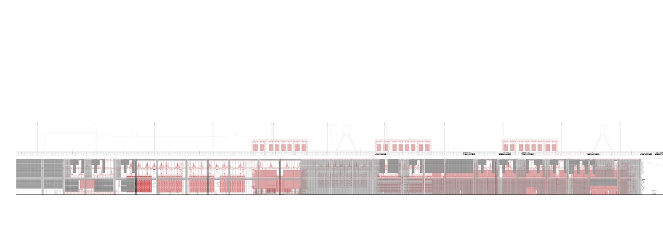
West Elevation 1:100 - Conor Ryan McCormack
Down The Rabbit Hole_3B To Play
Down the Rabbit Hole_3B To Play.
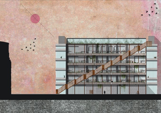
West Elevation 1:100 - Conor Ryan McCormack
Allotment Living _3A To Play
Allotment Living_3A To Live.
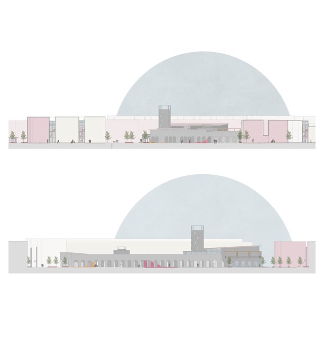
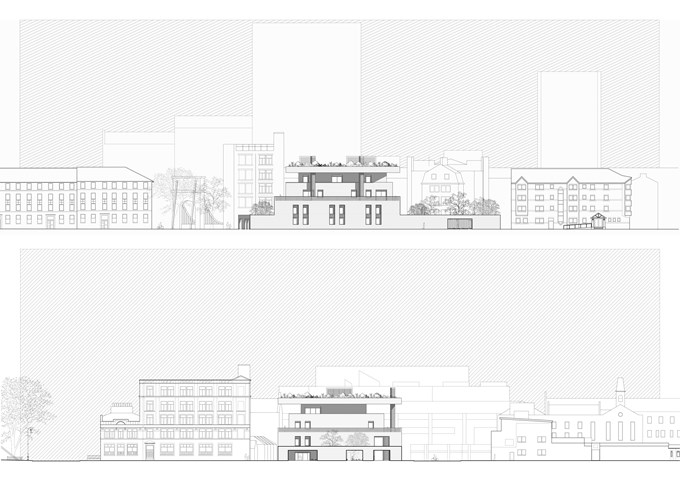
Elevations in context - Asya Gumus
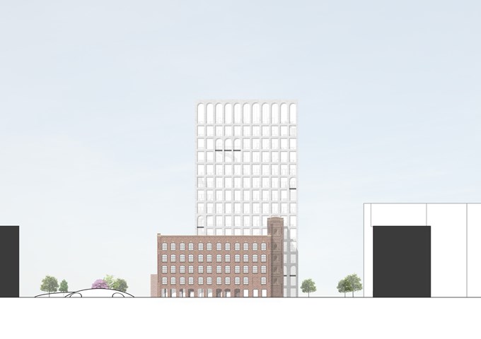
The top elevation shows the 'safe wings' in context and the elevation below shows transparency/ access between street and larger intervention.
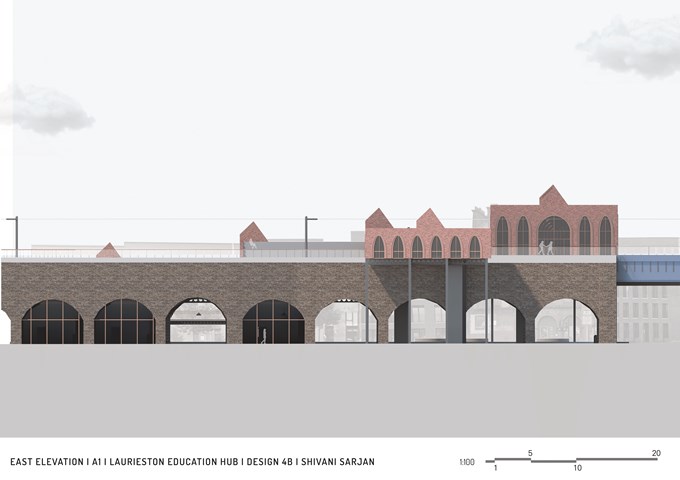
East Elevation - Shivani Sarjan
Laurieston Education Hub
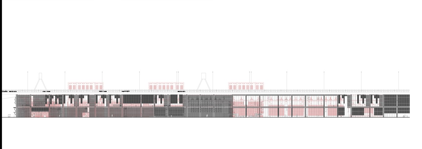
East Elevation 1:100 - Conor Ryan McCormack
Down The Rabbit Hole_3B To Play
Down the Rabbit Hole_3B To Play.
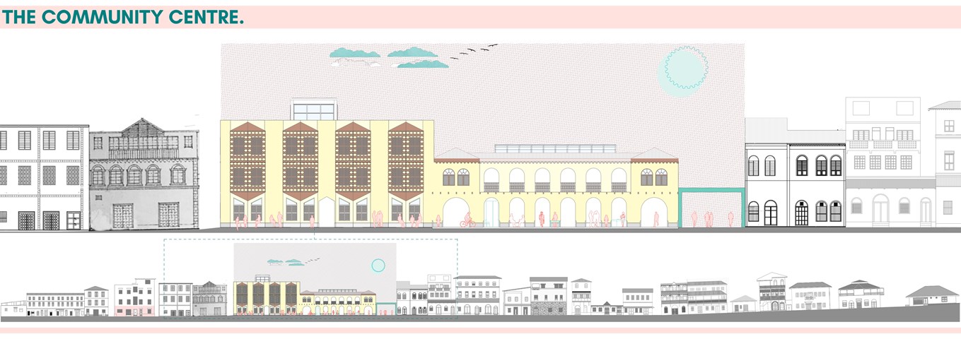
Elevation Of Ndia Kuu street. - Alamin Mandhry
Great care is taken when designing the facade of the community centre. The proportions of the buildings and architectural elements, materiality and other Swahili architectural elements like decorative fascia boards played an important role during design. The building is divided into two volumes to ensure seamlessly it fits into the street elevation.
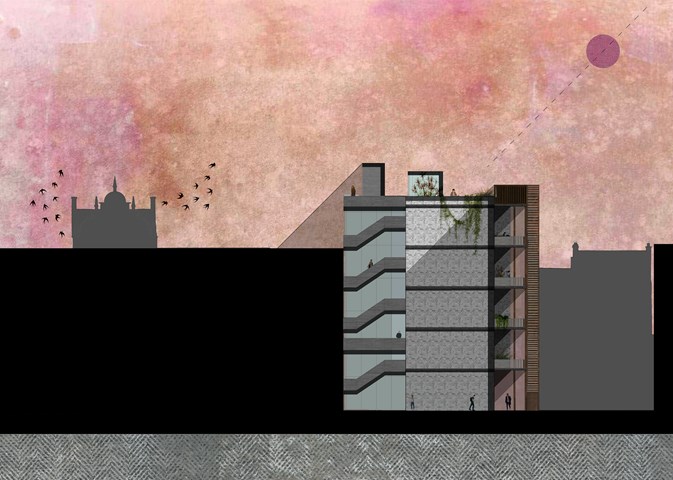
North Elevation 1:100 - Conor Ryan McCormack
Allotment Living _3A To Play
Allotment Living_3A To Live.
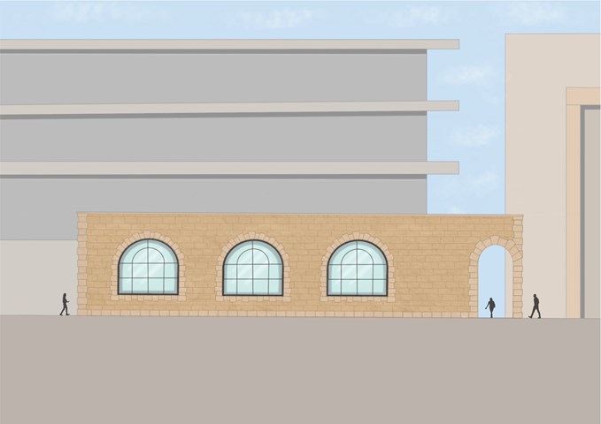
South Elevation - Leena Hussain
Large arched windows belong to the reading room.
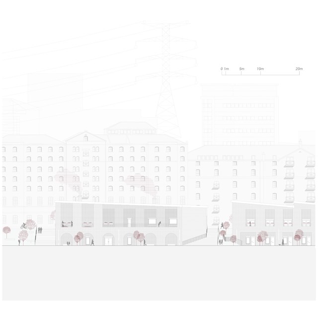
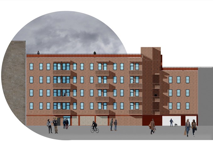
Centre for Unpaid Care and Domestic Work Elevation - Rebecca Irving
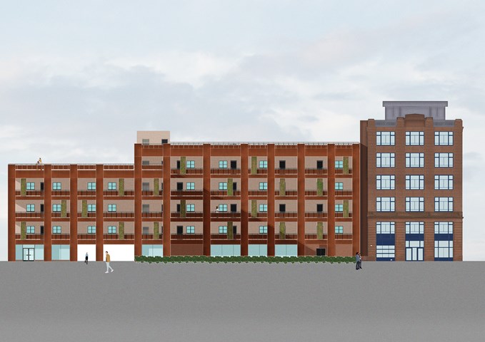
Externally, it is hoped that the streets would be activated by the activities from within and there would be a strong presence of natural community surveillance by the placement of openings, balconies, and windows across the elevations.
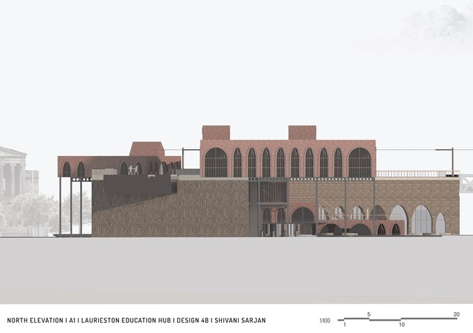
North Elevation - Shivani Sarjan
Laurieston Education Hub
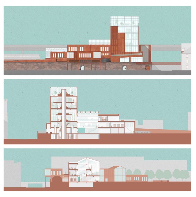
Elevation and Sections - Fiona Wylie
The north elevation, a long section through the growing tower, the seed library, the main atrium, and production spaces, and a short section through the main atrium, hydroponic growing spaces, and the main greenhouse.
The growing "tree" tower is inspired by Frank Lloyd Wright's Johnson Wax Research Tower, with alternating mezzanine floors to allow for double-height vertical farming spaces as the main production zone of the building. The roots of the tower start at the lower ground floor entrance, with a seed library and archive surrounding the main circulation core of the tower.
The main greenhouse off of the atrium acts as a buffer zone for solar gain and passive heating/cooling throughout the building, which then goes into the main atrium which acts as a thermal stack where hot air can exit through vents.
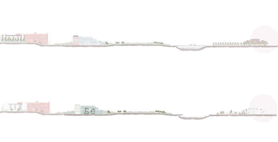
The Master plan of an Individual Story in Elevation and Section - Kate Melhuish
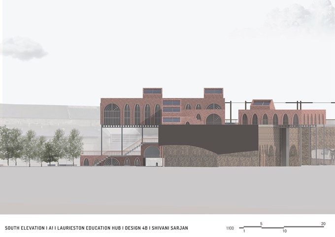
South Elevation - Shivani Sarjan
Laurieston Education Hub
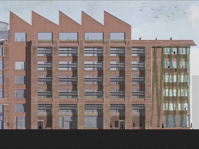
West Elevation - Jakob Young
Housing Project: The Living Machine
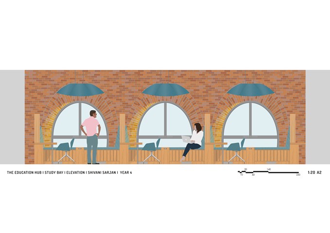
Interior Elevation of 3 Study Bays - Shivani Sarjan
Laurieston Education Hub
This interior elevation shows 3 Study Bays ranging along a mezzanine. It shows the relationship between these spaces as well as the larger building. The large windows frame the space while the desk forms and interlocking partition to divide but not entirely seperate the spaces. The bay accomodates several ways to work, including a formal desk, a bookshelf and a bench.
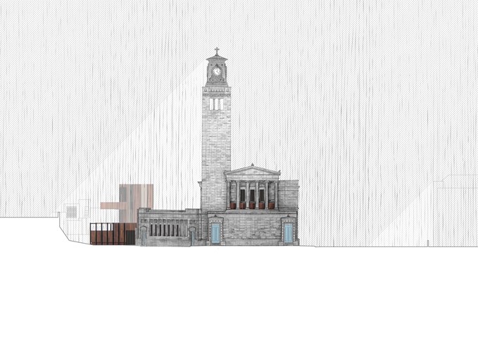
South Elevation - Alfie Hollington
Design Studies 3b
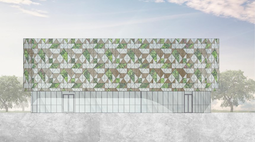
South Elevation - Angelika Hajdasz
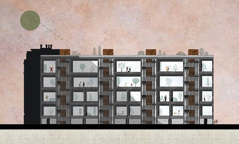
The elevation of the centre is designed from natural materials and includes elements of vertical gardens. The second-skin facade creates a repeatable pattern using wooden, glass and greenery panels.

Andrew McCluskie
1:500 Elevation to Old Dumbarton Road
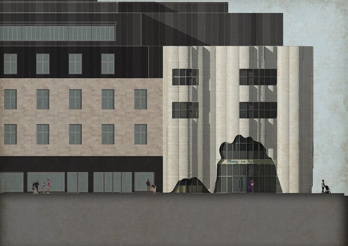
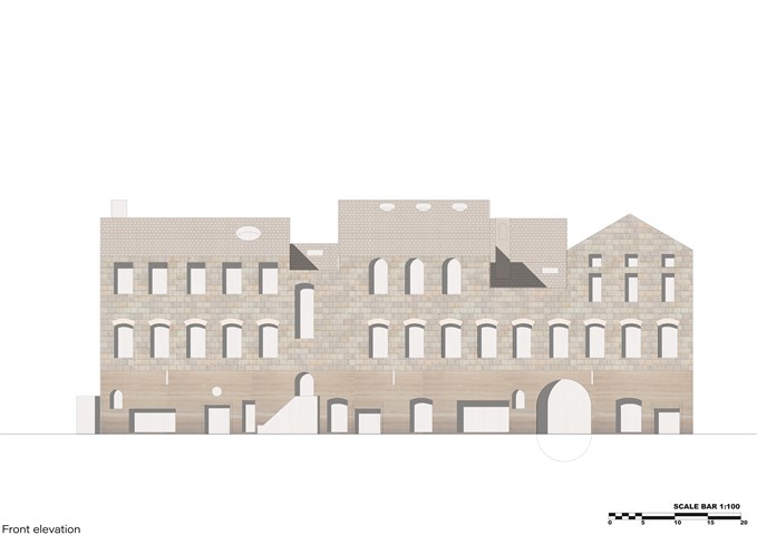
The façade is made mainly from stone slips formed from the existing on-site wall into which the new building embeds. Zinc Accents set within announce the programme within the wall sandstone. As the stone will match perfectly once weathered, the building should integrate with context as if it had always been there. In order to match the height datum of the existing wall, ceilings indoors have been raised to 4.5m which has resulted in better views to Benalder Bridge (the building’s physical connection in streetscape to Partick) from the Roofscape.
