Site Gallery - Section
- All tags
- #Design Studies
- #Render
- #Interior Views
- #Section
- #Elevation
- #Exterior Views
- #Drawings
- #Floor Plan
- #Views
- #Education
- #Urban Design
- #Axonometric
- #Technical Drawing
- #Diagram
- #Laurieston
- #Perspective
- #Model
- #Site Plan
- #Art Gallery
- #3D
- #collage
- #Exploded Axonometric
- #sketch
- #Masterplan
- #Concept
- #Diagrams
- #Site
- #Front Elevation
- #Housing
- #Renderings
- #Community Centre
- #Technical Design
- #Plans
- #conservation design project
- #Context
- #hand drawing
- #isometric
- #Public spaces
- #Technical Studies
- #landscaping
- #Structure
- #Cultural Studies
- #History
- #Dementia
- #Neighbourhood
- #Professional Studies
- #Art Gallery in the City
- #Environment
- #photomontage
- #Sustainable production
- #Construction
- #detailing
- #M8
- #Market
- #Physical Model
- #Programme
- #street elevation
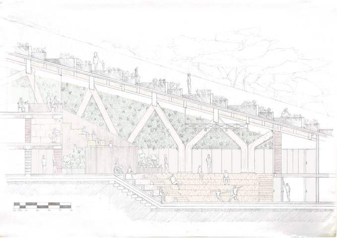
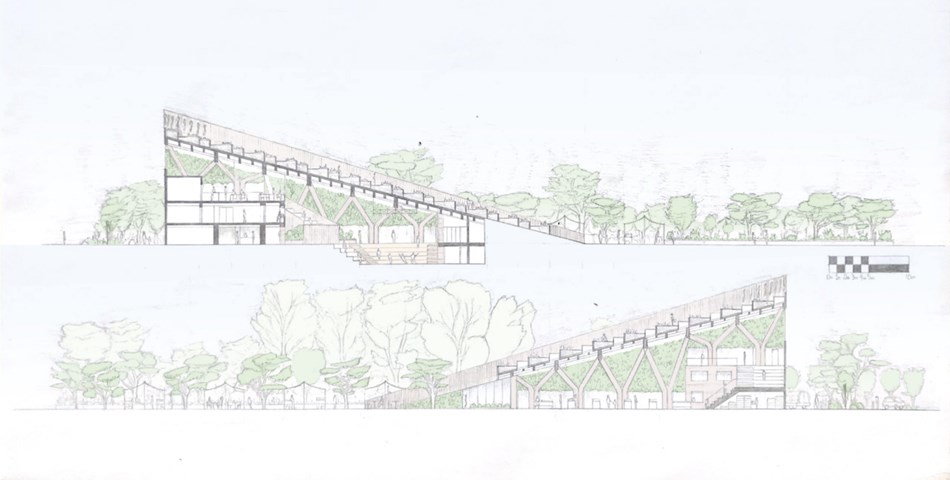
Section BB 1:100 - Conor Ryan McCormack
Down The Rabbit Hole_3B To Play
Down the Rabbit Hole_3B To Play.
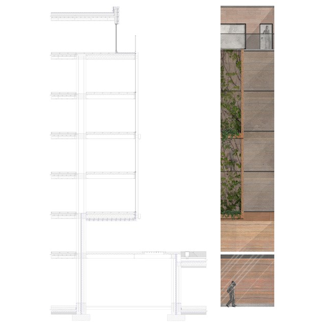
Technical section and elevation - Alfie Hollington
Design Studies 3a
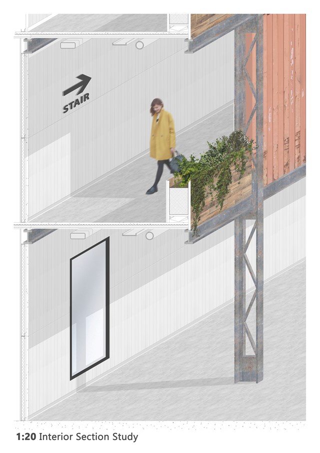
1:20 Interior Section Study - Andrew Devine
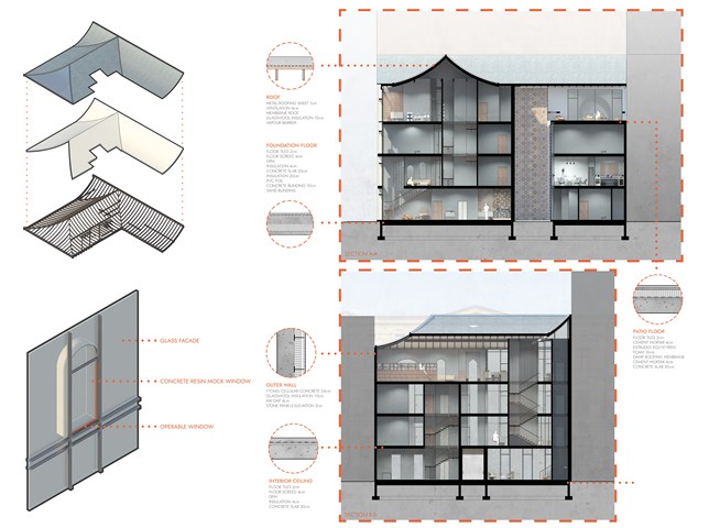
Study showing the construction of the gantries around the atrium
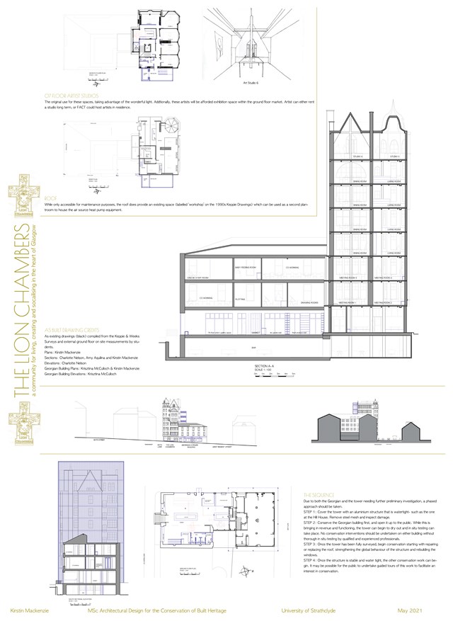
Conservation Design Proposal - Kirstin Mackenzie
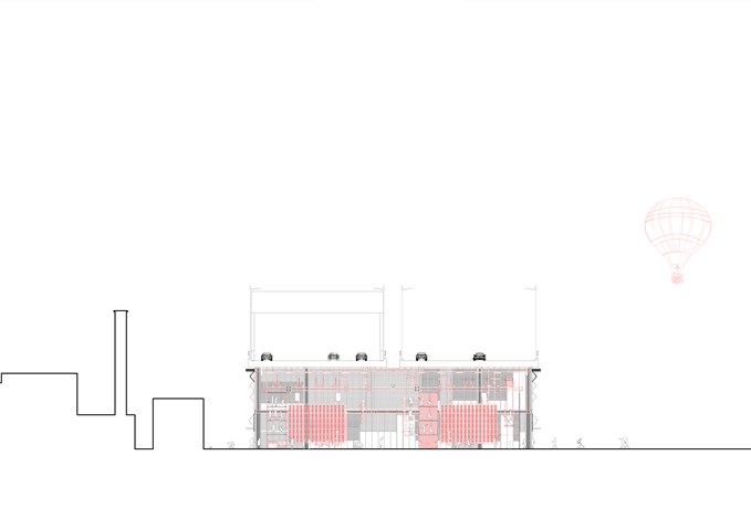
Section DD 1:100 - Conor Ryan McCormack
Down The Rabbit Hole_3B To Play
Down the Rabbit Hole_3B To Play.
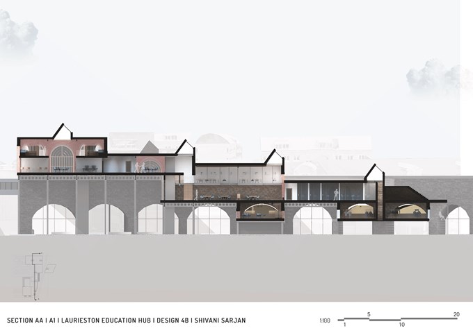
Section AA - Shivani Sarjan
Laurieston Education Hub
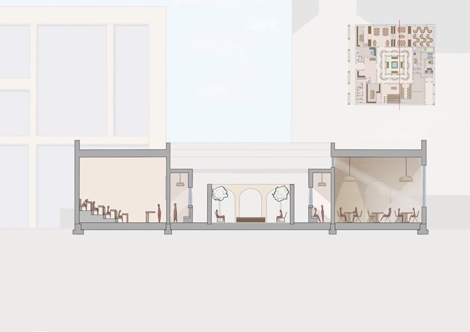
Section - Leena Hussain
Section detailing a small lecture hall, an inner cloister, a courtyard and a reading room.
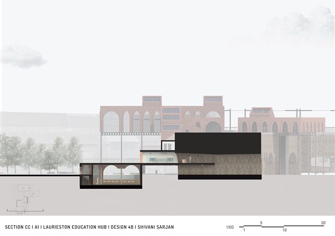
Section CC - Shivani Sarjan
Laurieston Education Hub
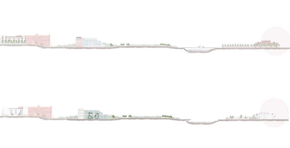
The Master plan of an Individual Story in Elevation and Section - Kate Melhuish
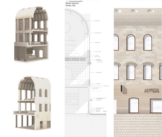
Technical detail - Fatema Hassan
In comparison, a rendered model interprets the differences between the interior and exterior elevations of the selected region to cut through. The technical section highlights the material relations of the facade with the interior activities.
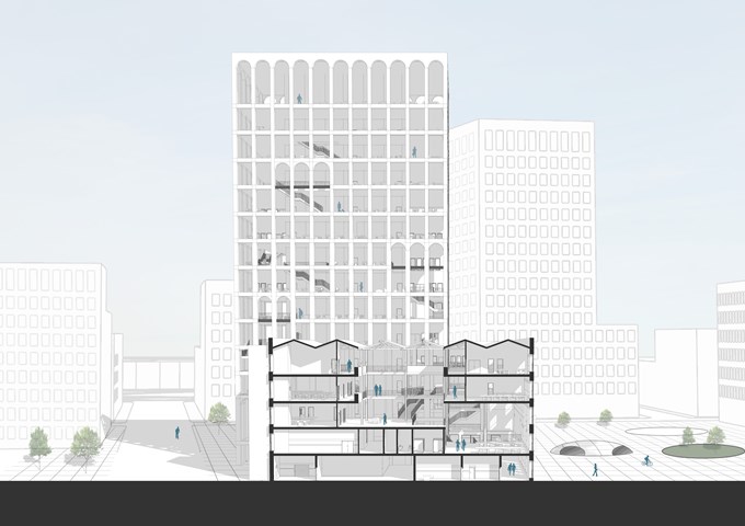
Short Section - Andrew Devine
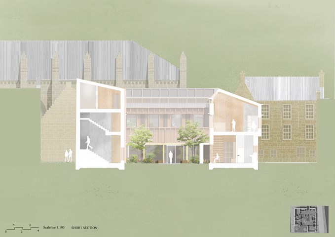
Section through the atrium space, highlighting the existing roof structure carried through into the new proposal. The scale of the wider masterplan can also be seen in this image as well as an idea of the public square and grey water collection scheme.
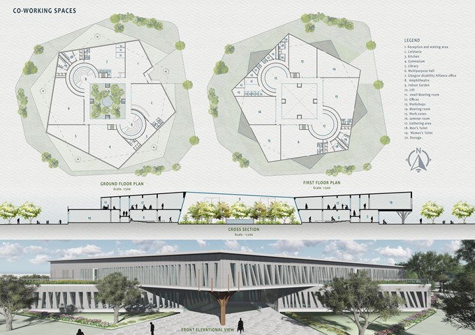
Co-working Spaces - Mrunmayi Pandit
Surrounded by green spaces, the pentagonal two-storey block nested in metal and glass envelope opens up into interior and exterior green landscape. A circulation area is provided surrounding the indoor garden. Spaces are divided into public areas on the ground floor and private areas on the first. Indoor small community gathering areas are also proposed on both floors along with offices, Café, Library, and multipurpose areas. Accessible toilets have been provided as per the needs of people with disabilities. Glass and metal Pattern has been created to balance light and shadow And having transparency in spaces. The pattern on the façade allows a controlled amount of daylight into the spaces. The metal mesh sheet façade is used for ventilation and light.
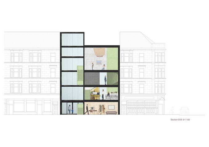
"To Engage" - Section B-B 1:100 - Zuzanna Woznicka
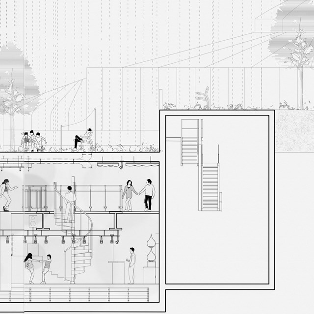
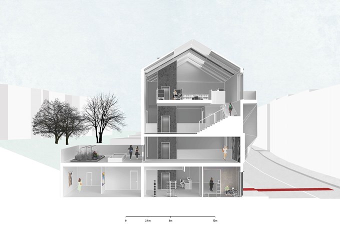
In this section, the main focus was to show this "hanging staircase" in a dramatically tall hall space. The gallery space is located on the last two floors which allow the space to be used after opening hours as a community centre or meeting point.
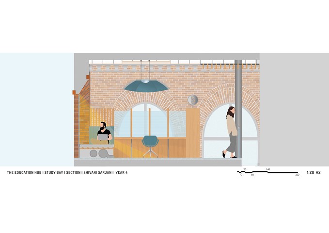
Section of 1 Study Bay and Balcony - Shivani Sarjan
Laurieston Education Hub
This Section cuts through one study bay and the mezzanine. It defines the deep embrasure created by the window which the bench fits into. The partition offers privacy without completely enclosing the user; using sheer fabric and spaced wooden elements. The shelf, defines the entrance to the space while providing a number for easy navigation. Finally, the large lighting element also provides a sound buffer.
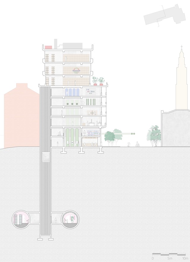
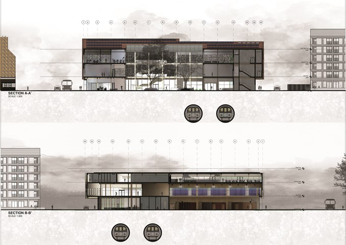
Cross Section of The Lifeline HQ - Shravan George
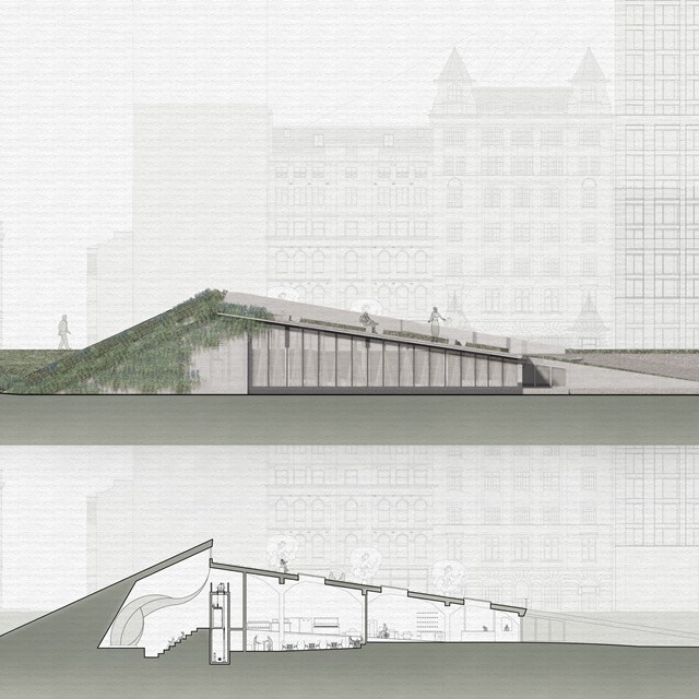
This section illustrates the HQ's connections to the tunnels below as well as to the newly pedestrianised Strand.
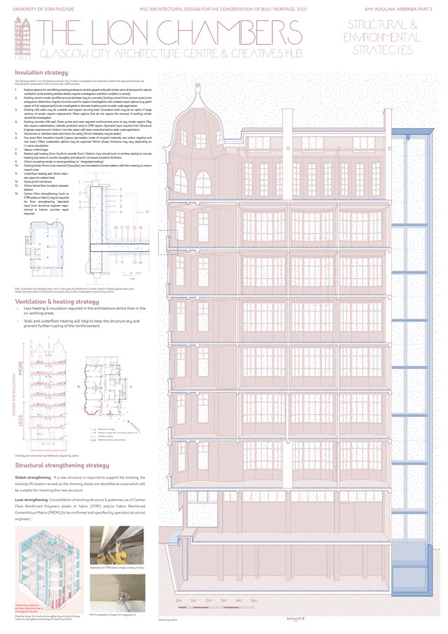
Structural & Environmental Strategies - Amy Aquilina
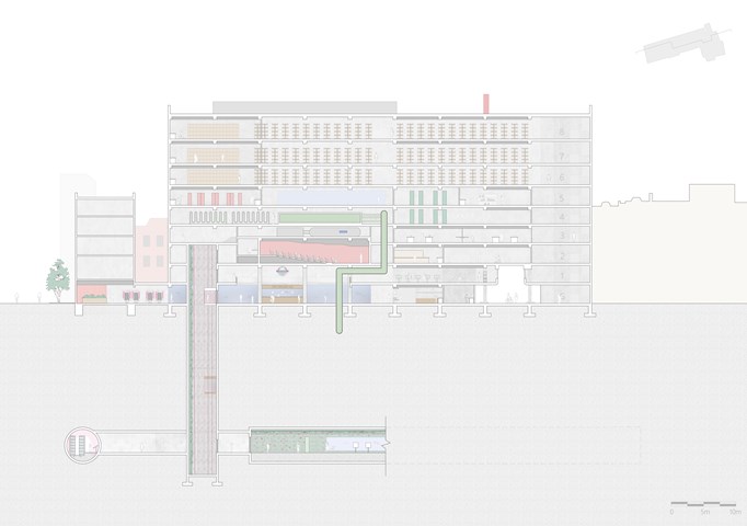
Longitudinal Section through The Lifeline HQ - Shravan George
This section illustrates the connections between The Lifeline HQ and the abandoned tube tunnels below. The tunnels accommodate a public exhibition space (tunnel) and a fine-dining restaurant. The tunnels are accessed via capsule lifts that take users through a vertical exhibition (lift shaft).
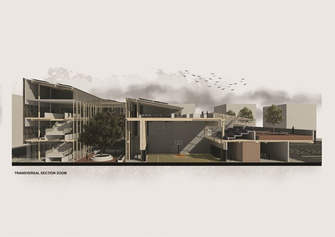
Transversal Sectional Perspective Zoom - Carlson Ko
Drawing that shows the connection from the commercial area connected to the gymnasium. This would introduce great activities around Laurieston and how it would interact within the community and accessibility. Private Restaurant that would introduce jobs and great private time to have a greater view of Laurieston to Gorbals and Tradeston. Courtyard that would allow an interesting interaction with passerby within the building and with the curiosity will attract community to interact within the building.
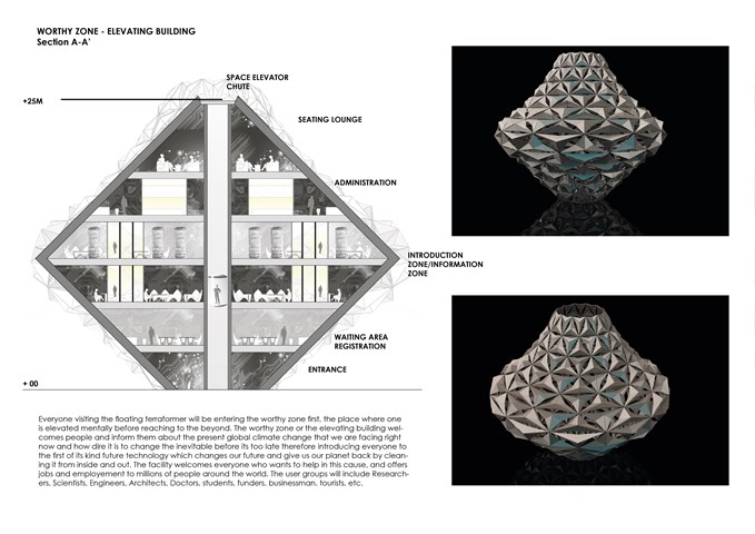
Elevating Building - Entry Zone - Sania Halim
Everyone visiting the floating terraformer will be entering the worthy zone first, the place where one is elevated mentally before reaching to the beyond. The worthy zone or the elevating building welcomes people and inform them about the present global climate change that we are facing right now and how dire it is to change the inevitable before its too late therefore introducing everyone to the first of its kind future technology which changes our future and give us our planet back by cleaning it from inside and out. The facility welcomes everyone who wants to help in this cause and offers jobs and employment to millions of people around the world. The user groups will include Researchers, Scientists, Engineers, Architects, Doctors, students, funders, businessmen, tourists, etc.
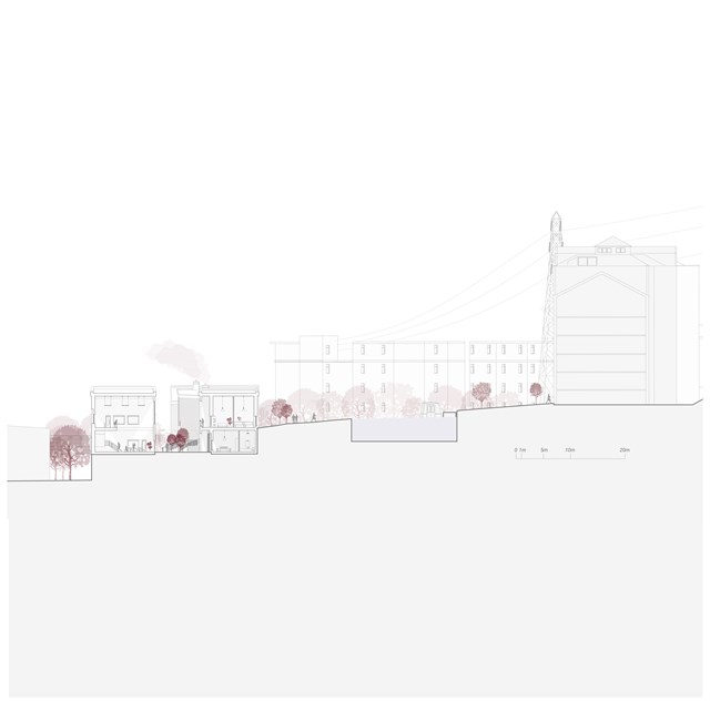
Social Services and Housing Section - Rebecca Irving
The housing blocks and community services are located in the heart of the site. The requirements for the community services are based on discussions with a diverse group of women, who suggested we need ‘in-between’ spaces for people to access help and support, without direct intervention.
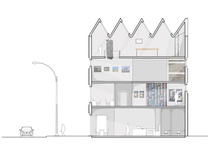
Section - Laura Kennedy
1:50 Section taken through gallery proposal showing art work.
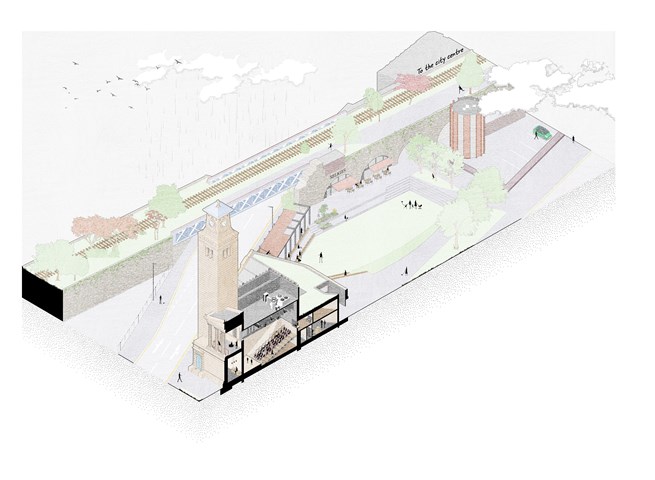
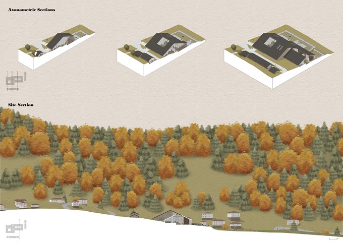
Isometric site section - Alfie Hollington
Design Studies 3b
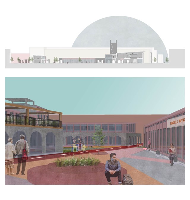
Section and exterior view of courtyard - Asya Gumus
Both images show the guiding masterplan route and individual buildings forming the central Anti-ageing hub.
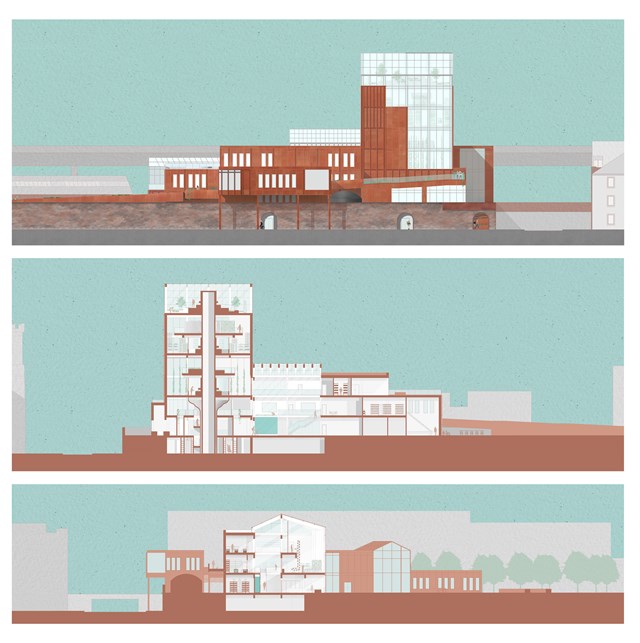
Elevation and Sections - Fiona Wylie
The north elevation, a long section through the growing tower, the seed library, the main atrium, and production spaces, and a short section through the main atrium, hydroponic growing spaces, and the main greenhouse.
The growing "tree" tower is inspired by Frank Lloyd Wright's Johnson Wax Research Tower, with alternating mezzanine floors to allow for double-height vertical farming spaces as the main production zone of the building. The roots of the tower start at the lower ground floor entrance, with a seed library and archive surrounding the main circulation core of the tower.
The main greenhouse off of the atrium acts as a buffer zone for solar gain and passive heating/cooling throughout the building, which then goes into the main atrium which acts as a thermal stack where hot air can exit through vents.
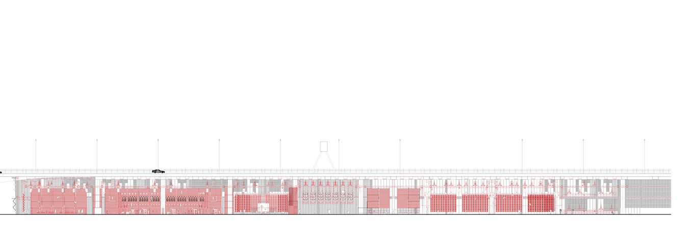
Section AA 1:100 - Conor Ryan McCormack
Down The Rabbit Hole_3B To Play
Down the Rabbit Hole_3B To Play.
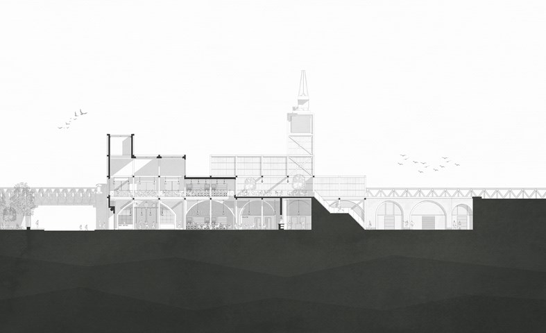
Section through cafe/bistro (ground floor) & rooftop bar (above) - Jakob Young
Undergraduate Thesis: Merchant Theatre
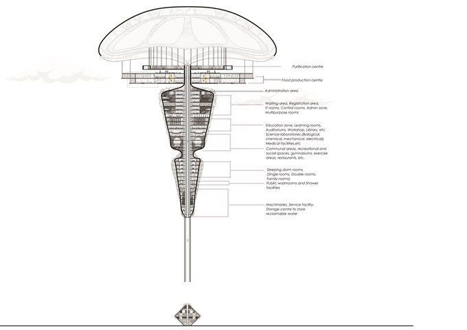
Long section of The Floating Facility and Plans - Sania Halim
The [PH] floating terraformer, as the name implies, is designed to float in the air using maglev technology. The repulsion induced by the structure’s magnetism and the earth’s magnetic field would regulate the buoyancy of the structure, causing it to migrate up to altitudes of 700m, where acidic contaminants typically congregate. Acidic materials, such as acid fog, will be absorbed by the porous membrane attached to the airbags and accumulated in the central purifier, where they will be neutralized by an alkaline solution formed by nitrogen-fixing microorganisms by biological activity and deposited in the purifier center. The water and salt generated during the neutralization process are fed to plants, trees, humans, and deserted areas, among other things.
Initial Location: Central Park, NY, USA
Program: 1500-2000 inhabitants anticipated
Total Height: 257.5 m
Status: Reviving atmosphere, Technological Research and Development
The terraformer will be seen as the first step towards a greener future without acid pollution, water scarcity and climate problems. Hence, reviving our ecosystem around the world part by part.
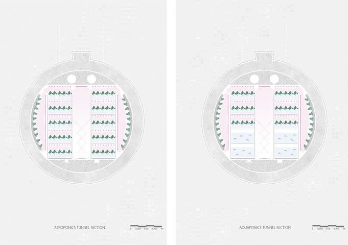
Typical section through production tunnels - Shravan George
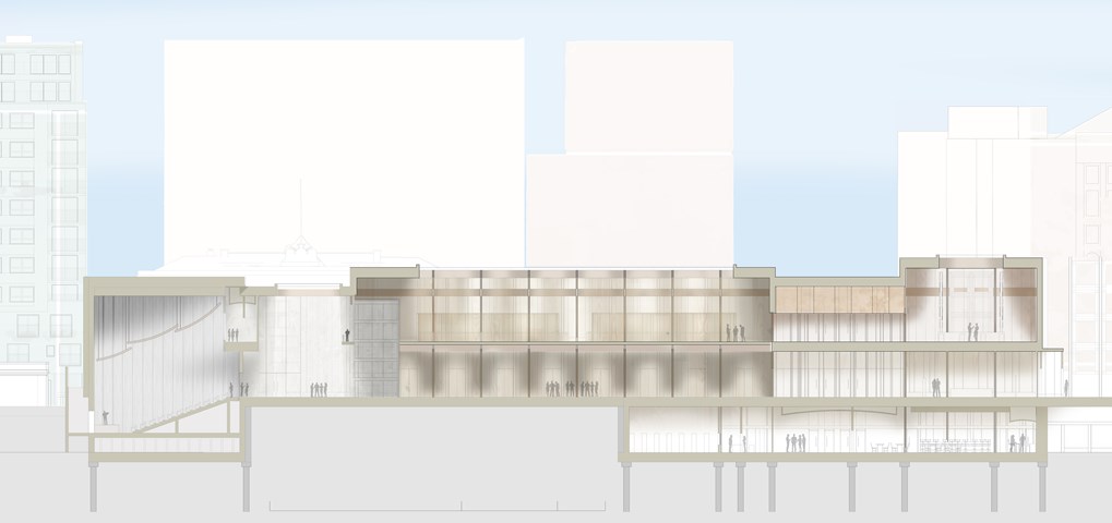
Main Forum Section BB - 1:100 - Antony James Graham
Section BB illustrates the diverse range in scale, hierarchy and spatial change throughout the building programme. Light is a crucial factor in enhancing the atmosphere, materiality and quality of the space, which is controlled by large overhead skylights that can be operated to change depending on the activity of the space. From Right to the left the public can be seen travelling through the building, rising and descending through gallery spaces, forums and media spaces that all offer opportunities to interact, learn and be heard.
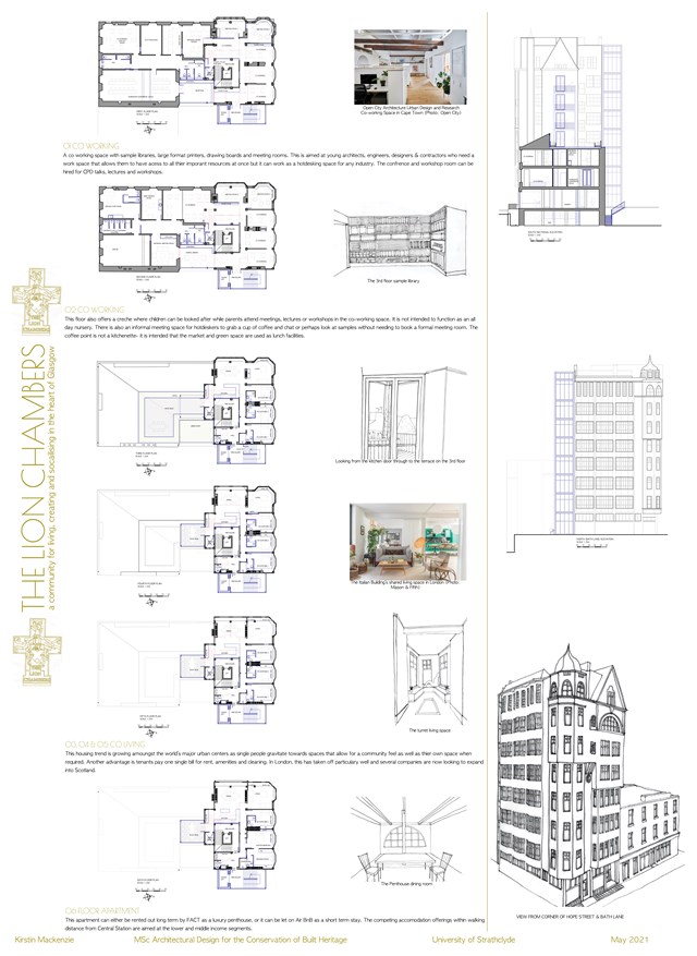
Conservation Design Proposal - Kirstin Mackenzie
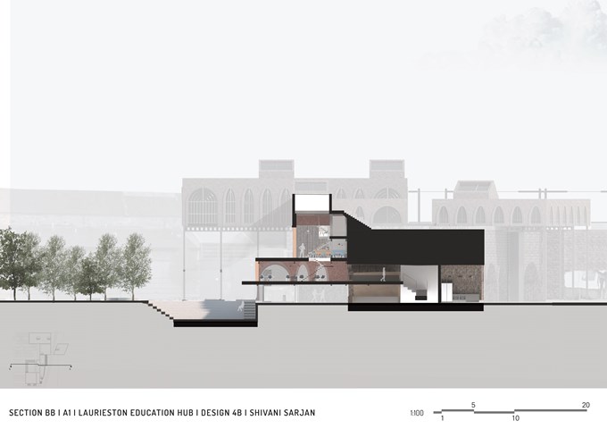
Section BB - Shivani Sarjan
Laurieston Education Hub
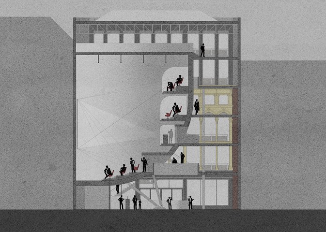
Cinema Section - Anthony Mazeli
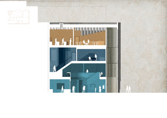
This section shows the cinema functionality through sight lines and projector throw. It also depicts the building programme with a spacious bar area on the ground level to encourage socialisation while maintaining a safe distance, hall areas with alternating floating bridges leading to cinema, and a gallery area on the 5th floor.
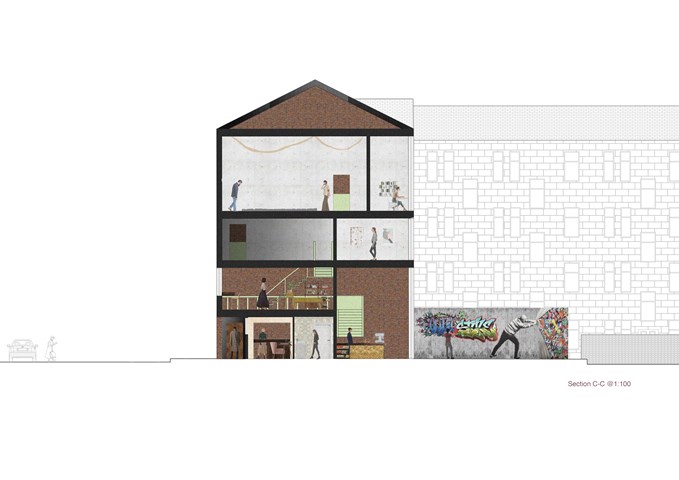
"To Engage" - Section C-C 1:100 - Zuzanna Woznicka
In this section, we can see the difference between the height of the floors and how the light accesses those spaces. In the backyard is located a public graffiti wall, that can be used by anyone who would like to express himself. To introduce the gallery to another social group I proposed a mini ramp at the back. The brick in the back is the recycled wall of the preexisting building, and that was my starting point for this project. I wanted to leave one wall that would be a reminder of the past.
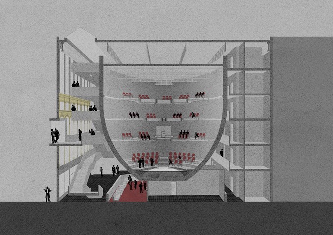
Cinema Perspective Section - Anthony Mazeli
Section cutting through ovoid shaped cinema drum to expose balcony seating arrangement for groups of six and three. The floating design intends to draw customers while protecting from virus spread and serving entertainment, with accommodation for scratch coated Perspex screens attached to balconies. Building programme is split into; circulation visible through transparent windows at the front of house; Cinema; and services at the back of house.
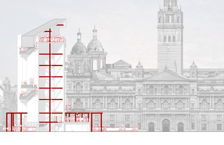
George Square Arx | During Protest - Ami Coulter
The design centres on verticality, drawing the users up to be eye to eye with the City Chambers – a very prominent power/political symbol within the city. At this height there is an honesty of position, the citizens can see what is happening in their city, as they ascend, they are offered a panoptic view unhindered.
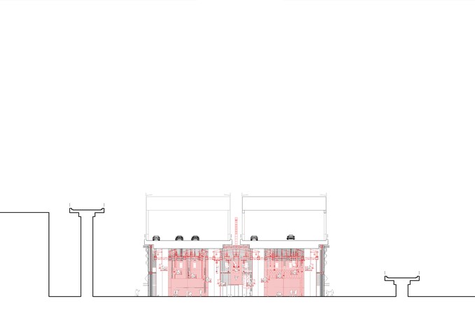
Section CC 1:100 - Conor Ryan McCormack
Down The Rabbit Hole_3B To Play
Down the Rabbit Hole_3B To Play.
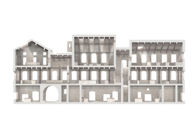
Sciographical study of the sectional model - Fatema Hassan
This section highlights and emphasizes the contrast and structural relationship between the inner and outer facades. The outer facade is a series of carved openings into the masonry wall while the inner facade is composed of the grid of timber columns making it a transparent facade to the interior courtyard.
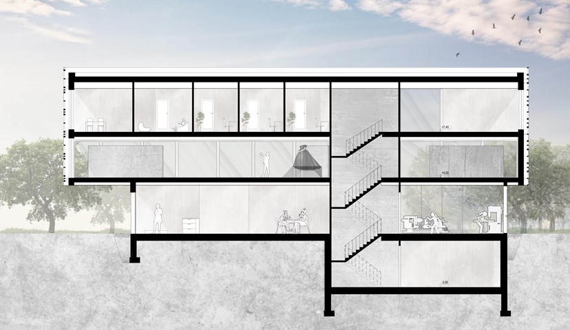
Section B-B - Angelika Hajdasz
The centre provides multiple opportunities to expand someone’s interest and share talents. The activities offered to women are woodworking, which helps to boost productivity and sense of achievement, which boosts self-esteem as a side effect. Another important space in the building is the sewing workshop, a place where women can express their creativity through fashion and clothes.
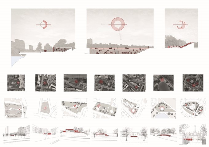
Pnyx | Sections, Plans and Sketches - Ami Coulter
The Pnyx are designed to encourage citizens to DISCUSS, enveloping pause points in the city. In Glasgow, these are often formed by green spaces offering the opportunity to slow down or stop for a moment. These spaces grant a particular opportunity for primary and secondary engagement with the programme. The reintroduction of the ancient form which has since been adopted and privatised, also reinstates the identifiable form associated with engagement in the public realm. Accessible to all, allowing citizens to gather together in their common moments.
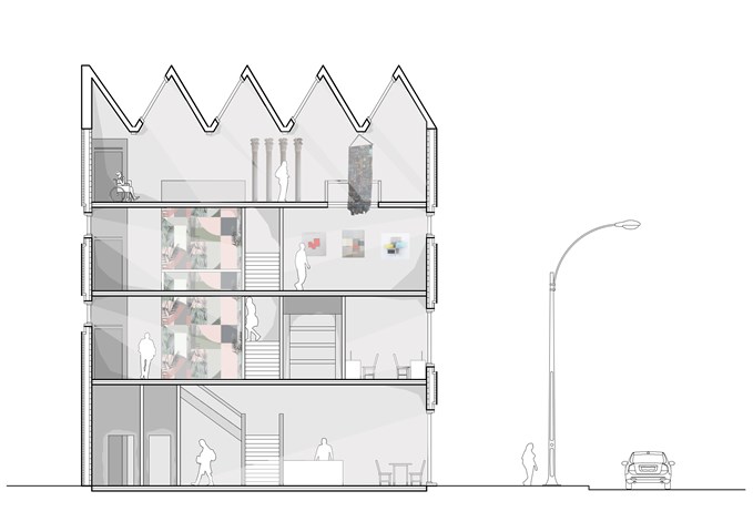
Section - Laura Kennedy
1:50 Section taken through gallery proposal showing vertical circulation and art work .
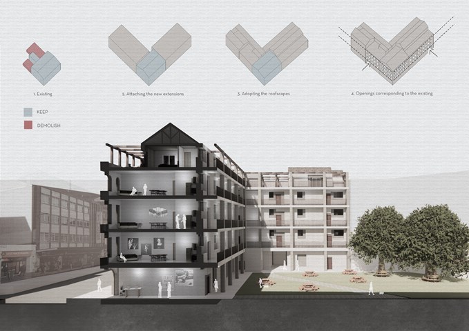
Site Section - Viktoria Georgieva
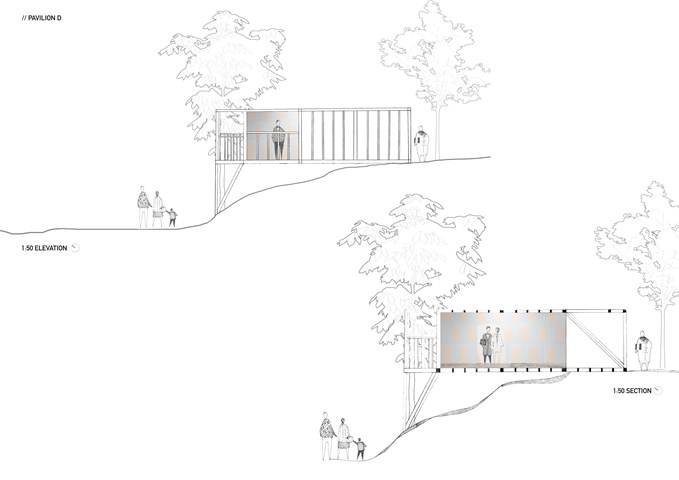
Section and elevation 1:50 - Zuzanna Woznicka
My first attempt at section and elevation, a combination of hand drawing and photomontage.
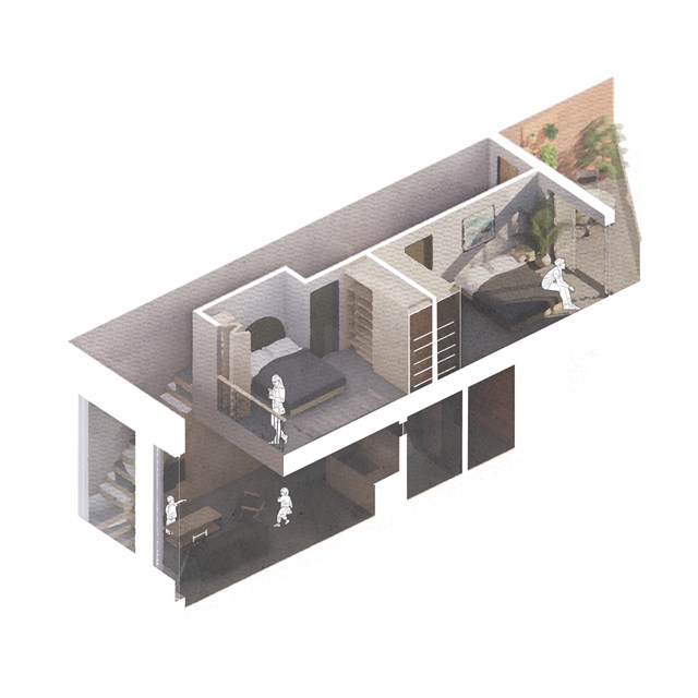
Isometric flat section - Alfie Hollington
Design Studies 3a
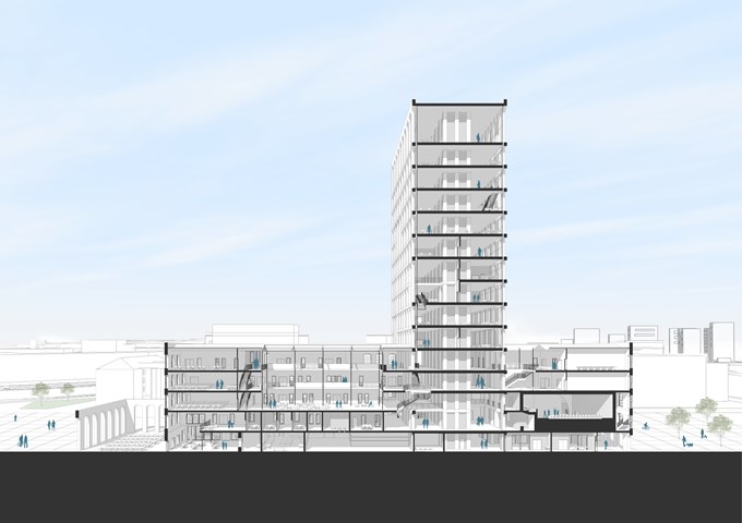
Long section - Andrew Devine
Section through the length of the building which shows the tower and how it intersects the existing building
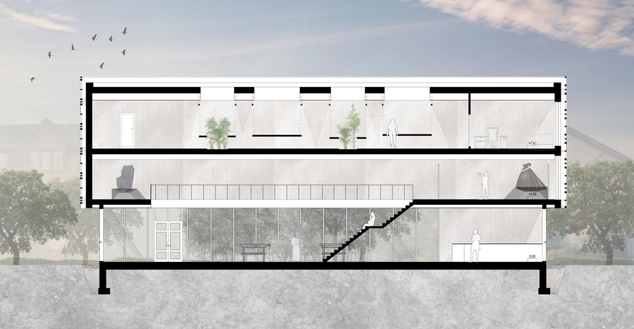
Section A-A - Angelika Hajdasz
The stairs are one of the main gathering points in the centre. This is a place from which the majority of the centre is visible so it is a perfect place for socialisation while on the move from one workshop to another or to just sit back and enjoy the views.
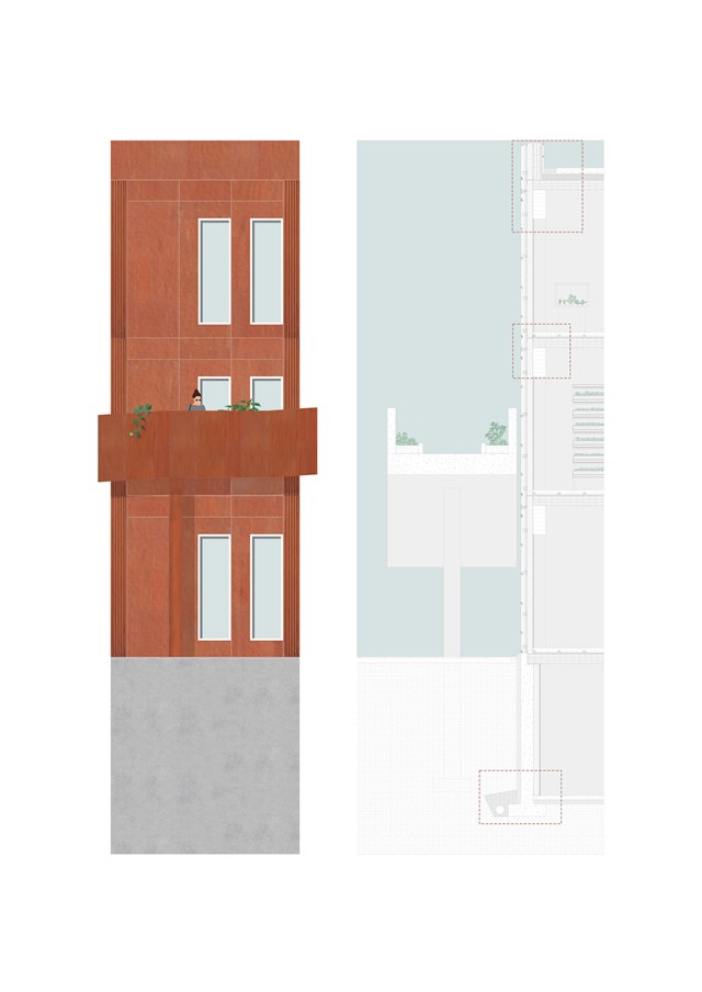
1:20 Detail Section & Elevation - Fiona Wylie
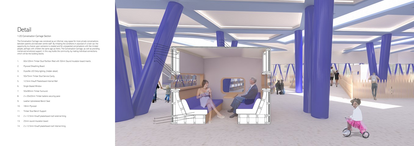
Andrew McCluskie
1:20 Conversation Carriage Section
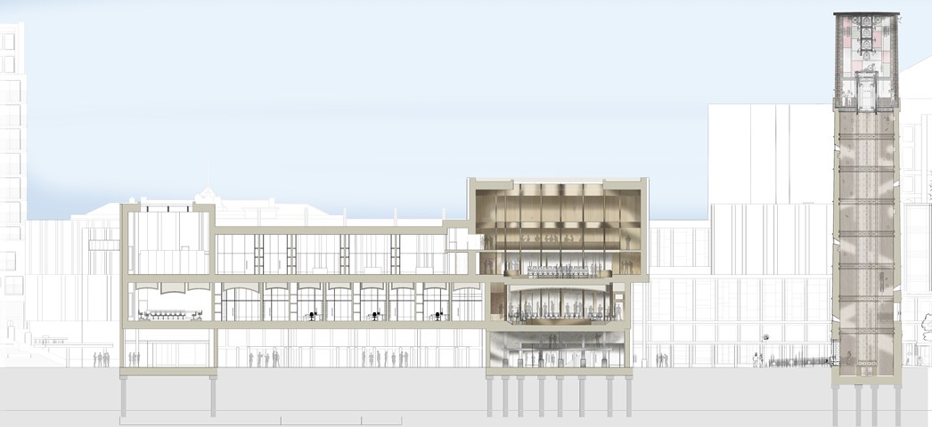
South Facing Section AA - 1:100 - Antony James Graham
This particular section demonstrates the important relationships between special quality, scale, atmosphere, materiality and hierarchy of space in relation to the remaining form of the building and context. The large bell tower is a symbolic gesture for gathering and offers a unique view across the city serving as a sentinel of the land and a beacon of hope for the people.
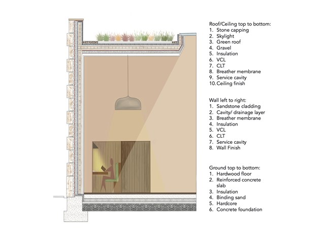
1:20 Section - Leena Hussain
Section from reading room detailing materials and lighting.
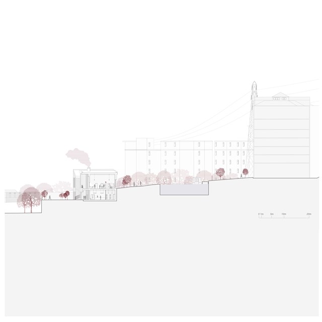
Centre for Unpaid Care Work Section - Rebecca Irving
The centre for unpaid care and domestic work challenges existing approaches to unpaid care and domestic work by providing a shared space for the work to become visible and portrayed as a productive activity within the community.
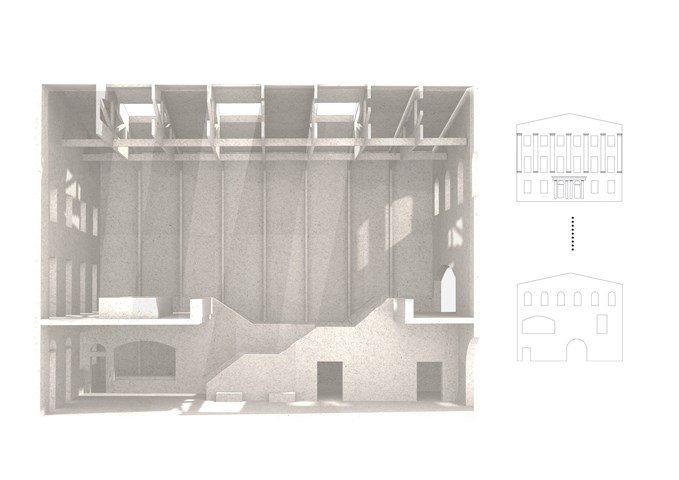
Sciographical study of the main markethall - Fatema Hassan
This shadow model emphasizes the spatial environment of the main market hall. A sense of outline and shadows have a heavy influence on the overall spatial experience of the visitors. This sketch filters and shows light penetrating through the old and new facade throughout the day in a pattern. The timber frame structure supporting the roof and skylights extends through all heights of the market hall's form. The structural columns give a sense of order in a dynamic and clustered space where many activities happen in.
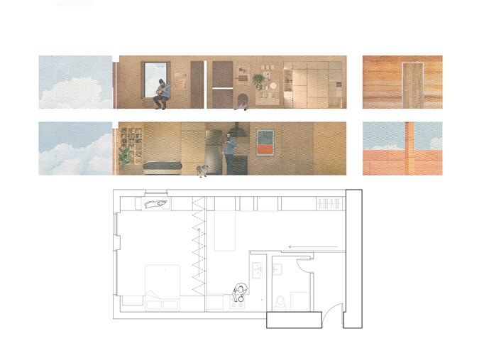
Flat plan and section - Alfie Hollington
Design Studies 3a
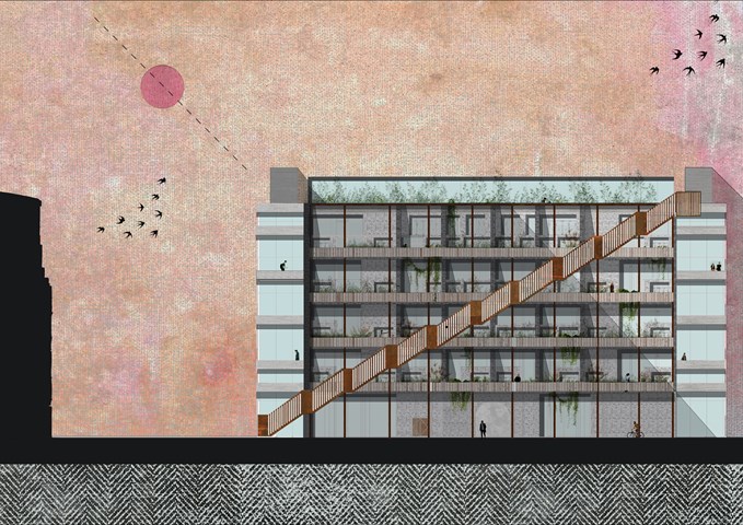
West Elevation 1:100 - Conor Ryan McCormack
Allotment Living _3A To Play
Allotment Living_3A To Live.
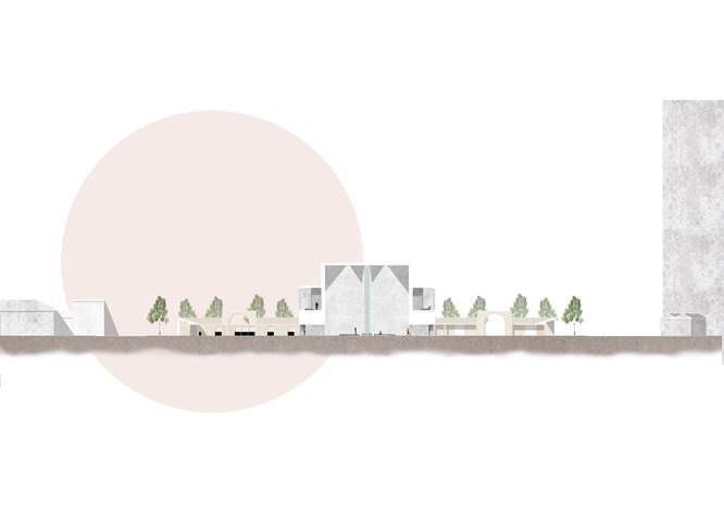
Section through the Main Building Showing Some Immersive Rooms - Kate Melhuish
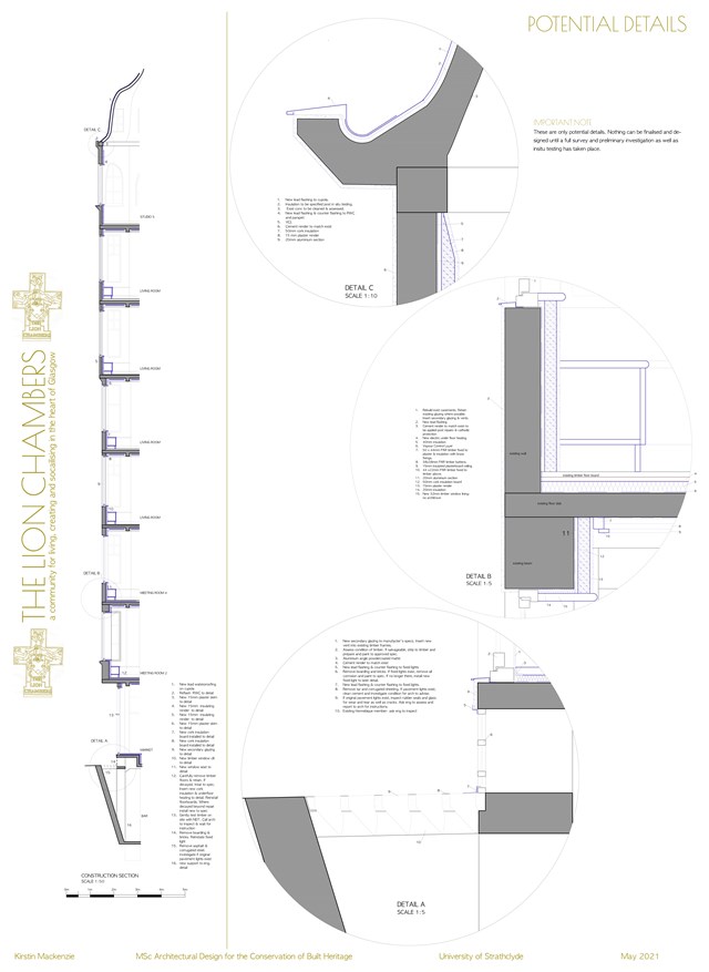
Potential Details - Kirstin Mackenzie
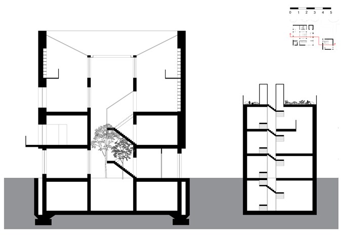
The Section - Freyja Lehnen
The section is defined by the void in the middle of the building that doubles as a staircase. The idea is the use the natural features of St Andrews, for example the rain, to power the building. The design form was based on the conditions of the site.
