Site Gallery - photomontage

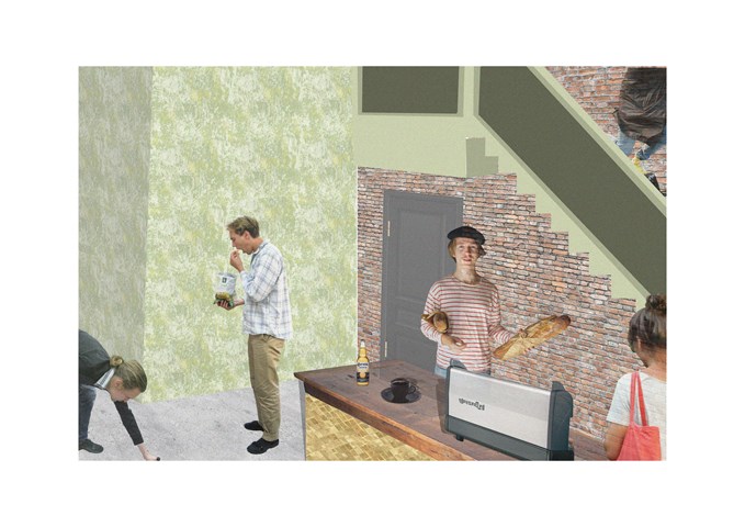
"To Engage" - Collage - Zuzanna Woznicka
Collage showing part of the cafe. At this stage of the project I started to face significant problem with my computer, and doing even simply collage was quite challenging. I really want to try to work with 3d software and see how my work can progress.

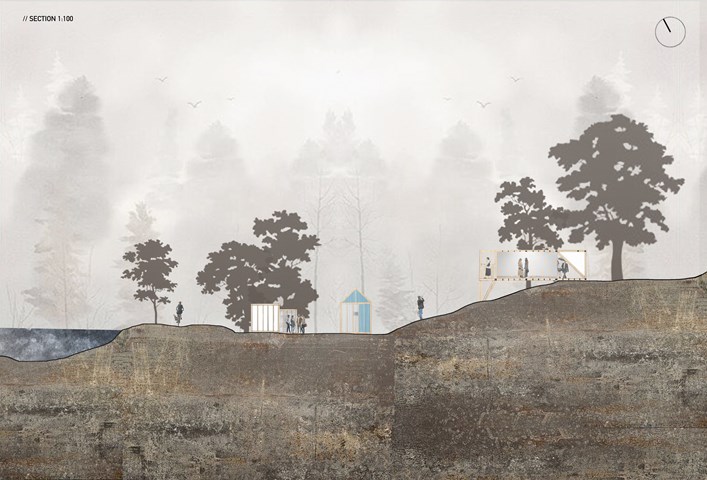
"To See" - Site Section 1:100 - Zuzanna Woznicka
Site Section 1:100, representing the layout of the pavilions within the site. The site I have chosen has uneven terrain, which was quite challenging from a technical point of view. The site had a river view and multiple points of access which were the main reasons for me to choose this location. What I really like about this picture is the misty atmosphere, in the future, I would like to achieve this effect more often.

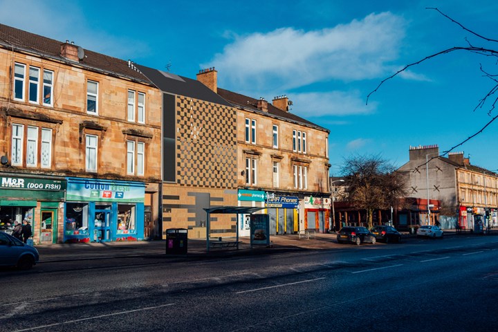
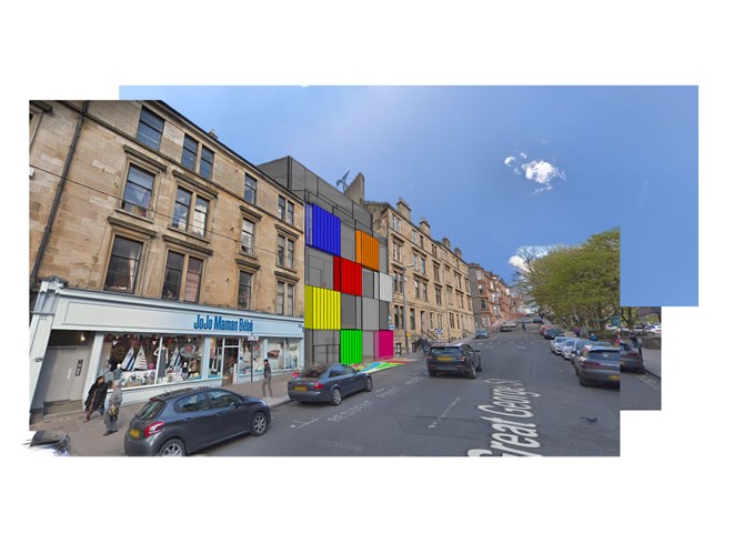
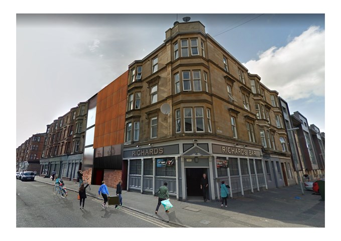
Photomontage - Nathan Constable
Finally, then, is the finished concept. This was my first ever photoshop attempt and used a full SketchUp digital model and Google Maps images to create this photomontage.
Thank you very much for looking at just a glimpse of my architecture folio from this year!

Andrew McCluskie
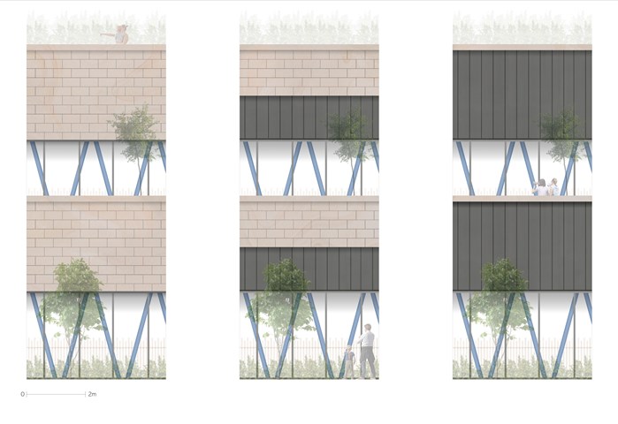
1:20 Façade Accent Testing
These images were created to decide the extents of Standing Seam Zinc within the Repurposed Sandstone Slips as well as to investigate how they would interact with the structural columns. The third test with the most zinc was chosen as it created the most layering and depth.

"To Engage" - 3D view - Zuzanna Woznicka
3D view of my design is a photomontage of the physical model, photography and patterns. It was quite challenging because I had to work from 3 point perspective, which is still quite new to me. This project definitely made me understand that I still have a lot to learn about the drawing basics such as perspective, shadows and geometry. There is a lot to learn about digital design, which I am really excited about.

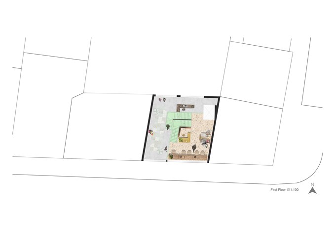
"To Engage" - Floor Plan 1:100 - Zuzanna Woznicka
In "To Engage project" we were meant to design the art gallery in the slice between the tenements. Since in this project we were quite limited with the form, I decided to focus a bit more on the interior design. I made a collage of the floor plan for each individual floor, to deliver the idea of the atmosphere I would like to achieve.

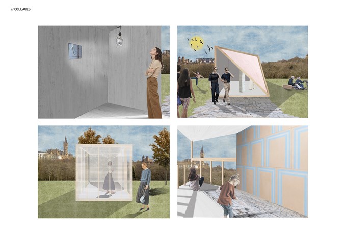
"To See" - Series of collages - Zuzanna Woznicka
Semester one project "To See".
Series of collages capturing the internal or external character of the temporary pavilions. Collages were made in Photoshop over the hand-drawn sketches.
