Site Gallery - Floor Plan
- All tags
- #Design Studies
- #Render
- #Interior Views
- #Section
- #Elevation
- #Exterior Views
- #Drawings
- #Floor Plan
- #Views
- #Education
- #Urban Design
- #Axonometric
- #Technical Drawing
- #Diagram
- #Laurieston
- #Perspective
- #Model
- #Site Plan
- #Art Gallery
- #3D
- #collage
- #Exploded Axonometric
- #sketch
- #Masterplan
- #Concept
- #Diagrams
- #Site
- #Front Elevation
- #Housing
- #Renderings
- #Community Centre
- #Technical Design
- #Plans
- #conservation design project
- #Context
- #hand drawing
- #isometric
- #Public spaces
- #Technical Studies
- #landscaping
- #Structure
- #Cultural Studies
- #History
- #Dementia
- #Neighbourhood
- #Professional Studies
- #Art Gallery in the City
- #Environment
- #photomontage
- #Sustainable production
- #Construction
- #detailing
- #M8
- #Market
- #Physical Model
- #Programme
- #street elevation
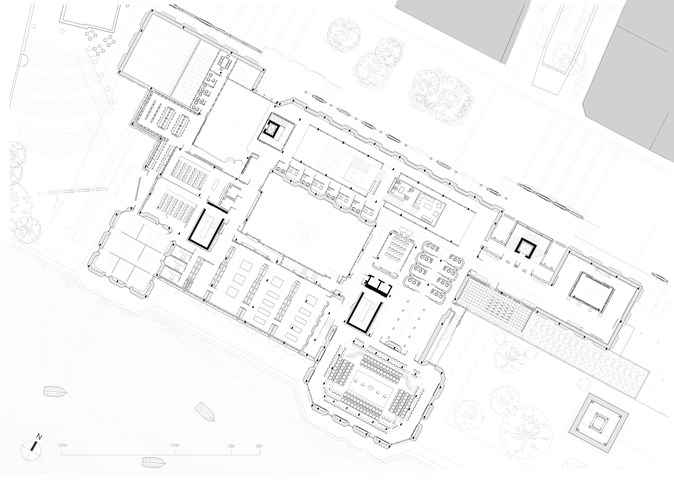
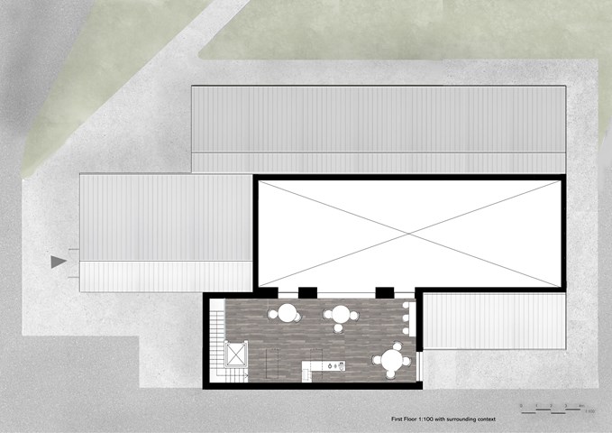
First Floor Plan - 1:100 - Antony James Graham
The first floor plan explores the educational and political nature of the building that offers further assistance in these fields for the public to learn, engage and participate in activities relating to Glasgow's heritage, culture, political and social status through workshops, galleries, lecture spaces, consultation rooms and the large main debating chamber.
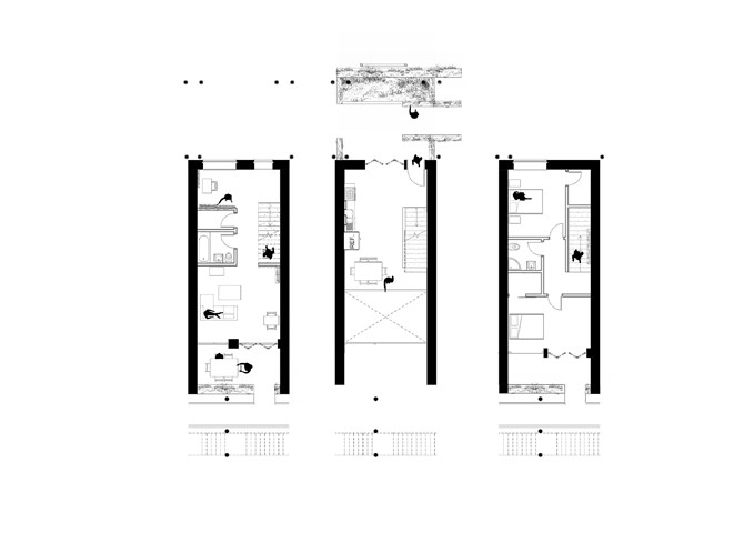
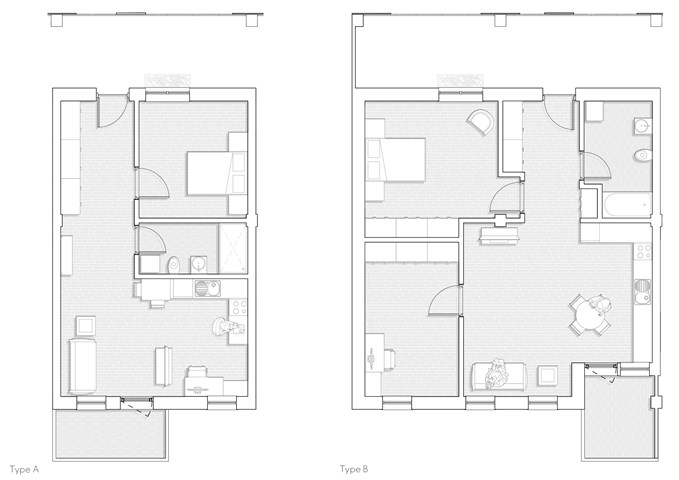
Apartment Type B: 1:50 - Conor Ryan McCormack
Allotment Living _3A To Play
Allotment Living_3A To Live.
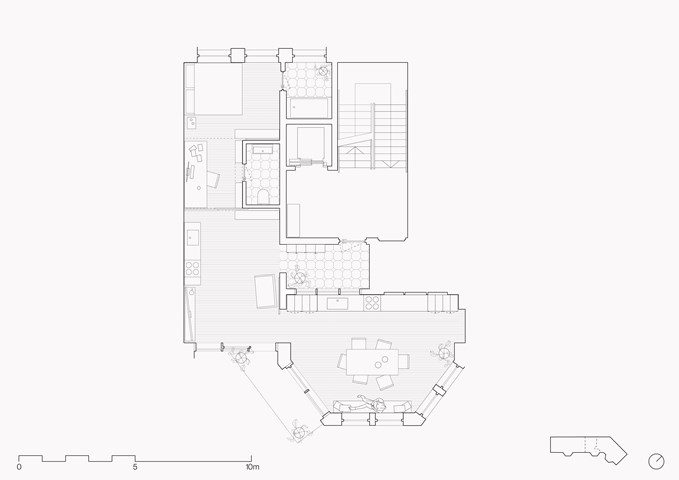
Example studio flat plan - Zachariasz Czerwinski
Design Studio 3A
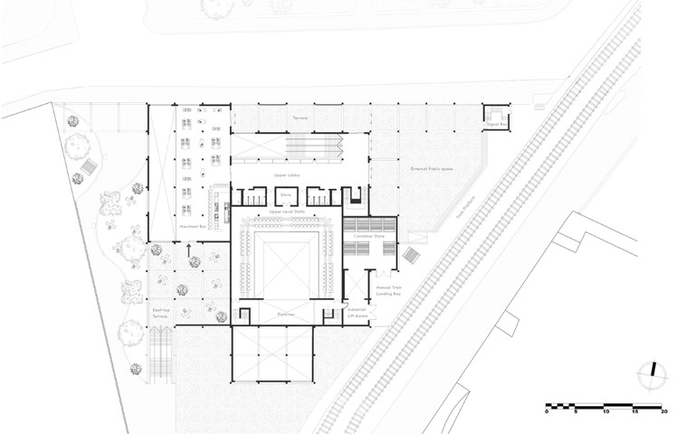
First Floor Plan - Jakob Young
Undergraduate Thesis: Merchant Theatre
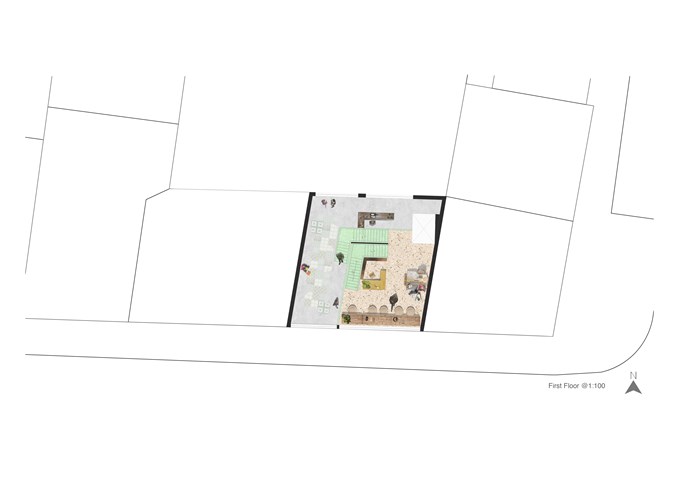
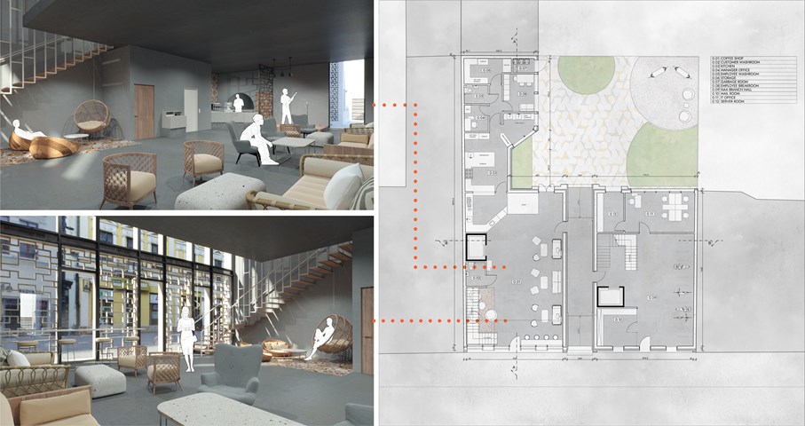
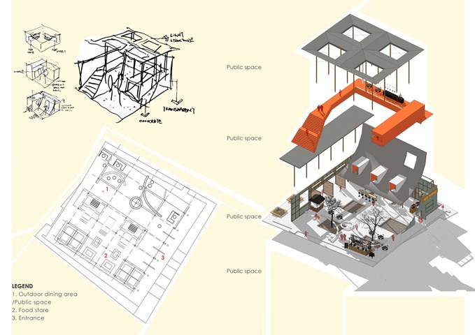
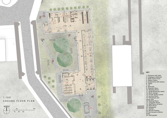
"To Engage" - Floor Plan 1:100 - Zuzanna Woznicka
In "To Engage project" we were meant to design the art gallery in the slice between the tenements. Since in this project we were quite limited with the form, I decided to focus a bit more on the interior design. I made a collage of the floor plan for each individual floor, to deliver the idea of the atmosphere I would like to achieve.
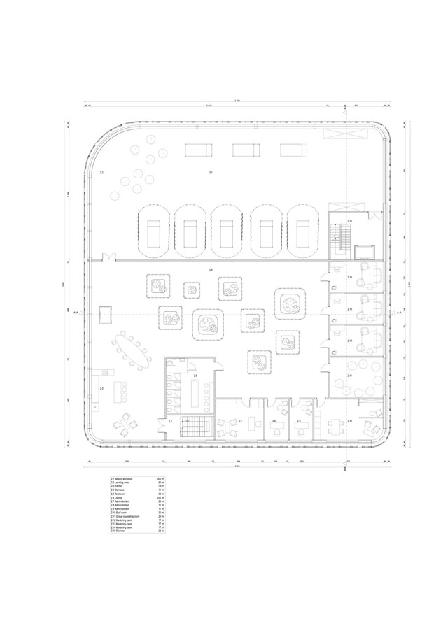
Second floor plan - Angelika Hajdasz
While H.E.R. focuses most on accidental counselling, there are mentoring rooms designed on the top floor of the centre. Mentors are qualified people who offer counselling sessions to those in need, without feeling ashamed of going to the psychiatric practice. The availability of services on-site at all times is a chance for hesitant ones to decide on seeking professional help on a ‘spur of the moment’ basis.
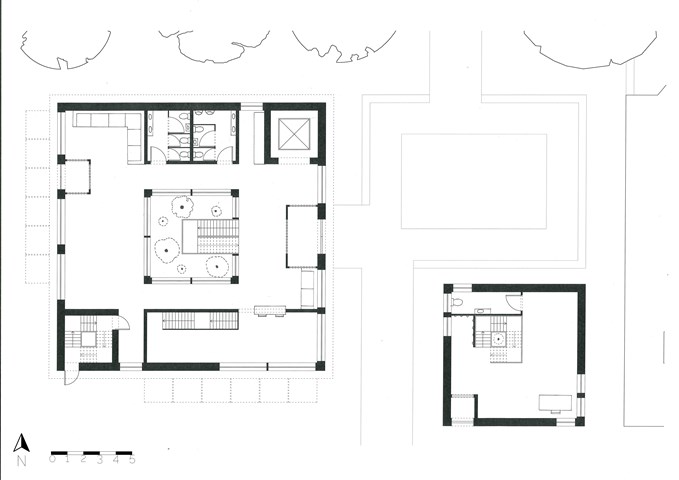
The Floorplans - Freyja Lehnen
The concept for the flooplans was to have an entrance area to the east, a more private area to the south and the north and west sides of the building are the main feature of each floor. There are also three points of circulation running on a diagonal through the building, the lift to the north-east, the main staircase in the middle and the fire stair to the south-west.
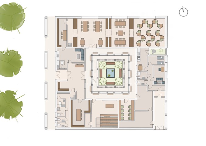
Floor Plan - Leena Hussain
Coloured floor plan drawn at 1:100
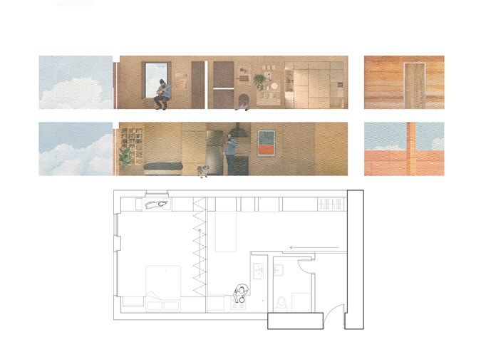
Flat plan and section - Alfie Hollington
Design Studies 3a
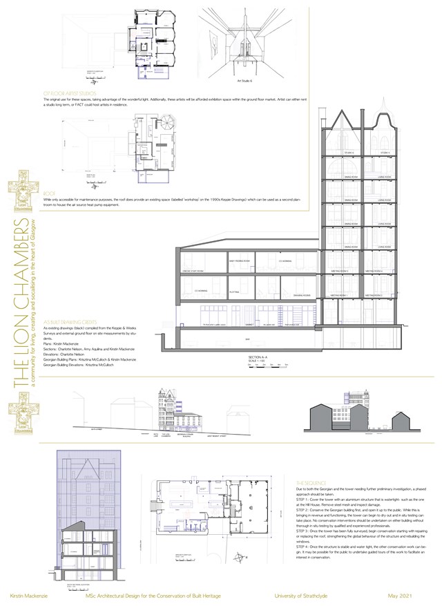
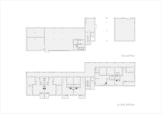
Conservation Design Proposal - Kirstin Mackenzie
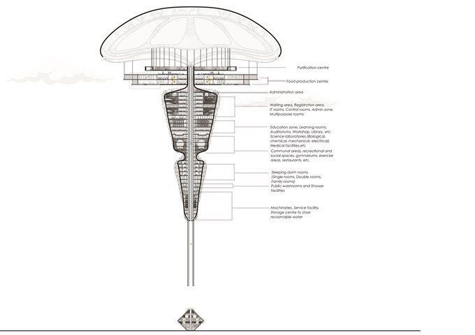
Long section of The Floating Facility and Plans - Sania Halim
The [PH] floating terraformer, as the name implies, is designed to float in the air using maglev technology. The repulsion induced by the structure’s magnetism and the earth’s magnetic field would regulate the buoyancy of the structure, causing it to migrate up to altitudes of 700m, where acidic contaminants typically congregate. Acidic materials, such as acid fog, will be absorbed by the porous membrane attached to the airbags and accumulated in the central purifier, where they will be neutralized by an alkaline solution formed by nitrogen-fixing microorganisms by biological activity and deposited in the purifier center. The water and salt generated during the neutralization process are fed to plants, trees, humans, and deserted areas, among other things.
Initial Location: Central Park, NY, USA
Program: 1500-2000 inhabitants anticipated
Total Height: 257.5 m
Status: Reviving atmosphere, Technological Research and Development
The terraformer will be seen as the first step towards a greener future without acid pollution, water scarcity and climate problems. Hence, reviving our ecosystem around the world part by part.
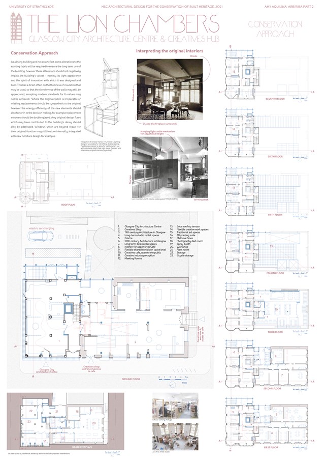
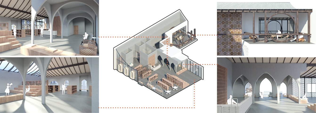
Conservation Approach: Floor plans - Amy Aquilina
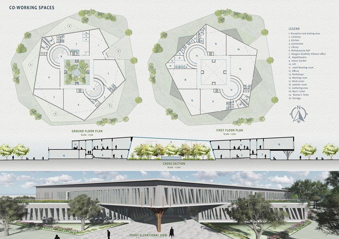
Co-working Spaces - Mrunmayi Pandit
Surrounded by green spaces, the pentagonal two-storey block nested in metal and glass envelope opens up into interior and exterior green landscape. A circulation area is provided surrounding the indoor garden. Spaces are divided into public areas on the ground floor and private areas on the first. Indoor small community gathering areas are also proposed on both floors along with offices, Café, Library, and multipurpose areas. Accessible toilets have been provided as per the needs of people with disabilities. Glass and metal Pattern has been created to balance light and shadow And having transparency in spaces. The pattern on the façade allows a controlled amount of daylight into the spaces. The metal mesh sheet façade is used for ventilation and light.
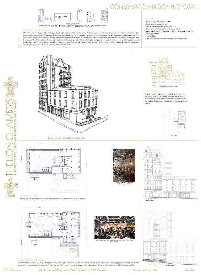
Conservation Design Proposal - Kirstin Mackenzie
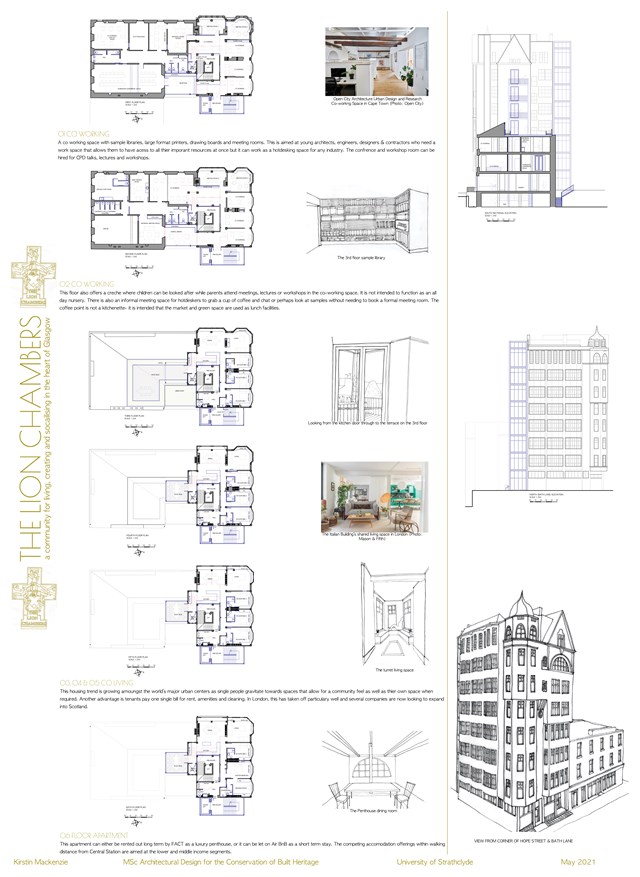
Conservation Design Proposal - Kirstin Mackenzie
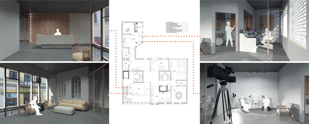
First Floor Plan - Anna Rogowska
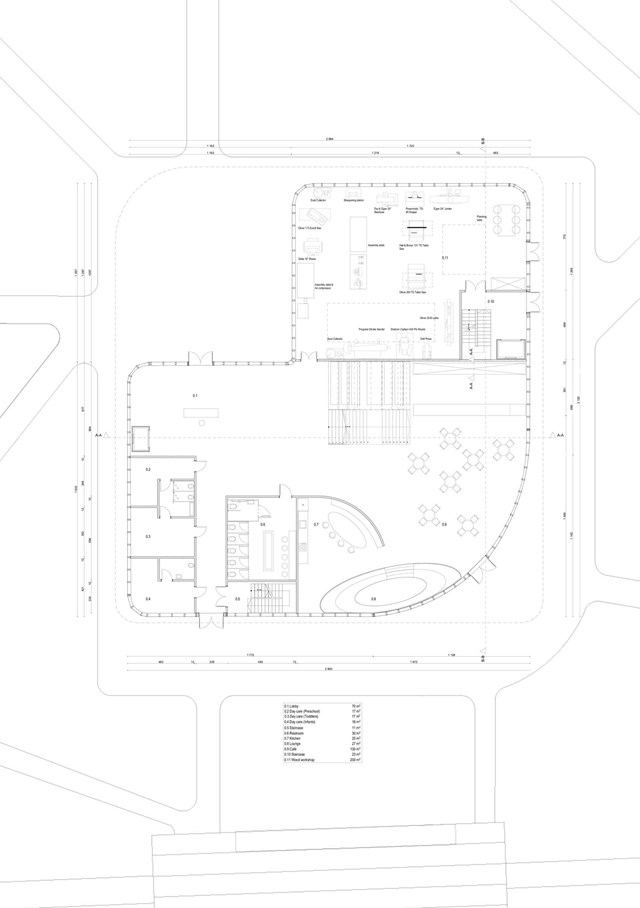
Ground floor plan - Angelika Hajdasz
The ground floor plan consists of a woodworking workshop, daycare, café and lounge areas.
The centre provides multiple opportunities to expand someone’s interest and share talents. The activities offered to women are woodworking, which helps to boost productivity and sense of achievement, which boosts self-esteem as a side effect. Another important space in the building is the sewing workshop, a place where women can express their creativity through fashion and clothes.
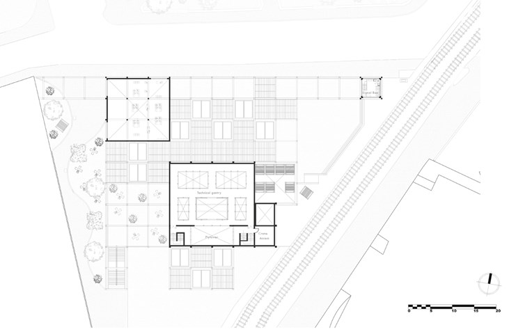
Second Floor Plan - Jakob Young
Undergraduate Thesis: Merchant Theatre
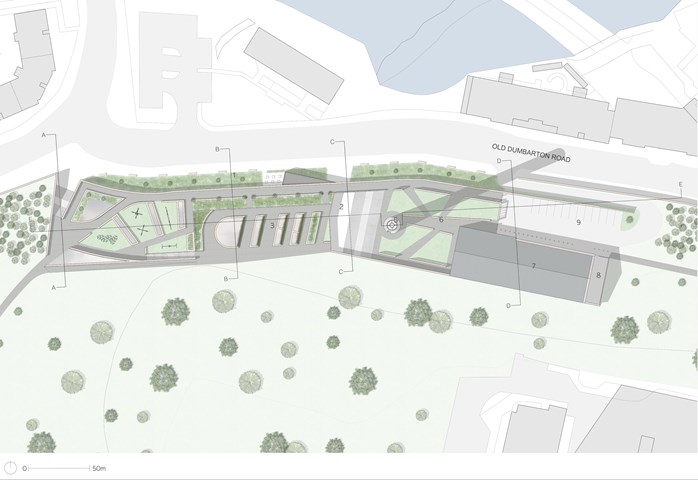
Andrew McCluskie
1:200 Landscaping And Curtilage Plan
1. Green Buffer to Old Dumbarton Road with Café Seating
2. Entrance Courtyard with Outdoor Gathering Stair
3. Roof Terrace with Rooflight Planters at the Park Level
4. Play Area
5. Community Beacon inside Repurposed Hospital Flue
6. Queen Mother Maternity Reading Green
7. Book Gifting and Distribution Building
8. Refuse and Community Recycling
9. Car Park
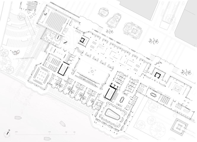
Ground Floor Plan - 1:100 - Antony James Graham
The ground floor plan is home to the public elements of the building allowing free movement and interaction for cultural, political and social events and activities. Multiple entrances from the newly pedestrianised Clyde street and off the Clyde walkways frontage enter into gallery spaces, forums and into a multitude of free spaces detailed to fit a programme that assists the public in educational, personal and leisure related matters. The main spaces consist of large events forum spaces, a large public auditorium, free space lecture spaces, public representative offices and a public debating chamber. The entire building is present to respond to public needs and give voice to the individual and community that need to be heard in a building that is publicly directed and observed.
