Site Gallery - Interior Views
- All tags
- #Design Studies
- #Render
- #Interior Views
- #Section
- #Elevation
- #Exterior Views
- #Drawings
- #Floor Plan
- #Views
- #Education
- #Urban Design
- #Axonometric
- #Technical Drawing
- #Diagram
- #Laurieston
- #Perspective
- #Model
- #Site Plan
- #Art Gallery
- #3D
- #collage
- #Exploded Axonometric
- #sketch
- #Masterplan
- #Concept
- #Diagrams
- #Site
- #Front Elevation
- #Housing
- #Renderings
- #Community Centre
- #Technical Design
- #Plans
- #conservation design project
- #Context
- #hand drawing
- #isometric
- #Public spaces
- #Technical Studies
- #landscaping
- #Structure
- #Cultural Studies
- #History
- #Dementia
- #Neighbourhood
- #Professional Studies
- #Art Gallery in the City
- #Environment
- #photomontage
- #Sustainable production
- #Construction
- #detailing
- #M8
- #Market
- #Physical Model
- #Programme
- #street elevation
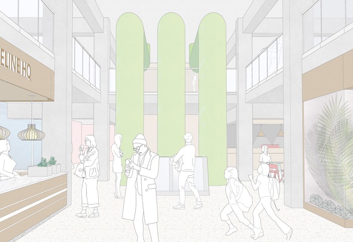
The Lifeline HQ - Shravan George
This visual shows how the interiors of The Lifeline HQ capture all the different food production groups in one space and serve as a portal for the pubic to experience them.
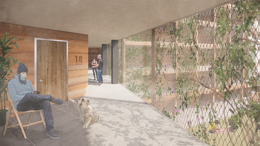
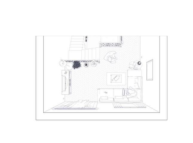
Circulation as an extension of the flat - Alfie Hollington
Design Studies 3a
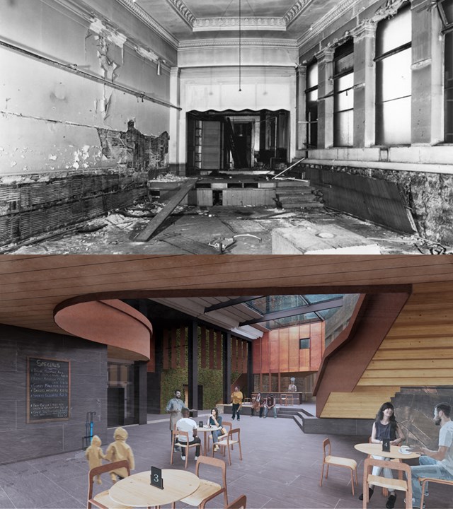
Storytellers Court - Before and After - Alfie Hollington
Design Studies 3b
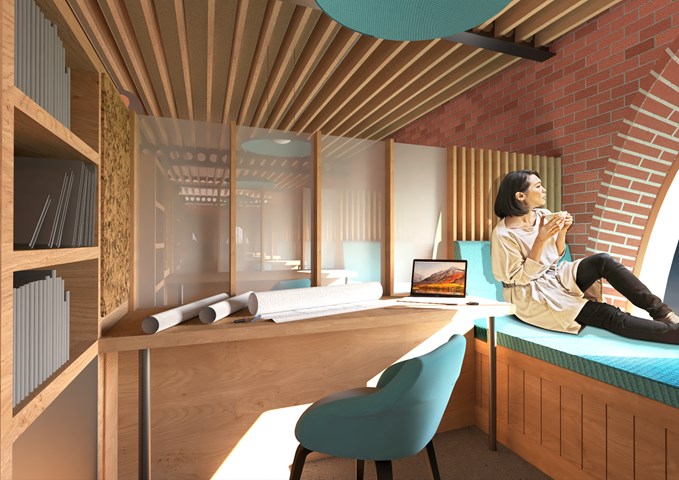
Interior View of the Study Bay - Shivani Sarjan
Laurieston Education Hub
This view depicts the 'Study Bay' a custom piece designed to create a semi isolated space to study or work. It maintains a relationship with adjoing bays and centers around a large window with a shallow embrasure.
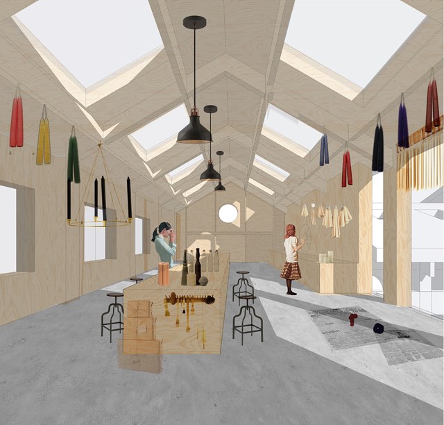
Candle making workshop - Fatema Hassan
Candles are hung on the timber frame to dry. The workshop is well lit with eight skylights aligned symmetrically against the main counter. The timber frame extends to the end of the space to form a grid of timber columns and beams to place candles ready to be packaged.
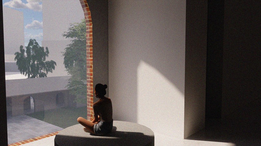
Internal Visual Showing Atmosphere - Kate Melhuish
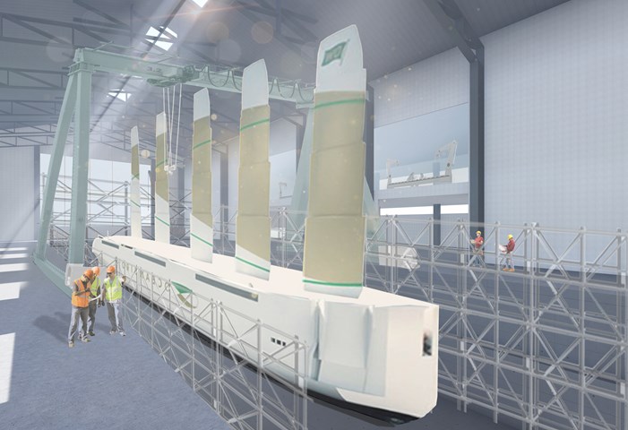
Interior on the Largest Graving Dock - Ellie Carroll
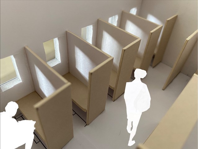
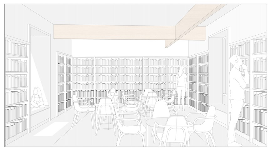
Study Carrel interior view - Lewis McLynn
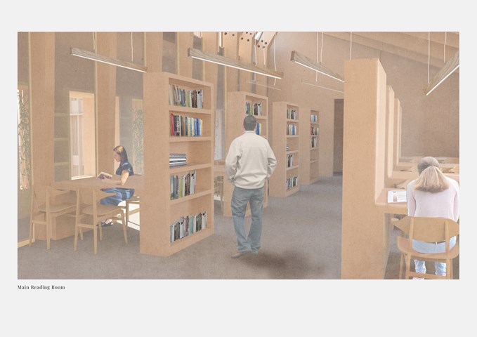
Interior perspective from Library design.
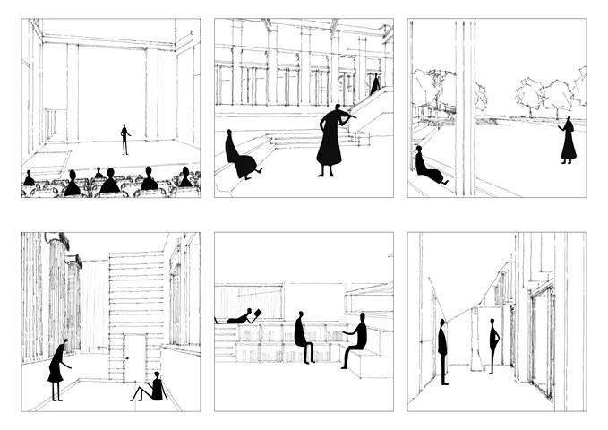
Storytelling spaces - Alfie Hollington
Design Studies 3b
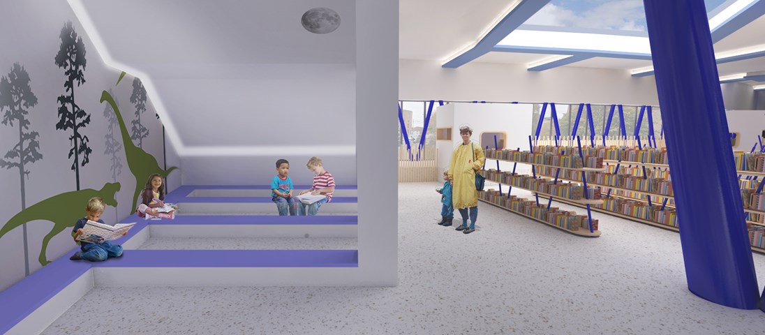
Andrew McCluskie
Reading Area for 4-5 year olds
After the design of the external stair above, the lighting conditions beneath created an opportunity for a “secret cave” space at the West end of the ground floor plan. This means 4-5 Year Old Children are provided with a space whose atmosphere is evocative of storybook setting. The wall decals are intended to add to this effect. A hidden strip LED will illuminate the space while its discretion ensures retention of the imaginative atmosphere.
In contrast, the book storage is in a more traditional Library format to help children make the transition to traditional libraries when they get older. The largest of the rooflights gives sky views from this area, opening up the internal experience while planting around will screen the books from afternoon sun.
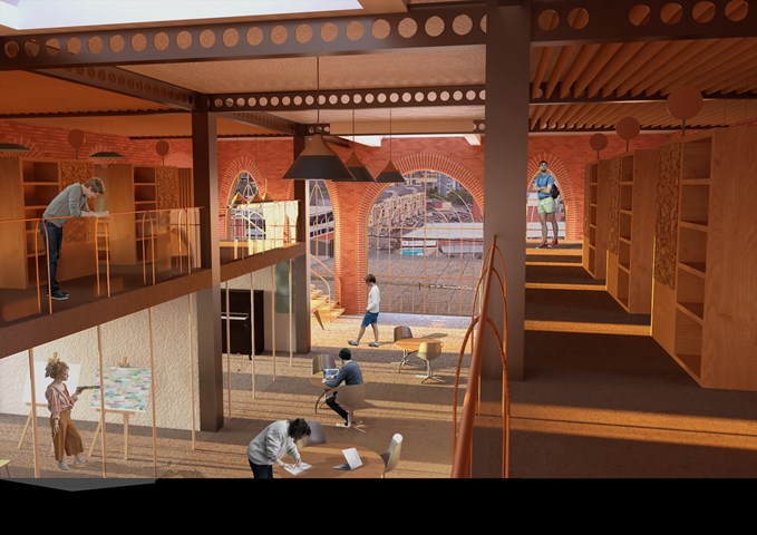
Interior View of the Entrance along the Study Bays - Shivani Sarjan
Laurieston Education Hub
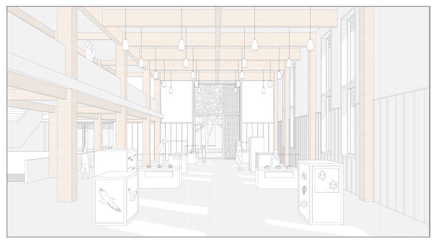
This view shows the entrance as seen from the mezzanine. The entrance is centered along the main space creating a double height space which draws visitors in. the casselated beams are exposed to create the illusion of strong enclosure, while the brick detailing creates a human scale haptic environment along the walls.
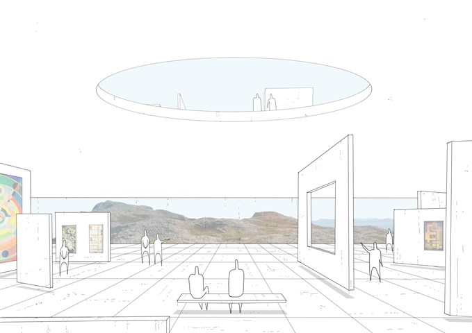
Kinetic and Adaptive Spaces - Daniel Kelly
We need to accommodate the constant change in society through technology, user needs and the way we live.
Therefore, the external form remains as a permanent but the internal spaces will be in constant flux through the use of kinetic partitions and smart furniture.
Through the arrival process, the AI can develop algorithms of each citizen and distinguish how they will like to enjoy their time and what activities they want to partake in, and in turn transport and create those spaces using these forms of kinetic and evolving architecture. This image shows the lower level on the circuit which is being used as a continuous art gallery.
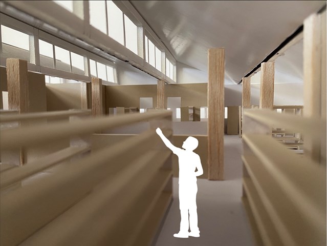
Second Floor interior view - Lewis McLynn
Interior perspective from Library design.
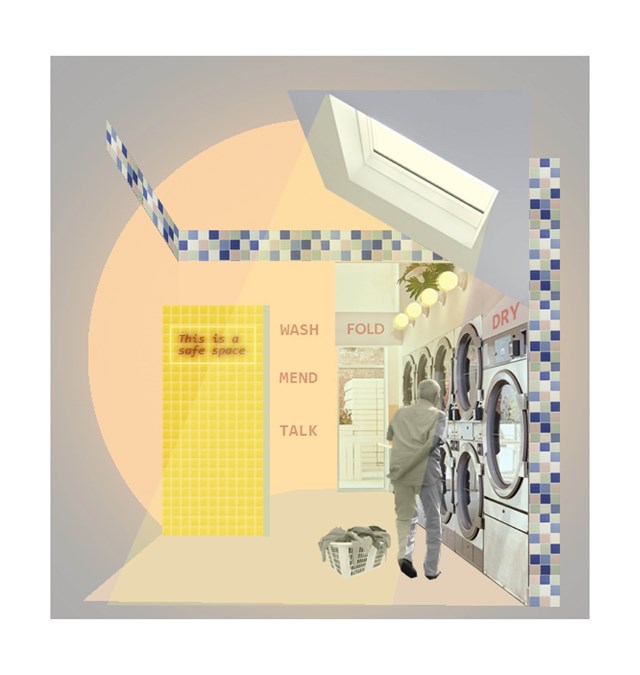
Example of a 'safe wing'- Laundrette - Asya Gumus
The laundrette is the most important medium sized intervention in this context as it is promotes an easy and independent activity that is also familiar to an elderly person. Informal encounters/ conversations can have a positive impact on an elderly persons daily life. The chosen coral/ yellow tones encourage social activity and invite the elderly to spend a longer times with their neighbours and other locals.
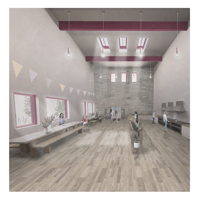
South Satellite Shared Kitchen - Rebecca Irving
The communal kitchen provides a shared productive domestic space. It should allow users to take control of the space and form social connections.
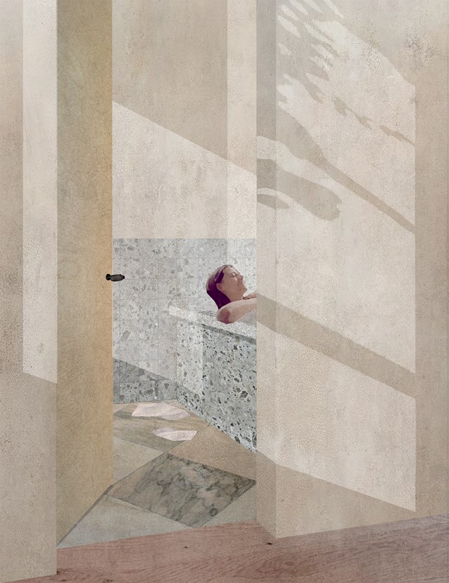
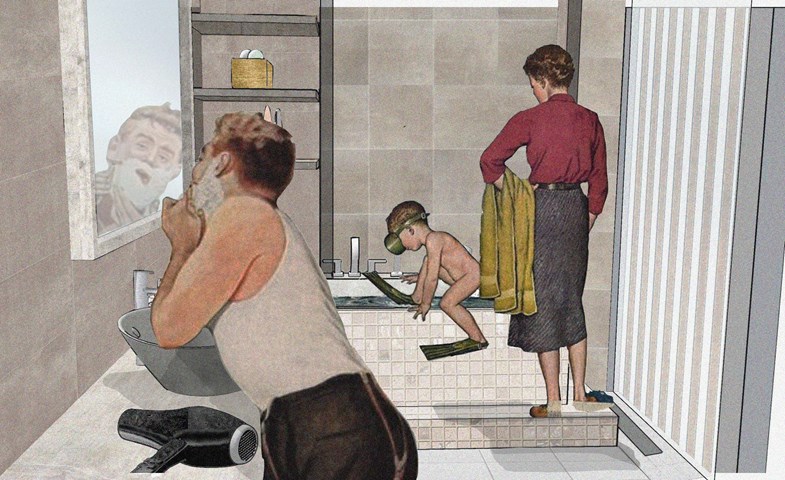
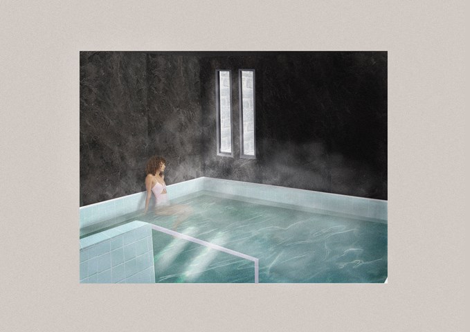
The Bathroom as a space for both Body and Mind - Zachariasz Czerwinski
Design Studio 3A
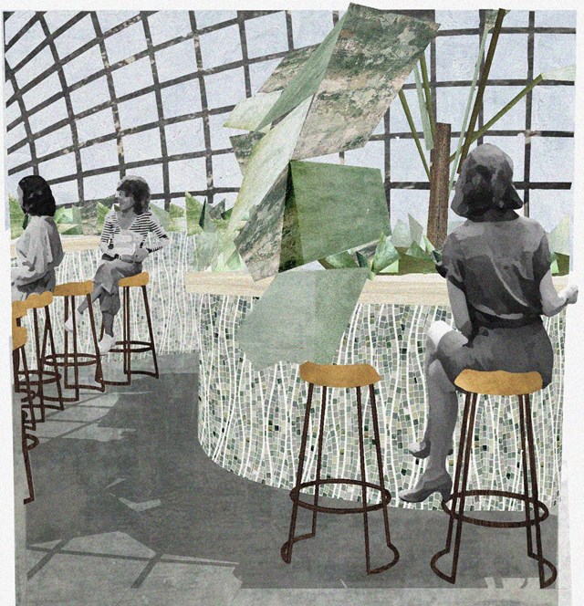
Alamin Mandhry
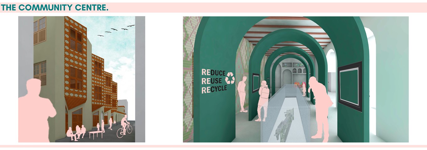
The exterior of the community centre features a modern interpretation of the protruding screened timber balconies and baraza (stone bench). The traditional straight baraza is transformed into a triangular one to create a space that allows for better interactions. To enhance the transparency of the recycling process, the display area has a void cased by a glass structure that allows visitors to see directly into the recycling plant below. Goods produced within the scheme are displayed in modern Swahili zidaka (wall niches) while artwork and information on recycling are displayed on large green structures made from recycled plastic meant to create this feeling of one being in a life-sized zidaka. The walls of the display area are adorned with plastic-bottle tops that create a mosaic; an example of how recycled materials can be used in construction.
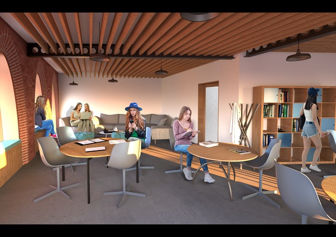
Interior View of the Youth Club - Shivani Sarjan
Laurieston Education Hub
The Youth Club is a dedicated space in the Hub for teenagers to gather and use independently. This room adjoins two auxilliary spaces for study and counselling.
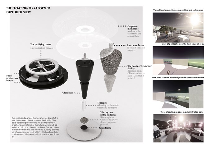
The Exploded Diagram of the Floating Terraformer - Sania Halim
The exploded parts of the terraformer depict the mechanism and the working of the facility. The acid collecting membrane will be made up of graphene, a material of the future, which will absorb the acid from the atmosphere. The façade of the terraformer and the elevated building is made up of graphene as well, which will absorb sunlight and converts it into electricity to run the terraformer.
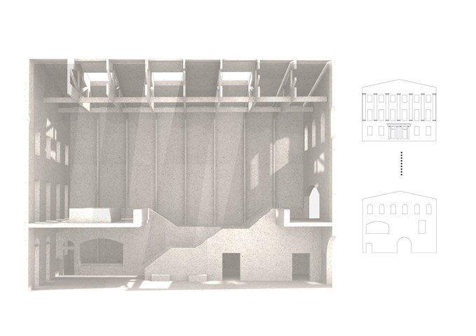
Sciographical study of the main markethall - Fatema Hassan
This shadow model emphasizes the spatial environment of the main market hall. A sense of outline and shadows have a heavy influence on the overall spatial experience of the visitors. This sketch filters and shows light penetrating through the old and new facade throughout the day in a pattern. The timber frame structure supporting the roof and skylights extends through all heights of the market hall's form. The structural columns give a sense of order in a dynamic and clustered space where many activities happen in.
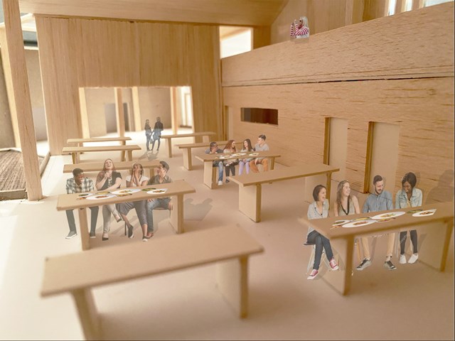
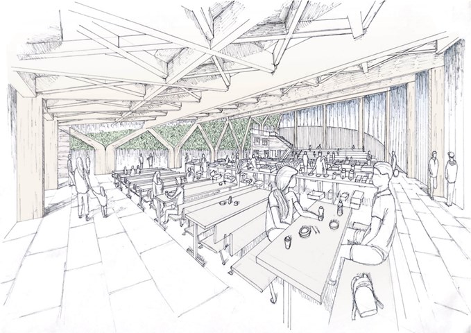
Interior view of Sailing Club dining hall - Lewis McLynn
Interior shot from design model with some photoshop people for scale.
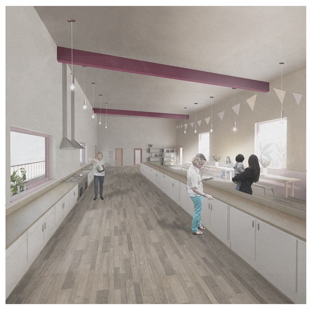
Centre Shared Kitchen - Rebecca Irving
A communal kitchen and dining space in the centre for unpaid care & domestic work.
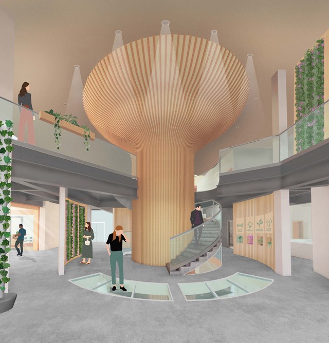
The Main Entrance - Fiona Wylie
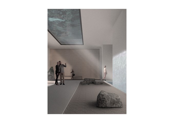
After entering the building from Cook street and rising up through the building, the main entrance acts as a "tree" base for the rest of the growing tower, with a glass floor looking down into the seed library. At the center of it is introductory information about hydroponic growing, and the space splits off into the learning spaces, the main atrium, growing spaces, and the wellness wing.
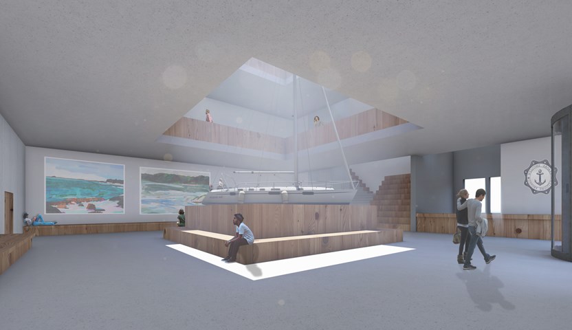
Interior of the Education Hub's Atrium and Reception - Ellie Carroll
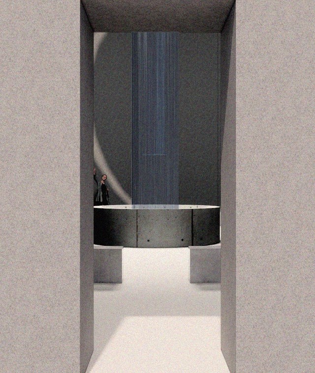
Internal Visual Showing Atmosphere - Kate Melhuish
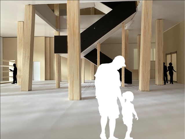
Ground Floor interior view - Lewis McLynn
Interior perspective from Library design.
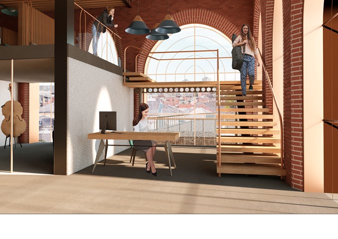
Interior View of the Reception - Shivani Sarjan
Laurieston Education Hub
This is the administrative reception as you enter the primary space from the station. A lightweight staircase wraps around a simple reception space across from the administrative office. This semi private block is open to the public and visitors and the receotion provides the first point of contact within the building,
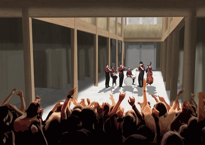
Main Public Forum - Antony James Graham
The main forum space is a long double heighted volume that acts as a free space allowing for flexible function and use to accommodate the building programme to serve the communities of Glasgow. This space can be interpreted as a cultural venue, art gallery or a social gathering space where the surrounding amenities cater to public needs. A common factor in the buildings overall aesthetic and character is the use of stone, wood, light and shadow to create exciting, atmospheric and inviting spaces.
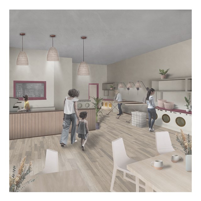
Laundrette Cafe - Rebecca Irving
A laundrette cafe in the centre for unpaid care & domestic work.
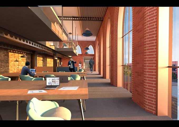
Interior View of the Co-Working Space - Shivani Sarjan
Laurieston Education Hub
The co-working spaces is large open space designed for hot-desking as 'offices' become more flexible. It is a more public with its own elevator. The block also incudes more private spaces in the mezzanine above and meeting rooms. It opens onto two outdoor terraces and directly connects to the cafe block below.
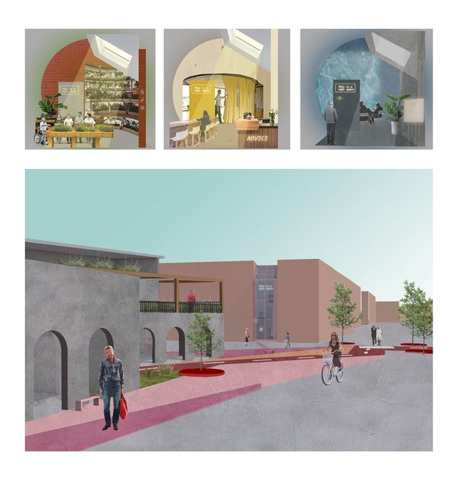
Approach to the 'safe wing' model - Asya Gumus
Each safe wing involves a different activity. Other designs include gardening and sensory therapy that reduces stress and anxiety that can surface due to progressing dementia. Each safe wing will include a different colour/ character/ material in accordance to the interventions use, such as red promoting energy, motivation and activity and blue promoting a calmer and less stressful environment. These colours are important for elderly design as it can slow the process of the developing dementia amongst the ageing population.
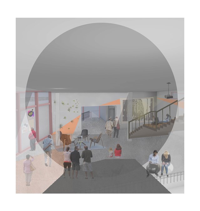
Interior view of the carers hub - Asya Gumus
This space is used as a joint activity space for both elderly with dementia and carers. Regularly organized movie nights, exhibitions, theatre and concerts will be held in this space for the locals to enjoy.
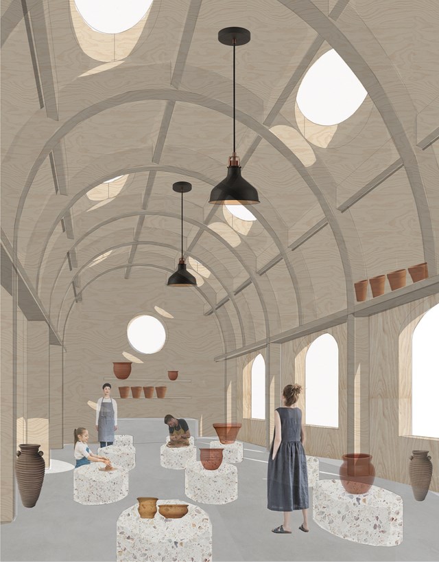
Potters workshop - Fatema Hassan
The pottery workshop is a vast space supported by arched timber frames that form a lattice where pots and vases can be laid to dry. The structure forms a top shelf where potters can use to store or dry ceramics. The overall atmosphere consists of circular light rays cast and moves throughout space and time as a natural spotlight within the workshop.
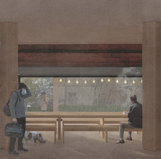
Soup kitchen - Alfie Hollington
Design Studies 3a
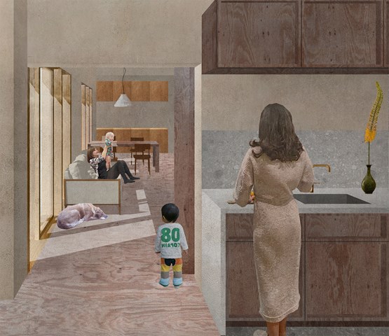
Thresholds between shared and private spaces - Zachariasz Czerwinski
Design Studio 3A
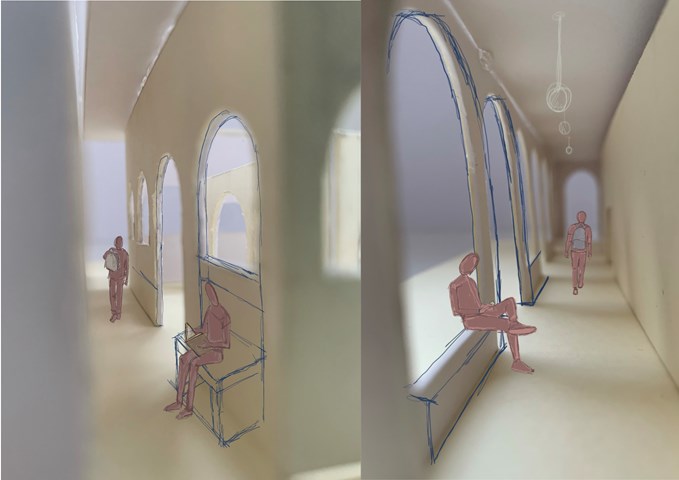
3D Internal Views - Leena Hussain
Sketch over model of inner cloister and entry walkway.
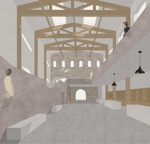
Market hall foyer space - Fatema Hassan
This view shows the plaster render staircase that leads to the upper spaces including the food hall, workshops, and cafe. On the left, rentable kiosk spaces for people to advertise and sell products beneath a high ceiling braced in exposed timber construction and bathed in skylight light.
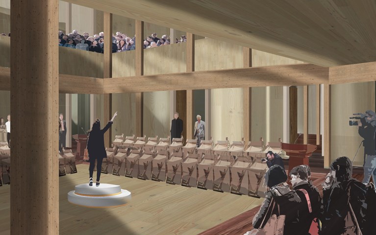
Main Chamber Presentation Visual - Antony James Graham
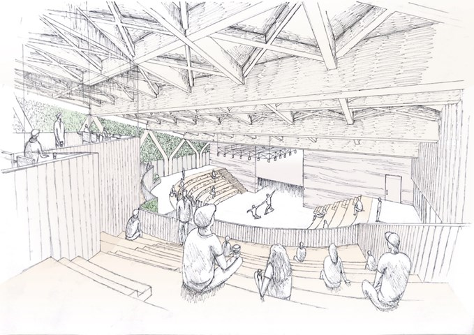
In the heart of the building is the main debating chamber, located on the first floor, where the public and representatives debate, discuss and partake in events, conversations and moments to make change and be heard in the community. The rich interior of woods is a contrast to the ridged stone façade. The main chamber is flooded with natural light creating an atmospheric space of light, shadow and materiality when the activity is high. The exposed structure adds to the character and spatial quality of the volume drawing attention upwards to the gallery and light above.
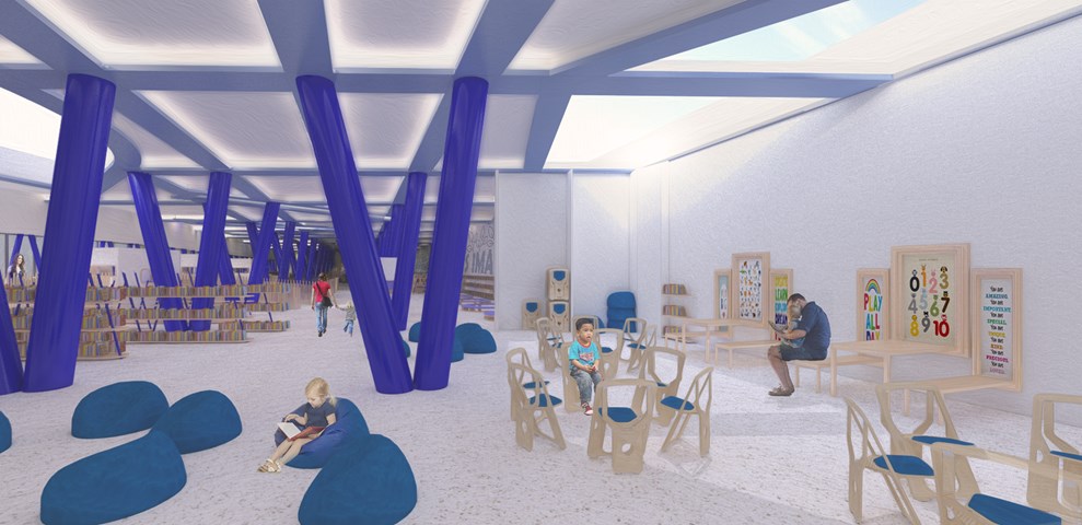
Andrew McCluskie
Flexible Workshop Space
The Flexible workshopping space is designed to host School Trip Groups as well as everyday workshops for pre-school aged children that will be run by Centre Staff. As such the seating can be completely removed, folding away or stored in a bespoke unit built off of the retaining wall. A palate of light stained Larch is used for the furniture to maximise daylighting potential at the rear of the building.
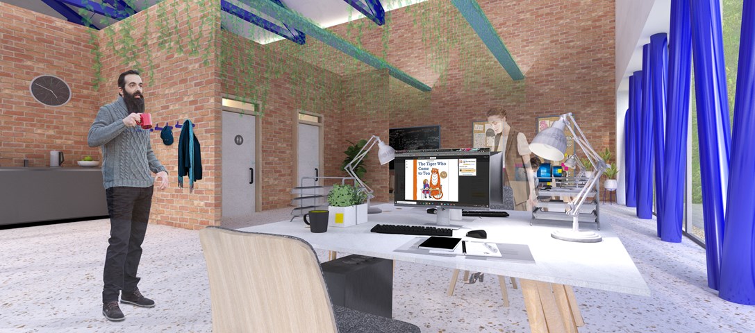
Andrew McCluskie
Distribution Admin Space
The Existing Building has been adapted to host the the Book Distribution related programme elements, thereby using the existing structure on site to portray the existing functions of the two organisations. The existing building has fell victim to a few unsympathetic extensions, which will be removed and brick partitions in the distribution building are formed from reclaimed brick kept aside during demolition. The glazed façade and additional dark blue steelwork provide a visual link both to the new façade elements and the rest of the scheme. Biophilic Design has been linked psychologically to stress relief, so the admin office includes plants within and a view to the living retaining wall and the new Reading Green it neighbours. This contributes to a relaxed atmosphere within the spacious office.
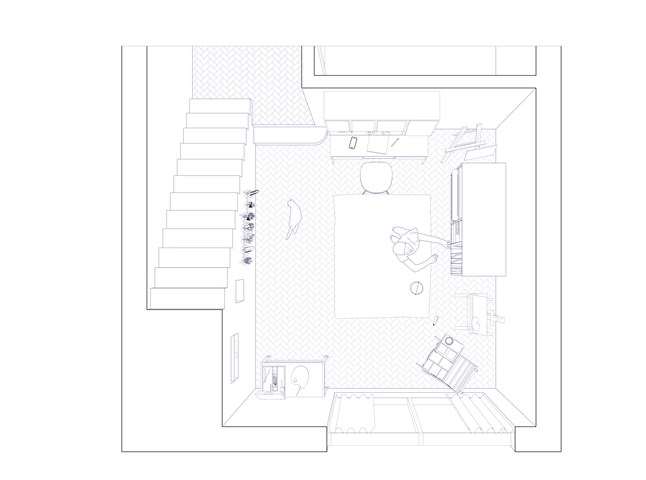
Art Studio/Shop Front - Flat type A - Giulia Panedigrano
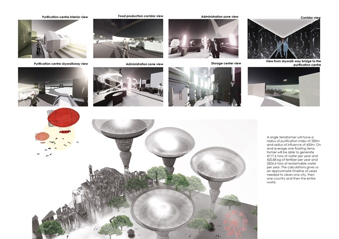
The Interior View of the Facility - Sania Halim
A single terraformer will have a radius of purification index of 300m and a radius of influence of 450m. On an average one floating terraformer will be able to generate 4117.6 tons of water per year and 420.88 kg of fertilizer per year and 2826.6 tons of reclaimable water per year. The calculations give us an approximate timeline of years needed to clean one city, then one country and then the entire world.
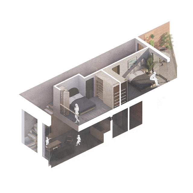
Isometric flat section - Alfie Hollington
Design Studies 3a
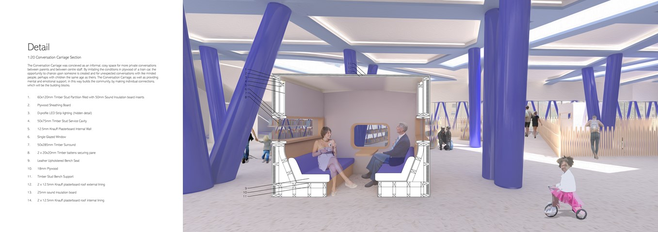
Andrew McCluskie
1:20 Conversation Carriage Section
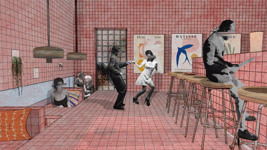
Changing Atmospheres throughout Spaces - Enbiya Yuecel
3B To Play
Second Star to the Right / 3B / To Play
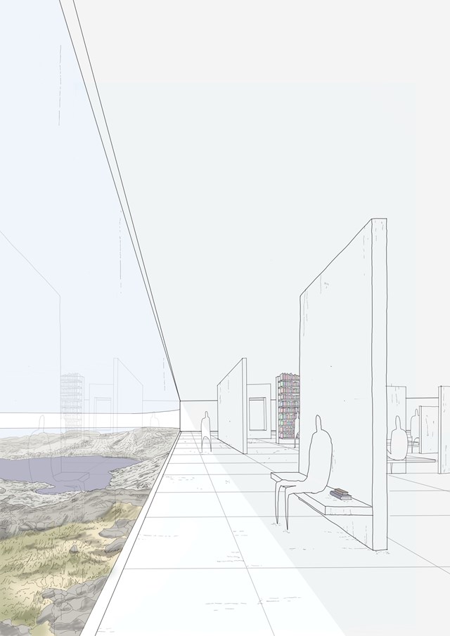
A Place for Learning - Daniel Kelly
On the lower level of the structure, small and intimate spaces are produced for the citizens to use as areas for reading, reflecting and conversing whilst enjoying elements of biohpilic design with a connection to nature.
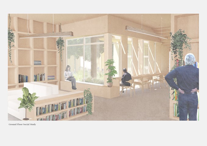
Ground Floor Social Study - Victoria Rozewska
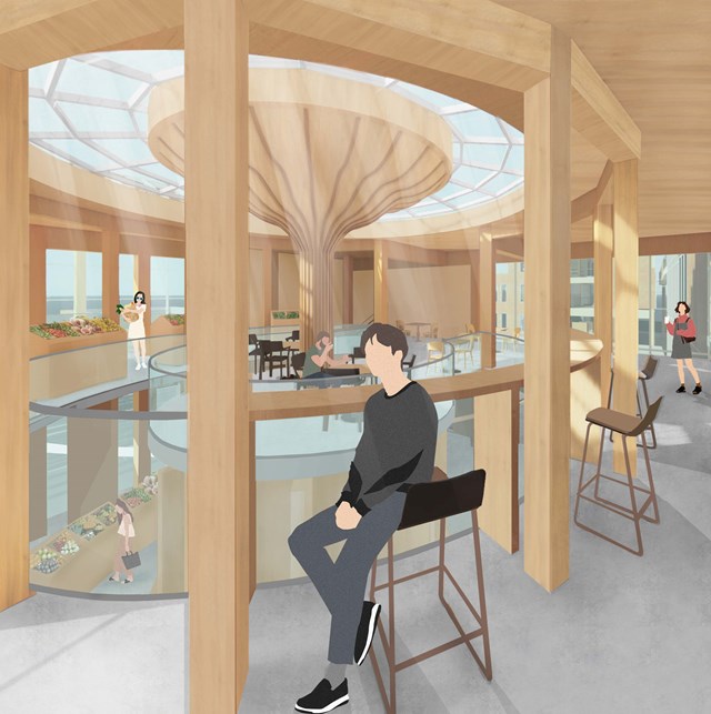
The Market Seating - Fiona Wylie
Interior view of the cafe seating area above the public market stall, highlighting the glulam and CLT construction for a warm, earthy atmosphere.
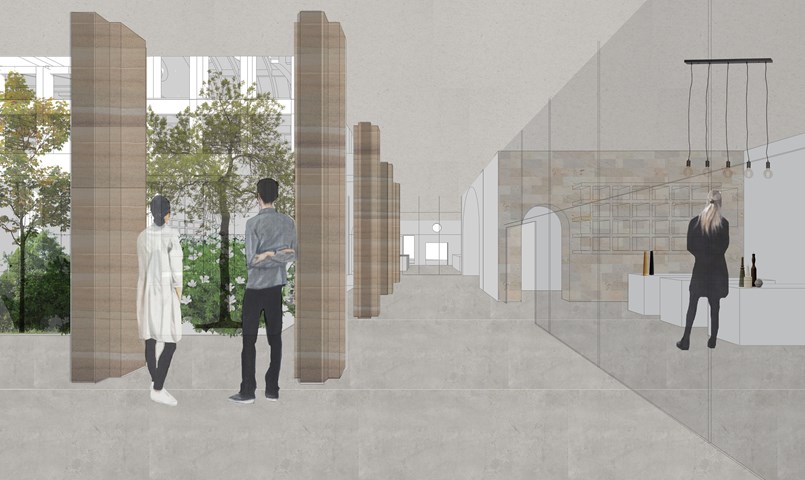
Arcade between shops and courtyard - Fatema Hassan
This region within the ground floor connects all entrances from all edges of the site to the central courtyard and shops. It is open to the outside and sheltered with a cantilever that forms the first floor. All shops have curtain walls facing the interior courtyard to absorb light penetrating through.
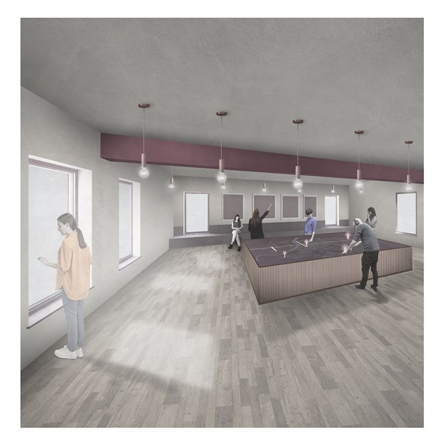
City Satellite Control Centre - Rebecca Irving
The city centre site adopts a piece of vacant land in the city and focusses on improving feelings of safety by introducing another lookout tower.
