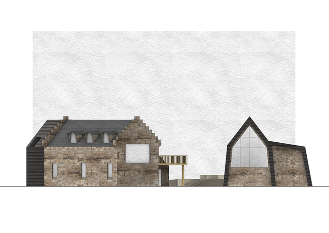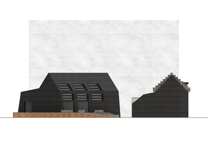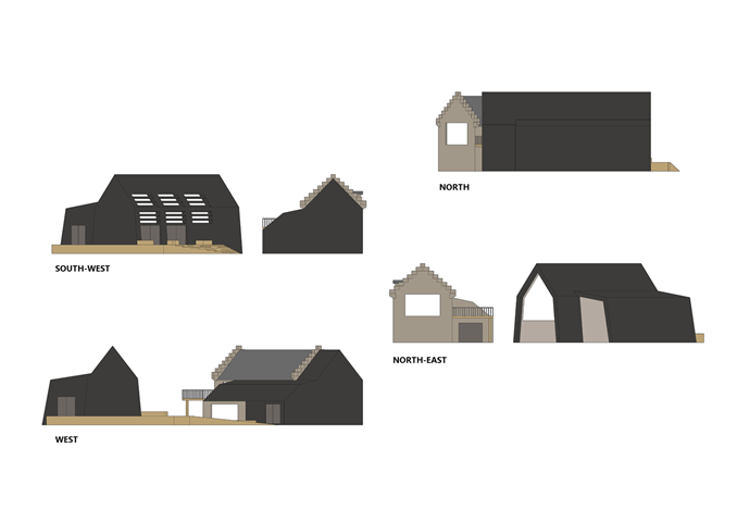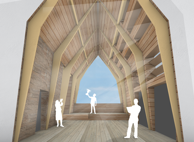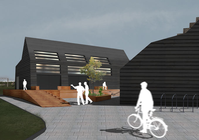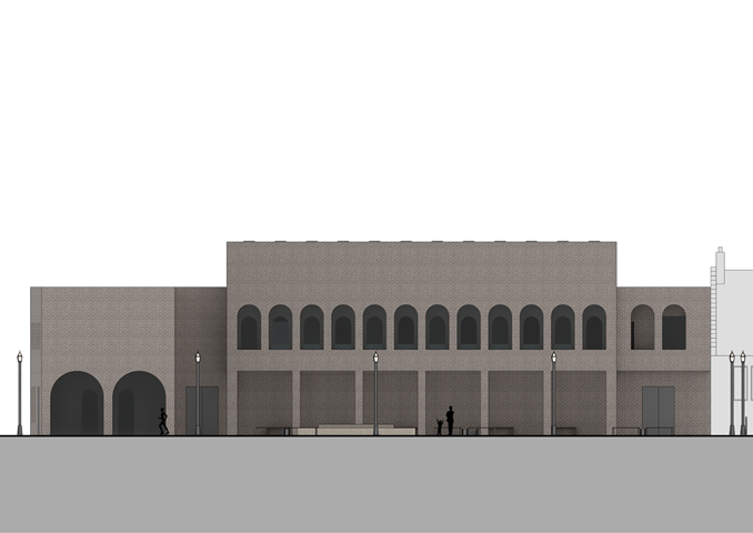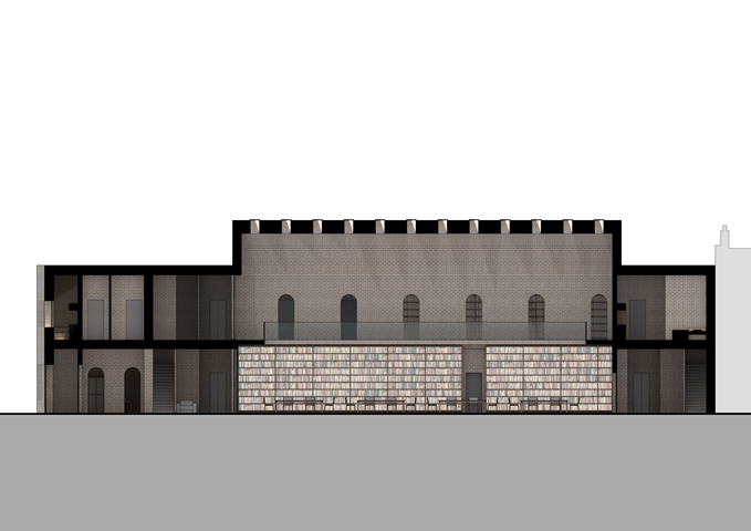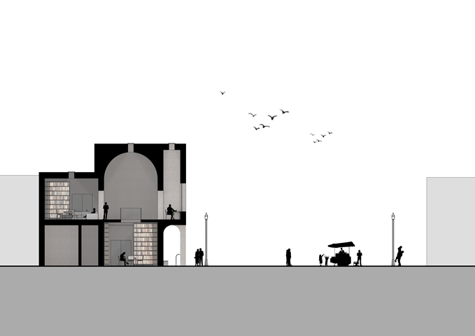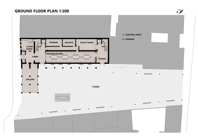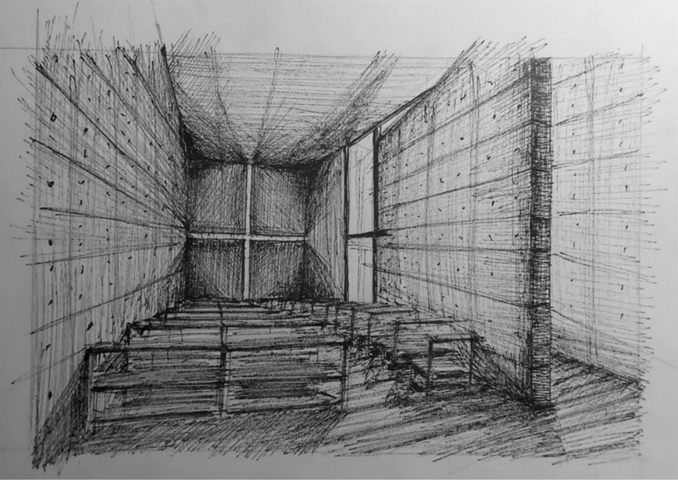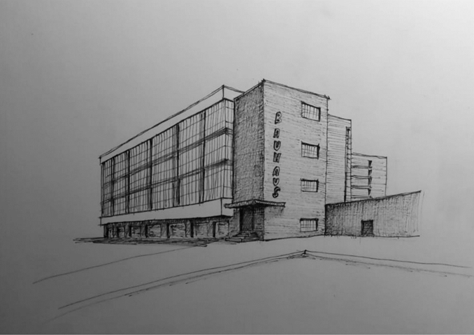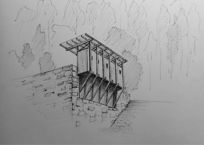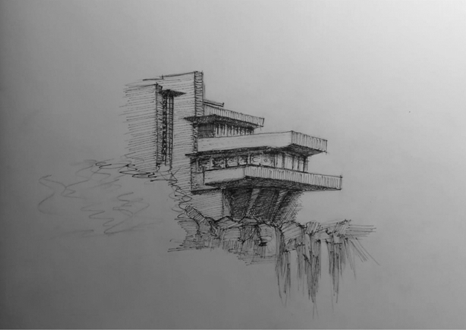
In this showcase, I have chosen to display work that I thought best reflects my goals and accomplishments this year. Specifically, I focused on my visual representation in a digital format emphasizing the materiality of a building. This year I felt I have also greatly improved my work ethos, design process, ability to communicate my ideas. Additionally, I developed my skills in various digital programs.
SAILING CLUB PROJECT
Semester 1
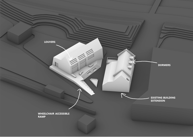
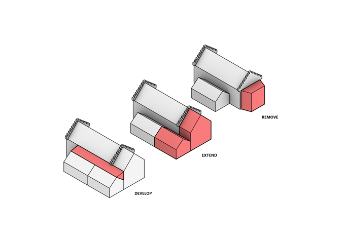
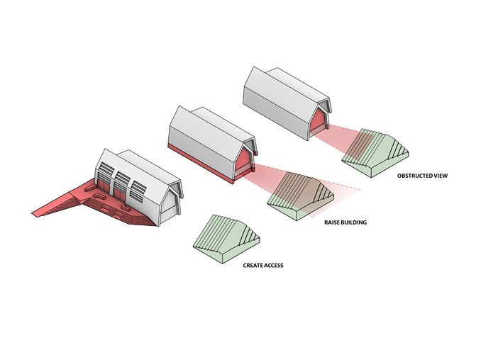
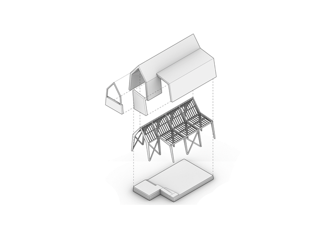
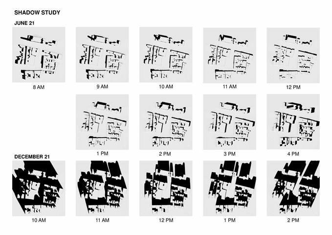
In this project, I made some improvements to the existing building and then as the brief requires created a gathering space. I chose to make a separate building entirely for this purpose that is connected to the existing building with a key part of my design - the outdoor area. Additionally, I used a primarily wood structure and paid attention to my buildings orientation in order to best utilize passive solar gains and reduce heat loss. Another important part of my design and potentially most challenging one is accessibility because in order to have a view of the sea I needed to raise my building.
LIBRARY PROJECT
Semester 2
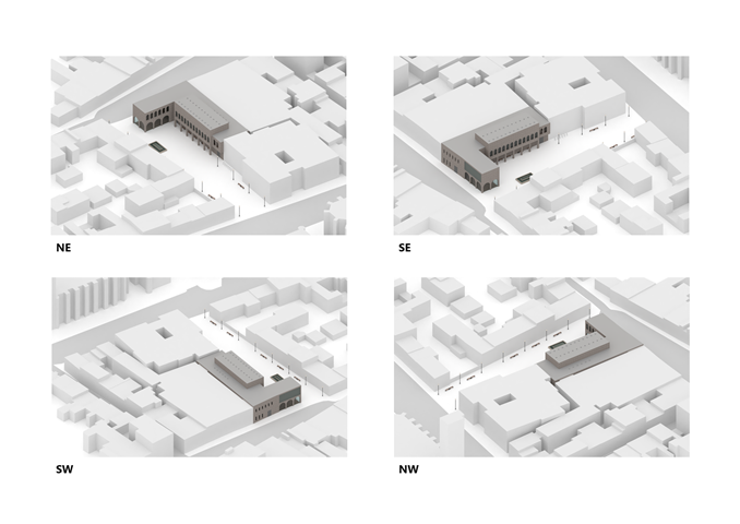
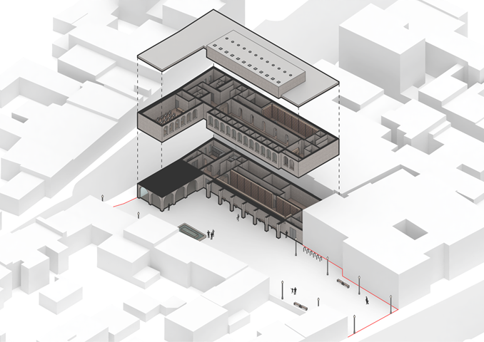
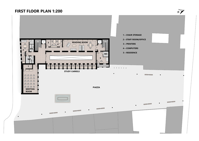
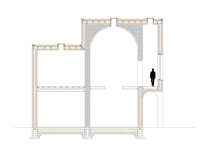
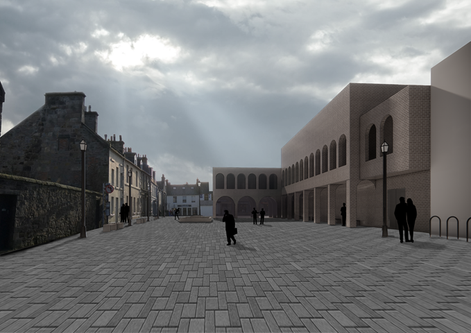
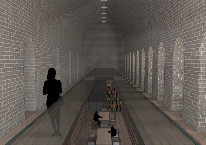
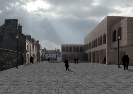
For this project, I chose the most urban site of the three and took inspiration from the nearby old churches and buildings of St. Andrews and designed a brick load-bearing building that reflects elements of these other historical buildings. A large emphasis was on the materiality of this building and the weight of its structure in order to create interesting volumes such as the individual study carrels with their unusual proportions and high ceilings. The building's plan is carefully thought out and central to my design was also the outdoor urban piazza. I also chose to utilize a Trombe wall and compressed stabilized earth bricks to reduce my environmental footprint.
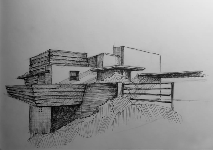
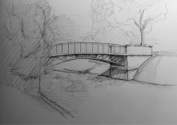
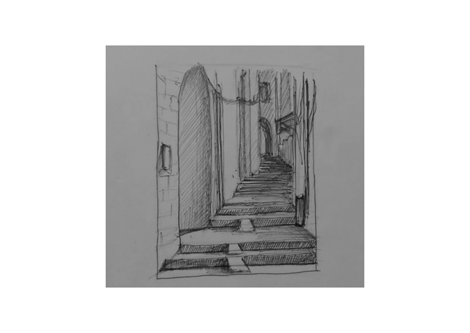
SKETCHES
Some sample sketches I have done in my free time that help me explore other architects' work and further develop my sketching skills. All sketches are done with a pen and are drawn in under an hour.
