Before arriving at Strathclyde, I studied at Edinburgh College Art&Design and Architectural Technology. I found some of my previous experience helping with certain subjects, however, I have experienced that some of my knowledge was quite disturbing during the design process.
I think that our goals and interests in architecture change as a part of the process. In college, my greatest interest was the relationship between architecture and the environment. Currently, I am learning more about the economic and social aspects behind the design. I like to see what was great in the past and how we can achieve better standards with currently available materials and techniques.
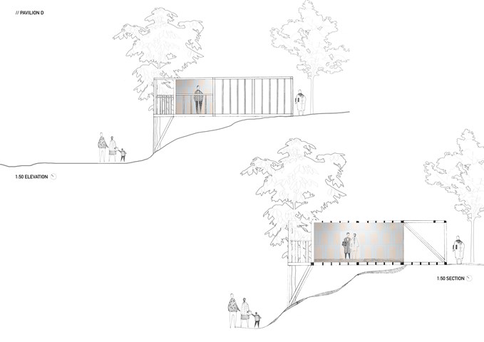
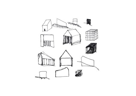
In this showcase, I would like to share few pieces from the projects carried in year 1. In semester one, I was asked to design a temporary pavilion in Kelvingrove Park that would accommodate the artwork of Kate V Robertson. I decided to focus on the word TEMPORARY, and I proposed pavilions that could be built overnight. Artist said that she likes when people engage with art, and it gets “worn”. My design doesn’t have doors or windows and erases the boundary between inside and outside.
In semester two, we had to design a contemporary art gallery in the city. My group had to focus on the Govan area in Glasgow. In this project, I developed my interest in the relation between architecture and community. And how the buildings can change the way people living. I wanted to embrace the rich history of the given area and bring the community together.
This year was very challenging for everyone, I am looking forward to being back on campus and explore the studio and library. I cannot wait to develop my digital skills and work with my colleagues.
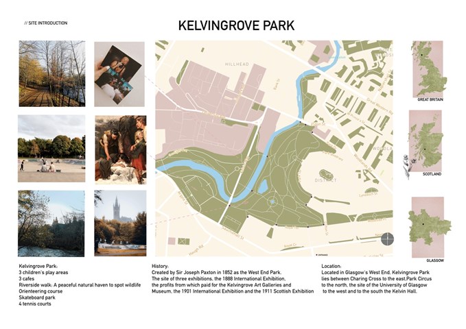
"To See" - Site Introduction
This was my first attempt at the site analysis. I was quite happy with the overview of my project because I made it all in pastel colours. In this slide, I introduced the location, main features and history of the site. Some of the pictures presented on the slide has been taken by me, and a few of them are from image stock since I have not got a chance to visit a site this year.
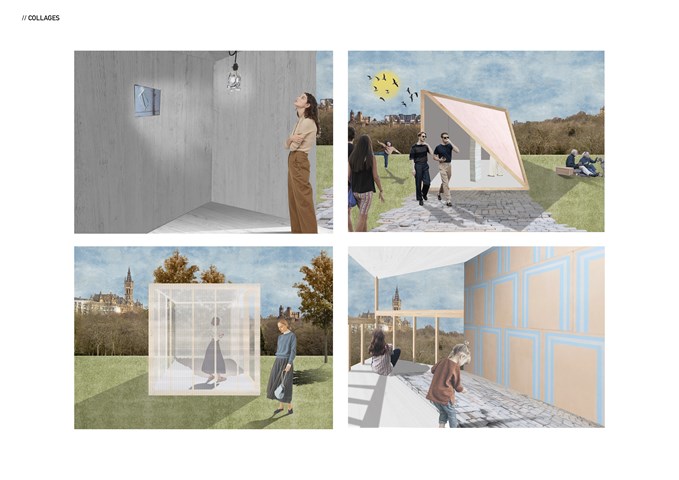
"To See" - Series of collages
Semester one project "To See". Series of collages capturing the internal or external character of the temporary pavilions. Collages were made in Photoshop over the hand-drawn sketches.
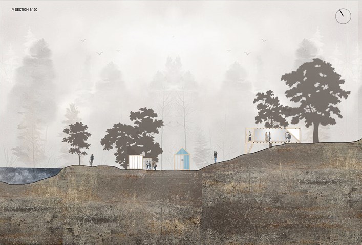
"To See" - Site Section 1:100
Site Section 1:100, representing the layout of the pavilions within the site. The site I have chosen has uneven terrain, which was quite challenging from a technical point of view. The site had a river view and multiple points of access which were the main reasons for me to choose this location. What I really like about this picture is the misty atmosphere, in the future, I would like to achieve this effect more often.
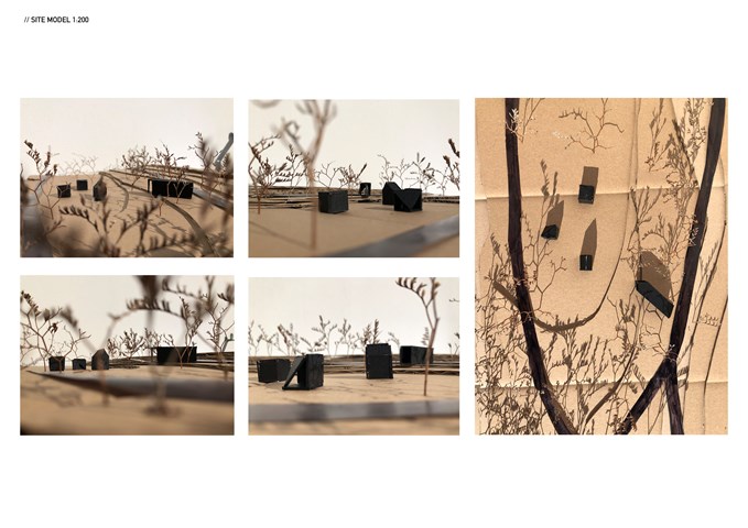
Site model 1:200
This site model helped me to locate and connect pavilions. It was really important for me to understand how they collaborate together. I wanted to achieve the route that will lead from the exit to the entrance of the next pavilion, ending at the largest pavilion. The last pavilion design collaborates with the shapes of the rest three and captures an incredible view of the pavilions, river and tenements.
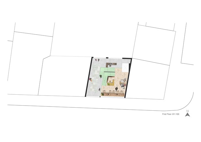
"To Engage" - Floor Plan 1:100
In "To Engage project" we were meant to design the art gallery in the slice between the tenements. Since in this project we were quite limited with the form, I decided to focus a bit more on the interior design. I made a collage of the floor plan for each individual floor, to deliver the idea of the atmosphere I would like to achieve.
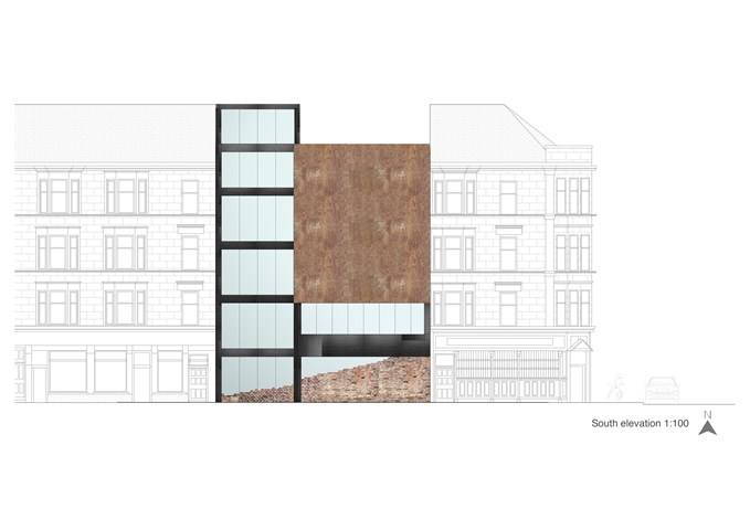
"To Engage" - South Elevation 1:100
I proposed steel frame construction, in my design because it allows achieving long spans, large open spaces and is aesthetically fitting into the project. In the south elevation are visible construction elements - steel beams and columns painted in black. A large recycled rusted steel panel is a decorative element and it doesn't have a shading function, I would imagine that made of the shipyard's remains welded into one piece. Large windows should be made with solar controlled glazing (IGU), or ideally with electrochromic glazing. At the bottom are recycled bricks which, are in the hall part purely aesthetic. Those brick main are a symbol of new rising from old; a reminder of Govan's heritage. From the staff room side, the brick is also a structural element, non-load bearing.
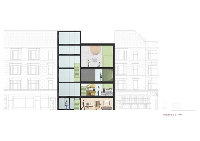
"To Engage" - Section B-B 1:100
In this section, the main focus was to show this "hanging staircase" in a dramatically tall hall space. The gallery space is located on the last two floors which allow the space to be used after opening hours as a community centre or meeting point.
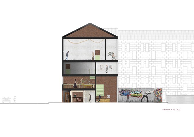
"To Engage" - Section C-C 1:100
In this section, we can see the difference between the height of the floors and how the light accesses those spaces. In the backyard is located a public graffiti wall, that can be used by anyone who would like to express himself. To introduce the gallery to another social group I proposed a mini ramp at the back. The brick in the back is the recycled wall of the preexisting building, and that was my starting point for this project. I wanted to leave one wall that would be a reminder of the past.
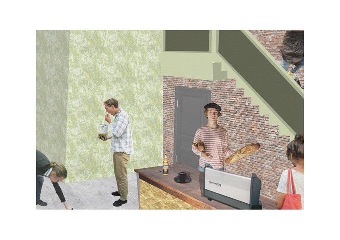
"To Engage" - Collage
Collage showing part of the cafe. At this stage of the project I started to face significant problem with my computer, and doing even simply collage was quite challenging. I really want to try to work with 3d software and see how my work can progress.
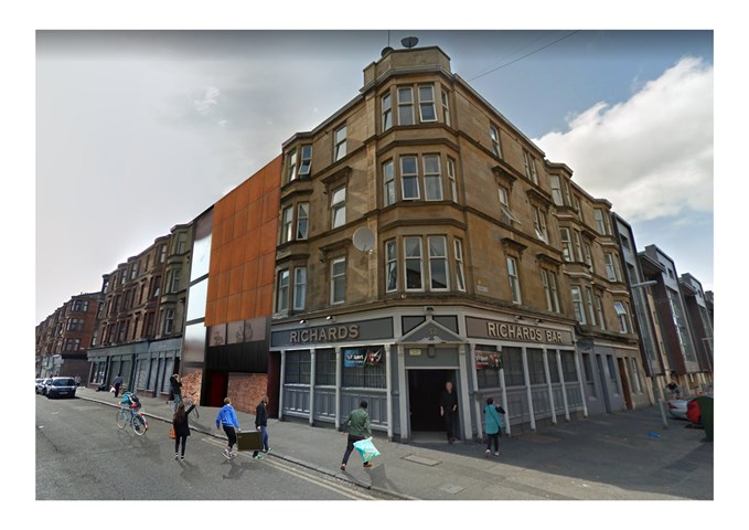
"To Engage" - 3D view
3D view of my design is a photomontage of the physical model, photography and patterns. It was quite challenging because I had to work from 3 point perspective, which is still quite new to me. This project definitely made me understand that I still have a lot to learn about the drawing basics such as perspective, shadows and geometry. There is a lot to learn about digital design, which I am really excited about.
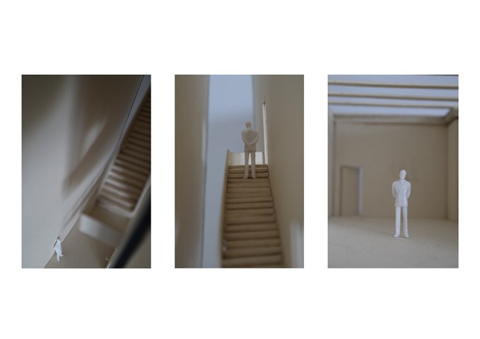
"To Engage" - Section Model 1:50
Few shots of my physical model at a scale of 1:50. It was my first experience of building a sectional model, I understood how hard and time consuming it is, however, the model helped me to visualize how the building will work and feel the real scale. I want to definitely do more models in the future and try new materials and techniques.
