Colourless Colour
A Gallery in the City
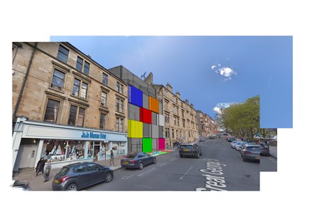
Hello and welcome to my final year one project, titled “Colourless Colour – A Gallery in the City”, which features work from both the AB108 and AB109 projects “to belong” and “to engage”. On this page, I want to give you an insight into my personal design process, what I have learnt and how and why I arrived at my final design solution in response to the brief.
As a first year student, this process is continually changing and adapting, as I look to refine my design skills. In my future work, I am looking to continue my use of colour and simple geometry as a means to arriving at a complete, eye-catching concept and wish to make these staples of my work.
Please feel free to send me any feedback: nathan.constable.2020@uni.strath.ac.uk
"to belong"
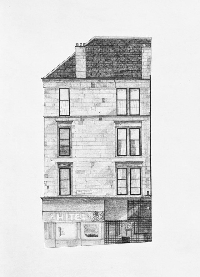
For this project, we had to recreate a "slice" of the tenement facade where our "to engage" project was situated through pencil drawing. This involved figuring out the sizes of all the aspects solely through digital investigation and then using these to mock up the "slice" as accurately as possible. Students in particular may recognise this block as it is on the corner of Byres Road and Great George Street.
Analysis of the Brief
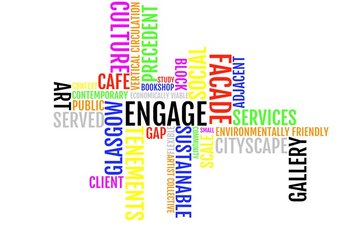
Every time we are posed with a new brief, I break it down into key words and organise them in terms of importance. Here, you can see that the larger words are what I think will be crucial to making a concept work – they focus on user engagement and connection to the site, space and city.
The Initial Idea
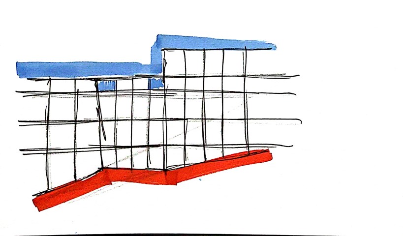
By looking at the lines created by the tenement facades, a clear idea was formed in my head. Simply geometry was discovered and I ran with that concept throughout my project, manipulating and exploring it in various forms.
The Concept
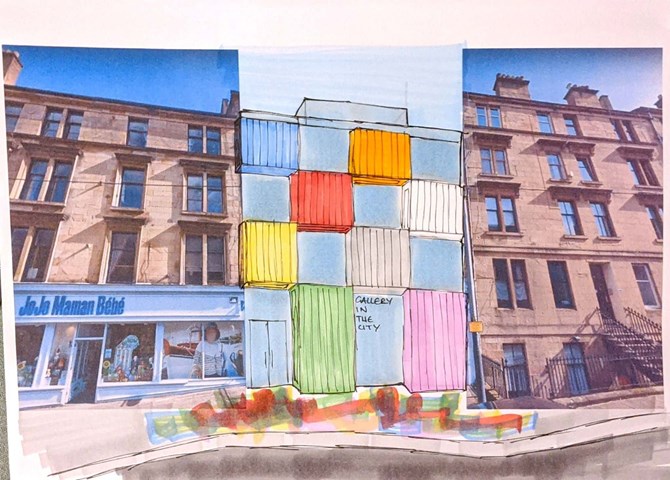
As previously stated, colour is a key aspect used within this project and one that I want to feature in my future work. Personally, I think a lot of architects shy away from using colour. I think it should be used for bold statements and that's exactly what I tried to do with this project - I wanted to create a gallery that looked like modern art, that contrasted its surroundings but still took aspects of them and twisted the rules to create a unique connection to the buildings' history. The rules of tenement design were brought into my design through the impression of verticality, continued floor levels to the blocks adjacent to my site and large windows to allow light into the spaces behind. Key precedents for me included: the Mo-Tel House by Office S&M, the Mira Shopping Centre by Fondara and the Brandhorst Museum by Sauerbruch Hutton
A Sense of Playfulness
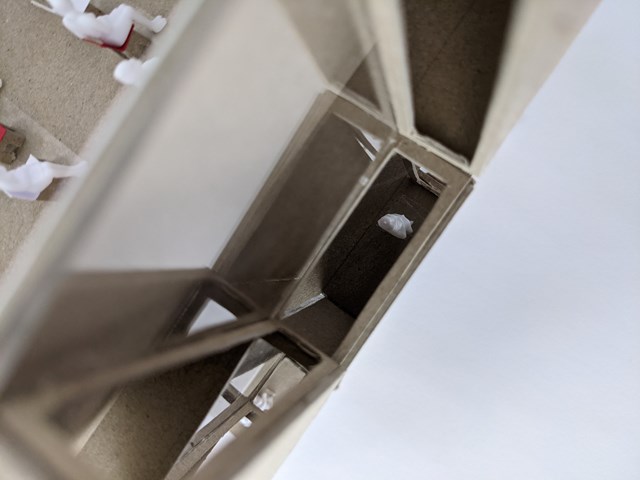
During the design process, a concept takes many turns. That is no more evident than here. As can be seen in the initial sketches, the facade sat flush with the rest of the street. However, through digital and physical modelling and stretching the concept to its limits, a more attractive solution was found. Initially for those walking at street level, they main attraction to the gallery was a paint marbled piece of art on the pavement which would utilise the colours chosen on the block idea and create a sense of arrival at the gallery. The chequerboard squares used in the very first concept drawing evolved to jut out into the street and allow those inside to view, connect and engage with the street from multiple angles (and later it was decided colours through the use of adhesives on glass), as well as create a sense of playfulness within the space and an additional draw for those on Byres Road or Great George Street. This was an idea taken from the themes used by Roderick Buchanan in his art.
Modelling
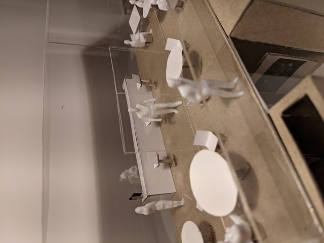
As the whole year was spent working from home, this aspect in particular was the most challenging for me. Using 1:50 scale people to create accurate depictions of the spaces I was looking to create in my design proved to be very rewarding and the sticky process of creating the furniture for these rooms really allowed the uses of the spaces to be explored. This particular scene is my favourite - it is the rooftop terrace of my gallery and house a cafe/bar and balcony overlooking the street and courtyard behind the site - and was art of a full 1:50 mock up of my final design. Only through physical modelling can you get a true understanding of movement through these spaces and how they work in the context of the street.

Street Elevation
In order to properly understand the tenement rules, working as a unit to determine the dimensions of the street was key. Then creating an elevation that displays the materiality of it allowed for further development of final ideas - here, the ideas my concept are clear: continued lines, vibrant colours and contrast. However, the extruded boxes cannot by seen and that is why it was crucial to work with various perspectives and multiple mediums.
Axonometric
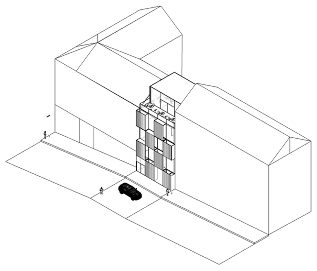
Now the concept can be seen more clearly. The coloured boxes are now obvious, as are their windows which allow viewers to see between floors and view the street in various colours and with new perspectives, and the rooftop terrace space is much clearer.
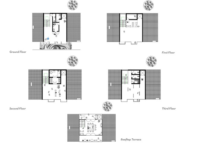
Floor Plans
The interior of my design was to feature herringbone oak flooring, the chevrons extending the feeling of space within the cramped site and accentuating the corridors of light created by the floor to ceiling windows, plain white walls to allow the coloured interiors of the boxes and the art pieces to stand out and lighting tracks. Each floor is unique and could serve multiple purposes. The ground floor sports a large open welcoming space with easy disabled access, the second is an open space to be used however for sculpture exhibitions and features a bookshop and archive, subtly placed away from the key attractions of the art. The third and fourth both have folding doors to allow the artist to use the space however they wish: a workshop? An audio-visual piece? This space was made to be multifunctional for all purposes and both are fitted with services to fit the schedule of accommodation. The rooftop terrace is a key attraction on its own, but makes viewers travel through the gallery space to give artists exposure. A return stair fitted with glass balustrades and oak handrails connects each floor, as well as a lift.

Photomontage
Finally, then, is the finished concept. This was my first ever photoshop attempt and used a full SketchUp digital model and Google Maps images to create this photomontage. Thank you very much for looking at just a glimpse of my architecture folio from this year!