"To Share": Knowledge
A Student Library
Introduction
I'm a year 2 student in the Architecture BSc Hons course. This year, due to COVID-19, we faced several challenges the made our work particularly tough: we weren't able to physically interact with other students or members of staff, we were unable to visit our working sites, we couldn't make use of the workshop or the studio, but despite all of these hurdles I believe we were able to overcome them and deliver interesting and succesful pieces of architecture.
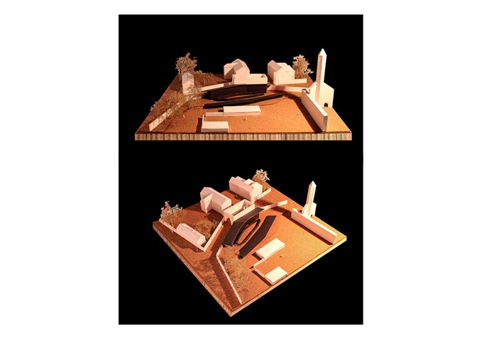
As a second semestre Design Studies project, we had to design a student study Library in the small town of St Andrews, which is located in the northeastern part of Scotland. My site, more precisely, was in the Pends, adjacent to the St Andrews Cathedral ruins.
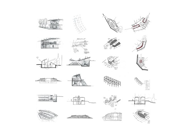
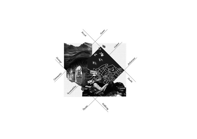
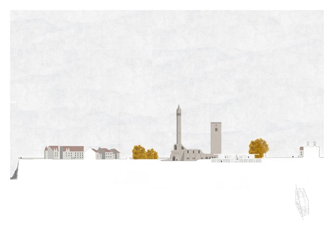
The historical and social significance of the site made it particularly challenging...A hierarchy with the natural and built context had to be maintained, while a new, sustainable, modern library had to "invade" this delicate environment. I therefore took into consideration a few essential principles throughout the whole design process: Sustainability, efficiency, use of natural light, respect of the context and fusion with nature.
The Building in its context
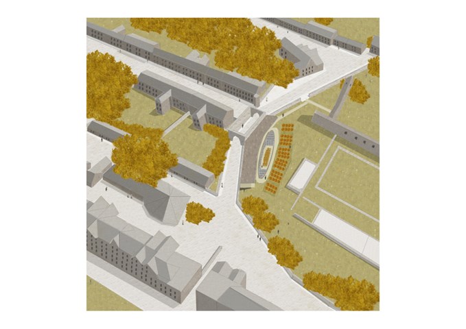
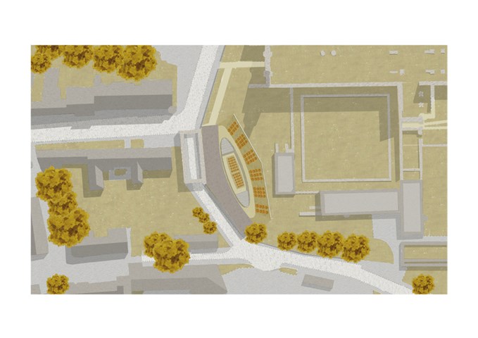
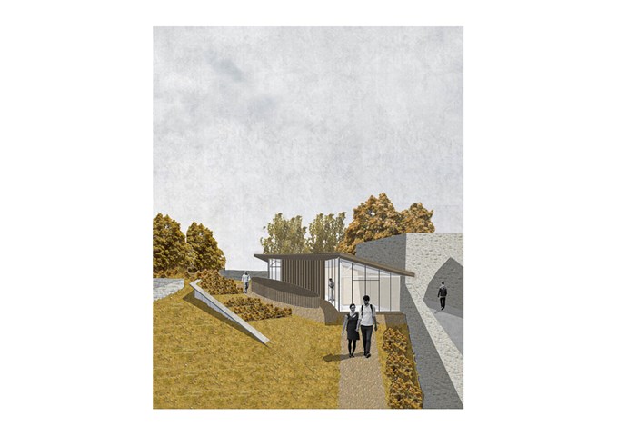
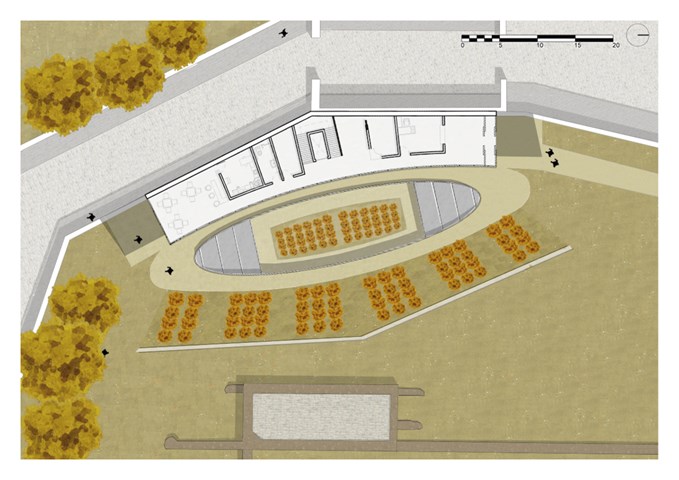
Not only does the shape and orientation of the building maximize the views of the Cathedral and the coast, it also follows the direction of the existing wall.
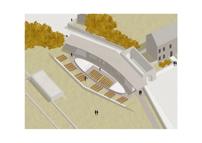
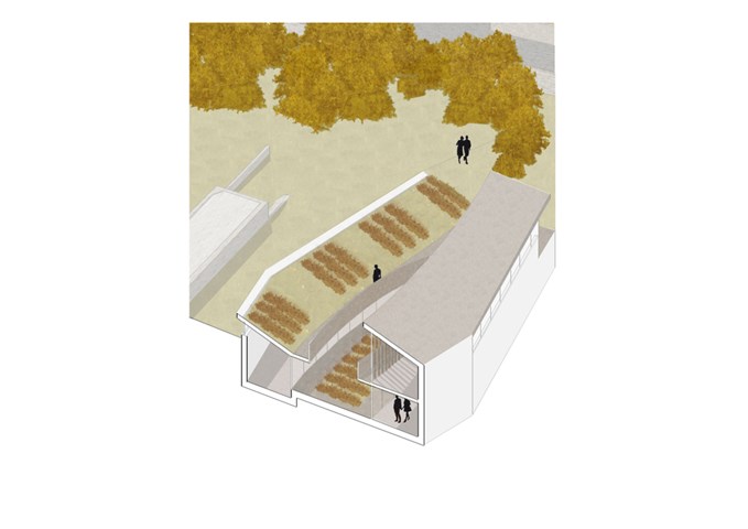
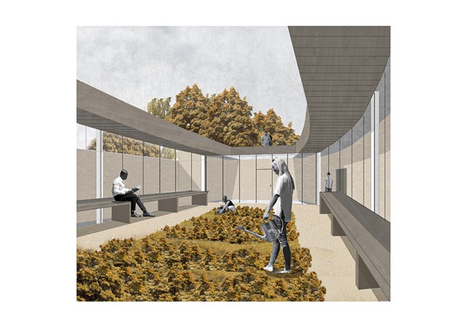
The library makes its presence known through its interesting external architectural features, such as the open-air courtyard with its vegetable garden in the centre and the vegetation on the green roof, which also creates a delicate transition with the landscape.
The external walkway that passes through the building recalls the original path that existed in the 1800s.
External Views
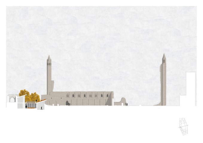
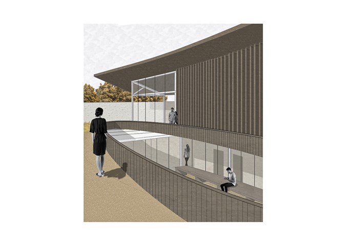
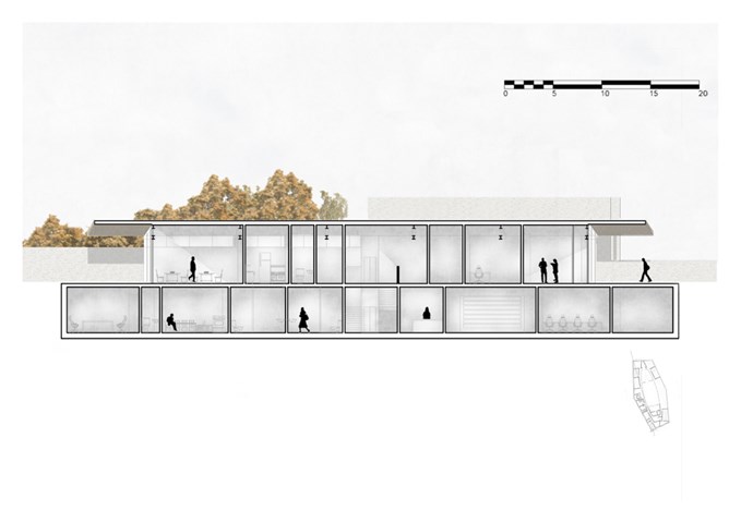
The Ground floor level fully exploits the scenery by using a series of glazed facades. The north and south end, which accomodate the lobby and the cafe, are fully glazed, thereby allowing visitors complete unobstructed views of the Cathedral ruins, whereas the central part, which accomodates facilities such as the service room, cloakroom, kitchen and so on... have vertical timber louvres placed externally which allow visitors to still see outside, while creating a sunshade for the building.
The green roof located towards the east is covered with wild plants, whereas the garden in the central courtyard has vegetables. Vegetation provides an aesthetic function, a sustainable one and also reflects the context nearby.
The Library
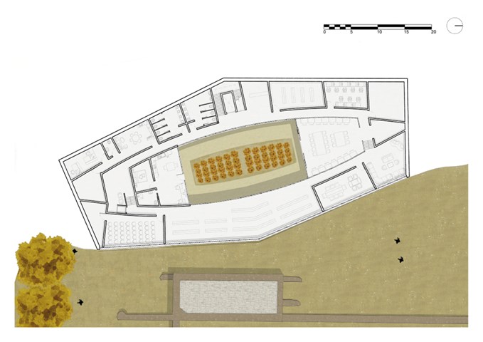
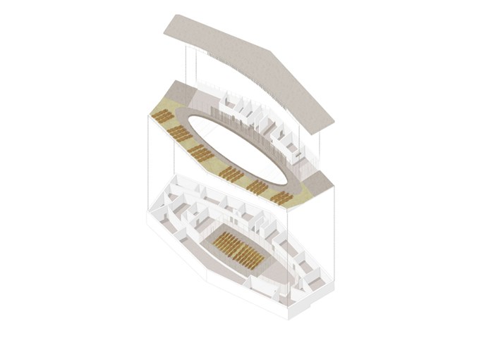
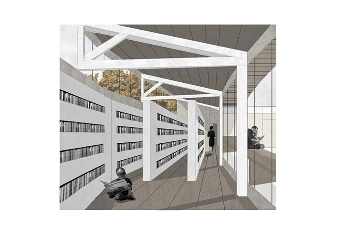
The building develops over two floors and follows the topography of the site. Those who enter the facility are guided through a series of spaces that create a sort of “transition area” between the outside and the library per se: an environmental lobby with a display of selected books welcomes guests inside, who are then required to go through the staff control point and to use the cloakroom if required.
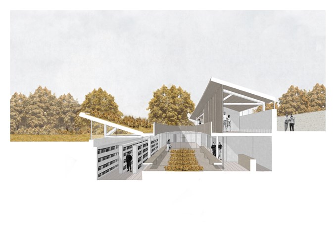
The basement floor plan revolves around the central courtyard, a place that offers guests different activities, such as reading, socializing and the opportunity to do some gardening. All the spaces that do not necessarily require natural light are situated in the western part of the building, whereas the library-related rooms are close to windows and openings.
General View
An important inspiration in the designing of this building that is prevelantly underground, has been Tadao Ando: by studying his projects, a series of ideas concerning use of light and shadows and also the integration of the landscape in the design came to mind. In an interview describing the Chichu art museum in Japan he stated: “I have an almost unconscious inclination to underground spaces. Regardless of the nature of the site, I try to create an architecture that never dominates the surrounding environment...”. I immediately found myself sharing this approach and understood what he meant. This way of thinking is clearly evident in the design of this library.
Internal Views
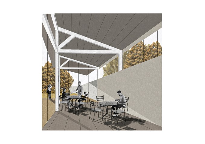
At ground level there is a cafe offering menus based on produce from the library’s central courtyard garden.
This location is fully glazed, enabling guests to enjoy the complete visual and atmospheric experience, while sampling the local healthy delicacies.
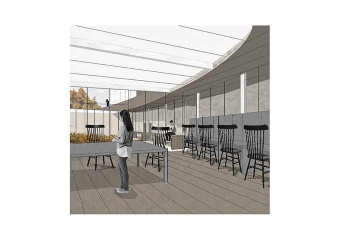
The main reading area of the library is located next to the courtyard. A series of long tables can be found in the centre, surrounded by 14 private study carrels. Thanks to the frosted glass roof, the space is well lit, while maintaining relative privacy from people using the external walkways.
The courtyard is the beating heart of the building. A space where the St Andrews community can come together to develop gardening skills and gain a better understanding of a healthy lifestyle through organized workshops offered by the library.
The physical model and the Structure
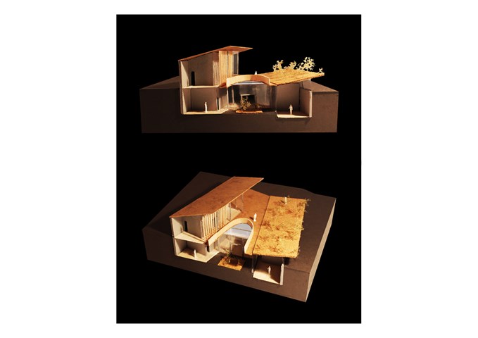
By creating a physical representation of my design ideas, I was finally able to see and present something tangible: a series of differently sized shapes and materials that together form the product of months of development and refinement.
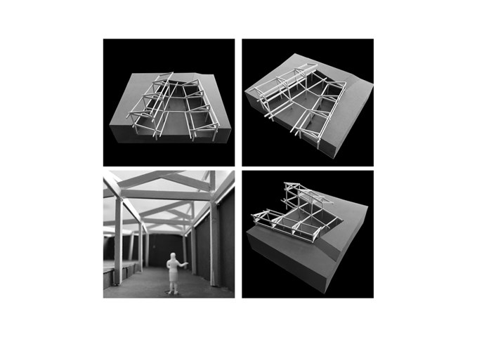
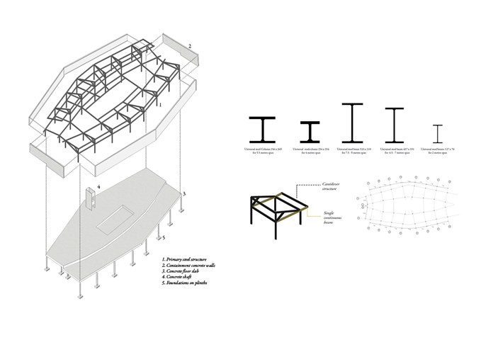
I have chosen steel as the material for the structure because of its strength in tension and in compression. Due to the heavy load it needs to support (an accessible roof covered in vegetation), it worked effectively for my design. Its 100% recycling aspect also drove my decision.

