The images which I've selected showcase my ever developing skillset and are the ones I view as the most rewarding. I believe the work reflects upon the continuous effort and dedication that I have applied to my studies through second year. As I look back, I've learnt how to think in multiple dimensions simultaneously. In addition to this I see how my architectural style has developed as my knowledge has expanded, leaving me with nothing but excitement for projects to come.
Whilst the works that I have shared are those that I enjoyed the most, they are also the projects which I found equally as challenging. I've pushed myself in areas where I lacked confidence to only to find it opened new gateways which expanded my skillset. I look forward to seeing my progress throughout my years at Strathclyde and where these new routes will take me.
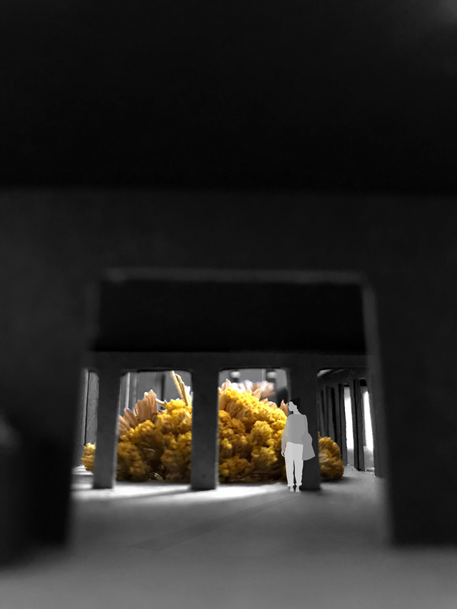
Entrance View Towards the Garden
Upon entering the building, there is a strong connection between the user and the green space that the buildings encircles. The entrance lobby creates an intimate space with the dropped ceiling height, and allows the user to feel transported away from the busy street to a calmer realm to study in.
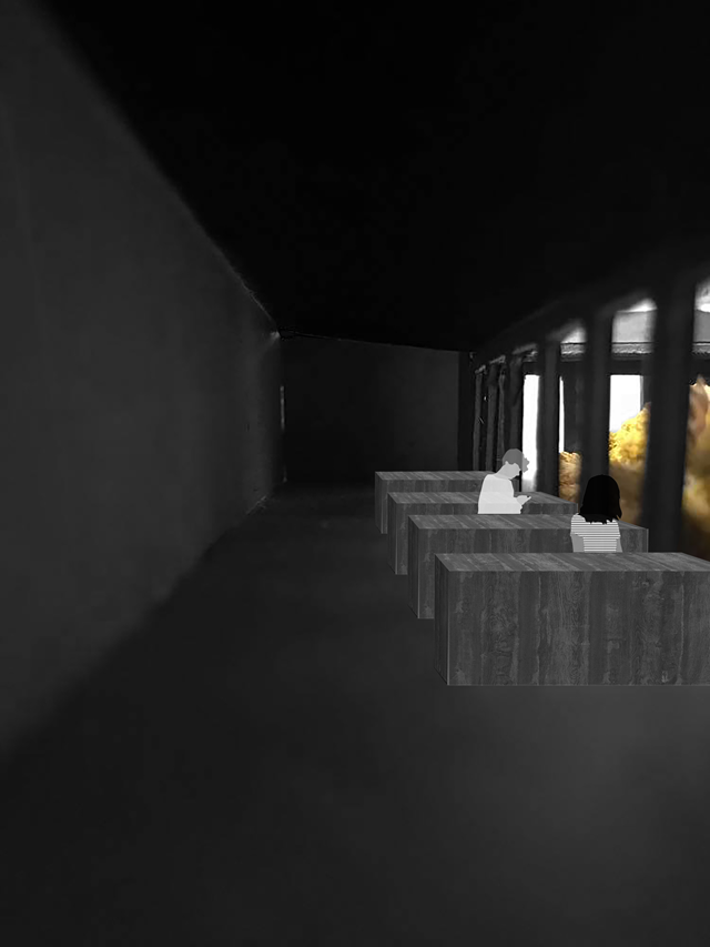
Study Booth View
The main idea of this library design was to create a central focus around the wild flowers within the central garden space. Within this, there was strong inspiration from the architect, Peter Zumthor, who believes, “A garden is a very intimate space. It requires care and protection. To do this, we encircle it and give it shelter. The garden then becomes a place.” From this, I designed the study spaces around the garden so not only does the garden become a space to dwell and reflect, but the shelter also allows the person to be taken away from the street and left with the garden in a quiet intimate atmosphere.
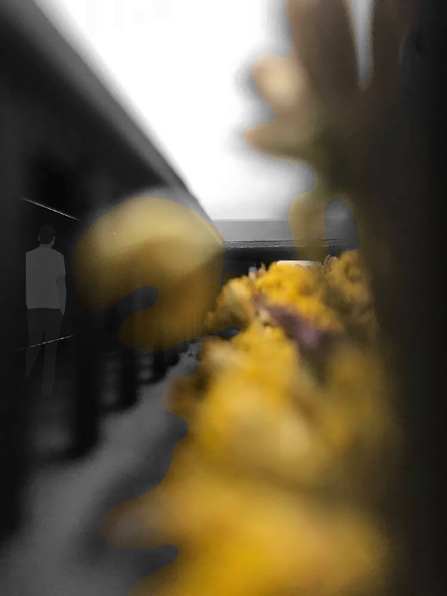
View Back to the Entrance Lobby Through Wild Flower Garden.
By designing the circulation space around the central wild flower garden, it strengthens the connection between the person and the outdoors. With views from every room to this lush green space, the library aims to improve the publics wellbeing and responds to the sustainable design outcomes.
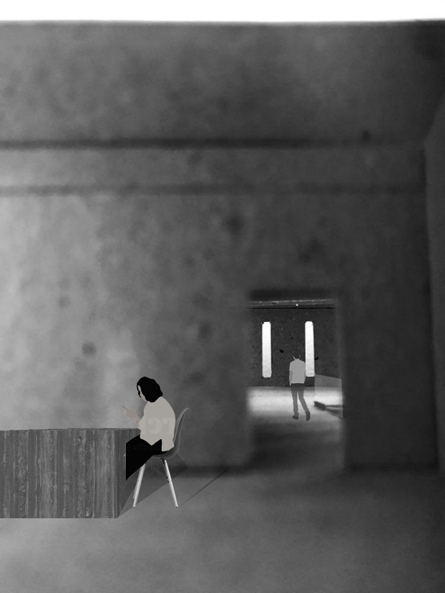
Reading Room View towards Main Library Space
The Reading Room is designed with north facing roof windows which flood the space with natural light. The space is elevated off the front of the street to reduce noise pollution and to create a more serene space to allow one to become absorbed in their reading material.
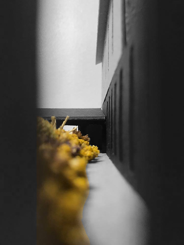
Long View Through Wild Flower Garden to Entrance
By only providing views towards the green space in the middle of the building, the user develops a strong connection physically and mentally to the outdoor world. Not only does the direct connection to the green space physically transport the user away from the busy city surroundings, but mentally it is proven to enhance students learning, reduce stress and improve general wellbeing too.
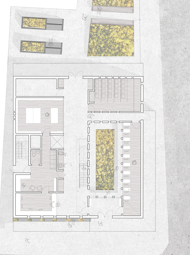
Ground Floor Plan Scale 1:100
The ground floor plan showcases the main spaces of the building. To the left are the main service spaces that allow the building to function. This includes (from bottom to top) the reception, staff base, private fire stair, archive and plant room. The circulation space is given life with alcove benches facing the garden, and storage for students. By designing this space with a function, it prevents the circulation space from becoming a dead space, but gives it a bit of life and character.
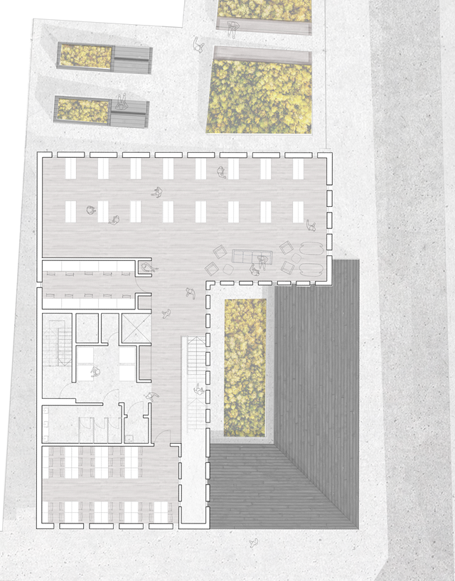
First Floor Plan Scale 1:100
The first floor plan follows a similar theory, with service spaces kept to the left. From Bottom to top lie the reading room, toilet facilities, print room, private storage, computer base, and main library space.
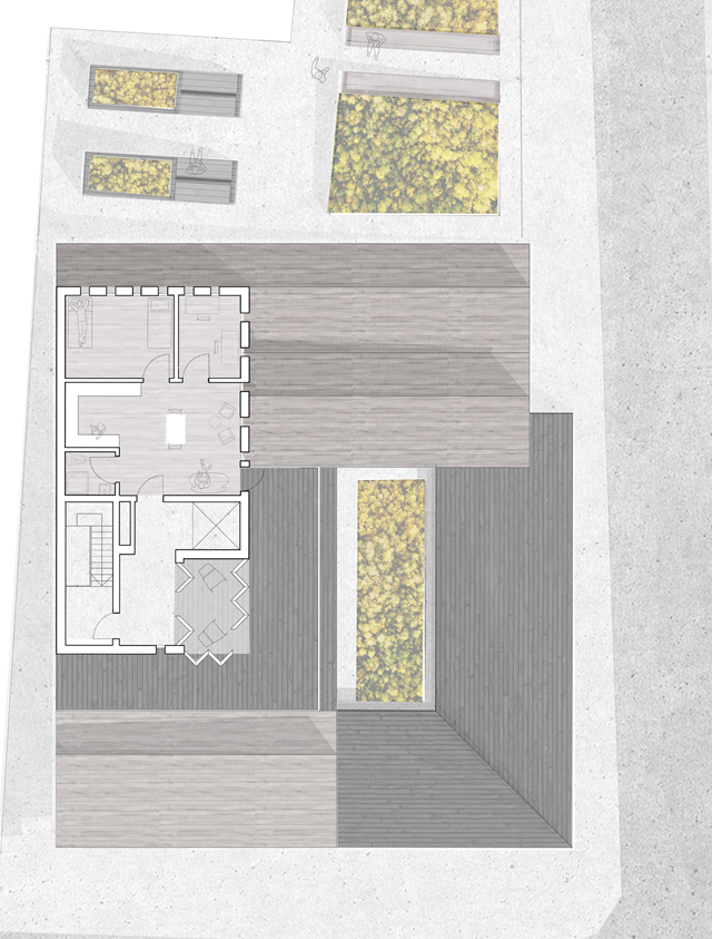
Second Floor Plan Scale 1:100
Accesses via the private fire stair are the residences for visiting lecturers and professors alike. To stray away from common shoe box accommodation, I decided to take advantage of the height and south facing balcony to create an experience for the visitor. The rooftop balcony overlooks the wild flowers, but the sunroom also opens up to create flexibility and a feature within the space. The living quarters are open plan, and are accompanied by a north lit study and twin bedroom with views out to the coast and nearby Church.
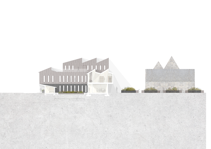
Long Section Through Wild Flower Garden
This long section displays the direct correlation from all areas within the building to the greenspace in the centre of the design.
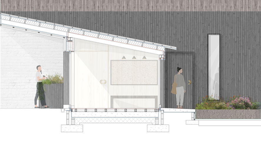
1:20 Technical Section Through Entrance Lobby
The roofscape of the lobby and study carrells are specifically designed to enhance the user's experience within the building. The overhang on Market Street takes the user away from the street and creates a threshold into the building. The angle of the roof provides shelter from solar gain, creating a dark and intimate lobby space, emphasising the light and colours that shine in the wild flower garden. In addition to this, the roof is designed to gather rainfall with the large surface area and channel it into the central space to allow the flowers to grow.
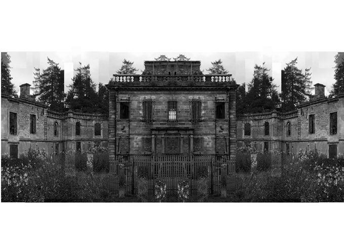
Mavisbank House / Symmetry and Order
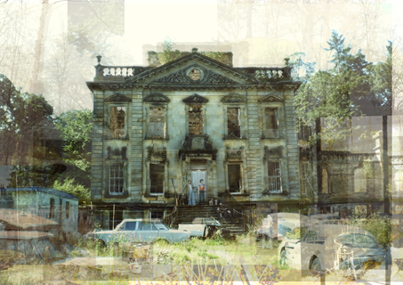
The following artworks convey the regression of Mavisbank House. The Palladian villa was the first of its kind to be built in Scotland during the period of enlightenment, where it experienced an entourage of regimes. Originally built in 1727 by architect William Adam in collaboration with his client with intentions of being a stately family home, the building was erected with strict form and order which showed its stance in the local hierarchy. With being a sign of wealth and importance within the area, the building received high levels of care with a flock of maids and groundskeepers to maintain the property. Through time, and many pairs of hands, the building was eventually left in a state of hibernation after the property owner passed away. Eventually gutted by fire, the building was robbed of its elegance and hope of rejuvenation. The building then left in turmoil gradually disintegrated, finding purpose as a car park and scrap heap in the early 70s. Within this project, I wanted to reveal how although the building may not stand with its intended character, I think the building is far more interesting now nature and time have allowed it age and develop its own charm. I have compared the buildings in their two main phases of life through photo collage. In the first I show the building as if it had aged through time, maintaining the characteristics of the Palladian style with strong symmetry and organised features. In the second I have shown how the building has truly deteriorated, veering away from its original style and descending into a state of chaos. Personally I much prefer the style of the more chaotic artwork as I feel as though it represents the bitty and unpredictable life that the building has endured.

Mavisbank House / A Descent into Chaos
The following artworks convey the regression of Mavisbank House. The Palladian villa was the first of its kind to be built in Scotland during the period of enlightenment, where it experienced an entourage of regimes. Originally built in 1727 by architect William Adam in collaboration with his client with intentions of being a stately family home, the building was erected with strict form and order which showed its stance in the local hierarchy. With being a sign of wealth and importance within the area, the building received high levels of care with a flock of maids and groundskeepers to maintain the property. Through time, and many pairs of hands, the building was eventually left in a state of hibernation after the property owner passed away. Eventually gutted by fire, the building was robbed of its elegance and hope of rejuvenation. The building then left in turmoil gradually disintegrated, finding purpose as a car park and scrap heap in the early 70s. Within this project, I wanted to reveal how although the building may not stand with its intended character, I think the building is far more interesting now nature and time have allowed it age and develop its own charm. I have compared the buildings in their two main phases of life through photo collage. In the first I show the building as if it had aged through time, maintaining the characteristics of the Palladian style with strong symmetry and organised features. In the second I have shown how the building has truly deteriorated, veering away from its original style and descending into a state of chaos. Personally I much prefer the style of the more chaotic artwork as I feel as though it represents the bitty and unpredictable life that the building has endured.