Towering Knowledge
A study library in St Andrews
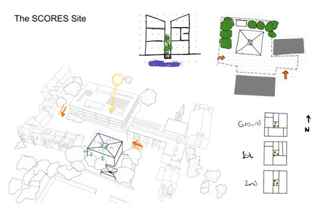
Even though this second year of my studies has been entirely online, I still learned so much about architecture and the skills that are needed to communicate ideas. This project in particular taught me a lot about the typ of architecture I like to create and how to create it.
The brief for this project was to create a study library in St Andrews. To me it was not only important how the building work as a building, but also how it fit into the rest of the town and how it worked with the conditions of St Andrews, so the twonscape analysis was very important in the design process of the building. For example the void came from the idea to let the rain into the building and use it as opposed to keeping it out.
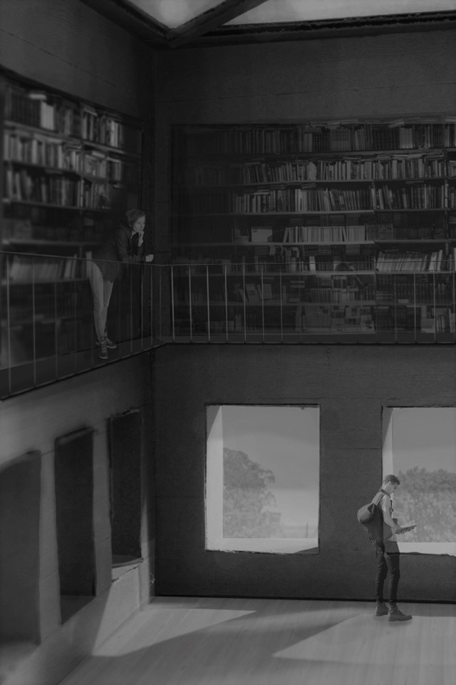
The Library
The library part of the building takes up the upper two floors and is the most important aspect of the project. This image was created using a cardboard model and then edited on the computer.
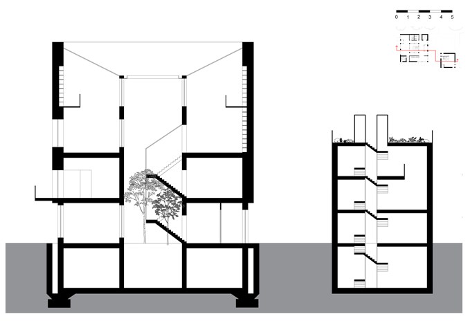
The Section
The section is defined by the void in the middle of the building that doubles as a staircase. The idea is the use the natural features of St Andrews, for example the rain, to power the building. The design form was based on the conditions of the site.
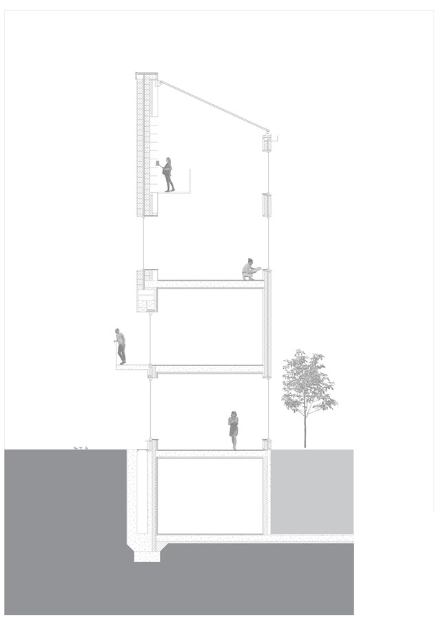
The Technical Aspects
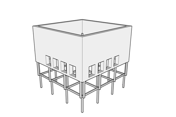
The structure of the building changes from the lower floors to the upper floors so the make-up of the walls also changes at that point. The upper floor contain load-bearing blockwork compared to the steel-framed and insulated lower half of the building.
The Struture
The structure of the project is half load-bearing walls and half structural frame. The idea for this specific structural split came from tenement buildings that have stores in the lower portion of the building. The lower half is meant to be very open and advertising what is inside, whereas the upper half is more closed off and private.
The Floorplans
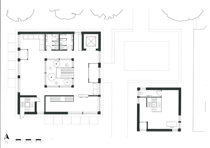
The concept for the flooplans was to have an entrance area to the east, a more private area to the south and the north and west sides of the building are the main feature of each floor. There are also three points of circulation running on a diagonal through the building, the lift to the north-east, the main staircase in the middle and the fire stair to the south-west.
The Entrance
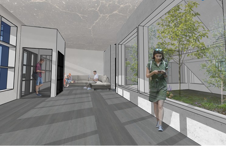
The image shows the secondairy entrance to the building that is located on the west facade. This part of the building is meant to be very open and almost "see-through". This is achieved by large windows in most walls and the greenery inside the open staircase.
The Site
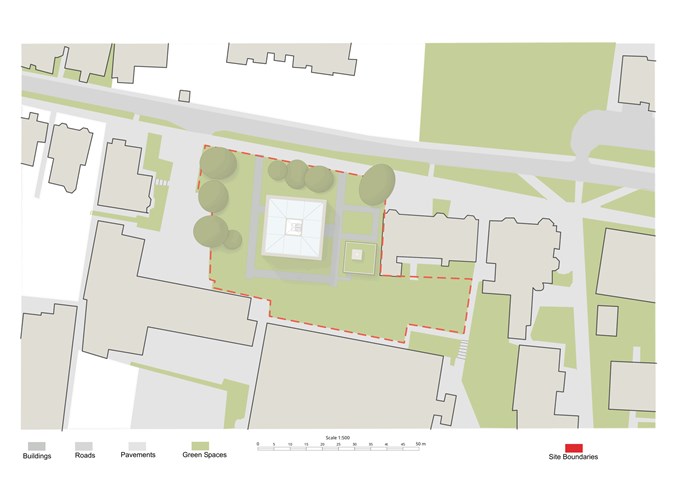
The project mainly occupies the upper half of the site as the site was already naturally split into two separate parts. The lower rectangle I left as it was in order to not disturb the view out off the neighbouring residential buildings.